Yesterday, VG posted this comment:
Lucia:is this data accurate/true?
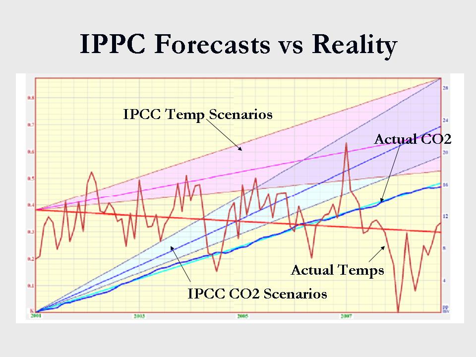
 (Figure by Monckton; I added guidelines and comments.)
The image appears at Icecap in an brief article by Christopher Monckton. The brief article includes a link to a 14 page pdf that elaborates on the Viscount’s message.
In this post, I will restrict myself to discussing the implied claims about the IPCC projections for surface temperature in that graph. I’m even going focus on this:
Is the dark lavender line in the middle of the lavender region a fair representation of the IPCC’s projection? (I assume Monckton means the IPCC projection in the AR4.)
I think the answer is: Ehrmm…. no.
What does Monckton’s seem communicate about IPPC projections?
I think Monckton’s figure suggests the IPCC projected that between Jan 2001 and Dec 2008 the underlying trend for surface temperature was more or less linear with a trend of approximately 0.35 C/decade.. I say it appears to suggest this because a) it shows this specific time period and b) the slope of the lavender line is about 0.35 C/decade.
The suggestion of linearity is essentially true; the suggestion that the trend is 0.35 C/decade over that period of time is, at best, deceptive. Maybe we could call it “artful”.
What did the IPCC really project?
The IPCC projection as communicated in figure 10.4 of the WG1 report to the AR4 creates a projection for the underlying trend (or expected value of the surface temperature) by averaging over all models used. This results in a more-or less smoothly varying function.
For short periods of time this smoothly varying function can be treated as approximately linear. So, I have no objections to Monckton’s decision to show a linear trend between 2001-2008.
However…. 0.35C/decade? For this decade? Where does he get that? As far as I can tell, the claim for this trend appears on page 4 of the pdf, where Monckton inserts a figure explained by this caption:

I’ve scanned the rest of the article for further discussion to justify the rend of approximately 0.35 C/decade in Monckton’s graph. The numerical value 0.35 C/decade bothers me because:
- Figure 10.4 in the Chapter 10 of the WG1 of the AR4 shows non-linearity for every scenarios, and all scenarios show trends closer to 0.2 C/decade during the period in Monckton’s graphs.

Figure 2: Figure 10.4 from WG1 to the AR4 (annotated). - Table 10.5 in Chapter 10 of the WG1 of the AR4 contains numerical projections for that corresponds to trends of 0.21 C/decade, 0.23 C/decade and 0.22 C/decade for scenarios a2, a1b and b1 respectively during the early portion of this century. Higher trends are justified later in the century but are irrelevant to when comparing 2001-2008 data to IPCC projections.
- On page 12 of the Summary for Policy Makers of the WG1, the authors says we expect about 0.2 C per decade of warming over the next two decades.
- In the past, when I have interpreted all the above to mean the authors projected the underlying trend to be about 0.2C per decade and used 0.2 per decade when comparing to projections to data.
I have been criticized and told that I must use the average based on the actual model runs.
In response to that criticism, I obtained the monthly average GMST for those runs, and happen to know magnitude of trends we obtain if we average over runs forced with the SRES a1b scenarios. I computed trends for Jan 2001-Nov. 2008, then averaged trends weighting several ways. If I weight each run equally, I obtain an average trend of 0.25 C/decade. If I weight each model average equally, I obtain an average trend of 0.26 C/decade. (Note: this includes a few models not used in the AR4 and is based on models I downloaded from The Climate Explorer.)
So, if we use the information from models themselves, we can interpret the IPCC projection for the best estimate of the underlying trend to be greater than 0.2C/decade, but it’s still not 0.35 C/decade suggested by Monckton.
For the curious, I have inserted a figure comparing the HadCrut and GISSTemp trends to trends from simulations I downloaded:

Figure 3: Draft figure comparing simulated and observed trends. (Note the figure also shows trend since 1980, which is relevant to discussions of Figure 5 in Monckton’s pdf.)


So, based on all the above, I think that Monckton’s graph suggests the IPCC projected an underlying trend of 0.35 C/decade during the current decade. I believe this is clearly incorrect.
Unless Moncton elaborates, providing further explanation of his choices, I think the more appropriate value to use when comparing an observed trend based on 2001-2008 data for GMST is the trend rate provided in the summary for policy makers.
That rate is about “about 0.2 C/decade”.
For those who want to know about Figure 5 in Monckton’s pdf
Monckton also shows a figure since 1980. Here it is:
 Click for larger.
The IPCC didn’t project a warming rate of about 0.38 C/decade since 1980 either. Or, at least, I can find no way to interpret anything in the AR4 to suggest they either project or hind-cast that rate.
Oddly, I agree the IPCC model’s projections look high!
Some will find it odd I write this when they know I think the IPCC projections look high. I do indeed. Observations, when fit with least squares since 2001, display negative trends. Observations, when fit with least squares since 1980, display, trends that are, on average, less than those for the simulations I downloaded from The Climate Explorer (which consist, predominantly of simulations used in the AR4).
However, Monckton’s figure compare the 2001-2008 data to 2001-2008 projections I do not consider to be IPCC projections for that period.
Lucia:is this data accurate/true?
 click for larger.
I’m not sure. I’m squnting at the figure. Is the slope of that temp scenarios 0.2C/decade? The IPCC AR4 says “about” that value. Does the text going with that figure explain what they mean by IPCC temp scenarios?
The trend shown looks larger than 0.2C/decade since it appears to rise more than 0.2 C in 7 years. (Depending on how I average runs/models etc, I do get different a variety of different trends from the underlying runs. I can’t recall what’s the highest average trend I can come up with– it would be based on runs from models using volcanic forcings. But someone would have to clarify what they mean provide a number higher than 0.2C/century. That should be explained in the narrative of the article. )
I don’t know what the IPCC projected for the CO2 forcings or what the actual CO2 forcings have been.
The actual temps look more or less ok for monthly values. They rose after 2001, wiggled around, then dropped last year.
Vincent–
I found the Monckton article and I have concluded that I consider the representation of IPCC temperature projections sufficiently wrong so as to call it a figure that lies. I’ll explain later, showing how it related to figure 10.4 in the AR4.
For now, let me show this:
Above, I superimposed lines to make it easier to see the rate of warming C.Monckton says is projected by the IPCC.
Below, I have made a wild guess how he came up with that warming rate.
Notice that there is no way to interpret the IPCC projections to suggest that the underlying warming trend should be 0.35 C/decade during the early portion of the decade.
As for the underlying models: I have downloaded the sres a1b only, and never looked at the a2 scenarios. Depending on how I average (by run, by model etc.), I can get a range of warming rates. But there is no choice that results in a projection of 0.35 C/decade during the first decade of the 21st century.
I’ll write more tomorrow, and possibly finally make Boris and Arthur happy that I said the figure appears to be what I would call wrong.
I’m not sufficiently familiar with the CO2 data to guess whether that part of the figure is correct or not.
I have a sneaking suspicion that the CO2 data is incorrect as well, given the occasional report that CO2 emission rates are on the upper end of SRES projections over the past few years (driven mostly by China’s enormous growth).
http://www.climateshifts.org/?p=492 supports this suspicion, though its for emissions rather than atmospheric concentrations…
A bit more searching turned up this from a Rahmstorf et al paper last year in Science (pdf here: http://pubs.giss.nasa.gov/docs/2007/2007_Rahmstorf_etal.pdf)
So yep, atmospheric CO2 is on the upper end of IPCC projections at the moment.
Zeke–
If my quick guess at what Monckton means by the trend projection is correct, he may have done something similar with the CO2 projection. Doesn’t the a2 scenario call for the rate of increase in CO2 to increase? If so, CO2 levels would not be linear over the century. They would be concave upward. So, if he just drew a line from the level in Jan 2001 to the level in Dec 2100, then his trend line would exceed the levels projected by the IPCC.
Or… he did something else.
I’m not going to be blogging about what that graph suggests about the CO2 projections (because I don’t want to do the research to check.) But, I think there are at least two things wrong:
1) What he calls the IPCC Temp Scenarios is deceptive. The don’t project and underlying trend of 0.35 C/decade for this decade.
2) Though it is a point many do not understand, we don’t expect temperatures to be in equilibrium with current levels of CO2. According to the IPCC, the underlying temperature trend should be positive right now, even if CO2 levels remain constant. (That’s what the constant composition curve on the IPCC curve is supposed to communicate. GMST is expected to increase during this century even if CO2 levels remain constant.)
Lucia,
Even more than temperature, CO2 concentrations increase rapidly later on in the century in the A2 scenario (they actually slow down in the other scenarios, due to assumptions about the decarbonization of energy supplies, but A2 sticks with much more coal). So that would explain the odd graph.
The point about thermal inertia is well taken, though if I recall correctly below 2 degrees C or so there is a pretty close match between equilibrium sensitivity and 2100 projected temperatures (and, by extension, I imagine 2008 temperatures, though there is much more short-term cyclical variability in play here with ENSOs). Its only on the higher end of temperature projections that the earth’s thermal inertia really plays that large a role.
By the way, I think I botched my attempt to display an image in my prior post… I wonder if you could do me a favor and fix it.
To clarify a tad: thermal inertia is certainly not unimportant (especially given that we have 0.6 C or so in the pipeline at current atmospheric concentrations at the mean modeled sensitivity). Rather, I just wanted to point out that the marginal contribution of CO2 emissions to instantaneous warming would decrease proportionally with increasing atmospheric concentrations as the temperature difference between ice sheets/deep ocean and mean surface temperatures grows larger. So for low atmospheric concentrations of CO2, we see less impact of thermal inertia.
Zeke– It’s the 0.6 C estimate for “in the pipeline” that I refer too when saying we need to be careful when looking at the rate of increase in CO2 over these specific 8 years and assume that increase drives the anticipated 0.2C increase expected for the decade.
That’s not quite right. A portion of the 0.2 C arises from the amount of heat “in the pipeline”. It’s maybe a non obvious point, but it is one of the problems associated with superimposing both CO2 and Temperature data on the same graph generally, and it’s particularly a problem if we use small amounts of time.
But with respect to Monckton’s graph: I really don’t see how anyone can read the AR4 to believe the IPCC projects 0.35 C/decade as the current underlying trend.
Lucia wrote:
That rate is about “about 0.2 C/centuryâ€.
I think that should be “decade” instead of “century”.
Thanks Brent! I usually write 2C/century. But this time for some reason, I switched to per decade. I hope I caught all the goofs.
Lucia,
If you will permit me an offtopic tangent, I was looking at some interesting properties of temperature data sets last night. Particularly, I was interested in the systemic differences between satellite records and surface records, and what might be the cause of these differences. I know that satellite records were considerably higher than surface records during the 1998-1999 period, and significantly below surface records in 2008. Given that these are the last major La Nina and El Nino years, it naturally led me to suspect that there might be a relationship between ENSO and the deviation between surface and satellite records.
I started by plotting the average of satellite records ([UAH + RSS] / 2) minus the average of surface records ([GISS + HadCRU3] / 2) since 1979 (with all datasets normalized to a 1979-1998 base period), which yielded this:
http://i81.photobucket.com/albums/j237/hausfath/Picture1.png
I plotted the ENSO index (http://www.cdc.noaa.gov/people/klaus.wolter/MEI/table.html) on the same graph:
http://i81.photobucket.com/albums/j237/hausfath/Picture2.png
Now, its pretty clear that there isn’t a strong relationship between ENSOs and the diffs between satellite and surface records, as we can see in the OLS regression:
If I offset the ENSO index by 6 months, the relationship becomes slightly better (though hardly significant), though I’m loathe to arbitrarily transform the dataset with no real justification other than eyeballing the fact that the diffs in temp data come ~6 months after the 1998 and 2008 ENSO index changes…
Anyhow, thanks for humoring my random musings.
Zeke–
Oddly that observation would have fit in splendidly with the TT hotspot discussion. But…. I think that should be permitted to finally end! 🙂
It is somewhat relevant to the Monckton issue, because of an issue I didn’t mention. Monckton’s observation is an average of the 4 data sets. I don’t have any any issue with that– particularly for blog or self published pdf. (Obviously, I don’t have any issue, since I did it at the blog to diminish arguments that my results depended on which observation I picked. I looked at 5 metrics individually and the average over all five.)
That said, we do know that that the temperature has gone down, and troposphere temperature appear to exhibit higher variability than surface temperatures. So, if we don’t account for that variability in any comparison, we’ll see bigger excursions from the mean. If you “like” the upswings, it’s possible to cherry pick by including troposhere temperatures when temperatures rise, and decide not to talk about them when temperature fall. If you “like” downswings, you can do the opposite.
Regardless, it’s interesting to see that you don’t get much of a correlation for the difference with ENSO for the data you happened to examine.
I think that Monckton is using Figure SPM.5., from the policy makers paper, of AR4. That is also lying/artful, trying to scare the politicians.
If you look at that figure, anything from .2 to .4 can be extracted per decade, and the first ten years are linear to the eye.
I suppose Monckton is addressing the same politicians that got the SPM.
Anna V.:
Figure SPM.5 (below) is the exact same figure as Lucia posted in the original post, except it only shows 1900 to 2100 rather than 2300. I hardly think its lying/artful, since it takes the mean climate sensitivity from the AR4 and applies it to the various SRES scenarios. My only real beef with it is the inclusion of the A1F reference scenario on the right side, which in my humble opinion is completely unrealistic.
When I run the numbers for A1B, the log formulae combined with the slightly exponential trend for rising GHGs results in very close to a stable linear trend for about 60 or 70 years starting about the year 2000. It is just a characteristic of the formulae and the parametres.
I also love how they use the thickest lines possible in the graphs so that you can not tell what the projections are by decade or for the next 20 years.
AnnaV & Zeke–
Yes. The figures are the same. Even if figure SPM5, I see the same concave upward featture on A2, and you need to draw a line from 2000 to 2100 on teh orange A2 SRES to get the trend Monckton got.
Anna does have a point that SPM 5 sort of makes warming seemgreater than it seems in 10.4. Something about choices of scale can do this. Nevertheless, I think in this, Monckton is being significantly more “artful” in his choice. The magnitude of warming for the first two or three decades of this century are called out not only in two figures but in actual words. That magnitude is not 0.35 C/decade. It’s closer to 0.2 C/decade.
(Oddly, we don’t need to exaggerate the IPCC projections to say the observatiosn fall below the projections. The observed trend since 0.2 C/decade is distinctly lower than 0.2 C/decade. If I tally over all the runs listed on my figure above, the observed trend since 1980 is below the mean model trend since them. We could argue about the statitical significance of the observed differenes, but the observations as a statistic defnitiely fall below the mean.)
And I should have added, that the only way one can get to +3.0C by the year 2100 (starting at +0.65C in the year 2000) is for that (close to) linear trend to be increasing at 0.27C per decade.
No comments on Monckton’s choice of zero point? Wouldn’t it have made more sense to start the various straight lines at the January 2001 average, since he’s showing monthly numbers? Or to be fairest, start at 1/2 the expected 8-year increment below the observed average for the full 8 years? 🙂
Temperature is log (co2 concentration) according to the IPCC. ie. It’s not linear. Most of the temperature rise should be concentrated at the start of the century.
One ‘excuse’ is that there is a lag in temperature response. However, we can estimate how quickly the climate changes by looking at how quickly the temperature dropped post 1998 high. This cannot be CO2 related, its a natural effect. CO2 causes rises, doesn’t it.
So since the temperature dropped quickly, there isn’t a huge lag in the system.
RE: Zeke Hausfather (Comment#8620)
You might want to take a look at Roy Spencer’s paper on this, http://www.drroyspencer.com/research-articles/global-warming-as-a-natural-response/
I haven’t read it in detail, but he has some interesting ideas, and similar graphs. Also see his Fig. 1, another variation on the IPCC vs reality graphs.
Cheers — Pete Tillman, occasional lurker
Arthur–
I’m not sure how he picks his zero point. I avoided commenting on that because a blog post does have to finish somehow. Then we can discuss in comments.
However, check this out:
* Look at the first Monckton figure. What’s the IPCC projected anomaly in Jan 2001.
* Look at the second one Monckton figure beginning in 1980. What’s the projected anomaly in Jan 2001.
Shouldn’t these be explained? If they aren’t explained, then shouldn’t we be told the baselines?
If we discuss trends only, then the baseline doesn’t matter. But if we discuss anomalies, we need to say what they are. It’s not stated. I have no idea why the projected anomaly for Jan 2001 differs by roughly 0.5C in the two figures.
Nick–
I think you should be cautious before associating fluctuations in the surface temperature with rapid responses for the system as a whole.
Lucia, thanks for straightening this out. With all the hyperbole and sloppiness on both sides of this issue it is hard to keep a supposedly fact based discussion fact based…
On one account Monktons graph is giving the IPCC a free ride. The emissions of CO2 have most closely followed the most fossile intensive emission scenario, but the CO2 levels in the atmosphere have not kept pace. Or as Rahmstorf et al prefers to put it:
“The level of agreement [between forecast and observations] is partly coincidental, a result of compensating errors in industrial emissions [based on the IS92a scenario (1)] and carbon sinks in the projections”.
Rahmstorf et al
Good analysis Lucia, and deserving of respectful attention. However, it seems to me that we mustn’t throw the baby out with the bathwater, eh!
While he has perhaps exaggerated, doesn’t his main point remain valid? That is, CO2 levels continue to rise, with a certain inexorability, while temperatures – not so much.
What does the past decade tell us about sensitivity to CO2 levels? My simplistic approach would be to say that Hansen argues that doubling CO2 (presumably from 380ppm to 760ppm) will increase Global Mean Temperatures by 3 deg C. that means that for every 100ppm increase, GMT should increase by 0.79 Deg C for every 100 ppm increase in CO2, or 0.079 deg C for every 10 ppm increase.
However you look at it, the past decade doesn’t seem to support this. Of course I realise that there is a pretty significant signal/noise issue in all of this.
We could also ask whether Monckton damages his case by exaggerating. It certainly didn’t seem to hurt Al Gore who famously said: “I believe it is appropriate to have an over-representation of factual presentations on how dangerous (anthropogenic global warming) is, as a predicate for opening up the audience to listen to what the solutions are.â€
Perhaps it depends which side of the debate you are on.
Mondo45, your approach is too simplistic. First, the impact of CO2 is logarithmic, meaning that the first 190 ppm will have a much bigger impact than the last 190 ppm. Second, you will have to include in your analysis a time lag; the time it takes for the climate system to heat up.
Several have attempted the analysis and if I remember correctly you might want to consult Forster & Gregory 2006, Schwartz 2007, Spencer and Braswell 2008 and Douglas et al 2008.
vind avfuktning-
Yes. Zeke pointed the CO2 issues out in comments. If CO2 really hadn’t rise, that might partially explain the slowed warming. But, my impression is Monckton’s graph gives a deceptive impression on that too. (I just didn’t go look up the exact projections for C02 in the IPCC documents myself.)
During the last 8 years, that’s right. Also, if you eyeballmy figure 3, you’ll get the impression the projections over-estimate warming since 1980 also. That’s true on average. I’ll be writing more on that.
But there is no point in exaggerating what the IPCC really projected when pointing this out. All the exaggeration does is let people point out the big, fat problem with the article.
I think Gore has damaged his case with his exaggerations. The exaggerations themselves make some suspicious of the man’s overall claim and they become talking points. The same thing will happen when Monckton exaggerates.
Lucia, I am afraid this post is not up to your usual standard. Your investigation is based almost entirely on Monckton’s “dark lavender line”. But in his caption, he does not say what this line represents. You cannot criticise him for your misinterpretation of what this line is supposed to mean. (You could, however, criticise him for not specifying exactly what this line is in his caption). Clearly it does not correspond to the 2 degrees per century (SPM page 12) that you have used in much of your previous work. In his caption he refers to the the pink region being IPCC ‘projected rates’. Therefore you ought to be looking at the pink band and its boundaries, which have slopes of about 1.8 and 6. Where do these numbers come from? I don’t know. The polite thing to do would be to ask him. They might be a ‘spun’ version of table SPM3: 1.8 is the ‘best estimate’ from the B1 scenario, while 6.4 is the maximum range of the A1F1 scenario.
Any ‘artfulness’ in Monckton’s paper is slight compared with that employed by the IPCC (see IPCC FAQ3.1 fig 1, which is Moncktons fig 8, or here).
While it’s arguable that Monckton and Al have both exaggerated, the magnitude of the “exaggerations” are not the same. Al has basically given himself license to lie about AGW and to get as many people to believe it as possible. Monckton’s exaggeration of a number (if he indeed even did that) is not of the same scale.
Andrew ♫
What most of these articles show is a wilful act of the IPCC to not put into its reports any numbers that can be used to test their predictions.
If you have to resort to drawing lines on a graph to get the numbers out, its just wrong
Since science is hypothesis, predict test, the IPCC have decided not to make any testable predictions, and thats wrong
Paul–
I can see no way anyone can make any valid argument that the IPCC has projected the upper bound of the uncertainty interval for trends bewteen 2001-2008 to be 6C/century. None.
If Monckton were to actually post what he thinks he means, we might be able to rebut his idea of what he thinks he means. For the present, I stand by my statement about his graph that “Maybe we could call it “artfulâ€.
If you want to make the case that the IPCC itself spins: Go ahead and make it! People often ask me about specific statements and claims. Sometimes, they stuff I am asked to look at is so copious, including many, many vague things I cannot begin to engage and so I ask: “What specificaly do you want me to look at?” (This drives Boris nuts– but I can’t engage every word in a 20 page article, some of which is just vague goo.)
In this case, Monckton, who is likely a cooler, made a graph that is deceptive. I was asked about it. I’m not going to say Monckton’s graph is ok just because people spin on the warming side too.
“I can see no way anyone can make any valid argument that the IPCC has projected the upper bound of the uncertainty interval for trends bewteen 2001-2008 to be 6C/century.”
6C/century is right there as the upper range in table SPM3, and has led to scaremongering such as the ridiculous ‘six degrees’ book. You can argue about whether it is linear over the whole period, but since fig SPM5 shows some accelerating and others decelerating, a linear approximation seems reasonable.
“If you want to make the case that the IPCC itself spins: Go ahead and make it! ” I have – 20 examples on my web page. Which reminds me I should get that up to date and stop criticising other people 🙂
Nick, Andrew, PaulM – Don’t try to excuse Monckton for “spinning” or being “artful” just because you perceive that the IPCC does the same. (Actually, I am not so sure that the IPCC spins although clearly many of its supporters seem to.). Lucia is right to point out that Monckton is at best being artful. It is necessary to point out bad/weak arguments or positions regardless of which “side” of the debate the protagonist is on.
Can we drop this silly canard that there is any meaningful relationship between atmospheric concentrations of CO2 and temperature change over short periods of time? Its especially egregious when people arbitrarily choose the scale of CO2 one the graph to exaggerate its trend vis a vis everything else, ala Monckton.
On another note, Figure 3 looks suspiciously like something prepared for publication. Hows the progress going Lucia?
Speaking of GMSTs, GISTEMP is out:
2008 15 25 64 42 41 34 52 38 52 58 59 45
Year Jan Feb Mar Apr May Jun Jul Aug Sep Oct Nov Dec
(Dec: 0.41 with 250 km smoothing)
By the way, Jan-Dec value of 0.44, the coolest since 2000.
I agree Bob, but I just wanted to say that one exaggeration is not always the same as another. Spinning a graph up to support your conclusion is bad enough, if that’s what a person did. One lie on top of another on top of another to maximize your deceit on a global scale is something else entirely.
Andrew ♫
Zeke–
Figure 3 looks suspiciously like what it is. I want to
a) Freeze this using multiples of 12 months of data.
b) Check one of the downloaded runs which Geert Jan had only just uploaded the two days. As he’d done me the favor of uploading things that I needed and making them available, I reciprocated by looking at the displays for all the runs to see if I noticed “weirdness”. The “weirdness” was in a freshly uploaded run. So… I need to verify I have the corrected model data.
c) write up all the tables, narrative etc.
So.. basically, I’m waiting for HadCrut. Then, I’ll dive into a little hole and write this puppy up.
Nick, Andrew, PaulM – Don’t try to excuse Monckton for “spinning” or being “artful” just because you perceive that the IPCC does the same. (Actually, I am not so sure that the IPCC spins although clearly many of its supporters seem to.). Lucia is right to point out that Monckton is at best being artful. It is necessary to point out bad/weak arguments or positions regardless of which “side” of the debate the protagonist is on.M
So come on, where can we get the numbers for the IPCC predictions shown in their graphs.
Unless they publish the numbers, we’re free to take the numbers off the graph and use those as the prediction.
The IPCC doesn’t want testable predictions because it blows the argument.
That’s why Lucia is doing a good job. It’s putting the testing of those predictions on a sound statistical basis. The fact that its not a IPCC member doing it is the shocking part. The fact that they have to interpret graphs to get the numbers equally bad.
The statistical basis of the test is important. Otherwise, and its common, the alarmists keep extending the period you need to observe. 10 years. Then when it fails on ten years and the trend is down, its 20 years and so on. The statistical test shows that if the temperatures are far enough, and for long enough, diverging from the prediction, then the IPCC is wrong.
The other big part missing, is that the claim for AGW is two fold.
The first part, temperature is consistent with AGW, but the omited part is that temperature is not consistent with natural climate change.
ie. We know even from the IPCC that natural is around +-1.0C. An anomaly of 0.4 is perfectly natural
I can here you saying, ah, but its too rapid. Well, just look at how rapidly the temperatures dropped post 1998, because that drop is all natural. It’s not CO2 driven is it.
Nick
A rebuttal/comment by C Monckton would be nice
and more problems with GISS
http://motls.blogspot.com/2009/01/final-digit-and-cheating-giss.html
VG—
If not rebuttal, at least a clarification of what he means might be helpful.
Monckton publishes pdfs rather than blog posts. That choice of publishing method makest a bit difficult for us to get clarification if and when what he writes is ambiguous. I write a blog, so I post at a blog. People can ask questions. (They might still disagree with me– but comments are pretty much open. I don’t even have the troll plugin running right now as the target of that plugin promised to behave.
If yoou are querying Moncktons figures I suggest you email him with the query, I had a question that confused me some time ago and got a promt and usefull reply. I suspect the .35 deg/decade figure may relate to arguments he raised on the issue of climate sensativity to co2 doubling
Lindsay H–
The graph specifically labels that “IPCC projections”. That is consistent with his narrative.
Monckton published in a public forum. So did I. I suspect someone has already shown him this. If he feels any need to clarify; he will.
Lucia,
Why don’t you ask Monckton for clarification? He is very good in responding to questions/challenges. I don’t have his e-mail address but I am sure that Ferguson of SPPI – email deleted — will send your e-mail to Monckton.
Monctons email is
email deleted.
I delete emails to protect from spam harvesters. – Lucia
Lindsay H,
Thank you, but I already had Monckton’s email. Of course, anyone would like him to clarify is free to email him. (I will now delete his email to protect it from spam.)
Lucia: Your steadfastness in determing scientific and statistical accuracy of claims from both sides of the AGW debate is admirable. While I personally feel that man’s part in global warming is minimal compared to natural processes, it is important that neither side engages in exaggeration, hyperbole or scientific inaccuracy.
Keep up the great work!
Lucia,
If you already have Monckton’s e-mail wouldn’t it be a great idea to ask him for a guest post addressing the above?
Chris–
Your suggesting is interesting, but it would present difficulties for me.
Hosting a guest post by Monckton would be dicey. It puts me in an odd position if I utterly disagree with what he posts. It’s equally difficult to invite a post, having him go to a lot of effort and then refuse to post it if I disagree.
For those of use who would like easier access to Monckton, it might be nice if he blogged. However, he doesn’t. Monckton does write up his ideas regularly and posts pdfs at his site. These get picked up at IceCap. Based on his degrees, background, writing skills etc, he is obviously both intelligent. and politically savvy. Presumably, he has thought about his choice of publication forums, and he prefers them.
So, all in all, I think Monckton probably would not accept an offer of a guest post. If he did accept it, that might cause me difficulties.
Or… maybe I’m wrong and it would be fun. 🙂
“And I should have added, that the only way one can get to +3.0C by the year 2100 (starting at +0.65C in the year 2000) is for that (close to) linear trend to be increasing at 0.27C per decade.”
3.0 – 0.65 = 2.35.
2.35 / 10 = 0.235
Where does 0.27 come from?
Lucia,
I don’t see the problem with asking Monckton to justify his “artful” graph. You need only make it clear that you are trying to ascertain the truth and that you are impartial on the matter. If his reply (or post, as the case may be) does not adequately satisfy your objections then you must say so. That is what any real sceptic must do.