With all the discussion of the new BEST results, there has been renewed interest in comparisons of different land records, with good discussions here and here for example. There has been quite a bit of confusion over differences between BEST, NCDC, CRUTemp, and GISTemp, with some commenters incorrectly arguing that the differences between NCDC/BEST and CRUTemp are due to data homogenization instead of spatial weighting.
Both NCDC and BEST spatially weight land temperatures proportionate to the land area. NCDC uses spatial gridding with 5 by 5 lat/lon gridcells, while BEST uses a kriging approach. GISTemp’s published “land” record is actually an attempt to estimate global temperatures using only land stations with no land mask, and is the average of the anomalies for the zones 90°N to 23.6°N, 23.6°N to 23.6°S and 23.6°S to 90°S with weightings 0.3, 0.4 and 0.3, respectively, proportional to their total areas. CRUTem uses a land-area weighted sum (0.68 × NH + 0.32 × SH), which also differs in practice to the system employed by NCDC/BEST. Its unclear if CRUTem uses a land mask in calculating their hemispheric averages. Because of these difference in spatial weighting, simple comparisons of these published records can be quite misleading!
Thankfully, a number of intrepid commenters over at Nick Stoke’s blog took the time to track down land-only runs of GISTemp and CRUTem that are more directly comparable to the NCDC/BEST spatial weighting scheme. For GISTemp, this involved taking the Clear Climate Code implementation and applying a land mask (raw data available here). For CRUTem, this involved tracking down a (rather poorly advertised) simple weighted average version, available here (note that I’m still not sure if a land mask is being used or not). Once we use these sets who have more comparable spatial weighting, we get much more similar results:
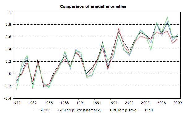
We can also compare these records to the various science blogging community reconstructions from last year. Recall that these reconstruction by-and-large used unadjusted GHCN data (v2.mean), and a methodology similar but not identical to that of NCDC. Note that a few of these (particularly Nick Stokes numbers) may be out of date (I think the version I have for Nick has no land masking, while a later release of his uses one):
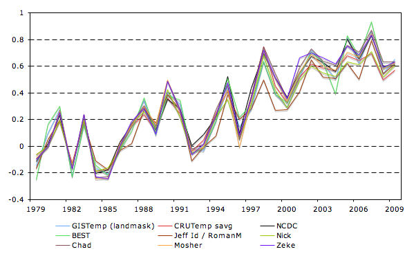
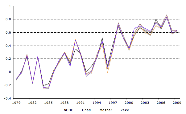
Its worth pointing out that a few of the reconstructions (Chad’s, Moshers, and my own) almost perfectly replicate NCDC despite using no homogenization:
While there are some differences between the records, when using similar spatial weighting techniques all produce rather similar results. My hunch is that any remaining differences between CRUTemp savg and NCDC are due to the lack of a land mask, but I’m not sure how to check save emailing the East Anglia folks.
Update: While Zeke is locked away in a cabin, I updated images Zeke created using data Gavin. I think I sorted the images out correctly -lucia
You can always try an FOIA request.
Zeke,
There’s a useful discussion of this in the AR4, Sec 3.2.2.1:
“Most of the differences arise from the diversity of spatial averaging techniques. The global average for CRUTEM3 is a land-area weighted sum (0.68 × NH + 0.32 × SH). For NCDC it is an area-weighted average of the grid-box anomalies where available worldwide. For GISS it is the average of the anomalies for the zones 90°N to 23.6°N, 23.6°N to 23.6°S and 23.6°S to 90°S with weightings 0.3, 0.4 and 0.3, respectively, proportional to their total areas. …As a result, the recent global trends are largest in CRUTEM3 and NCDC, which give more weight to the NH where recent trends have been greatest.
…Table 3.2 (useful)
…
Further, small differences arise from the treatment of gaps in the data. The GISS gridding method favours isolated island and coastal sites, thereby reducing recent trends, and Lugina et al. (2005) also obtain reduced recent trends owing to their optimal interpolation method that tends to adjust anomalies towards zero where there are few observations nearby (see, e.g., Hurrell and Trenberth, 1999). The NCDC analysis, which begins in 1880, is higher than CRUTEM3 by between 0.1°C and 0.2°C in the first half of the 20th century and since the late 1990s. This is probably because its anomalies have been interpolated to be spatially complete: an earlier but very similar version (CRUTEM2v; Jones and Moberg, 2003) agreed very closely with NCDC when the global averages were calculated in the same way (Vose et al., 2005b). Differences may also arise because the numbers of stations used by CRUTEM3, NCDC and GISS differ (4,349, 7,230 and >7,200 respectively), although many of the basic station data are in common. Differences in station numbers relate principally to CRUTEM3 requiring series to have sufficient data between 1961 and 1990 to allow the calculation of anomalies (Brohan et al., 2006). Further differences may have arisen from differing homogeneity adjustments (see also Appendix 3.B.2). “
I haven’t used a land mask with TempLS. I haven’t done much with global land at all recently – mainly land/sea, and regional.
I would note that centering the anomalies in the center of the graphs over the time period provides a visual illusion that the graphs are the same. Pin them to 1979 and they look much different.
One should also note there were two large stratospheric eruptions which reduced global (as opposed to Land) temperatures by 0.45 and 0.5C respectively in March/April 1982 El Chichon, and June 1991 Pinatubo.
This effect increases the trend by 0.05C per decade in the UAH/RSS lower troposphere temperatures and some other amount in the Land temperatures.
The charts would look quite different with 0.5C added (who knows how much for Land temperatures) in 1982/83/84 and 1991/92/93.
Bill,
I’d avoid pinning them on a single year (1979) because of the possibility of reflecting noise more than anything else. However, an early baseline (1979-1984) appears nearly identical to the charts in the post: http://i81.photobucket.com/albums/j237/hausfath/Screenshot2011-11-04at62911PM.png
Nick,
Oddly enough, I quote from those paragraphs in the post (albeit with indirect attribution via a link to an earlier post with the AR4 language in it).
It looks to me like you’re using unweighted fits for CRUTEM3, BEST & NCDC.
Given that they have quoted uncertainties, does that really make sense?
We had a discussion on Nick’s blog on that. Tamino claims you can’t use the quoted errors, but I find his arguments unconvincing.
So far he’s the only one who’s “weighed in” on this.
I’ll repeat the comment I made on Nick’s blog that unless you know exactly how they are doing the land average and you’re sure it’s equivalent, land only comparisons are a bit of apples to oranges
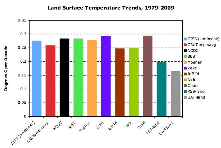
With BEST using an unweighted least-squares-fit gives a very different answer:
BEST(unweighted) 0.279±?.??? °C/decade
BEST (weighted) 0.344±0.005 °C/decade
It doesn’t make that much of a difference for CRUTEM3:
CRUTEM3(unweighted) 0.268±?.??? °C/decade
CRUTEM3(weighted) 0.266±0.009 °C/decade
I was always taught a number without a CL is meaningless. I’d hate to insinuate that climate science is meaningless. 😉
On Nick’s blog, some people think “ordinary” is a synonym for “unweighted”. That seems like a pointless use of the word “ordinary” to me, and I pointed out to them that you can search for and find in google scholar papers that talk about “weighted ordinary least squares fit” and even “unweighted ordinary least squares fit”.
I have always assume it refers to an optimization function that fits this pattern:
$latex L_2 = \sum_{n=1}^N W_n [y_n – (a + b x_n) ]^2$
You can have $latex W_n = 1/\sigma_n^2$ or even something like a Hann taper function. (In the latter case if your model is $latex a \sin\omega t+ b \cos \omega t$, you’ll end up deriving the formula for the Hann-weighted Fourier coefficient for frequency $latex \omega$.)
You can also have optimization functions for any power:
$latex L_p = \sum_{n=1}^N W_n |y_n – (a + b x_n) |^p$
With $latex W_n = \hbox{\it constant}$, minimizing $latex L_1$ is minimizes the sum of the absolute value of the residuals and minimizing $latex L_\infty$ minimizes the maximum of the residuals.
Zeke,
“…with some commenters incorrectly arguing that the differences between NCDC/BEST and CRUTemp are due to data homogenization instead of spatial weighting.”
“…almost perfectly replicate NCDC despite using no homogenization…”
You name homogenization the operation which Giss use in his UHI process. This operation acts on trends in urban stations and has a final effect close to zero.
We use also the same term of homogenization for the treatment which consist in removing the discontinuities in raw series. This operation is not implemented by the GISS global product but is impemented by CRU (and probably by GHCN or NCDC), it is also by BEST in the particular form of slicing. This is not neutral but cause a warming of 0.5 ° C in the twentieth century.
For comparison, it is better to use the land in the northern hemisphere that are less sensitive to the very different treatments of polar regions.
#85198
Carrick,
To add to the terminology, what you are talking about is diagonal weighting. W could be a general (symmetric pd) matrix kernel. That’s really the proper way of dealing with correlated residuals.
Nick, with respect to weighted least squares, I’m aware of an underlying relationship to maximum likelhood analysis (as MP so elegantly outlined on your blog).
One question is, is there a similar relationship for what I would called “generalized least squares”, were you replace the diagonal weighting with (what turns out to be) the inverse of the covariance matrix?
The other question is of course how one goes about building a covariance matrix.
We just had a discussion about this at Climate Audit. And as we concluded there, “the boys” are likely to be far off on their reconstructions since they don’t account for UHI at all and since the evidence for substantial UHI is very strong. To repost what I said on CA: —
–
First go back and read Steve M’s post on the subject:
–
http://climateaudit.org/2010/12/15/new-light-on-uhi/
–
And go back and read this NASA site on the subject:
–
http://www.nasa.gov/topics/earth/features/heat-island-sprawl.html
–
What did they find?
–
“Summer land surface temperature of cities in the Northeast were an average of 7 °C to 9 °C (13°F to 16 °F) warmer than surrounding rural areas over a three year period, the new research shows. The complex phenomenon that drives up temperatures is called the urban heat island effect.â€
–
Here are some of the numbers:
–
Providence, RI – 12.2 C of UHI
Buffalo, NY – 7.2 C of UHI
Philadelphia, PA – 11.7 C of UHI
Lynchburg, VA – 5.5 C of UHI
Syracuse, NY – 10.6 C of UHI
Harrisburg, PA – 7.6 C of UHI
Paris France – 8.0 C of UHI
–
Note: Lynchburg has a population of only 70,000
–
Here is the abstract from the Imhoff paper:
–
http://pubs.casi.ca/doi/abs/10.5589/m10-039
–
“Globally averaged, the daytime UHI amplitude for all settlements is 2.6 °C in summer and 1.4 °C in winter. Globally, the average summer daytime UHI is 4.7 °C for settlements larger than 500 km2 compared with 2.5 °C for settlements smaller than 50 km2 and larger than 10 km2.â€
–
And here are some charts from Spencer showing the relationship between UHI and population. Notice that the effect starts at very low population densities.
–
http://www.drroyspencer.com/wp-content/uploads/ISH-UHI-warming-global-and-US-non-US.jpg
–
It looks like even this young boy is able to find the UHI.
http://www.youtube.com/user/TheseData?blend=21&ob=5
–
–
I should also add that in the discussion with Zeke at CA, he could provide no evidence that homogenization actually removed any UHI effect at all. But instead it appears that it simply spreads that effect around. If homogenization actually removed UHI, then the amount of warming and the slope of the rise would both be reduced.
It’s absolutely amazing to me to see “skeptics” perform their game of obfuscation by conflating the UHI effect which is well known and undeniable, with the faith-based expectation of dramatically higher warming due to UHI. What this is really about is attacking any analysis that fails to prove what people “know” from the safety of their comfy chairs.
You can “remove” the UHI effect by splitting off rural sites and analyzing them seperately. You have to have a good urbanity proxy to do this, and you have to account for the lack of precision of the location in the station metadata. If warming of rural sites is no different then you have failed to show that UHI, on a global basis, contributes to the warming signal.
cce: “You have to have a good urbanity proxy to do this, and you have to account for the lack of precision of the location in the station metadata. If warming of rural sites is no different then you have failed to show that UHI, on a global basis, contributes to the warming signal.”
Maybe you didn’t read the links that I posted above. Substantial UHI contribution is a proven fact. Change in UHI at very low population densities is shown by Spencer’s diagram. Throwing all stations into two bins proves absolutely nothing. But even that weak effort yielded a significant UHI in Zeke’s own study. Problem is that Zeke thinks he can get rid of it by streading it around.
“It’s absolutely amazing to me to see “skeptics†perform their game of obfuscation by conflating the UHI effect”
Stop talking like an AGW wako!
Here is a highly simplified explanation of why the practice of taking stations and throwing them into either an “urban” or “rural” bin for the purpose of finding UHI simply doesn’t work.
Let’s say the year is 1950 and we are going to put a thermometer in a growing city. But the city is already there and already has a very high built density. So, let’s say that the city already has 1C of UHI effect. Over the next 60 years the city continues to grow, mostly around the perimeter. The UHI effect goes up, and by 2010 there is 1.5C of UHI effect. The thermometer was only there since 1950, so the thermometer will only see the delta UHI change from 1950 to 2010 as an anomaly. So, by that thermometer, the delta UHI effect for that period is .5C.
Now, in the same year, 1950, we put another thermometer into a medium size town. Let’s say that it has a UHI effect of .1C at the time we put the thermometer there. The town grows over the next 60 years, there is a lot of building that happens close to the thermometer, and by 2010 it has .6C of UHI effect. Again, the thermometer will not register that first .1C as anomaly. But it will register the next .5C as anomaly.
So, in 2010, what we end up with is that the urban thermometer has 1.5C total of UHI effect, and the rural thermometer has .6C of total UHI effect. But, the delta UHI for both thermometers since they were installed is .5C. It is that .5C that both of them will show as anomaly.
Now BEST comes along and decides that they will measure UHI by subtracting rural anomaly from urban anomaly. Let’s also say that there has been .3C of real warming over those 60 years. So the rural thermometer shows .8C of warming anomaly and the urban thermometer shows .8C of warming anomaly. BEST subtracts rural from urban and gets zero. Their conclusion is, “either there is no UHI or it doesn’t effect the trendâ€. But, as we have just seen, .5C of the .8C in the trend of both the urban station and the rural station were UHI.
With their results, BEST has failed to discover the pre thermometer urban UHI effect, the post thermometer urban UHI effect, the pre thermometer rural UHI effect, and the post thermometer rural UHI effect. They have also failed to discover the UHI addition to the trend in either place. In other words, their test is a total fail. Even if they did their math perfectly, ran their programs perfectly, and did their classification perfectly, their answer is still completely wrong. Why? Because the design of the test never made it possible to quantify UHI. Now, many of you may object to my scenario.
Some of you may wonder if it is reasonable to expect a small town to grow at a rate that pushes up the delta UHI as fast as a city. This is where the definitions of rural and urban come in. Modis defines an urban area as an area that is greater than 50% built, and there must be greater than 1 square kilometer, contiguous, of such an area. So, for example, if you have two .75 square kilometer areas that are 60% built, separated by one square kilometer of 40% built, it’s all rural. So the urban standard is high enough that an area must be strongly urban to qualify. The rural standard is anything that is not urban. And that allows for a whole lot of built. 10 square kilometers of 49% built is all classified as rural.
BEST then goes on and further refines the rural standard as “very rural†and “not very ruralâ€. Unfortunately, they make no new build requirements for “very ruralâ€. The only new requirement is that such an area be at least 10 kilometers from an area classified as urban. But a “very rural†place could still have up to 49% build.
This means that you can have towns, small cities, and even some suburbs that are classified as rural. In such areas there is still plenty of room to build and build close to the thermometer. In the urban areas, there is little room to build. So either structures are torn down in the city to make room for new structures, or structures are put up at the edge of the city, expanding it. The new structures being put up at the edge of the city are far from the thermometer and while they still effect it, the further away they are, the less effect they have.
In the rural area there is still space to grow close to the thermometer. So, in the rural area you can actually have more UHI effect with less change in the amount of build. So, if a rural area goes from 10% built to 30% built it will still be rural and it can have the same UHI effect on the thermometer as the city where most of the new building is around the edges. The urban area may go from 75% built to 85% built around the thermometer, and it may have it’s suburbs growing, but the total effect will be close to that to the rural build.
All of this is essentially confirmed by Roy Spencer’s paper and by BEST’s own test results.
Of course this doesn’t apply to “the boys” reconstructions since they did nothing at all about UHI.
cce, rural sites generally have been tampered with by anthropogenic activity. Sometimes the effect is to decrease night time temperatures (what happens when you cut down all of the trees and increase wind exposure) and sometimes it is to cool daytime temperatures (irrigation). I can’t think of any rural only mechanisms that would lead to warming, bu tI would suppose they exist.
Anyway, you can’t just go to rural only stations to get away from anthropogenic influence on your stations.
cce,
huh?
That’s exactly what the kid and his dad explained and did in the youtube video, or are you being sarcastic? or do you criticize without viewing and reading first?
cce: “You have to have a good urbanity proxy to do this, and you have to account for the lack of precision of the location in the station metadata. If warming of rural sites is no different then you have failed to show that UHI, on a global basis, contributes to the warming signal.â€
Maybe you didn’t read the links that I posted above. Substantial UHI contribution is a proven fact. Change in UHI at very low population densities is shown by Spencer’s diagram. Throwing all stations into two bins proves absolutely nothing. But even that weak effort yielded a significant UHI in Zeke’s own study. Problem is that Zeke thinks he can get rid of it by spreading it around.
“It’s absolutely amazing to me to see “skeptics†perform their game of obfuscation by conflating the UHI effectâ€
It’s absolutely amazing to me to see “warmers” perform their game of obfuscation by rationalizing for anything to increase warming and against anything to decrease it.
Carrick: Anyway, you can’t just go to rural only stations to get away from anthropogenic influence on your stations.
Agree. It seems to me that people go through this action of parsing stations into two sets, rural and urban. Then having done that they think that all of their urban stations are in skyscraper land and all of their rural stations are in national parks. Problem is that the real thermometers are spread across the entire spectrum between those two kinds of places – with very few actually being in national parks. Then, when you draw a line and split them in two, you get a lot of those thermometers that barely make it to one side of that line or the other. And, as Spencer’s diagram shows, the effect starts at very low population densities. And with the two bin method you only get to see delta UHI effect, not total UHI effect.
As a layperson in these matters I am always impressed with how a graph of several series can show excellent correlation over time yet have significantly different trends over the same period. When most of us compare temperature series we are most interested in trends over a given period of time. Always helpful, but not conclusive in determining significant differences without further calculations, are presenting CIs for the trends or noting if CIs have not been calculated.
If we peruse Zeke’s trend chart we would expect there to be significant differences in the trends calculated from the various temperature series noted if we accept the BEST CIs of -/+ 0.005 degrees C decade or the CRUTemp -/+ 0.009 degrees C per decade. If we assume significant differences then some or all series trends could be in error. Or we could assume that the CIs are erroneously too small and all these trends are part of the same distribution. For the non satellite series it should not be all that surprising that the trends are as close as they appear in Zeke’s graph – as the sources are nearly all the same.
I am not at all certain that the rather narrow CIs presented for the various temperature series trends and particularly those going back in time have accounted for all the uncertainties. I think part of this uncertainty might arise for assumptions made about the homogenizing algorithms and the kinds of non homogeneity in the station records. Menne hints at this in his paper on breakpoints and his algorithm for determining and replacing bad data. Some kinds of changes would be difficult to find and others that are legitimate climate changes might cause false alarms.
The way I read the Menne paper on replacing a breakpoint regime deemed legitimate is to replace that regime or a minimum length of the series with a segment from a neighboring station series that is estimated to represent a median difference with the station series in question. Alternatively the BEST process does not replace any of the segments in error but instead down weights that segment in their summary calculation.
I have been determining significant breakpoints for all the USHCN stations in the before breakpoint adjustments, i.e. the maximum and minimum TOB monthly series and the after breakpoint adjusted series, i.e. the maximum and minimum Adjusted monthly series. According to my reading of the Menne paper the breakpoint of a difference series between neighboring stations should correspond with a breakpoint that would be found in the station series in question. The differences series are used to more readily find legitimate breakpoints due to station changes and avoid making any adjustments with breakpoints that are common to neighboring stations and assumed to be due to climate changes. Looking at breakpoints with all neighboring stations takes extraordinarily lengthy recursive computer calculations and thus I have been looking at individual station series breakpoints and assigning those breakpoints to climate and station changes. In doing so I have found what could be considered both over and under corrections, but this needs further work and analyses.
I was also surprised to see how differently the breakpoints occurred for the maximum and minimum temperature series of individual stations and further how consistent the breakpoints were for the averaged series of TOB and Adjusted for both maximum and minimum series (I found a single break date for each series that was common to all four series) given the wide range of break dates found even in the Adjusted maximum and minimum series for individual stations. All this indicates to me that there are a number of rather localized climate changes that occur over time that tend to average to the same year/month for the entire US. I am not sure how this process would fit the model of an overiding climate background superimposed on local weather variations.
Unfortunately I’m not at my normal IP address this weekend (I’m in a cabin in the woods), and hence cannot update the post, but Gavin sent me a link to the actual GISTemp land masked proportionally spatially weighted data: http://www.columbia.edu/~mhs119/Temperature/T_moreFigs/Tanom_land_monthly.txt
This shows a somewhat higher trend than the CCC landmasked data, and brings it much more closely in like with BEST/NCDC. Updated figures are below:
http://i81.photobucket.com/albums/j237/hausfath/Fig1.png
http://i81.photobucket.com/albums/j237/hausfath/Fig2.png
http://i81.photobucket.com/albums/j237/hausfath/Fig3.png
http://i81.photobucket.com/albums/j237/hausfath/Fig4.png
phi,
By homogenization I mean the use of BEST’s scalpel or NCDC’s PSA. For comparison, all the blogger-created records (mine, Moshers, Chad’s, Nick’s, Jeff’s, etc.) use the raw GHCN data with no adjustment to individual station records). These do not attempt to correct for UHI or other factors, but do show that the net effect of NCDC and BEST’s homogenization is relatively small compared to a simple reconstruction using the raw data.
Tilo Reber,
As I mentioned over at CA, we used a rural-only set to homogenize to test if spreading was possible. This idea was developed based on Troy_CA’s excellent work on the subject. We found that some spreading is possible when using all stations (both urban and rural) to correct for inhomogenities, but the net effect is relatively small. You might disagree that this approach can correctly eliminate the risk of spreading due to residual UHI as rural sites, but we specifically tested it with four different urbanity proxies (ISA, Nightlights, GRUMP, and Historical Pop Growth) to try and test different gradations of urban. We even tested all possible cutoff values for continuous proxies like ISA. If you have a suggestion of a “truly rural” proxy that can get around the issue of residual UHI, I’d love to try that as well.
Zeke: “These do not attempt to correct for UHI or other factors, but do show that the net effect of NCDC and BEST’s homogenization is relatively small compared to a simple reconstruction using the raw data.”
Which tells you that the BEST and NCDC homgenization does nothing to remove UHI.
Carrick,
I’m talking about the “urban heat island” effect. Microsite changes would be mostly handled by the scalpel, and Fall et al did not find a bias in the mean temperature trends due to such contamination. Increased irrigation would reduce trends. Wide scale land use change is another issue and I haven’t read enough about it, although the scalpel might detect the change (for example, clear cutting a forest to make room for crops).
Kermit,
Unless the kid and his dad created time series over the past 30 years and compared the amount of warming at each location throughout the city and countryside independently and then replicated that all over the globe, the youtube video isn’t “exactly” what I am talking about.
Tilo,
Please link to studies that actually say what you are asserting. Do not link to studies or blog posts that show that urbanized areas are warmer than rural areas, since that is obfuscation in its purest form. I want to see actual estimates of the contribution of UHI to the global warming signal, not dataless worst case scenarios that exist in someone’s head.
Zeke,
Have you tried a union of all urbanity proxies? And then allowed for a large “cushion” between those areas and the stations? With the BEST dataset, you should probably have adequate coverage since at least the early seventies.
“As I mentioned over at CA, we used a rural-only set to homogenize to test if spreading was possible.”
Yes, and it gave you a different result than homogening without that limitation. And the temperature reconstructions for “the boys” above don’t even do rural-only homogenization.
“You might disagree that this approach can correctly eliminate the risk of spreading due to residual UHI as rural sites, but we specifically tested it with four different urbanity proxies (ISA, Nightlights, GRUMP, and Historical Pop Growth) to try and test different gradations of urban. ”
It really doesn’t matter about the urbanity proxies. You still created two bins, some very close to 50/50. And that won’t show you what you are looking for. Like I said above, the simple action of automatic parsing of stations into a rural bin and an urban bin doesn’t get you skyscraper land in one bin and national parks in the other – no matter which of the methods you use. Because the thermometers are not just in skyscraper land or national parks. In fact, the minority are probably in those areas.
Zhang and Imhoff and Spencer do a good job of identifying the problem. Look at what they did. Just because you don’t have an easy way of letting the computer do the work for you doesn’t mean that the problem isn’t there.
Like I said before, if your homogenization doesn’t reduce the temperature and the slope of the warming trend, then you haven’t done anything except spread the UHI around. UHI is not a discontinouity. And you don’t do anything about it by adjusting to nearby coop stations, since they have the same UHI problems themselves. And the two bin method only gives you delta anomolies where you could easily have as much delta growth near rural thermometers as near urban thermometers.
Zeke,
“By homogenization I mean the use of BEST’s scalpel or NCDC’s PSA.”
Okay, so there is a serious problem somewhere because all the case studies that I know (New Zealand, United States, Switzerland, Alpine region) show that the raw series are characterized by discontinuities bias of 0.5 ° C in the twentieth century. Do you have a regional case study that would show a different result?
Update: Zeke emailed and ask I update some images. I substituted some, I hope without having screwed anything up. If the images seem to be mismatched, let me know.
Does anyone know why my reconstruction came out at the bottom. All I did was pile the data and use LS regression to offset it. The trend was lower if I used anomaly methods. I’m not familiar enough with the non-standard blogger series to know what is happening.
jeff, it depends on the integration period:
Tilo Reber (Comment #85227)
November 5th, 2011 at 11:37 am
Here is a highly simplified explanation of why the practice of taking stations and throwing them into either an “urban†or “rural†bin for the purpose of finding UHI simply doesn’t work.
That makes sense to me. The BEST methodology is simply saying that for UHI to be true, large cites on average must be warming faster than smaller towns.
This could introduce Simpson’s Paradox or similar problems, because averaging could be masking other causes of warming. A small town growing rapidly could for example show greater warming than a large town that is no longer growing, something that the BEST methodology would not detect. While this would be evidence for UHI, BEST would see this as evidence that UHI does not exists
To avoid this BEST should have compare the rate of warming with the rate of urbanization at individual stations, before averaging. Something BEST failed to do.
Carrick #85125,
Actually, “generalized least squares†is what it is called. This is one area poorly covered by Wiki, but the basic algebra is here. Here are some Cornell notes.
The matrix algebra is a little more complicated than just inverting the correlation matrix. But you do have to do that, which is a kind of robust estimation problem. It needs empirical variogram kind of stuff. A common method seems to be to guess the structure and fit a scale factor.
I expected BEST would do this, using kriging for the estimator, but I don’t think their approach is equivalent.
ferd: A small town growing rapidly could for example show greater warming than a large town that is no longer growing,
The large town could even be growing at a healthy rate, but more at the edges than near the center of built, where there is not much room. Both the volumn of growth and the proximity to the thermometer make a difference.
cce: “Unless the kid and his dad created time series over the past 30 years and compared the amount of warming at each location throughout the city and countryside independently and then replicated that all over the globe, the youtube video isn’t “exactly†what I am talking about.”
–
You don’t need a time series to tell you that a significant difference exists between the city and the countryside, or that it it got that way through time. And the sites were compared independenty. And you don’t need the entire globle, because assuming that we have stong UHI in the US but not in the rest of the world is absurd. So, if nothing else, the kid’s finding can tell you that the BEST UHI result is stupid. Of course Zhang and Imhoff and Spencer proved that as well.
–
cce: “Please link to studies that actually say what you are asserting.”
–
Spencer’s chart shows it to you. Imhoff’s paper quantizes the effect:
–
“Globally averaged, the daytime UHI amplitude for all settlements is 2.6 °C in summer and 1.4 °C in winter. Globally, the average summer daytime UHI is 4.7 °C for settlements larger than 500 km2 compared with 2.5 °C for settlements smaller than 50 km2 and larger than 10 km2.â€
“I want to see actual estimates of the contribution of UHI to the global warming signal”
Yes, you would think that having spent 50 billion trying to prove that mankind is guilty, that someone would have taken the known effect and integrated it as a part of the whole. But that would have gone counter to what they were desperate to prove. But if the average amplitude is 2.6C for all settlements that should give you a clue. “All settlements” likely includes 50% of the thermometers or more. So even if you distribute that 2.6 C summer + 1.4C winter / 2 = 2C from just settlements to all thermometers it is still going to be big. Even if you go to the extreme and use the 27% of the thermometers that are known to be in cities and take 27% of 2C, you still get .54C of UHI across all thermometers. But we know from Spencer’s chart that the UHI effect starts at very low population levels, so the number is likely much higher than .54C.
Now if you want time series integrated into a global result, just give me a Mann sized grant and I’ll do the work.
Tilo.
Spencer used an Alpha population data product and did no QA on station locations. His is an interesting IDEA, but hardly a compelling case given the inaccuracies in the data he used.
cce (Comment #85246)
November 5th, 2011 at 12:56 pm
Zeke,
Have you tried a union of all urbanity proxies? And then allowed for a large “cushion†between those areas and the stations? With the BEST dataset, you should probably have adequate coverage since at least the early seventies.
########################################
I won’t pull a Muller, but let’s just say that this approach is on the table. with a couple twists.
There are other confounding factors as well. One can, for example, take one of the proxies ( say lights) and create two piles
No lights: bright Lights. so the extremes of the proxy. And you can show a difference. So compare the top 10% to the bottom 10%
But then you have a spatial coverage issue.
You can do the union of all proxies, but then, you lose places like South America, parts of africa, India, eastern Coastal China.
so you kinda have a trade off between finding the signal by looking at extremes and having enough stations to do a decent global average.. of course you could say.. pick the best and live with the uncertainty.. in the end we are fighting over less than .1C decade.
Thats a fun fight, but it’s side discussion if you want to discuss AGW. Frankly I prefer the side discussion more and more. fewer idiots
Tilo
So even if you distribute that 2.6 C summer + 1.4C winter / 2 = 2C from just settlements to all thermometers it is still going to be big.
You have to ascertain whether Imhoff was discussing the effect on Tmean or Tave. Next you need the Fall and Spring numbers.
Next you have to realize that the size of places he was looking at are typically not in the station database.
Mosher: Even if he is off by 20-30% the idea would hold. And Imhoff wasn’t using any alpha products to come up with 2.6C summer and 1.4C winter of UHI for all settlements. So even if “settlements” meant nothing but the 27% of thermometers known to be in cities, and even if everything else had zero UHI, you would still get .54C of UHI as an average for every thermometer on the planet.
Mosher: “You have to ascertain whether Imhoff was discussing the effect on Tmean or Tave. Next you need the Fall and Spring numbers.”
Nope, I don’t need any of it to know that the UHI effect is large and to know that using .01C is stupid and to know that the BEST negative UHI effect is even stupider. You are grasping for straws again Mosher. Are you going to suggest that fall and spring have a negative UHI effect now? Please don’t waste my time.
Jeff Id,
I’m almost sure its due to the lack of a land mask; with one, your and Nick’s reconstruction should match mine/Chad’s/Mosh’s.
Carrick,
You might be using a dated file. With the latest version I get this for 1950-2009: http://i81.photobucket.com/albums/j237/hausfath/Screenshot2011-11-05at33658PM.png
The data file is here: http://www.2shared.com/document/b4cq5AnU/BEST_scratchwork.html
Tilo. .54C? over on CA you were saying more like .1C
Further, I’m not suggesting that Fall and Spring are 0. strawman
Im suggesting you actually read Imhoff.
Next, look at what LST is and what it is not.
Next where do you get a 27% number? and is that the same criteria as Imhoff?
Look, I do not disagree with the approach, but you need to be a bit more consistent and diligent.
On spencer. do you even know the dataset he used?
do you know that the locations in that dataset are good?
are they good enough to use with a 30 arc second population dataset?
Do you know how that dataset was created?
Trying to draw conclusions from web posts and paper abstracts is Bruce like. you are better than that.
Interestingly enough, once can quite easily think of a case where there is a very large absolute UHI with no (or slightly negative) UHI trend. Central Park comes to mind. That said, I am suspicious of the BEST negative UHI result as well, though its worth pointing out that BEST is using homogenized (via scalpel) rather than raw data in their comparisons.
the satellite data would differ significantly from thermometer data, if the UHI effect was anything close to what Tilo suggests.
apart from that, the “U” in UHI comes from the word “URBAN”. Tilo suggests a “UHI” effect in villages and the countryside, which is stronger than what we see in cities. that is “urban” places, where we get zero light data at night.
and Steven Mosher is right. Tilo forgot to mention, what his data is. day max? minimum? monthly averages? with windy days or without?
Zeke,
If you are saying that deweighting of ocean/land squares by the land mask would reduce trend, I think that makes sense. Roman’s method really should produce a higher trend with the same data and gridding so it was disappointing to see the result at the bottom.
Mosher “Tilo. .54C? over on CA you were saying more like .1C”
That was “per decade” since 79.
“Next where do you get a 27% number?”
From BESTs UHI paper.
“Urban areas are heavily overrepresented in the siting of temperature stations: less than 1% of the globe is urban but 27% of the Global Historical Climatology Network Monthly (GHCN-M) stations are located in cities with a population greater than 50,000.”
“and is that the same criteria as Imhoff?”
Well, Imhoff says this:
“Globally, the average summer daytime UHI is 4.7 °C for settlements larger than 500 km2 compared with 2.5 °C for settlements smaller than 50 km2 and larger than 10 km2.—
For comparison, Philadelphia is 790 km2, Lynchburg VA, with a population of only 70,000 is 29km2. So if the 27% is everything above 50,000 population, and if Imhoff is including everything over 10km2, then Imhoff’s study probably includes more than 27% of the cities. So I’m giving you the slop on everything you bring up Mosher, and you keep bickering as though there were some magic that was going to make the truth go away. UHI is large – accept it.
Sod: “the satellite data would differ significantly from thermometer data, if the UHI effect was anything close to what Tilo suggests.”
–
It is significantly different from the thermometer data, Sod. But go back and read all my posts along with the links I provided before you get started. I don’t want to have to write all of that all over again for your benefit.
Mosher: “So compare the top 10% to the bottom 10%”
“But then you have a spatial coverage issue.”
–
I would say use the top 5% and the bottom 5%. You don’t need spatial coverage. Get representative coverage. Whatever thermometers you use, make sure that their breakdown covers deserts, polar areas, shore areas, city areas, farming areas, some different elevations, and continents in proportion to the reality of the globe. Over the long haul, convection is going to move any global change around to where it is seen everywhere. A hundred thermometers, with no adjustments required or moves made and correctly distributed, simply averaged together should tell the story better than thousands of the “homogenized” or “kriged” broken and spliced, grided, TOBd, MMTSd, interpolated, extrapolated, etc., etc., etc., set. But of course if it’s really fun to do all that math and programming, then it’s absolutely necessary. Kind of a shame about the proxy data, however. Because if all that is required to produce a meaningful number, then you can’t get there with proxy data.
Oops:
1 Using a minimum and maximum temperature dataset exaggerates the increase in the global average land surface temperature over the last 60 years by approximately 45%
2 Almost all the warming over the last 60 years occurred between 6am and 12 noon
3 Warming is strongly correlated with decreasing cloud cover during the daytime and is therefore caused by increased solar insolation
4 I’ll then add a part 4 covering some additional analysis of mine
Reduced anthropogenic aerosols (and clouds seeded by anthropogenic aerosols) are the cause of most the observed warming over the last 60 years.”
“I find it surprising to say the least, that Tom Karl, Director Of The National Climate Data Center hasn’t in the last 20 years investigated whether minimum temperatures (which he correctly states occurs in the early morning) do indeed measure nighttime temperatures, as this is perhaps the most important assumption underlying the evidence for AGW.”
How many have died for the false AGW theory?
Trust the Aussies not to take the bait.
Jonathan Lowe, Philip Bradley and Bishop Hill
http://bishophill.squarespace.com/blog/2011/11/4/australian-temperatures.html
There are two different issues. The first, is there an urban heat island effect, and the answer is obviously yes.
The second is, has the magnitude of the heat island effect affected temperature anomalies measured in urban areas, and the answer there is no, because urban densities have remained constant over more than a century.
Where the anomalies have changed due to heat island increases is suburban areas, and Eli strongly suspects in small towns which have lost population.
“The second is, has the magnitude of the heat island effect affected temperature anomalies measured in urban areas, and the answer there is no, because urban densities have remained constant over more than a century.”
No, an increase in urban area resulting from growth around the edges will also increase the effect. And no again because many areas that are urban now were not urban a hundred years ago. But yes, development around the edges of a city doesn’t effect thermometers as much as development close by.
“Where the anomalies have changed due to heat island increases is suburban areas,”
Very likely.
“and Eli strongly suspects in small towns which have lost population.”
And thermometers.
Here is the population chart.
http://en.wikipedia.org/wiki/File:World-Population-1800-2100.png
Denver 1898
http://en.wikipedia.org/wiki/History_of_Denver
Denver today:
http://www.rexwallpapers.com/wallpaper/Denver-1/
Mosher,
As Tilo says “I would say use the top 5% and the bottom 5%. You don’t need spatial coverage. Get representative coverage.”
So could you start from the ends and work your way to the middle and see if there are any patterns that emerge?
Zeke:
You were right… I had the latest file downloaded but hadn’t converted it. It just made things worse (makes sense, they were reporting TMAX instead of TAVG before).
Have you tried the weighted least squares? These are what I get (not including confidence intervals):
BEST unweighted: 0.279
BEST weighted: 0.344
There is currently a difference in approach to climate science between the sceptical Baconian – empirical appraoch solidly based on data and the Platonic IPCC approach – based on theoretical assumptions built into climate models.The question arises from the recent Muller – BEST furore -What is the best metric for a global measure of and for discussion of global warming or cooling. For some years I have suggested in various web comments and on my blog that the Hadley Sea Surface Temperature data is the best metric for the following reasons . (Anyone can check this data for themselves – Google Hadley Cru — scroll down to SST GL and check the annual numbers.)
1. Oceans cover about 70% of the surface.
2. Because of the thermal inertia of water – short term noise is smoothed out.
3. All the questions re UHI, changes in land use local topographic effects etc are simply sidestepped.
4. Perhaps most importantly – what we really need to measure is the enthalpy of the system – the land measurements do not capture this aspect because the relative humidity at the time of temperature measurement is ignored. In water the temperature changes are a good measure of relative enthalpy changes.
5. It is very clear that the most direct means to short term and decadal length predictions is through the study of the interactions of the atmospheric sytems ,ocean currents and temperature regimes – PDO ,ENSO. SOI AMO AO etc etc. and the SST is a major measure of these systems.Certainly the SST data has its own problems but these are much less than those of the land data.
What does the SST data show? The 5 year moving SST temperature average shows that the warming trend peaked in 2003 and a simple regression analysis shows an eight year global SST cooling trend since then .The data shows warming from 1900 – 1940 ,cooling from 1940 to about 1975 and warming from 1975 – 2003. CO2 levels rose monotonically during this entire period.There has been no net warming since 1997 – 14 years with CO2 up 7% and no net warming. Anthropogenic CO2 has some effect but our knowledge of the natural drivers is still so poor that we cannot accurately estimate what the anthropogenic CO2 contribution is. Since 2003 CO2 has risen further and yet the global temperature trend is negative. This is obviously a short term on which to base predictions but all statistical analyses of particular time series must be interpreted in conjunction with other ongoing events and in the context of declining solar magnetic field strength and activity – to the extent of a possible Dalton or Maunder minimum and the negative phase of the Pacific Decadal a global 20 – 30 year cooling spell is more likely than a warming trend.
It is clear that the IPCC models , on which AL Gore based his entire anti CO2 scare campaign ,have been wrongly framed. and their predictions have failed completely.This paradigm was never well founded ,but ,in recent years, the entire basis for the Climate and Temperature trends and predictions of dangerous warming in the 2007 IPCC Ar4 Summary for Policy Makers has been destroyed. First – this Summary is inconsistent with the AR4 WG1 Science section. It should be noted that the Summary was published before the WG1 report and the editors of the Summary , incredibly ,asked the authors of the Science report to make their reports conform to the Summary rather than the other way around. When this was not done the Science section was simply ignored..
I give one egregious example – there are many others.Most of the predicted disasters are based on climate models.Even the Modelers themselves say that they do not make predictions . The models produce projections or scenarios which are no more accurate than the assumptions,algorithms and data , often of poor quality,which were put into them. In reality they are no more than expensive drafting tools to produce power point slides to illustrate the ideas and prejudices of their creators. The IPCC science section AR4 WG1 section 8.6.4 deals with the reliability of the climate models .This IPCC science section on models itself concludes:
“Moreover it is not yet clear which tests are critical for constraining the future projections,consequently a set of model metrics that might be used to narrow the range of plausible climate change feedbacks and climate sensitivity has yet to be developed”
What could be clearer. The IPCC itself says that we don’t even know what metrics to put into the models to test their reliability.- i.e. we don’t know what future temperatures will be and we can’t yet calculate the climate sensitivity to anthropogenic CO2.This also begs a further question of what mere assumptions went into the “plausible” models to be tested anyway. Nevertheless this statement was ignored by the editors who produced the Summary. Here predictions of disaster were illegitimately given “with high confidence.” in complete contradiction to several sections of the WG1 science section where uncertainties and error bars were discussed.
A key part of the AGW paradigm is that recent warming is unprecedented and can only be explained by anthropogenic CO2. This is the basic message of the iconic “hockey stick ” However hundreds of published papers show that the Medieval warming period and the Roman climatic optimum were warmer than the present. The infamous “hide the decline ” quote from the Climategate Emails is so important. not so much because of its effect on one graph but because it shows that the entire basis if dendrothermometry is highly suspect. A complete referenced discussion of the issues involved can be found in “The Hockey Stick Illusion – Climategate and the Corruption of science ” by AW Montford.
Temperature reconstructions based on tree ring proxies are a total waste of time and money and cannot be relied on.
There is no evident empirical correlation between CO2 levels and temperature, In all cases CO2 changes follow temperature changes not vice versa.It has always been clear that the sun is the main climate driver. One new paper ” Empirical Evidence for a Celestial origin of the Climate Oscillations and its implications “by Scafetta from Duke University casts new light on this. http://www.fel.duke.edu/~scafetta/pdf/scafetta-JSTP2.pdf Humidity, and natural CO2 levels are solar feedback effects not prime drivers. Recent experiments at CERN have shown the possible powerful influence of cosmic rays on clouds and climate.
Solar Cycle 24 will peak in a year or two thus masking the cooling to some extent, but from 2014 on, the cooling trend will become so obvious that the IPCC will be unable to continue ignoring the real world – even now Hansen and Trenberth are desperately seeking ad hoc fixes to locate the missing heat.
Nick, I don’t know if you have access to matlab, but they have a solver that uses the covariance matrix when available:
For general info:
A is the matrix composed of the vectors you’re minimizing with respect to, x is the set of parameters you’re fitting for, and b is the array of measured data you’re fitting to.
I would say use the top 5% and the bottom 5%. You don’t need spatial coverage. Get representative coverage. Whatever thermometers you use, make sure that their breakdown covers deserts, polar areas, shore areas, city areas, farming areas, some different elevations, and continents in proportion to the reality of the globe.
###
I can see you have not worked with the data. desert stations are almost all rural so you cant get a representative urban sample.
same with polar. they are all rural. Shore areas, mostly urban.. go figure we like to live by the ocean.
Like I said when you look at the extremes you lose spatial variety
anyways the top 5% are no different than the top 10%
Next
Tilo.
On CA you said that you were willing to say that UHI was over half
of the .11 c per decade difference between UHA and the ground record
UAH = .18Cdecade
BEST = .28C decade
You agreed with spencer, christy and McIntyre that this .1C
difference might be attributed to UHI and guess that some of it was due to kidging and over half was UHI
.05C to .1C per decade from 1979to 2010 is not large. Recall
this is 30% of the total.
So are you disagreeing with your self
Eli on de urbanization
I can put that to rest. The number of sites where population dropped from 1950 to today is mouse nuts
I love this speculation
Next
“The second is, has the magnitude of the heat island effect affected temperature anomalies measured in urban areas, and the answer there is no, because urban densities have remained constant over more than a century.”
Eli is dead wrong about this when it comes to stations.
Lets look at a good example.
The largest collection of daily min/max sites is GHCN Daily
there are 26000 stations that report tmax and tmin on a daily
basis.
If we use a BEST like strategy to divide them into very rural and
Not very rural, we end up with the following for historical population density.
These are the figures for the Very rural by Best rules
1950 5.9 persons per sq km
1960 6.9
1970 7.7
1980 8.7
1990 9.7
2000 10.6
Not very rural by Best rules
1950 230 people per sq km
1960 281
1970 335
1980 387
1990 444
2000 502
Of the sites that are classified as Not very rural 3% de urbanized
that is 3% had less population in 2000 than in 1950
Next Myth.
Carrick, #85300
I don’t have access to Matlab. But it sounds like the scale factor fitting version that I mentioned:
“A common method seems to be to guess the structure and fit a scale factor.”
You have to supply V (and make sure it is invertible).
Zeke, FYI:
Here’s a comparison of best fits, weighted versus unweighted on BEST.
The outliers in BEST seem to have a larger associated uncertainty, which downweights them in the weighted LSF, resulting in a steeper slope. (It’s my impression that the typical effect of the generalized LSF discussed by Nick is to widen the uncertainties, not dramatically shift the computed trends, so using that won’t rescue BEST.)
0.344 °C/decade is really not very a consistent result compared with the other series. For the “results based” group, let’s have them circle the wagons and explain why you can’t use weighted least squares fit in climate science. That’s already happened a bit on Nick’s thread.
Zeke (Comment #85273)
November 5th, 2011 at 4:49 pm
Interestingly enough, once can quite easily think of a case where there is a very large absolute UHI with no (or slightly negative) UHI trend.
#####
in fact when looking at UHI in Portand the number 1 regressor for predicting UHI was …. Canopy
Canopy created negative UHI about -2 to 4C
The second most significant/important regressor was building height
if you look around you can find this not behind the paywall
http://www.springerlink.com/content/2614272141303766/
http://www.google.com/url?sa=t&rct=j&q=&esrc=s&source=web&cd=4&sqi=2&ved=0CDAQFjAD&url=http%3A%2F%2Fams.confex.com%2Fams%2Fpdfpapers%2F127284.pdf&ei=fh22Tur9C4O0iQLYzbBm&usg=AFQjCNFHZMbRpg7qAF_eFfy__Vi_2F1YJg&sig2=rNvk32SgKVaeUVFW17hCJw
You can see the -4C urban cool parks here
http://www.epa.gov/statelocalclimate/documents/pdf/sailor_presentation_heat_islands_5-10-2007.pdf
If you live in brussels you can see the UHI for your house.
http://geowebgis.irisnet.be/BXLHEAT/mapviewer.jsf?langue=NL
About 50% of the temperature change at Uccles from 1833 to today has been attributed to UHI.
Nick, I think it’s basically what the WIKI causes feasible generalized least squares. There’s an option where you just give a vector of the weightings, which get used as a diagonal matrix as you described above.
Here’s a link to the full documentation.
Unfortunately lscov is missing from octave still.
At least it now supports classes. I haven’t tested any of my class-based code to see how well it works though.
http://journals.ametsoc.org/doi/pdf/10.1175/JCLI3431.1
FIG. 6. UHI analysis where the station rural (urban) classification was based on whether it was below (above) a given population threshold. The first statistically significant UHI is detected at
14 000 people within 6 km. This classified 42% of the stations as
urban. The peak value at 30 000 classifies 30% as urban. And the
final statistically significant threshold at 60 000 within 6-km radius
classifies only 18% of the stations as urban
It should not be surprising from the scatter in Fig. 5a that the correlation r of
temperature anomaly from the dataset having the
strongest UHI signal and population anomaly at the
radius with the strongest urban temperature signal is
only 0.17, indicating that the population anomaly only
explains 3% of the variance in temperature anomalies.
The results shown in Figs. 7a and 7b suggest that
removing the 30% of the most populated stations from
an UHI analysis essentially removes the UHI signal
from U.S. data. As stated earlier, the 30% most urban
in this analysis refers to stations with 30 000 or more
people within 6 km. The U.S. HCN (Easterling et al.
1996) is the most widely used in situ network for longterm temperature change analyses in the United States.
Figure 8 shows the percent of U.S. HCN stations with
populations in excess of various thresholds within 6 km
calculated from the 1 km gridded population data for
2000 rather than 1990 as used previously. It turns out
that 16% of the U.S. HCN stations are at or above
the 30 000 population within the 6-km threshold
######################
Interesting.
It is clear from recent discussions that UHI or more properly the disturbances of stations by urbanization can be estimated at about 1 ° C per century since 1979 on the basis BEST UAH. In fact, it would be better to make comparisons considering only land in the northern hemisphere to avoid the problem of Antarctic, in this case, we get at least 1 ° C per century but based on CRUTEM UAH.
What was the evolution of perturbations before 1979?
To get an idea, one can imagine that most of these disturbances are caused by energy expenditure and drainage of urban surfaces. We can now estimate the shape of the evolution of perturbations from the increase in energy consumption:
http://1.bp.blogspot.com/_6VdeaIXri4s/TNnRB-6iUiI/AAAAAAAANLc/_qsfsdDiB9I/s1600/energy%2Bconsumption%2Bsince%2B1850.PNG
“I can see you have not worked with the data. desert stations are almost all rural so you cant get a representative urban sample.”
Try Phoenix, Tuscon, Albuquerque, El Paso.
“Shore areas, mostly urban”
Ever driven up California coastal highway 1? Every been to the shores of Australia?
“So are you disagreeing with your self”
Still up to your old tricks of blabbing without reading. It’s the second time you’ve asked the question and I already gave you the answer after the first time. The .1C refers to the “PER DECADE” trend since 79. The “greater than .54C” refers to the entire error in the instrument record.
Tilo
.1Cper decade for the period 1979 to 2010
you said over half
you wanted to reserve some of this for your kridging delusion
last time I looked 1979 to 2010 was 3 decades
3* .1 = .3
But then you got no kriding delusion
3. .05 = .15
The mistake you are making is extrapolation the 1979 to 2010 stuff
backwards before 1979.
and we know what you think of extraoplation.
1. When I speak of desert stations I am speaking of ALL desert stations, so when I say almost all, I mean that idiots can of course find some. thank you.
2. when I say mostly urban I mean what I say. Yes, idiots can find rural coastal sites. thank you. Some of us can actually compare the rural coastal stations with the urban coastal stations.. and look at desert coastal stations both rural and urban
Next.
Suggest a rural coastal station. Any one. I will use the characteristics of that rural station to DEFINE rural. that is, I will use your definition of rural. Pick one. any one. as your prime example
and remember. if you want both UHI and kridging error they have to sum to .1
and remember there are three decades from 1979 to 2010.
no extrapolating allowed
Mosher:
From the article that you linked.
“An additional analysis was performed using what should be
only the “most rural†stations and the “most urban†stations defined by the station being classified as rural or urban by both metadata sets. Interestingly, using only the most rural and most urban stations, as shown in Table 1, the mean urban rural temperature difference was fairly large but no longer statistically significant, perhaps because of the smaller sample size and
variability.”
So basically, they found that using the most rural and most urban stations gives you a large temperature difference – but they won’t tell you what the difference was. Another case of hiding the data by an AGW team that never wanted to know the truth in the first place. Instead, they try to blow it off by claiming it was not “statistically significant”. Just like they blow off the UHI changes above 60,000 and below 10,000 by claiming they are not statistically significant. So their interpretation doesn’t say we didn’t find the UHI. It means they found it but because they couldn’t classify it as statistically significant it meant they could pretend that it didn’t exist at all. And their interpretation of statistiacally significant wasn’t necessarily related to the magnitude of the UHI, but rather to other factors like quantity of stations and coverage. So, from figure 6, you get between .2C and .3C of UHI effect at populations over 60,000 that is blown off because it doesn’t qualify as statistically significant. And they couldn’t be bothered to get more stations to make it significant.
Really, this study was BS.
In any case, this is an old study that has been overcome by better work from Zhang, Imhoff and Spencer.
Tilo,
Will you please post links to papers that show what you are asserting? Because, to date, you haven’t provided us with anything.
The question of whether UHI contaminates global trends has been answered by the literature and the answer is: very little. If “skeptics” don’t like that answer, it is up to them to show that it is false. It is up to them to put up their time and money to show this. They have spent decades complaining, and they now have all the information required to do this. They need to put up or shut up, rather than continue this game of linking youtube videos and blog posts and papers about UHI while claiming they prove things that they do not address. If multiple analyses show that UHI contamination doesn’t substantially affect global trends, they are not immediately wrong because you don’t want to believe it.
“.1Cper decade for the period 1979 to 2010”
you said over half
Yes, Mosher, I said over half. I only used the .1C as a simplified reference because you used it that way. What I said was over half of .11C. That means from .055 to .11C per decade. But likely not the full .11C because of the statistical extrapolation errors. Good lord, Mosher, are you trying to be dense on purpose?
“last time I looked 1979 to 2010 was 3 decades”
That’s right, and the rate for that 3 decades period was given as between .055 and .11C PER DECADE. That means roughly between .165 and .33 C for that period. Is that spelled out clearly enough for you? And likely somewhat less than .33C because of the statistical extrapolation errors. A five year old could figure out what I mean. Are you trying to be contradictory and petty because you’ve got nothing. Are you puroposely looking for a way to misinterpret what I said just so that you can jump up and down yelling, “I gotcha”?
“1. When I speak of desert stations I am speaking of ALL desert stations, so when I say almost all, I mean that I can of course find some. thank you.”
And as I clearly explained in the very example that you were addressing, you don’t need all the desert satation, only a representative sample.
In any case, you have again returned to babbling like a confused lunatic. So get lost, you have again exhaused my patience.
cce: “Will you please post links to papers that show what you are asserting? Because, to date, you haven’t provided us with anything.”
I posted them above. If you don’t understand my argument then don’t waste my time. If you do understand my argument, then make your objections directly to those points.
“The question of whether UHI contaminates global trends has been answered by the literature and the answer is: very little. ”
It’s been answered in more recent literature, and the answer is: a lot.
“They have spent decades complaining,”
Blah, blah, blah.
Tilo,
I haven’t been able to find this Spencer study that you keep referencing. Perhaps you are mistakenly conflating a blog post on absolute UHI differences with some publication on trend effects?
Zeke:
“I haven’t been able to find this Spencer study that you keep referencing.”
–
With regard to Spencer, I’m talking about these charts.
–
http://www.drroyspencer.com/wp-content/uploads/ISH-UHI-warming-global-and-US-non-US.jpg
–
And this study.
–
http://www.drroyspencer.com/2010/03/the-global-average-urban-heat-island-effect-in-2000-estimated-from-station-temperatures-and-population-density-data/
–
You can see the abstract from the Imhoff paper here.
–
http://pubs.casi.ca/doi/abs/10.5589/m10-039
–
And the NASA article is here:
–
http://www.nasa.gov/topics/earth/features/heat-island-sprawl.html
Tilo:
.
OK, allow me to summarise:
.
1- You absolutely fail at reading. They do tell you what the difference is. As indicated in the goddamn paragraph that you quote, it’s in Table 1, just under the numbers in bold. Let me spell them out for you: .22 for the “adjusted” data and .15 for the “modified adjusted” data.
.
2- You confuse effects of UHI on absolute temperatures (which is the subject of that passage) and on trends (which is what people are talking about).
.
3- You don’t understand what statistical significance means. Which may explain why you like Judith’s blog so much.
.
4- You get rude when people suggest that maybe, just maybe, the burden of proving that everybody else has completely missed an obvious UHI effects on trend falls on you, not on the rest of the world.
.
Can you see why people don’t take you seriously?
Tilo,
Please provide quotes from your oft-pasted links that quantify the portion of warming in the global land record that is attributable to urbanization.
Also, I understand your argument just fine. You believe that because the UHI effect exists, any study that shows minimal contamination of the global temperature record from urban sites is wrong and the authors are idiots. You prove this assertion by repeating it.
Tilo,
Those charts from Spencer’s blog post refer to absolute temperature differences, not trend differences. The two really aren’t comparable.
toto:
“You confuse effects of UHI on absolute temperatures (which is the subject of that passage) and on trends (which is what people are talking about).”
You can’t get to a large absolute UHI effect without having gone through a trend to get there.
“You don’t understand what statistical significance means.”
I understand perfectly well what statistical significance means. Apparently you don’t. The values that they have show large UHI. The fact that they are not statistically significant is not the same as showing that the UHI doesn’t exist. In their own words.
“Interestingly, using only the most rural and most urban stations, as shown in Table 1, the mean urban rural temperature difference was fairly large but no longer statistically significant,
perhaps because of the smaller sample size and variability.”
Obviously if the sample size is too small and the variability too large, then the right answer is to get a bigger sample size, not to blow off the result as non-existent UHI.
“You get rude when people suggest that maybe, just maybe, the burden of proving that everybody else has completely missed an obvious UHI effects on trend falls on you, not on the rest of the world.”
Everybody else hasn’t missed the UHI effect. It’s been documented again, and again, and again, as is shown in the links that I gave you. The burden of proof lies with those that would seek to deny both that which is obvious and that which has been documented.
Zeke:
“Those charts from Spencer’s blog post refer to absolute temperature differences, not trend differences. The two really aren’t comparable.”
That is absurd Zeke. When you have the huge absolute differences that are currently measured, you didn’t get to that point by way of zero trend differences. Think about what you are saying. In fact, it’s you who are confused about UHI. If you have a rural UHI trend and a city UHI trend and then you difference the two and find no difference, then you cannot conclude that there is no UHI. It only means that both trends have been made more positive by UHI. And if you read Spencers study it tells you this:
“For instance, a population increase from 0 to 20 people per sq. km gives a warming of +0.22 deg C, but for a densely populated location having 1,000 people per sq. km, it takes an additional 1,500 people (to 2,500 people per sq. km) to get the same 0.22 deg. C warming.”
This is where you, Mosher, and others get completely confused. When you are trying to answer the question, “How much of the warming we see in the temperature record is UHI”, that is not the same as, “What is the difference in trend between rural and urban stations”. The questions are not necessarily related. Just because the name “urban” is in UHI doesn’t mean anything. What you are trying to determine is the contribution of man made structures on the temperarture record. Throwing stations into two bins and finding their difference fails to do that.
Tilo,
Oddly enough, most currently urban stations were not originally built in pristine rural areas.
Zeke:
“Oddly enough, most currently urban stations were not originally built in pristine rural areas.”
This is true. But even for the ones that began life in an urban environment, the degree of urbanity has continued to increase (Mosher gives you some numbers at 85304). Also, if you put a thermometer into a city in 1950, it will not show you the UHI that was accumulated before 1950. However, the total UHI change that occured from 1850 (if that is where your reconstruction starts) to 1950 is still registering on that thermometer – even though you cannot see it as a change on that thermometer alone.
I’m going to put the argument together from all the pieces, for cce’s benefit.
Let’s start with the results from Imhoff’s paper.
“Globally averaged, the daytime UHI amplitude for all settlements is 2.6 °C in summer and 1.4 °C in winter. Globally, the average summer daytime UHI is 4.7 °C for settlements larger than 500 km2 compared with 2.5 °C for settlements smaller than 50 km2 and larger than 10 km2.â€
This tells us that UHI contamination for all “settlements” is 2.6C summer + 1.4C winter / 2 = 2.0C. So, what qualifies as a settlement. At the end of that quote he says:
“for settlements smaller than 50 km2 and larger than 10 km2.”
So we know that a settlement would have to be larger than 10 km2. What does that mean in terms of population. Zhang gives the example of Lynchburg VA, which has a population of 70,000 and an area of 29 km2. So if Lynchburg has 70,000 in 29km2, then I’m going to assume that Imhoff’s 10 km2 will have less than 50,000 people. And I’m giving away quite a bit of slop here.
Now, turning to the BEST UHI study, they say this:
“Urban areas are heavily overrepresented in the siting of temperature stations: less than 1% of the globe is urban but 27% of the Global Historical Climatology Network Monthly (GHCN-M) stations are located in cities with a population greater than 50,000.â€
From this we can conclude that Imhoff’s settlements have, at a minimum, 27% of the GHCN thermometers. Let’s say that all the rest of the thermometers have no UHI effect. As Spencers study shows, this is not going to be the case, since the effect starts at very low population densities. But I’m again giving away the slop here. So, if that 27% has 2C of UHI contamination, then that averages out to .54C of UHI contamination for every thermometer globally – as a minimum. Considering Spencer’s study about low density UHI effect, and the fact that Imhoff’s paper likely meant more than 27% of all stations, that number could be as high as 1C, in my mind.
Now, in 1850, when many of these reconstructions start, the world population was 1.2 billion. Today it is 7 billion. The fact that there was already some UHI in 1850 means that some of that effect, which is meant to show global temperature change for the study period, will have to be given back. But, regardless, the answer remains that the contamination of the temperature record is very large.
There’s a fairly obvious check on all this, since population growth is a well known quantity: check to see if the growth (if any) of the UHI is actually related to increased urbanization.
For example, many large central cities in the US have seen little population growth (and some declines) since 1960. Thermometers in those central cities should be unbiased for detecting AGW during any such period of roughly static population.
And I’d be surprised if there are not similar cases of small towns having roughly static populations over long time periods too.
I’m betting it’s not the cities that are the problem, and not the Podunks. It’s the suburbs where growth is fastest. Should be easy to test, and easy to filter out if found.
This is a fruitless and often silly discussion that bounces from blog to blog. I find this dumb dismissal of the UHI issue as particularly amusing “It’s absolutely amazing to me to see “skeptics†perform their game of obfuscation by conflating the UHI effect which is well known and undeniable, with the faith-based expectation of dramatically higher warming due to UHI.” This character is no doubt convinced by the BEST result, that although it is not statistically consistent with previous estimates on UHI, it nonetheless confirms that UHI is not a biggy, because the BEST result was negative. Priceless.
The reason they can’t find the “undeniable” UHI effect is because the thermometers are almost totally absent from areas that are not influenced by human habitation. They are comparing inhabited areas, with inhabited areas, and the rates of growth are not that dissimilar. See Mosher’s post above #85304.
This is where the thermometers are:
http://journals.ametsoc.org/doi/abs/10.1175/1087-3562%282004%29008%3C0001%3AGPDAUL%3E2.0.CO%3B2
“Census enumerations and satellite-detected night lights provide two complementary, but distinct, representations of human population distribution. Census estimates indicate that 37% of Earth’s enumerated land area is populated at densities greater than 1 person per square kilometer. Human populations are strongly clustered within this area. Spatial variations in human population density span more than six orders of magnitude with 50% of the 1990 population occupying less than 3% of the inhabited land area. Temporally stable lighted areas detectable from space provide an independent proxy for the spatial distribution of urban settlements and the intensive land-cover changes that accompany them. These 60 000 lighted areas account for less than 2% of inhabited land area, and 50% of this lighted area is associated with the largest 5% of cities and conurbations. Urban land use associated with higher population densities can exert a disproportionate influence on environments both near and distant.”
The rest of the land surface is nearly devoid of people and their infrastructure, including thermometers. Go to the satellites.
you don t want to tell us, that “1 person per square kilometer” will give us an UHI effect?!? (remember, the “U” stands for “urban”!!!
“The rest of the land surface is nearly devoid of people and their infrastructure, including thermometers.”
yes it is. and you will not find a temperature history of 100 years in a region that is devoid of all people, because until rather recently (in the relevant time frames), it was impossible to have temperature readings without “people” doing the actual reading!
I know what U stands for. This is precisely what I am talking about. This topic can’t be discussed without some pedant making that silly comment. Why don’t you tell Muller what U stands for? I pointed out Mosher’s post that divides stations into the BEST categories of very-rural, vs. not very-rural. Do you see any U category in there, genius? Have they compared U, to something else? Just what is U ?
http://en.wikipedia.org/wiki/Urban_area
Does 2, or 3, or 5 hundred people per sq km meet the common definition of U, genius?
The point, sod, is that it would be helpful to know how much of the warming we have seen is due to localized human influence on the temperature record. But if you are hung up on the U thing, I am sure you will have more opportunities for semantic quibbling.
I don’t need to touch your second comment. I have already covered that.
Sod: “remember, the “U†stands for “urbanâ€!!!”
–
Yeah, the fact that it’s misnamed doesn’t help. Obviously, what we are trying to get at, is any contribution of human construction or infastructure to the temperature signal.
“Yeah, the fact that it’s misnamed doesn’t help.”
Speaking of misnamed…so is ‘global’. -Andrew
Tilo,
I asked for papers that quantify the amount of warming caused by urbanization. You instead repeat your thought experiment, which is the same story “skeptics” have been peddling for decades. If you want to show that urbanization has exaggerated “global warming,” you actually have to show it.
Don,
As I recall, there was all of this excitement with people taking pictures of parking lots and air conditioners and other evidence of filthy humans. Do you remember what the result of that study was? No change in the mean temperature change between “good” sites and “bad” sites, despite the millions and millions of words spilled by “skeptics” declaring how worthless the data from those stations must be.
Now, if you want to get to the “urban” in UHI, you have to examine truly rural sites. Has BEST done this? Probably not. But does the existence of UHI prove that the trends are biased? Does a youtube video? That is the mindless obfuscation I speak of.
UHI is UHI. Whether it contaminates the global signal to any large degree is another question. To take a page from a well known blow hard, “I’m prepared to accept” whatever answer Zeke, Mosher, etc come up with when they publish their paper. Will you? Doubtful.
I have this feeling that their results, as sophisticated as their analysis might be, won’t differ all that much from past estimates. Which is to say, “no biggy.” Which is why the “skeptics” will never accept such results, and all this will be repeated again when the time comes. They’ll all be idiots for failing to show what all “skeptics” know from birth.
BTW, before you “go to the satellites” you would have to reconcile the differences between the various analyses, both in zonal and global trends which are significant. Strange that such sophisticated thingamajigs can have such large differences depending on how they’re stitched together, while such primitive devices down here on planet Earth produce nearly the same results no matter how they’re assembled.
Australia does have some truly pristine sites – I’ve been to a number of them during my many years in mineral exploration. Right now I’m looking at data from over 40 of them, period 1972-2006 (limited by weather data availability) with the aim of setting a baseline observed trend in that period. There early indications are that the typical pristine site in Australia, based on raw BOM data, has warmed Tmean by 0.4 deg C in that time, with Tmax warming 0.55 deg C and Tmin 0.24 deg C. Next I look at rural sites, then I look at urban sites. Total data base is about 600 sites, possibly chosen by BEST and sent to me via Steven Mosher.
I hope to quantify some of the change from glass to wire thermometers and changes in daily observation frequencies. That seems to be a candidate source of noise.
Data are freely available – just ask. sherro1 at optusnet com au
While here, might I please submit this little essay on temporal variation of temperature at a single site. One interpretation, by me, is that it’s Homer Simpson stuff to infer temperatures at one station from those at another station 1,500 km distant.
http://www.geoffstuff.com/Extended%20paper%20on%20chasing%20R.pdf
cce: “I asked for papers that quantify the amount of warming caused by urbanization.”
You don’t get to decide that you want it handed to you on a silver plate. And I really don’t care about what papers you want. I quantified it for you using the information from papers that I linked for you, with no gaps and no assumptions that were even remotely out of line. The number is greater than an average of 0.54C of UHI contamination per thermometer globally.
cce: “If you want to show that urbanization has exaggerated “global warming,†you actually have to show it.”
I have shown it to you clearly, explicitly, and repeatedly. If you choose to go with your biases instead and deny what is in front of you, that is your problem.
cce,
I never said anything about good sites and bad sites, or youtube videos. I am talking about the vast expanses where there are no sites. But some think that is covered by the thermometers that can reach out 1200 km, or so.
You forgot to cite the study that lays to rest the good site-bad site issue. Are you talking about the BEST press release?
I am sure that Mosher et al, will do a much better job of dealing with a temperature record that lacks the coverage needed to quantify the undeniable human influence on local temperatures. I would bet that they don’t come up with that -.19 shit. I don’t expect them to find more than a modest UHI effect, because they will be comparing populated areas with populated areas, just like everyone else has. The satellites know better. They got their issues, but you clowns say that surface station issues don’t matter, it’s the trend that counts. Subtract the surface station trend from the satellite trend, and you will find your UHI effect in there. But you don’t want that, because it’s all got to be C02. That’s all the time I have for you.
.
Quick, without looking, which of these trends are satellites and which are surface data?
.
http://www.woodfortrees.org/plot/gistemp/from:1979/to:2011/trend/plot/uah/from:1979/to:2011/trend/plot/rss/from:1979/to:2011/trend/plot/hadcrut3vgl/from:1979/to:2011/trend
.
Never mind. 🙂
Hey Toto,
Not many cities floating in the ocean!
Take the land and rather only those of the North.
Decadal trends from 1979 (Woodfortrees):
.
GISS: 0.162931
Hadcrut: 0.149952
.
RSS: 0.142153
UAH: 0.138246
Not much tropospheric amplification there. Unless the satellite temperatures are biased low of course.
Or…the surface temperatures are biased high? No that couldn’t be, the errors always go the other way.
toto (Comment #85410) November 8th, 2011 at 1:47 pm
It’s hard to say anything without looking. Did you look? Still confused? Maybe Zeke’s bar chart above will be easier for you to understand. The bars representing the satellite data are the two on the far right. The short ones. Follow me?
I just noticed that I said to subtract the surface station trend from the satellite trend. But I guess that is OK with you people.
Don,
There are these people who conflate UHI (which has been shown and is undeniable) with the belief that urbanization has substantially biased trends of “global warming” (which has not been shown). For example, read anything by Tilo. This is the obfuscation to which I refer. You know, “a kid can find UHI but BEST can’t!” He hee. Of course, it’s baloney. They’re not looking for the same thing. But never mind that.
Your thesis is based on the notion that we can’t know temperature trends if we measure the temperature, because then we’re contaminating it with our outhouses and corn fields and asphalt and burlesque houses. Maybe cooling is hiding in the bushes? Obviously, you won’t be modifying your opinion any time soon.
And I love how skeptics gloss over “issues” with the satellites. There have been a handful of MSU/AMSU instruments flying over the past 30 years. How do you put them together? Compare the TMT trends of UAH, RSS, UMD, UW and STAR. The trend matters, right? So which one? Now compare the zonal trends. Compare the trends over land and over ocean. That’s an awful lot of trends from the same instruments. Strange they change so much depending on how the data is analyzed.
FWIW Fall et al is the paper that looked at “good” sites and “bad” sites.
cce,
You are just plain silly. You can keep repeating your dumb conflating argument, but it is irrelevant. It is an undeniable fact that humans influence the surface temperature, where they live. Skeptics did not make up UHI, or whatever you want to call it. And it is an undeniable fact that the vast uninhabited and sparsely inhabited regions of the earth’s landmass have very few thermometers. That is a little issue that clowns like you wish to gloss over. Go to the satellites. Case closed.
Sorry I have been absent, but other matters needed tending to.
I have not read here for the past few days as I’ve been consumed by a couple different projects. More on that later, don’t expect me to pull a Muller. Rather, what I’ve tried to do is pull the best counter arguments I’ve seen here and see if there is anyway I can provide actual data that gets toward an answer that narrows the bounds of what we are looking for. My starting point, back of the envelop is driven by two considerations
1. The published literature
a. UHI contamination in the actual record is ~0C Jones
b. UHI contamination in the actual record is ~.1C decade (Mckittrik) 1979 on
2. Comparisons between Satellite and surface. 1979 on.
Roughly we are looking for a signal that may be between 0 and .1C
decade. That sounds easy. It’s not.
prior to mid century is a whole nuther bag of wormage.
Currently, I’m running down a possible approach that looks at low population effects, if there are any to be found.
Anyway, once tools and data are squared away, I’ll try to build something you all can use.
Also I need to catch up with the work Geoff has done in australia.
Here is a question to ponder.
Spencer has argued using 1km resolution population data
that there is a significant jump in temperature when you go from 0 people to very small numbers. To do this he had to adjust temperatures to account for differences in altitude. that is, he applied an “adjustment” based on the reported altitudes of the stations.
Questions:
1. has anybody here looked at the stations he used and the accuracy of the location data?
2. has anybody checked the accuracy of the elevation data
3. Can anybody tell me what lapse rate adjustment he used and its error bounds?
Those are real questions.
More questions:
1. How big do any of you expect this effect to be?
2. If I take a station that has zero population and then increases
to 5 people and compare its TREND over a decade to a station
that has no increase in population, what do you predict?
what does you theory of low population UHI predict?
Those are open questions, I have not even determined if I can find such examples. But rather than looking at pairs of stations and doing a temperature adjustment as Spencer appears to do, I’d consider removing that by looking at the trend.
Re: Steven Mosher (Nov 9 12:25),
I don’t think that’s the correct question. You need a trend in population, not a step change. At a guess, I would think UHI would be an approximately linear function of the logarithm of the population. I would try to find a site that had a population increase of 2 or three orders of magnitude over as short a time as possible. And you’d still need good site meta-data. What started out as an open field may have grown up with trees over time. I’ve seen a report on how snow pack data using load cells was affected by that sort of thing.
Steve,
Have you ever looked at the RAWS station data?
http://www.raws.dri.edu/cgi-bin/rawMAIN.pl?caCBGR
I took a quick look at some of the stations and many have twenty years of data. Might be interesting to compare these with urban stations?
Also the Great Plains might be interesting ground to explore. Many counties lost significant percentages of people, and the major population growth has been in the cities:
http://www.ers.usda.gov/publications/rdp/rdp298/rdp298d.pdf
Wish I could help 🙂
Dewitt.
so if population is 0 in 1950, 0 in 1960, and 5 in 1970
would you call the change a step change? and would you expect Spensers findings to be confirmed?
Spenser basically compares stations with zero pop to those will small pop and “calculates” a differential temperature.
So if station A has a trend of 0 for a decade. 0 trend in temperature and zero trend in population and you have a nearby
station that sees a groth from 0 to 10 people over a decade.
What do you expect IF you believe in the theory that changes from zero population to small numbers of people ( 2, 3, etc) cause most of the UHI signal.
I’m just happy to get Tilo on the record clearly.
he agrees with the approach of bounding UHI by looking at the difference between Satellites and Ground.
A. If the satellite trend is X
B. If the land trend is Y
C. UHI, for that period, is not going to be greater than
Y-X or ~.1C ( depending on your choices )
D. Other effects, like “extrapolation effects” are a PART of
this error budget.
E. Error estimates around the satillite records and the land records also need to be taken into account.
Since our best data is probably post 1979 its probably a good idea to see if we can settle things out by focusing on that.
One might for example, ask Tilo to estimate the extrapolation ‘error’ by looking at GISS and CRU, one extrapolates, the other doesnt. Again, just trying to get a handle.. is 50% of the .1C due to sampling/extrapolation and 50% due to UHI?
Of course the bottom line is that none of this has to due with AGW directly.
Mosher: “One might for example, ask Tilo to estimate the extrapolation ‘error’ by looking at GISS and CRU, one extrapolates, the other doesnt.”
Hansen has already shown that the current divergence between GISS and CRU doesn’t exist if you take a CRU mask of GISS. So that tells you that the difference is likely GISS extrapolation.
Care to put a number on that?
Mosher: “I’m just happy to get Tilo on the record clearly.
he agrees with the approach of bounding UHI by looking at the difference between Satellites and Ground.”
Yes, now if you could only get it into your head clearly.
It’s .1C PER DECADE.
UHI + extrapolation <= ~.1C according to your previous statements.
And you think the GISS versus CRU difference is extrapolation.. correct?
Don,
I havent looked at RAWS but I would guess that RAWS data makes its way into other series. I’ll have to check source bits.
As for de population I have that as well.
What I’m looking for is somebody ( maybe Tilo ) who argues that there is a big effect in going from 0 population to a “small” population, to offer up a testable hypothesis.
Suppose I have two stations 100km apart ( Spencers distance)
A. zero population growth for 3 decades
B. starts at zero people and goes to 20.
Do the folks who believe that there is substantial UHI in going from 0 people to 2 people or 4 people, believe that station
B will warm faster than station A or not?
Do they have a proposal to test their theory.
Absent that can they answer basic questions about any studies they cite. basic questions like..
1. what data was used and where Can I get it
2. where station locations checked for accuracy
3. What population data was used and is it good
4. what adjustments were made to the data and where can I
find the math describing that?
Simple questions we would ask of Mann or Jones.
So, if CRU has no extrapolation error…
RSS = .198 (.2)
UAH = .173 (.17)
CRU = .22
extrapolation free UHI
If RSS: .02C decade (.22-.2)
if UAH: .05C decade (.22 -.17)
You see there is a boundary on the claims you can make. If “one” make wild claims about huge extrapolation errors AND huge UHI errors.. and “one” submits to Spensers, Christies and McIntyres approach.. Land – Satellite = UHI+spatial bias+gridding bias+micrositebias+ adjustment bias…..
Then, you have to make the accounting work. making the accounting work means all bias– UHI, Microsite, kridging, adjustments, sampling, rounding up, great thermometer dying.. All these biases.. must sum up.
That’s just an observation of the consequences of adopting an approach.
So, Here is a practical question for those who believe in the small population effect.
2000 stations. Each has a 1930 population of zero.
By 2000.
1700 still have a population of zero
300 have populations that range from 1 to 34.
Will those that have small population growth, warm faster or about the same as those that have no population for the entire period?
Re: Steven Mosher (Nov 9 14:32),
I’m not sure that UHI is really the correct term to use. Let’s say those few people make major LU/LC changes, say cutting down lots of trees and replacing them with farmland. Do you believe that won’t make a significant change in the local climate? The population density of farmland isn’t very high. Conversely, with the increased productivity of farming, some farmland is becoming forest again. Like Pielke, Sr., I think that LU/LC changes are an important component of the anthropogenic influence on climate.
So, I see that there are no takers on testing the hypothesis.
Dewitt.
of the .1C delta between satellites and land?
Bias = UHI+land use+ spatial bias +,+,
Which land use change do you think is most salient.
i’ll pose a concrete hypothesis on that.
sounds like you think forest to agrculture… and then back again
For the lands of the Northern Hemisphere, CRUTEM and UAH (1979 – 2009) :
Perturbations of stations = Tstations – Tsatellites +- Error = 0.32 °C/decade – 0.22 °C/decade +- Error = 0.1 °C/decade +- Error
I would think it depended heavily upon where they chose to place the air conditioner unit, the parking lot for their car, etc. This would seem to be a perfect case for micro site issues having large effects.
bob
Re: steven mosher (Nov 10 00:14),
Actually, I don’t think that the contamination of the surface temperature record by UHI is large enough to be significant. I doubt you’ll be able to find a significant difference between a population density of zero and ten. It will be lost in the noise. I suspect that the bias in the tmin trend caused by temperature inversions may be more significant. Anyway, LU/LC changes are more of a climate forcing than a contaminating factor for the temperature record.
Re: steven mosher (Nov 10 00:14),
Not to mention that satellite temperature measurements are hardly holy writ. They do have the most uniform coverage, but it’s still not clear that the accuracy is all that great. It’s at least as likely that any difference in trend between satellite and surface measurement is caused by unresolved problems in the conversion of the microwave emission readings to temperature at a particular altitude or altitude range.
One of the great ironies of the climate change debate is people who don’t believe the radiative transfer calculations that show that ghg’s can cause warming believe in satellite atmospheric temperature measurement.
DeWitt Payne,
You can always put everything on the account of errors. At some point, you still have to ask questions. Errors that are always in the same direction and affecting several independent parameters, it becomes a bit strange.
“I would think it depended heavily upon where they chose to place the air conditioner unit, the parking lot for their car, etc. This would seem to be a perfect case for micro site issues having large effects.
bob”
Anthony already proved that this has no effect on the mean in his very first paper
dewitt
“One of the great ironies of the climate change debate is people who don’t believe the radiative transfer calculations that show that ghg’s can cause warming believe in satellite atmospheric temperature measurement.”
Yes, and when I point that out, they slither away or change the topic.
Satellite, like others, has error bounds. The issue, in the end, is that we are able to at least bound the problem.
Steven,
You seem to be fishing for something. I hope you get a bite, and then proceed with whatever it is you are going to do. I’ll check back later. If this helps, I would expect areas with no population in 1930 to have warmed significantly less, or cooled more, than areas that saw the population and accompanying infrastructure grow from about 2 billion in 1930, to about 7 billion now. Maybe I am just crazy, but that’s my guess.
Quick Question (also asked at CA).
I have R code to calculate century averages, standard deviations etc… using factoring and then cbind() but i’m having the problem where NAs are resulting in centuries being excluded. Any idea how I can calculate century averages excluding NAs?
Thanks
Don Monfort:
Then I wonder how you’d explain this?
Figure.
That’s not what the data say. Why is it that the most northern land regions, with the lowest population, show the largest trends?
“That’s not what the data say”
Carrick,
The unverified/unverifiable data always say a lot.
Andrew
Carrick,
What I like in your graph are the values for 85° N, especially the difference between the two values. Odd.
Carrick: “That’s not what the data say. Why is it that the most northern land regions, with the lowest population, show the largest trends?”
I’m afraid that I can’t buy a generalized statement about northern land regions. You are going to have to prove that those northern thermometers are from pristeen, unpopulated settings. While you may not have many people in Siberia and Northern Canada, you don’t have many thermometers there either. And the thermometers that you do have there are in settlements. Remember, it doesn’t matter how unpopulated the land is in general, it matters how unpopulated the immediate vicinity of the thermometers is. And it matters what the delta population change in the immediate vicinity of the thermometer is. I wouldn’t argue that there isn’t more warming at higher latitudes. I would argue about that saying anything about UHI.
Mosher: “UHI + extrapolation <= ~.1C according to your previous statements."
.
For about the tenth time now, it's ~.1C PER DECADE.
.
Have you got that "PER DECADE" part, or does it just keep sliping out of your ear.
.
"1700 still have a population of zero"
.
How do you know this? Are you telling me that some guy get's in his Jeep at 7AM every day to bounce across the unpaved terrain to where the thermometer is?
By the way, you keep trying to contradict Imhoff and Spencer. Have you written to them to point out their mistakes?
Mosher:
By the way Mosher, if you have 1700 thermometers with zero population density, then please post that data set.
@Mosher.
“Anthony already proved that this has no effect on the mean in his very first paper”
Not to himself.
Carrick there is a narrowing of the difference between 45 and 60 latitude. That is probably the highest density of population in Europe but probably way too far North for the Americas. Are you able to break the data down between America Europe and Asia – that would seem to show if UHI is a meaningful concept
digenes: I’ll see what I can do.
How about plotting the US and Europe as points on the “global” curve?
We’ll be able to see whether these regions are statistically consistent or not with the global behavior. There are conclusions one could draw from that. It’s more general than just UHI though, unless one posits that UHI is the dominant source of systematic bias.
[It’s also important to note up front that even over 60 years, you’ll get an inflation in uncertainty by limiting your geographical region this way.]
diogenes: “that would seem to show if UHI is a meaningful concept”
We don’t need anything so abstract. The satellites are taking temperature measurements of cities and of rural areas. The UHI effect is glaringly obvious. Here is a NASA clip where you can see the satellite photos.
http://www.nasa.gov/topics/earth/features/heat-island-sprawl.html
http://www.youtube.com/watch?v=lnBO4vX82Fs
Tilo:
No you don’t, actually, as long as the behavior is systematic.
And we observe a systematic trend with latitude.
The challenge is then to build a model that is consistent with this trend. UHI contamination arising from population growth is one of those models.
If you can’t get your model to fit the data, it gets rejected, just like any other model.
If latitude is the chief explanatory variable in geographical effect on temperature trend (in fact, largely a monotonic increase in temperature trend with latitude) then whether we can generate a reasonable model that explains this variation does provide a bounds on UHI contamination.
phi:
Perhaps, perhaps not. For the main body of the oceans we have circulation that prevents temperature trends from varying with latitude.
The Arctic Ocean is largely isolated from the rest of the globe and, it is covered with ice during part of the year, so it may not be surprising it doesn’t have a lot in common with the behavior of the other oceans. Similar behavior is observed in Southern Ocean (the trend is much lower than points further north).
Tilo:
Satellites don’t measure temperature in the surface boundary layer so it is worthwhile looking at surface temperature measurements too. Secondly the question is effect of UHI on anomalized temperature trend, not just whether an UHI effect exists.
just saying that latitude is latitude…New York is the same latitude, i believe, as Lisbon…which is 1000 miles south of me. Lisbon gets fog: New York gets 2 meters of snow. I get fog: New York gets 2 meters snow
Tilo, yes per decade. and you see that extrapolation accounts
for say .05C decade ( 1979-2010) according to you.
That means: no bias for dying thermometers. no bias for changing instruments. unless you want to wrap those up in UHI?
I dont disagree with Imhoff. His team is very helpful. Spencer hasnt published anything. That is why I am asking you if you know the answers to those vital questions.
Tilo Reber (Comment #85485)
November 10th, 2011 at 2:12 pm
Mosher:
By the way Mosher, if you have 1700 thermometers with zero population density, then please post that data set.
#######################
Tilo, the dataset is already published and its updated daily.
Now, answer the question.
will the 300 stations that grow from 0 people to as many as 34
warm more or less than those that have no population.
and thats just 1700 in the US.
So, answer. It’s your theory, what does you theory say about what we can expect
Don,
we already know that if we look at cities with population over 1M that we can find a UHI signal, even at 100K people.
The other thing is people need to be more precise when they talk about population. You get a different UHI if you take 10000 people and spread them over 100 sq km than you get if you pack those 10000 people in one sq km.
density is the word people are looking for
Thank you carrick.
I’ve been working on a regression of trend and had a good deal of the varience explained by certain features… I need to add latitude to the mix. as it stands I’ve got significance for one land use
variable, one UHI variable and a topology category, my favored population regressor is on the cusp.
So starting with a bias budget of .1C per decade
Allocate
1. UHI Bias
2. Spatial Sampling bias
3. Spatial averaging bias
3. microsite bias
4. instrument change bias
5. adjustment bias
6. using (tmax+tmin)/2 bias
7…..
The wonderful thing about setting even a loosely concieved limit
on the sum of all bias is that you see how hard it is to find a single one.
Carrick,
Most northern land regions with the lowest populations don’t have thermometers. So how do you know what went on there? Are you talking about data from the thermometers with the 1200 km range?
It is very unlikely that anyone will ever figure out how to use the available ground station data to determine within .5C, what has happened globally over the 60 years of the anthropogenic CO2 era. It’s time to stop pretending otherwise, and go to the satellites. Which may not be a whole lot better, but they don’t leave out half of the freaking earth, the half where we know there is no UHI, because there ain’t any people there. That is all I have to say about phantom thermometers. I will move on.
Mosher: “Tilo, the dataset is already published and its updated daily.”
No, it’s not. Some bigger dataset may be published and updated daily, but I’m interested in seeing what you claim are 1700 thermometers with zero population.
“So, answer. It’s your theory, what does you theory say about what we can expect”
Nothing, until we know that your claims about your dataset have validity. You saying I have 1700 of these and 2000 of these means nothing to me.
“Spencer hasnt published anything.”
Who cares about a process that can’t find upside down proxy data? Spencers work is available.
Carrick: “Secondly the question is effect of UHI on anomalized temperature trend, not just whether an UHI effect exists.”
How can it be there without it getting into the anomaly. I can understand how it can be there and not show up as a difference between two bins of thermometers. But that is a completely different issue from being in there and not being in the trend. I can also understand that some of it may not show up because there was some urbanization already in 1850, if you start there, or in 1900 if you start there. But I can see no possibility of UHI existing and for most of it not being in the anomaly trend.
Carrick: “Satellites don’t measure temperature in the surface boundary layer so it is worthwhile looking at surface temperature measurements too.”
I assume that the heat that the satellites see above the city that they don’t see above the rural areas came from the boundary layer directly underneath where they see it.
How many times have they pulled that “you are conflating the undeniable existence of UHI with blah…blah…blah” bull crap? Oh, we know that UHI exists, but it goes away when we calculate/guess the average global temperature. We had cities in 1930. And cities are basically the same today as they were then. All that has happened in the interim is the addition of 5,000,000,000 people and their various accoutrements.
Tilo:
Simple enough, if it’s a constant offset, it will show up as a zero anomaly.
If the UHI correct is say 8°C, and its constant, it will be in the absolute temperature, but result in a 0°C correction to the anomaly. I think you’ve got this exactly backwards.
My point is that since they measure different things, that you can’t use satellite by itself to characterize errors that only appear in the surface temperature record.
Looking at rural versus urban is one way. Looking for systematic trends such as the latitudinal variation I pointed out above also helps.
Don:
I think you just skipped straight to the answer you wanted, and since you “know” this answer, you know what data you need to reject in order to arrive at it.
Whether thermometers are measuring unbiased temperature or not, they are measuring temperature, and the variation in trend is seen to be highly systematic.
Once you have the presence of systematic behavior, it becomes amenable to modeling the origin of the systematic behavior.
You can throw out rhetoric about 1200 km, most rural sites blah blah blah, but you stilll have to eventually build a numerical, predictive model that demonstrates that the effects you are claiming to be dominate can explain the observed trend in the data.
Otherwise, this is religion or politics you are debating, but certainly not science.
Steven Mosher:
I would guess that, averaged over 5°x5° grids, you’ll find that latitude matters the most, then whether it’s coastal or inland (elevation is a proxy for that), then urban vs rural.
Are you doing a MANOVA type analysis?
Carrick: Simple enough, if it’s a constant offset, it will show up as a zero anomaly.
How can it be a constant offset?
Carrick: “If the UHI correct is say 8°C, and its constant, it will be in the absolute temperature, but result in a 0°C correction to the anomaly.”
The only way that such a scenario could happen is if that 8C popped up before 1850 and then never changed. Of course I understood that answer before I asked the question. But in the real world UHI is going to be a building quantity and it will show up in the anomaly trend.
“My point is that since they measure different things, that you can’t use satellite by itself to characterize errors that only appear in the surface temperature record.”
True, they can’t see TOB and CRS vs MMTS, etc.; but they can see UHI and I can’t think of any reason for why the UHI that they see above the surface would be significantly less at the surface. I don’t want to make a case that there wouldn’t be some difference in magnitude. But I wouldn’t expect that difference to be large.
Carrick,
You are wrong. I am not rejecting data. I want the rest of it; the half that is missing. I don’t do models, but you get me the station data for the the vast area of the land surface that is uninhabited and I will hire somebody very expensive to do the model.
I don’t really care that you see a systematic trend with a highly improbable accuracy for less than half of the earth’s land surface, which happens to be the half that is inhabited by 7 billion people, with their black-top parking lots and other infrastructure. And one third of that half has actually cooled, according to BEST. Look at figure 4, of BEST’s alleged UHI study. See all those red dot concentrations where we know that the cities are located. See the blue dots homogeneously distributed among the red, outside of the larger urban areas. Ring any bells?
What am I “claiming to be dominate”? I am claiming that the land based data and analysis needed to back up the assertions of trends and attributions pegged down to the hundredth of a degree are not sufficient to convince me that the noble Big Climate Scientists are getting it right. If you have faith in the data and the abilities of the people who have been muddling through this issue for decades, then rest easy. Or worry your ass off. I don’t care. I will go to the satellites. If that hurts your feelings, I don’t care about that either. Are we clear now?
Tilo:
Because it depends on population growth, and the effects saturates rapidly as the population density increases. If the population is constant, the offset is constant, if the population is large enough the change is not constant but negligible.
No, it would only have to not change over the period where you’re looking for a change due to anthropogenic forcing is circa 1970 to now.
The surface layer is very complex compared to higher elevations.
Good reference here:
That’s why you don’t do science just by intuition.
Don Monfort, you are rejecting data actually. You are using the excuse of “not enough data” without doing any of the work needed to show the coverage is lacking.
This may work for party conversation.
Then you are engaged in religion rather than science. No point in wasting my time is there? You should go to “I know the truth and don’t need facts to confirm it.com”.
Carrick: “Because it depends on population growth, and the effects saturates rapidly as the population density increases.”
The population grew – a lot. There is no saturation point. The rate of UHI increase slows down, but it doesn’t saturate. And with only 27% of thermometers being in cities larger than 50K, most are not close to saturation. That’s even more true of the past.
Carrick: “No, it would only have to not change over the period where you’re looking for a change due to anthropogenic forcing is circa 1970 to now.”
The CO2 has been rising a lot longer than from just 1970. But, even if you were only concerned about 1970 to now, the size of the rise from 1850 to 1970 would still contain the UHI effect and 1970 would start with a positive that was built into it. And when I see alarmists advertising temperature rise they always go back at least to 1900. In any case, the world population has almost doubled since 1970. And I seriously doubt that all, or even most, of the thermometers were in places so saturated that they could not be effected by that. Take a look at Mosher’s #85304 about increase in population density.
“That’s why you don’t do science just by intuition.”
Nor do you do it without common sense. The complexity of the surface makes no difference to the long term UHI effect taken across the entire globe. And as the discussion of land surface vs land area satellite at CA shows, the muliplier is somewhere between .95 and 1.1. Which is why I say that I wouldn’t expect the difference to be large.
Carrick,
You are being stubbornly obtuse and disingenuous at the same time. That’s not easy. I will give you the last word. Now say that I am rejecting the data, make up another lie about what I “am claiming to be dominate”, throw in some bullshit about religion, and blah…blah…blah
Tilo,
You are conflating UHI with Urban Heating Island. The cities were already there and they aren’t really islands. They are cities. People live there, but if you average it all out, the people really live in the Sahara Desert, Antarctic, and the Amazon rain forest. You have to average everything out. Don’t you get it? If it’s too cold in one place you just smear some heat there from anywhere within a 1200 km radius. Get back to me with any questions. It’s really a nice story, once you commit to believing it, and have had enough drinks.
Don, sorry. If you are just going to hold your breath and refuse to look at the data… there isn’t any common ground between us. Nor am I interested in debating with people this anti-intellectual.
Later.
Don,
#1 You don’t need a large number of thermometers to get an idea of the global trend, only a good distribution of them. And since the early ’70s, there are plenty of thermometers.
#2 I’m guessing when it comes to satellites you “go with” UAH, glossing over the zonal differences with RSS, and completely ignoring the other 3 analyses. I also suspect that when STAR releases its TLT product, the “skeptics” will elect a new villain of the moment.
Tilo, if the population is approximately constant, obviously there is no change in the offset.
If the offset grows logarithmically, at some point it no longer becomes the primary (if it ever was) systematic bias in the data.
It’s been pointed out to you enumerable times that this is testable and yes, quantifiable.
In terms of population growth, you need to look at global changes, not just in the US.
I’m obviously not going to be convinced by rhetoric, but actual calculations, real numbers, not hand waving. If you’re not interested, able or willing to work at that level, maybe you should state that up front.
This isn’t even a debating topic for me, it’s one I’m trying to glean information from. So if you’re looking for somebody to go endlessly back and forth with with fixed positions, I’m not it. I don’t have firm expectations of the outcome, just requirements on what the methods need to satisfy. And that is that the methods not be handwaving.
I’ll state it once again in case you missed it: We know the surface land temperature trend monotonically increases in the northern hemisphere (by a factor of 4). Given where the population and economic growth has occurred, I don’t see any possible way to reconcile that with UHI effect being the primary source of that change in temperature trend with latitude.
Furthermore, I find comparisons with GCMs totally unsatisfactory, I don’t think they have all that much to do with surface temperature measurements (not without a physical based model to connect them).
Finally “common sense” and physics often are orthogonal. You need to learn to base your arguments on solid analytical methods not on seat of the pants hunches.
cce:
Yep, you can certainly recreate the same trend with many fewer thermometers. (I believe there’s a realclimate post on this, but it will burn the eyes of the skeptics from their sockets to even view the url, so I’ll skip that).
This is of course because the thermometers regionally are highly correlated with each other, something that would not be expected if micro-siting issues were as prevalent as some claim on this blog. One would expect a much lower correlation (the variations between thermometers should look at first order like stochastic noise, not highly correlated, systematic trends).
cce,
Now you are making up shit. I didn’t give any indication that I would go with UAH. I said satellites. Let’s take the average of all the satellites, in the Universe. That’s how you people do it, right?
And it’s a lie that there is a good distribution of thermometers globally. So you ain’t getting a real good idea of the global trend. Certainly not down to hundredths of a freaking degree C, per decade. Look at figure 2, in the study that BEST claims is about UHI. Does that look like a good global distribution?
You people are always carping about religion, but you are the freaking evangelists. What is your problem? I happen to prefer the satellites. That’s legal. Get used to it.
Carrick.
You’re intuiton is correct.
Coastal matters the most. Then my particular UHI proxy which is continuous, then a land use variable.
So, I’ll add in latitude. I hadn’t used MANOVA but will probably end up there. Finding some really different regional differences, mostly exploratory work. But reminding me of latitude was golden. thanks.
“No, it’s not. Some bigger dataset may be published and updated daily, but I’m interested in seeing what you claim are 1700 thermometers with zero population.”
Since you refer to Spencer and since Spencer used Grump Population data you know where to get that. However, you’ll have to dig around for the better population data. Its in plain view. If you read UHI literature you would know exactly what I am talking about. As for the stations they are in plain view as well.
So what is your prediction?
Imagine there are 5000 unpopulated thermometers.
what you predict happens when the move from un populated
to 10 people per sq km?
Its very simple for you to answer the theoretical question. heck Don did.
There is a reason why you wont. there is a rason why you never questioned Spensers dataset, station locations or his population data. You liked the answer. Now, that you are worried that there might be better population data, more stations, and better location data.. you suddenly get all curious.
Carrick.. is there a word for Tilo’s inability to state the expected outcomes of this theory?
unfalsifiable… ya, thats the word
Don. have you ever looked at the 7600 stations from Environment canada. I’m pretty sure that these are not in BEST.
and Im 100 percent sure that Tilo has no clue about them.
Mosher: “As for the stations they are in plain view as well.”
So what you are saying is, “Trust me, if I say they have zero population then they have zero population”. Eh, no! Either produce those 1700 stations or don’t waste my time.
“Imagine there are 5000 unpopulated thermometers.”
Not interested in what you imagine. Only in what you can show.
Carrick: “I’m obviously not going to be convinced by rhetoric, but actual calculations, real numbers, not hand waving.”
Yeah, I noticed that when you were explaining your satellite theory based on satellites only recording on the day side of their orbits. And I noticed it when you hand waved your way through your little chart only showing it’s longitudanal trend in the northern half of the globe. And now you want to hand wave your way to no UHI changes over a period of doubling of the global population.
Tilo, I pointed out a data analysis result to you, I provided a reference, you are providing your opinion and nothing more.
And unlike you, when I’m wrong, I admit it.
Tilo:
Just as we’re interested in what you can show analytically, rather than just claim or imagine.
This works both ways. Mosher writes code, does analyses. So do I.
Where’s your original work?
Carrick: “Tilo, I pointed out a data analysis result to you, I provided a reference, you are providing your opinion and nothing more.”
Imhoff, Zhang and Spencer will be disappointed to hear that they are only giving my opinion.
Tilo, where’s your original work again? Can you do something besides read other people’s papers then regurgitate it?
Also regarding this:
I didn’t handwave anything. There is more coastline in the southern hemisphere. Coastline is strongly influenced by marine boundary layer.
The amount of land area plummets dramatically below -30°. You don’t see as much land amplification primarily because there isn’t enough land mass uncontaminated by marine boundary layer to see one.
What you aren’t getting is you are the one claiming UHI is so bloody important. The onus is on you to demonstrate your claims are consistent with the data. Mosh nor I have to do anything other than decide whether we think your claims are credible.
Can you change your position? Are you capable of learning? I’m not convinced.
Carrick: “Mosher writes code, does analyses.”
Means nothing if he can’t think. Speaking of can’t think, I see that SteveF has now confirmed much of my “hand waving” with conclusions that look much like mine regarding sea level rise. Conclusions that you opposed in the earlier post.
“The satellite sea level data shows no evidence of acceleration in the rate of ice melt over the past 18 years, and the observed reduction in the rate of sea level rise since ~2003 is consistent with a much reduced rate of ocean heat accumulation. ”
and
“I personally expect the sea level trend to not accelerate nearly as much as some have suggested, and I expect that projections of extreme rise in sea level by 2100 will be largely refuted within 15-20 years.”
That is not to say that there is no value to doing code and analysis. In my case, I’m directing my coding and analysis energy toward market investing right now. But before one does code and analysis one needs to start with reasonable physical assumptions. And if one cannot defend those, then the junk science that results is simply junk science with numbers.
Carrick: “Tilo, where’s your original work again? Can you do something besides read other people’s papers then regurgitate it?”
LOL. There he goes again, the old, “I can do math, I’m God” Carrick. But with suggestions like, “No UHI because it’s all saturated”, and “UHI all appeared magically at some point without creating a trend”, I see that you still can’t think.
Tilo:
Check yes on “can think”. So that’s out of the way.
I ask if you characterize my opinion in your own words, you provide a link. In these two quoted paragraphs, which part do you think I disagree with? Use my words, not your impressions. I think your impression of my opinion is in error. (Being it’s my opinion I’m sure of that, I’m just curious what words you read that thought I was disputing those paragraphs.)
You have to get your hands dirty, so to speak, if you’re going to learn something.
I made the obvious point that satellites don’t measure the same thing as surface measurements. It’s not my responsibility to show they can be used in the way you would like to use them. It’s yours. Not necessarily with your own code and modeling, but at least point to research that makes this argument.
I believe in adhering to the process of science. This often leads to unique conclusions that often aren’t published in papers.
I was aware of polar amplification, it’s a mechanism that exists whether warming arose from natural causes and anthropogenic causes. It should be there and it was. I was surprised personally that it was as smoothly increasing as it is, as that tells us that much of the variance (again select for land only) in the trend can be explained by latitude only.
I have done UHI type studies, Steve Mosher, Zeke, Nick Stokes and others have done them too. We always come up with the conclusion that “it isn’t a dominant effect”. My own estimate is that it could be as much as 10% of the land surface trend, which makes it 3% of the global trend, which means compared to other errors, for land+ocean global mean trend, it can be neglected.
Where’s your own estimate? I’d be interested in an analysis that assumes a logarithmic dependence on population for temperature offset. I’m interested in a lot of things, enough so that I can’t investigate everything myself.
My suggestion is, if this is interesting to you, and you have the background necessary, get your fingers dirty, take risks, get a few things wrong and learn something new. That all comes with the territory of scientific discovery.
Carrick: “I didn’t handwave anything. There is more coastline in the southern hemisphere. Coastline is strongly influenced by marine boundary layer.”
.
The amount that coastline effects the land surface trend is still a qualitative claim with no proof or calculation. What you attack me for with your holy and sanctimonious attitude is exactly what you do yourself every day. Except that I at least backed my claim up with work by Imhoff, Zhang and Spencer and I reached conclusions based on simple computations based on their work.
Tilo:
I never said any such thing: I just said it’s a necessary starting point for doing science.
Science is spoken in the language of math. You can’t do this type of work using words. Words are malleable. With words you can get science to do anything you’d like. Which is why it is important to go beyond them if you are to make any progress.
Again please don’t paraphrase me, quote me or at least link to my words. In this case, what you are doing is dishonest since it is not expressing my own views.
In any case, onus is on you to demonstrate it matters not me. You’re the one claiming the UHI mechanism is important here not me. I’ve decided through my own work, to my own satisfaction, that it doesn’t.
It isn’t my or Steven Mosher’s responsibility or anybody else to convince you you’re wrong or to convince ourselves that you’re right. You have to go beyond the sort of hand-waving simplistic arguments that you keep accusing me of.
Tilo:
It’s already contained in the figure I’ve shown you, and it’s well known to be true regardless.
Love how when you get your back pushed to the wall, how the ad hominems start popping out.
Funny how that works.
“It’s not my responsibility to show they can be used in the way you would like to use them. It’s yours. Not necessarily with your own code and modeling, but at least point to research that makes this argument.”
That’s kind of absurd. Obviously Zhang and Imhoff and Spencer did the research to show that they can be used to show UHI. Other people did the research to show that the multiplication factor between surface and LT is .95 to 1.1. If you want to claim a large difference between LT and the surface on a globally averaged scale, then it is your responsibility to show it, not claim it with handwaving about factors that are irrelevant on a long term global scale.
“It’s already contained in the figure I’ve shown you,”
LOL. That’s like saying warming proves AGW. Like I said, you have to be able to think.
Carrick: “and it’s well known to be true regardless.”
Oh, I just love that math, programming and original work.
Tilo,
You are somewhat misrepresenting Imhoff, Zhang, and (to a lesser extent) Spencer’s blog posts. None of them looked at the effect of UHI on trends (though Spencer implied as much). As we’ve discussed ad nauseum, the absolute magnitude of UHI really doesn’t tell you much about the effect of UHI on the trend unless you know the conditions when the sensor was constructed/moved. In many cases the results can be counterintuitive; e.g. when many stations were moved from rooftops to airports in the US in the 1930s-1950s. Furthermore, the UHI is impacted by microscale effects as well as mesoscale effects, and (for example) a sensor initially built on a paved surface would have minimal microscale bias in the trends (though large bias in the absolute temperatures).
Essentially, if you want to show that UHI has an effect on the trends, you have to demonstrate it. Find pristine rural and urban stations. Compare them. Examine the differences in trends. Thats what the rest of us are doing.
Don Monfort,
What does 1200 km interpolation have to do with the land temperature records being discussed herein?
Tilo:
Can you point me to the figure in their paper that replicates mine?
(I suspect not only can you not find a figure that replicates it, they would broadly agree with me that the effect we’re seeing is polar amplification.)
That’s a global trend and it’s land+ocean. Like you said “learn to think”.
Well I apologize for not posting a 50 page rebuttal to your claims. However, I will post a figure when I get a chance showing the effect of land mask on land only reconstruction.
Whe one says “it is well known”, this just means “this can be easily replicated” in science speak.
So you should do it, if you don’t ‘believe the result.
Carrick: “Again please don’t paraphrase me, quote me or at least link to my words.”
Carrick: “If the population is constant, the offset is constant, if the population is large enough the change is not constant but negligible.”
This is obviously a hand waving rationalization that is attempting to support the prior idea that was also unsupportable. First of all, even the large cities have growth that effect UHI beyond the “negligible” point. But since only 27% of the thermometers are in urban areas, it is an even more absurd defense of your earlier point.
The earlier statement, again in defense of another unsupportable earlier claim was this:
Carrick: “If the UHI correct is say 8°C, and its constant, it will be in the absolute temperature, but result in a 0°C correction to the anomaly. I think you’ve got this exactly backwards.”
And of course this is the ultra example of handwaving since UHI is not constant and there is no sane reason to believe that it should be constant. So as a rationalization for why real UHI would not be reflected in the trend, it is a complete flop.
And the statement about UHI not being reflected in the trend is here:
Carrick: “Secondly the question is effect of UHI on anomalized temperature trend, not just whether an UHI effect exists.”
All in all, a completely defective line of thought and handwaving. And I didn’t see a calculation from you in there anywhere.
Steven Mosher, in reference to your analysis of variance study, you probably are aware of Mckitrick’s work, right?
I’m not suggesting you stop your own analysis, but he does discuss analysis methodology a fair amount.
On an other topic, what do you think we’d learn by comparing temperature trends for coastal sites compared with nearby ocean temperatures? Especially if we picked coastal sites that were rural versus costal sites that were urban.
Carrick: “Can you point me to the figure in their paper that replicates mine?”
Since yours is irrelevant to determining UHI, why should there be one?
“That’s a global trend and it’s land+ocean. Like you said “learn to thinkâ€.”
No, it’s land only. Global is between 1.2 and 1.6. So, again, I tell you, learn how to think and stop pulling facts out of your backside.
Tilo:
Um no it’s not. See Spencer’s work. You do know how logarithmic dependence works don’t you?
I think you’re the only one in the world with this view that for a fixed urban environment, you’d still expect a change in offset over time.
Again I apologize for not posting every calculation I’ve ever done in response to your line of inquiry.
But we’re back to this: You think it’s important, it’s up to you to demonstrate it is, if you want to convince anybody else.
Tilo:
That’s your claim. We have a systematic variation with temperature trend that depends solely on latitude. It varies smoothly from the equator to the high latitudes by a factor of four.
If UHI is important, based on your claim, you wouldn’t expect a smoothly varying, monotonic function—it would be maximized near regions of maximum industrialized activity.
I’ll go back and look at the numbers. All I can do.
I’m done for the day. Work calls. Later.
Here is a comparison of the monthly anomalies for the CRN station near Barrow and the GHCN station at Barrow, AK. The CRN station is “pristine”, and the GHCN station is categorized as “rural”. It is admittedly a short record, but it does provide evidence that “UHI” exists even for rural stations and that it is not constant over time. Unfortunately, there are very few of these pristine vs. rural comparisons that can be done right now, due to lack of data either in CRN or GHCN.
Carrick: “We have a systematic variation with temperature trend that depends solely on latitude.”
You have a correlation that works half the time, and despite the large land area of the Antarctic, doesn’t seem to work there at all. In fact, in the Antarctic, it is the Antarctic Peninsula, the area with the most costal exposure, that is showing the most warming – in direct contradiction to you unquantified excuses about why the southern hemisphere doesn’t have the same trend.
http://earthobservatory.nasa.gov/IOTD/view.php?id=6502
Steven,
7600 seems like a lot of stations to leave out. I did a quick look to see where the Canadian stations are located and got this map for 2003. Distribution looks like the usual; concentrated where the people are:
http://atlas.nrcan.gc.ca/site/english/maps/archives/3rdedition/environment/climate/032?maxwidth=1200&maxheight=1000&mode=navigator&upperleftx=0&upperlefty=0&lowerrightx=3968&lowerrighty=3008&mag=0.0625
Also, if you look at BEST UHI paper figures 2 and 4 it’s apparent that some Canadian stations are included. In figure 4, lot of red dots where the big cities in Canada are located.
Looking forward to seeing what you are working on. But don’t use the satellite images of lights thing. I hear that by averaging the world’s population over the entire land surface it has been learned that there really are a lot of people in the Sahara Desert, Antarctica, Amazon, etc. They just don’t want to be discovered and annoyed by the city folk, so they turn out the lights, when the satellites fly over. Which reminds me of a story about the Australian weather service.
They got the bright idea from an amateur anthropologist, who used to work there, that they could predict how severe the winters were going to be by satellite observation of the aborigines in the bush. They watched them to see how much firewood they were gathering. If they noticed that firewood gathering had intensified they would forecast a colder winter. They made up a baseline and soon discovered that it was worse than they thought. The aborigines were gathering a lot of firewood. So they issued a forecast for a cold winter. Subsequent observations showed the aborigines were increasing their efforts, so the weather service forecast an even colder winter. Aborigines gathering of firewood got to be frantic. The weather service got really scared and sent the amateur anthropologist out to get the poop directly from the aborigines. They told him they were rounding up all the firewood they could get their hands on, because the weather reporter on the telly keeps issuing ever more alarming forecasts for a brutally cold winter.
Zeke,
I don’t care about the 1200 km thermometers any more. I have moved on. Going with the satellites. You can screw around with the surface station data that misses half of the surface all you like. I hope that answers your question.
Tilo:
You’re plotting the coastline, not where the Antarctica see ice extends to… that’s where the marine-‘land” interface occurs of course.
Beyond that, I’m not sure what you mean by “works”. It’s data. It just is what it is. We have data, the question is what does it imply?
JR: You need more than one site, I hope you will agree, and 10 years is too short of a time period to make any conclusions about secular temperature trends. It would be interesting to see if Barrow has had any substantial changes in land development in that short of a period, if not, UHI is not a plausible explanation for the difference.
Nobody is arguing that UHI offset is always constant. We all agree it is more importantly in newly urbanizing areas, and if that is true and UHI is a dominant effect, India and China should show up as big hot spots.
They don’t.
Carrick – that last map seems to suggest that one of the hot-spots is the Falkland Isles, which seems a little weird. I believe that significant work took place after the war to improve the military infrastructure there…but any ideas as towhy should there be such a localised hot-spot?
Tilo: Antartica, showing current ice extent.
Keep in mind that this plot computed the trend for 10°-swaths.
I have no idea what sort of pattern the deep Antarctic should show, nor how reliable the limited data are for that region. As I recall, temperatures are very correlated (over monthly averages) for that region, but there are issues with sensors getting buried in winter and stuff like that.
Maybe somebody like Jeff Id could jump in on that.
Carrick:
I most definitely agree that one comparison is not enough, but unfortunately, that is what is available. I do think 10 years is enough time to consider alternate ideas. What the comparison suggests is that binning stations as rural vs. urban may not be the best way to do it. It may be that the binning should be “no population at all” vs. “population of any size”.
diogenes, I screwed up the parameters on that map. I meant to do annual, not just October.
Corrected figure.
The hot spot off the coast of South America is still there, but I’m not sure of its origin. Note the figure at the bottom that shows trend integrated over latitude.
Here is the same plot, just land only
Finally here’s a comparison of what their analysis shows.
(Now if we could just show this for tmin and tmax sepearately! Oh well, something for ClearClimateCode perhaps.)
JR, I think what Spencer shows suggests that most of the variability in offset occurs in changes from very low to low population densities.
See this.
I was suggesting to Steven Mosher as an alternative that we look at coastal versus nearby sea temperatures, when available. Presumably they should be very similar in trends so anything that is left could be considered a test of anthropogenic forcing.
(Some of these Polynesian islands with a temperature sensor at the airport might be ideal for this.)
Carrick: “We all agree it is more importantly in newly urbanizing areas, and if that is true and UHI is a dominant effect, India and China should show up as big hot spots.
They don’t.”
I have not looked at the data myself but I remember reading at Climate Audit that temperature sensors in the rest of the world outside the US and to some extent Europe are very often localised in cities or airports and not newly urbanizing areas and that the UHI-correction algorithm that GISS uses – one that McIntyre thinks is reasonable in the US – is probably much less reasonable to use in the rest of the world because the rest of the world has so few non-urban, non-airport reporting stations. If India and China are prime examples of this urban bias, these countries need not be exceptional hot spots (they are not cold, though) even if newly urbanizing areas are in fact biasing the trend somewhat.
I’m puzzled by the zonal means in the plot you link to. Not as much polar amplification as in your figure.
I found one of the articles I remembered reading: http://climateaudit.org/2009/01/16/noaa-versus-nasa-us-data/
Here’s the graph I promised comparing the effects of different land masks.
Figure.
Each mask, is successively more restrictive in terms of how it defines “land-only” regions.
The masks are located here.
There’s further discussion starting here.
Carrick – your new plot makes more sense for the Falkland Islands but it throws up some strange questions for me. Last night I mentioned to you the hump at 45-60 deg latitude – that seems to be borne out by your chart, which shows most warming in Siberia!
Anmd then if you look at the SH, large chunks of South America did not warm – and they seem to include the wildernesses of the Chacos in Paraguay, which is not urbanised to any extent whatsoever, as far as I know.
So 2 examples – admittedly just looking by eye – one suggests UHI could be real and significant and the other refutes it. This climate science is difficult!
Niels, there has been a lot done by Zeke here and others on rural versus urban. There may be issues with GISTEMP and how it calculates the UHI correction.
My analysis was done with CRUTEM data as opposed to GISTEMP (so it’s “cooked” less.)
This is pretty speculative, but again if one thinks it is the case, it is up to the person making the argument to demonstrate it of course. As long as you restrict yourself to speculation, nearly anything sounds plausible, that may not be when you put an analytic model to the test.
Their data is noiser because they use smaller zonal bands than my 10* bands, but we both get about a ratio of aobut 3 from equator to maximum value in the northern arctic (actually my analysis gave 2.6±0.3 and their’s gave 2.9).
Their data also doesn’t show error bars, so there isn’t any way to statistically test any differences between the two series, as opposed to differences in the data sets used or underlying algorithms.
Carrick. the weird thing about Spencers plot is that it doesnt go to zero. how do you read his chart?
Also, since he uses GRUMP which is a 30 arc second dataset ( he never says which resolution he uses, so ill assume he used the 30 second ) the area in each grid cell changes as a function of latitude.
“(Now if we could just show this for tmin and tmax sepearately! Oh well, something for ClearClimateCode perhaps.)”
I have them separately. I build my monthly from daily tmax and tmin
diogenes:
Actually if you look at it, the warming is spread across the Arctic north as well.
I can’t give you anything besides speculation so I’ll refrain–at this level, this is the stuff of peer reviewed papers of course. But I agree it’s interesting.
Yep, it’s very complex. One thing to keep focussed on is the more regionalized you are looking, the higher chance your data is corrupted by regional scale variability unrelated to the overall secular tend we’re interested in actually studying.
(It’s why I went with zonal averages when I started looking at the question out of my own interest.)
Steven Mosher:
I noticed that too. Without more details of his algorithm (which AFAIK he hasn’t published), it’s hard to tease out what that means.
Awesome! I need to get on the stick and get that running.
Daily is what I really want to start with anyway (30 day averages throw away information).
Don,
of the 7600 some are overlapped with GHCN.. they get feed into GHCN. others are not a part of that feeder system. Let me repeat my point which everyone should get by now.
1. If you buy the analysis approach used by Spencer, Christy, Willis and McIntyre, then you have an approach to bound the sum of all biases in the land record. The various biases are listed below. They are, to my knowledge all of the biases proposed by various folks
A. sampling Bias. we dont have all of the world covered
B. observation Bias. stations change instrumentation
C. Land use Change Bias
1. microsite
2. UHI
3. other land use ( irrigation, agriculture etc)
D. Methodological bias
1. kridging
2. extrapolation/interpolation
3. using (tmax+tmin)/2
The sum of all those bias is limited. That means you cannot on one thread, pound the table about kridging bias being “the” explanation
and on another thread pound the table about UHI. well you can, but it shows a lack of clear thinking. Stupid old me, knowing nothing, uniform prior, I would say.. A=B=C=D. and A+B+C+D =~ .1C decade
And if I can tease out a UHI signal of .03C decade, then people
only have .07C left to fight over.
### Now onto your other comments
Looking forward to seeing what you are working on. But don’t use the satellite images of lights thing. I hear that by averaging the world’s population over the entire land surface it has been learned that there really are a lot of people in the Sahara Desert, Antarctica, Amazon, etc. They just don’t want to be discovered and annoyed by the city folk, so they turn out the lights, when the satellites fly over. Which reminds me of a story about the Australian weather service.
#######################
Lights are a indication of electrification. They can be used to
include a site as Urban, not IDENTIFY a site as rural. A subtle logical point that you should let sink in.
basically the misatke Hansen made was to use Lights to IDENTIFY Rural, rather than identifying Urban.
Lights = dark: means no electricty or no lights on. It does not mean no built landscape.
Lights = bright: means electricty ( or gas.. well you can tell the difference)
So the Trick ( revealing a bit a here) is to understand the difference between a commission error rate and an ommission error rate.
Lights can identify urban. It has a low commission error rate. that is, if Lights says its urban, its urban. It’s omission error rate is bad.
If lights “omits” a site from urban, it makes mistakes. Lights says its rural, when, in fact its urban.
One really cannot start to look at the problem until you gronk the basic logic. does my proxy have a higher omission rate or commission rate?
“A+B+C+D =~ .1C decade
And if I can tease out a UHI signal of .03C decade, then people
only have .07C left to fight over.”
+-+-+-+-+-+-+-
Perturbations of stations = Tstations – Tsatellites +- Error
Carrick: “You’re plotting the coastline, not where the Antarctica see ice extends to… that’s where the marine-’land†interface occurs of course.”
.
Your theory is that the southern hemisphere doesn’t show the same trend going to the pole as the northern hemisphere because a coastal effect is keeping the land mass from doing the same kind of rise. But Antarctica is a very large land mass where there is plenty of land away from shore that should show your trend. But it doesn’t. Furthermore, you want to say that the ice line is where the marine-land interface occurs, then that means inland Antarctica should be even less effected by the coastal interface since the ice line pushes that interface further away. But again your theory breaks down. The inland Antarctica temperatures are even colder than the near coast Antarctic temperatures.
.
Then, also, there is more marine land interface for the Antarctic Peninsula. So again, if your theory is that the marine land interface is what is preventing heating in the southern hemisphere, then it should also work that way with the Antarctic Peninsula. But the very opposite is the case. The Antarctic Peninsula has a hotter anomaly than the rest of Antarctica.
Also, with your theory of “the closer you get to the poles, the hotter the anomaly, the part of the Antarctic closest to the pole should be the hottest. But instead, it’s the coldest.
http://earthobservatory.nasa.gov/IOTD/view.php?id=6502
So, basically, your excuse for why your chart breaks down in the Southern Hemisphere is falsified by Antarctica. Of course you never actually demonstrated that idea, you simply hand waved it.
Then we have your claim that UHI is disproved by the sparsity of population in the north. That claim suffers from the fact that total sparsity is irrelevant to UHI, but rather population change around a thermometer is the real issue.
Furthermore, even the northern hemisphere part of your chart is questionable with regards to UHI since built is not greatest at the equator, but instead built increases for some time as you go north.
And still furthermore, no one said that all of the warming is UHI based.
So as I said before, your chart is irrelevant to the UHI question.
Oddly enough, the air over a massive chunk of ice tends to heat up more slowly than air not over a massive chunk of ice, all things being equal.
Mosher: “Stupid old me, knowing nothing, uniform prior, I would say.. A=B=C=D. ”
Yes, that would be pretty stupid, since we have good prior that UHI is greater than .54 C in total and so if they were all equal, then you would have greater than 2.16 C in total. I don’t know of anyone claiming that. Do you?
Tilo, I think it’s fair to say that the Antarctic is anomalous for whatever reason. I think you’re putting an awful lot of weight on very little data and on a region that is not well understood either experimentally or by the experts who model it. Smacks of confirmation bias.
It’s ice bound in the winter, and that’s when the anomalous heating occurs. Summertime Antarctica peninsula temperatures show no anomalous warming. That’s completely consistent with
arcticpolar amplification. (Noting you choose to do zero of your own work as usual, preferring bloviation over factual discourse.)Oh what the f**k ever, Tilo.
You’ll have to excuse me for not writing a Ph.D. thesis on this topic and linking it before I was allowed to comment.
Some of these questions you could have tested yourself, but you choose instead to belittle and insult, because I guess you’d rather prove your superior IQ and how “Carrick doesn’t think.”
No one???? LOL. That’s an outright false statement and I suspect you know better.
Want a circular logic burger with those fries?
If you agree that UHI doesn’t cause a substantial effect, these results aren’t surprising. Obviously it sets a limit on the amount of UHI influence on global trend. Your trying to say otherwise is just a feeble attempt on your part to worm your way out of having to demonstrate anything you claim.
Zeke: “Oddly enough, the air over a massive chunk of ice tends to heat up more slowly than air not over a massive chunk of ice, all things being equal.”
How’s that theory working for you in inland Greenland, Zeke?
Well, it only becomes an issue when the ice starts melting.
Steven,
What makes you think that the sum of all those biases must be limited to .1C decade? And there is one you missed: E. Confirmation Bias bias. There are a lot of people in the climate business, who only want to find warming, and don’t they manage the data? How much of the surface station data has been contaminated by confirmation biased adjustments? Is everybody working with raw data? (rhetorical questions)
A lot of smart people have been at deciphering the surface station record for many years, and I am wondering if the understanding has improved any.
http://climateaudit.org/2008/06/08/homogeneity-adjustment-part-i/
Is the BEST bullcrap the best that can be done? Is it now settled science?
I have been looking at the issue, admittedly casually, for long enough to know that I am no longer interested in the surface station record. Lights, no lights, I don’t care. It’s a big muddle. And the biggest problem is substantially understated in your list of biases; we don’t have all of the world covered. We don’t have anywhere near all the world covered. And the part that is covered is the part that is populated by 7 billion humans, with all their heat absorbing big black cars, black-topped parking lots, black-roofed buildings, black-bottomed swimming pools, black hats, black cats, etc.
If the powers that be had said in 1950 that they were going to give you 39,000 thermometers and funding to spread them over the earth, so that we would today have a reliable land surface temperature record, where would you have put your little stations? Wait a minute, that was way too expensive and impractical. They came back and told you to put about a third of them in sizable and growing cities. The rest to go mostly in towns, suburbs, airports, and places where people could congregate around them in ever increasing numbers. Did you warn them that they were not going to get a reliable temperature record of the whole land surface with that scheme? Use some basic logic Steven. That’s all I have to say about the surface station record, until something more definitive emerges, if ever.
Carrick: “I think it’s fair to say that the Antarctic is anomalous for whatever reason.”
.
Oh, yeah, that has to be it. The southern hemisphere is anomalous with regard to the northern hemisphere and Antarctica is anomalous with regard to the southern hemisphere. It couldn’t possibly be that your theory is garbage.
.
“It’s ice bound in the winter, and that’s when the anomalous heating occurs. ”
.
The rest of Antarctica is ice bound for the winter as well. Where is it’s anomalous heating? And why is the anomalous heating for the Antarctic peninsula greater than the rest of Antarctica if proximity to circulating water is suppose to prevent heating. According to your theory it is the interior of eastern Antarctica, furthest from the oceans that should see most of the warming. But instead it shows most of the cooling.
.
“You’ll have to excuse me for not writing Ph.D. thesis on this topic and linking it before I was allowed to comment.”
.
Then don’t rant about other people’s lack of published material when they comment. They are as entitled to come up with unsupportable theories as you are.
.
“No one???? LOL. That’s an outright false statement and I suspect you know better.”
.
Ah, so you are jousting with the few who claim that UHI is responsible for all our warming signal. Well good luck to you in that quest. I’m sure you can win that fight.
.
“If you agree that UHI doesn’t cause a substantial effect, these results aren’t surprising.”
.
Ooops, now we want to swing to the other extreme. No, I’m not going there either. My take is that UHI could be up to one third of the total trend since 1850. And my take is also that it probably accounts for the majority of the difference between the ground stations and the satellites in the satellite era.
.
“Your trying to say otherwise is just a feeble attempt on your part to worm your way out of having to demonstrate anything you claim.:
.
If I were, I would only be following your example with regard to your hemispheric theory. And I have yet to see you show that my demonstration of a global number derived from Imhoff’s work is wrong.
Zeke: “Well, it only becomes an issue when the ice starts melting.”
Last I looked the interior of Greenland was still one big chunk of ice (a couple kilometers deep), and Greenland was nice and red in the surface anomaly maps. Antarctica is one big chunk of ice and it is nice and blue on the anomaly maps.
Carrick – thanks for your insights and not for doing a Mosher-style brush-off…but then it turns into how do you define regional? looking at the heat maps suggests that major swings are seriously confined to zones – such as that huge portion of northern central asia where Siberia is, or huge slabs of uninhabited Canada. Do humans in mass act as a moderating influence over the climate? This is not something that I have heard anyone posit before. I doubt its relevance because precisely those regions that show greatest changes are those regions with fewest thermometers.
diogenes:
.
The way I’d define “regional” would be by looking at the correlation length of climate noise. There’s a fair amount written in the Berkeley earth averaging paper on this.
However, you really need to go farther than they did—what you really need to look at is effect of frequency band and latitude on correlation length. This is something I’m looking at with my infinite amount of free time.
“Regional” would mean an area small enough that for a given frequency band (or equivalently time-scale) the local climate fluctuations don’t average out by integrating over it.
To the extent that we warm the climate, and the biggest effect is on Tmin and on high (cold) latitudes, I’d say “yes”.
Again,you look at this from a measurement perspective, you ask the question “how would the errors look if I didn’t sample at high enough a data rate”?
And similar to my earlier point, you look at the correlation scales—it turns out that high latitudes have longer correlation scales, so fewer sensors are needed.
Figure here.
What this figure doesn’t show is whether the correlation length is the same independent of azimuthal angle—my prediction is that it isn’t… I would expect the “regional scale structure” to get highly elongated along lines of equal latitude.
Tilo, from my side our conversation is through.
Bye.
Zeke (Comment #85582)
November 11th, 2011 at 2:37 pm
Oddly enough, the air over a massive chunk of ice tends to heat up more slowly than air not over a massive chunk of ice, all things being equal.
##################
dont confuse Tilo with physics.
Carrick, do you recall what amplification factor they use to infer global temps from antarctic cores is?
Steven,
What makes you think that the sum of all those biases must be limited to .1C
###################
its a CONSEQUENCE of the method that christy, spencer, willis and McIntyre propose.
1. The satelittes measure TLT.
2. The surface measure is Surface + all biases
3. Land- Sat = BIAS
4. Land – SAT =~ .1C decade
I am following the consequences of the approach. I am accepting the approach offered by the spencer paper. They argue that the difference between the sats and the land can be explained as BIAS in the land record. It is not my argument. It is their argument.
So, I accept that argument and follow the math to the conclusion.
IF you trust the satellites and you expect the trends to be the same , then you can estimate the bias very easily.
Sometimes it is advantageous to accept that your adversary may be right about an issue because they may not have thought through the full consequences.
Don
And the biggest problem is substantially understated in your list of biases; we don’t have all of the world covered.
Steve:
A. sampling Bias. we dont have all of the world covered
B. observation Bias. stations change instrumentation
Lets be clear on this Don.
It has been argued that you can estimate the bias by the following
TrendLand – TrendTLT = BIAS
BIAS = ~.1c per decade
I listed A-D. you want to add E
A+B+C+D+E = .1C
Absent any information and real numbers if you ask me to place an estimate on A-E I would say.. .02C per BIAS. you added E, so my
estimate goes down from .025C per BIAS to .02C per bias.
Basically, if you tell me to go look for any ONE of them, I’m going to tell you that your test will need hella POWER to extract it.
If you told me that C ( UHI et al) was likely to be half of the bias
then I would tell you that I can probably find that IFF I am very careful with the data and my tests.
see this
http://www.dssresearch.com/KnowledgeCenter/toolkitcalculators/statisticalpowercalculators.aspx
Tilo, you .54C number has never been agreed to by me or anyone
1979-2010 is 3 decades
.1C per decade is all the bias
YOU think 50% or more may be UHI
.05 * 3(decades) = .15
.1 * 3 = .30C
In the second case you are then obligated to admit you are WRONG about extrapolation error.
Carrick
“Obviously it sets a limit on the amount of UHI influence on global trend. Your trying to say otherwise is just a feeble attempt on your part to worm your way out of having to demonstrate anything you claim.”
Tilo cannot even get the fact that 3 decades of .1C bias = .3C
he keeps trying to extrapolate a 1979-2010 bias backwards. And he complains about Hansen. pfft
Steve Mosher:
That’s a good question. Do they use something besides “1”?
This is an interesting issue for any proxy reconstruction that has a limited number of geographical positions in them.
For example, Loehle’s reconstruction should use the appropriate “amplification factors” for his measurement sites to relate them to global temperature.
I’ve gotten around this issue when comparing them by assuming none of them were correctly calibrated (meaning I allowed them to be rescaled relative to each other, and baseline shifted, when comparing different proxies).
Steve, I should mention there is a problem if you use sensors that don’t have the same calibration constant. The noise doesn’t average out as 1/sqrt(N) the way it should—you end up with a smaller effective value for “N”.
This may be something for you to play with in your global mean averages too. If you know there is a latitudinal (and other) bias, rescale each grid cell before averaging…this may increase the effective statistical power.
Carrick, to be honest, I am intrigued by the way that the heating seems to occur where the thermometers are fewest. Your explanation could very well be true but how would you set about proving that temps at high latitudes tend to equalise? On a very micro level, the Lake District in the UK, various fjords in Norway, this seems counter -intuitive. Am I being mis-guided by micro-climatic signals?
Carrick
from this discussion my horribly counter-intuitive intuition would be that the presence of lots of humans dampens climatic fluctuations.
Now brand me and send me out to chew the cud with the denialists. This is just looking at all the heat maps I have seen where things are really changing. Your Giss maps and Nick Stokes charts suggest that heating is happening where the people are not there.
Steve,
Carrick obviously doesn’t have a clue. Maybe your information on what amplification thingy you guys use to infer/guess global temps from ice core data is in here. Look down around figures 4 and 5:
http://www.columbia.edu/~jeh1/mailings/2011/20110118_MilankovicPaper.pdf
It struck me as very funny that you suggested that Tilo lacks support from the physics and then you ask that question. Why do we need 39000 surface stations, if we can infer global temps from a freaking ice core? Please explain the physics behind the inference.
I thought that is where you got the .1 bias estimate, just wanted to see if you would confirm that you are accepting the difference between the satellite and surface stations concept. I am not sure what this means “Sometimes it is advantageous to accept that your adversary may be right about an issue because they may not have thought through the full consequences.” Anyway, .1 + or – .2, is fine with me. As I have said, I don’t need to concern myself with the biases in the land record, because neither myself or anyone else is likely to ever figure out what they are.
You didn’t respond to my question on what you would have advised the powers that be in 1950, regarding their design of the surface station network.
Steven Mosher, here’s another plot of interest:
Seasonal effect on land temperature trends.
Notice that the amplification, when it occurs, happens for that region for fall, winter and spring.
I’m using this calculator to do the math.
Monthly would be interesting also, then plotted on a contour or 3-d graph. The spirit is willing but the body is weak.
Steven,
“Tilo cannot even get the fact that 3 decades of .1C bias = .3C
he keeps trying to extrapolate a 1979-2010 bias backwards. And he complains about Hansen. pfft”
If there is a bias from 1979-2010, would that have just started in 1979? If there was a pre-existing bias before 1979, do you have any reason to believe it would be significantly different than the .1C bias per decade from 1979-2010?
In 85602, I meant +-.02
diogenes:
Really you only need one thermometer, if it’s accurate to establish an effect. Replication from multiple instruments helps one’s mood, but it’s not absolutely necessary.
You know you’ve “nailed it” when you can measure it and predict it and the two curves fall on top of each other—what we call at my work “textbook figures”.
In this case, there is a reason there are fewer thermometers up there—it’s d*mned cold and inhospitable up there and about the only reason to be there is for the promise of “easy riches”.
Perhaps you could link one of the temperature series?
If it is by a body of water then you have one effect (trend is more stable). If the body freezes over, you have a second (typically, minimum temperature is more strongly affected by global warming).
So which thermometer are you going to pick? Seriously, long term temperature measurements were not meant to detect climate change so more is definitely better.
JR, I agree with you generally that more is better.
In terms of the local (uncorrelated) “stochastic” noise, if I am interpreting the BEST correlational study correctly, oversampling within one spatial correlation length only gives you a 20% gain in SNR. So the benefits aren’t huge there.
There is also a cost-benefit trade off with a lot of sensors too—more means more meta data you have to track and increases the likelihood you’ve made less than an ideal measurement and/or have metadata errors that you now need all of those other sensors to detect.
As I understand it, the main advantage of multiple stations over a wide enough geographical scale, is it improves your noise floor–namely you can detect the same climatological signal (e.g., anthropogenic warming) in a shorter time scale.
But that means many sensors in many places, not many sensors in one place. Let’s look at the 75°N band as an example: the spatial correlation length is about 2000-km. The total distance around the Earth at that latitude band though is just:
$latex 2\pi \times 6.4\times10^3\,\hbox{km} \times \cos(75/180 \times \pi) = 10500\, \hbox{km}$.
Looks like you could get away with as few as 10 sensors at that latitude. But at 75° N, only 20% of that latitudinal swath is land… so on paper you just need 2 land-based sensors!?
Obviously we want more than 2, if you have one watch… how do you know it’s correct? If you have 2 and they disagree, which is right? Three is the minimum number you need to “overlap” for a long-term monitoring system.
So I agree with your general point, but it’s a bit more tricky than it looks at the surface.
One thing you might ask yourself is —what is the purpose of so many temperature sensors in the US then? The answer is—they were placed there to monitor weather not climate. If you were to design a system to monitor climate, you wouldn’t need or necessarily even want so many bloody sensors!
JR,
If you want to find a thermometer that shows a warming trend, just throw a dart at any of the major US or Canadian urban centers on that map. It is highly unlikely that you will miss hitting a red dot.
This is really funny:
“One thing you might ask yourself is —what is the purpose of so many temperature sensors in the US then? The answer is—they were placed there to monitor weather not climate.”
All of those blue dots are just showing 70 year cooling trends in the weather. But the red ones must be climate.
Don:
Most of those blue sensors are in SE US, which has been cooling for the last 70 years.
Thanks for playing “Dumb as a Turnip.” New set of prizes next week.
You are proof that a little knowledge is dangerous. Most of the blue dots are not in the Southeast. There are a lot of them there, but a lot of red dots where the major cites are. Funny how that works. Look at Atlanta, D.C-Baltimore, East coast cities in Fla, and Tampa-St. Pete on the other side, New Orleans. If you can figure out how to enlarge the map, you can get a better perspective. I will help you, if you ask nicely. After all, you really gave me a good chuckle with this one:
“One thing you might ask yourself is —what is the purpose of so many temperature sensors in the US then? The answer is—they were placed there to monitor weather not climate.â€
Weather thermometers, not to be used to monitor climate. Don’t get them mixed up.
Don, thanks so much for your generous offer to help, given that you probably couldn’t reboot your computer or find the on button without help. But I think I can manage.
I don’t know quite how to read this, so you could help with the translation. Are you just this big of an a$$, really this dumb, or both?
JR, could you link the paper that figure came from?
I’m trying to reproduce it and I’m running into some issues, and I want to look at their methodology in a bit more detail than is given by the figure caption.
Carrick, this is way off topic (sorry) but you mentioned in a thread recently a fundamental difference (because of the 1st Ammendment) between the US and Canada/European countries when it comes to free speech. In Europe a person can be convicted of a criminal offence for uttering his sincere opinion on a controversial subject. It has happened more than once in Denmark. Could you by any chance point me to a good source for that information?
If there is a bias from 1979-2010, would that have just started in 1979? If there was a pre-existing bias before 1979, do you have any reason to believe it would be significantly different than the .1C bias per decade from 1979-2010?
###################
It could be higher, it could be lower, it could be constant. in could be increasing from 0C per decade to .1C per decade. I’m skeptical. which means I’m open minded. Assuming its constant because you like the answer is not practicing skepticism.
Carrick – Here it is.
Niels:
Anyway, wiki has a list by nations of defamation penalties. Good place to start.
What is as interesting as the fact it is often treated as criminal, the onus is very much on the individual who uttered a comment to prove its truth, nor does it seem in general there is special protection against criticism of the state government.
(So hypothetically I could state something about somebody I know to true, like he’s sleeping with his secretary, but if I can’t prove this in court, I could go to jail.)
Thanks, JR.
The caption says:
What do they mean by “at least 70 years of measurements”, how do they define a positive trend versus a negative one, etc?
Do they include a station that say has one measurement in 1850, and three points in 2011 as a “legitimate” source?
Did they make any attempt at homongenization or other obvious or just use raw unadjusted data?
And if they are varying the trend length over the series the graph is practically meaningless.
Remember my comment related to this:
Quite often we use a single temperature sensor in our measurements, but some care has been taken (proper radiation shield, good fetch, etc. We know the providence of the sensor, and it should be calibrated before and after completion of the experiment (so instrumentation drift, which is usually assumed to be linear, can be corrected for).
Anyway, I will use my original comment as the selection criterion, then present some graphs when I finish my own analysis.
“It could be higher, it could be lower, it could be constant. in could be increasing from 0C per decade to .1C per decade. I’m skeptical. which means I’m open minded. Assuming its constant because you like the answer is not practicing skepticism.”
If you are open minded then you shouldn’t have a big problem with someone making the harmless assumption/guess that the bias in the previous couple few decades, perhaps maybe was not a whole lot different than it was in 1979-2009, since we are guessing about that period too. Making that little extrapolation/guess seems to me to be as reasonable and harmless as using an amplification/extrapolation/guess factor to guess global temperatures, from a guess that was made about temperatures in Antarctica by looking at some local ice cores.
You still haven’t answered my question about what you would have told the powers-that-be about their design of a climate change monitoring network of 39,000 surface stations back in 1950. Allow me to guess. You would have told them that their plan was seriously flawed. Now I am asking you what you would have told them to do with their surface stations? Maybe spread them around a little bit better? Or maybe you agree with Carrick the Clown that a few dozen thermometers would do the job?
Don Monfort:
Way to keep it classy, Don. You’re such a gentleman.
Don,
If you “go with UAH” then the thermometers are biased high. If you “go with STAR” the thermometers are about where they should be. You cannot use satellites to prove bias in the land record because the satellite analyses do not agree with each other and, over the years, haven’t even agreed with themselves. Results that are independent of method are kinda, sorta a requirement for arguing superiority. Since you are claiming a large bias caused by human effects, I must conclude that you consider the satellite analyses with the lower trends to be “correct” and are “glossing over” those analyses which do not support your belief system. You are certainly within your rights to believe a bunch of incoherent nonsense. But it’s my right to point it out. “Deal with it,” as they say.
And yes, BEST figure 2 looks like a good distribution, especially since we’re interested in global trends covering decades and not results for specific months or years. The danger comes only when you start eliminating stations for various reasons, then you have to be careful about retaining sites in poorly sampled regions.
Carrick (85622) – I don’t know the answers to your questions. The paper does not provide those details and I would only be speculating. I do remember your comment about one thermometer, and that may be relevant if you are planning out a new observing network, but that is not the reality of the historical network, so it does not apply to this conversation.
JR:
It’s not relevant to a historical network designed as part of a weather forecasting system that is getting repurposed to measure climate (the requirements of the two systems are very different if you think about it.)
It is relevant to a network of sensors that were carefully site selected to minimize athropogenic encroachment (e.g., placing them on land that is protected against future development).
I think we can get to something in pretty close by taking the existing network of sensors and apply some sensible data quality criteria on it.
So in other word, rather than striving to use all of the stations, generate a set of criteria for instrument selection, and then use those stations. Trying to include really poor quality data into a network is an interesting exercise, but I’m not convinced it’s particularly a fruitful one.
cce:
And then you’re dealing with the question of to what degree that data are meaningful, and how well you know this.
cce,
I am not trying to prove bias in the land record. I am past that. You can have the land record. I don’t care. Your accusation that I prefer the satellites, because they show lower trends, is stupid and dishonest. It’s also ad hominem bullshit. I am not obligated to accept the satellites either. I could deny greenhouse gas physics. You are just another clown. Half of the land surface has no thermometers. Go back to 1950 and put 39,000 thermometers out there in the unpopulated areas and I will be happy with the land record. Until then, I prefer the satellites. That you are pissed off about that, I don’t care. Now you are dismissed.
“Carrick (Comment #85614) November 12th, 2011 at 12:21 am
Don, thanks so much for your generous offer to help, given that you probably couldn’t reboot your computer or find the on button without help. But I think I can manage.
Weather thermometers, not to be used to monitor climate. Don’t get them mixed up.
I don’t know quite how to read this, so you could help with the translation. Are you just this big of an a$$, really this dumb, or both?”
You are a hypocrite, and a clown.
I think we can get to something in pretty close by taking the existing network of sensors and apply some sensible data quality criteria on it.
I don’t think this is possible. The thermometers, by necessity, have been placed close to people. They are all contaminated by anthropogenic effects. That is why I posted the plot comparing Barrow CRN (uncontaminated) with Barrow GHCN (contaminated).
But if someone could really figure out how to do what you suggest, it would be a great contribution. I agree that dropping all of the poor-quality data into the hopper and hoping it all averages out in the end is not very useful.
JR,
It’s nice to see the occasional sign of intelligent life on this thread. You are correct. But they will ignore your plot comparing uncontaminated data with contaminated data. Just like they ignore me when I point out that if you look at figure 4 in the BEST UHI paper, it is easy to pick out the major urban areas by scanning for concentrations of red dots. Like the Northeast Corridor from Boston to D.C. There is Buffalo to Torronto to Ottowa. Seattle to Vancouver. Los Angeles to Tijuana. The San Francisco Bay Area. Chicago to Milwaukee. Houston. New Orleans. The cities on the East Coast of Florida, Tampa-St. Pete on the other side. Hotlanta in the middle of the cool blue Southeast. Red Denver, with a lot of blues dots around it. Remove those urban areas from the mix and you got a lot different picture. And anybody of normal intelligence with a little objectivity could see it.
Don,
You are trying to prove bias in the land record. That is a fact. “Half of the land surface has no thermometers. Go back to 1950 and put 39,000 thermometers out there in the unpopulated areas and I will be happy with the land record.” See? You. Pointing out bias. In the same comment where you deny it. You are in this thread for the purpose of attacking the BEST analysis for not finding a warming bias caused by urbanization. If you are not trying to prove that the land record is biased, you should tell your fingers to stop typing all of these comments about how biased the temperature record is.
You prefer the satellites. Got it. But for what? I’m here to tell people that satellite measurements have a hard enough time measuring the altitude bands that they were designed to measure (for weather, I might add), much less the mathematical models of the lower troposphere that people call “TLT,” and certainly not the land surface which they cannot measure it all (at least, not MSU/AMSU). These facts tend to be “glossed over” by people who make a bunch of blanket statements about how untrustworthy other data is. Some might call them clowns.
Don:
You can’t distinguish the difference between name-calling, which is what you are doing, and labeling behavior? I never pegged you for much of an intellect, so I don’t see anything surprising here.
Keep it up Don. Maybe we get lucky and Lucia will have your ignoramus behavior and constant stream of ad hominems throttled.
JR:
Generally I agree with your comments, but I think there is a contradiction here. At least one of the thermometers is uncontaminated by your own admission. 😉
cce,
You are a liar and an idiot. I am not trying to prove anything. I am giving my observations and opinion. You are just making stupid, dishonest accusations. I know that I am not capable of proving a bias in the data. If I had a compelling reason or desire to do so, I am sure that I could hire it done. The bias is there. You can’t prove that it isn’t. It is not important to me to prove anything to willfully stupid dogmatic monkeys like you. Believe what you like. Ask Mosher if he couldn’t do significantly better than the BEST analysis, given the resources available to them. OK, dopey? I don’t have any more time for clowns. The stage is yours.
cce,
My reply to your stupid accusations is in the moderation queue. It may never see the light of day, but let your imagination fill in the blanks. That’s all I have for you folks. Not making any money here.
JR:
I think it is already in the works. I believe Anthony’s project works in that direction. NOAA has been putting in new higher resolution sensors with the sorts of controls I was talking about above. It will take a good 30 years of data to have a decent overlap and measure the quantitative bias introduced by anthropogenic activity.
I’m too busy playing with data to locate them, but there are some webpages at NOAA sites that discuss efforts along this line.
Don Monfort:
Ha ha. Couldn’t have happened to a nicer person.
You have a real job?
Let me guess, it has something to do with the entertainment industry and lots of make up.
I’m already at the point in my analysis where I can say that the BEST figure is completely screw-ball. I think this is just more evidence of how rapidly they’ve rushed this work out without appropriate vetting.
At the moment, I’m just using GHCNv3.1.0-adjusted, tavg values. I also anomalized the data in order to reduce the variance in the fit data and thereby reduce the variance in the trend
For anomalization, I took the monthly averages from 1970-1979 (my rational was to keep the anomalization period in the center of the range being fit to), then regressed a linear fit on it, and subtracted off the linear variability while preserving the mean value.
This method was informed by some insightful comments by RomanM. Whether I’ve “done it right” is something that I haven’t fully verified, but I needed something quick and dirty here. .
Here’s a comparison of histograms of “raw station data” that meets my measurement requirements versus the anomalized versions of the same stations. Notice that even after anomalization, some stations had very high RMS values.
Speculation: I believe part of the problem here is that monthly data undersamples the seasonal variation at some sites (mostly near polar locations), and that a shorter sampling period would reduce the RMS further after the anomalization process has been applied.
Because I just didn’t want to have to deal with what fraction of missing data the anomalization algorithm could support, I required 100% reporting for the anomalization period.
I also required that the station report at least 80% of the time during the entire 1940-2009 measurement period. That left 2535 stations out of 7279 stations. (And no, I haven’t adjusted for duplicates as of yet.)
So here’s what a histogram of the trend looks like.
The vast majority of sensors do not show a negative temperature trend over this time period. I have to assume that BEST is using all available data in computing their trends, which is a very noobie sort of thing to do.
Still to do: Plotting blue versus red marbles as a function of latitude/longitude. Once I realized I wouldn’t see that many blue marbles the urgency of replicating this wasn’t that important.
Interestingly I have a study on CRN stations using Modis.
barrow alaska CRN is quite good. And actually located near to the station used in the Barrow UHI study.
Don:
“Or maybe you agree with Carrick the Clown that a few dozen thermometers would do the job?”
Well, looking at the physics and looking at what happens when you decimate the field of sensors I would not suggest 1000’s of sensors for the US. It depends upon how well you want to resolve a decadal trend. a few hundred optimally placed sensors is all you need.
steven mosher:
Yep. And if you wanted to resolve 30 years, it is even fewer optimally placed sensors. For periods of 1000 years, one well-placed sensor would probably do, as long as you know its relation to the global temperature field (“amplification factor”).
What’s the link to your CRN study btw?
Also, have you looked at a histogram of the RMS of your raw versus anomalized series? I’m curious on how that works out for you.
If you can’t believe the sensors, do what McIntyre does and run for the ice.
“The Value of Independent Analysis
The purpose of audits in business is not to overturn the accounts prepared by management, but to provide reassurance to the public. 99% of all audits support management accounts. I’ve never contested the idea that it is warmer now than in the 19th century. If nothing else, the recession of glaciers provides plenty of evidence of warming in the last century.â€
Here’s the histogram for 1970-2009.
Again same picture: IMO, the idea that there are a substantial number of individual sites with negative trends is belied by data selected using fairly minimal standards for data quality control.
Since 1970-now is generally considered to be the period in which anthropogenic forcing became an important (or even the dominant driver) of climate change, I think this is the period one should focus on.
What happened in 1850 is interesting in a Sherlock Holmes sort of way, but it doesn’t resolve conflicts about whether some sites are cooling when they are “supposed to be warming”.
And this type of analysis exposes what a complete load of poppycock claims like this are.
.” Why do we need 39000 surface stations, if we can infer global temps from a freaking ice core? Please explain the physics behind the inference.”
Huh?
I dont think you are following the argument.
Its a matter of estimating.
I want you to imagine a giant swimming pool in your back yard.
Imagine one thermometer in that pool reading 72 degrees.
Can you use that one thermometer to estimate
1. the average temperature at the bottom of the pool
2. the air temp
3. yesterdays average temperature of the pool
4. the wind speed
Note. the word estimate does not mean know exactly.
What’s the link to your CRN study btw?
Also, have you looked at a histogram of the RMS of your raw versus anomalized series? I’m curious on how that works out for you.
I WIll send it along. It’s 2 blog posts that I have not got around to posting. Its just a metadata study to start with.. data to follow when I get time.
On the RMS, I’m using Nick’s code. I may do follow ups with Taminos and Roman’s..
Here are my marble plots. Note red = positive trend, blue = negative. It doesn’t indicate how “warm” or “cold” particular trend is (but from the histograms you can infer that the negatives are just the tail of a distribution that is largely positive.)
1940-2010
1970-2010
Incidentally, using the histograms I calculated, you can compute how many stations you would need in order to obtain a given accuracy in e.g., US mean temperature trend.
Steven Mosher:
Got it. I’ll look at his algorithm.
Don Monfort (Comment #85629)
November 12th, 2011 at 11:57 am
Are we even trying to know the exact average of the earths surface, and do we need to know it. We could just have an arbitrary but reasonably large number of recording stations, say 1,000, spaced out across the earth randomly, and define that as the temperature we will be watching. I bet it would be very close to what all the other surface temperature estimates have come up with.
Steven,
You are finally nibbling around the edges of my question. Since others are pretending that they can resolve global land surface decadal temperature trends down to two decimal places, let’s do the same. You decide how many thermometers you want to use. I trust you not to come up with a clownish number, like 3 for the 75N latitude band.
Where do you put them so they will be “optimally placed”? Do you put about a third in cities, and the remainder in towns, villages, suburbs, farming communities, beaver trapper camps, etc.?
Is it OK to leave out the half of the land surface that is uninhabited? Do we have to concern ourselves with UHI and other human effects on local temperatures?
How about microclimates and submicroclimates that are unrelated to human habitation? San Francisco is an interesting case. Should we waste any thermometers there?
Or do we look for places to put our thermometers that have an average climate, so when we compute the average of them all we get a good average global land surface temperature with an accuracy of two decimal places? Should we move some of our stuff around, once in a while?
What I am getting at is, what do you do to minimize the kind of biases and inaccuracies that are in the data collected from the 39000 surface stations that everyone else has been working with? Or maybe you are OK with what we have. Is BEST close enough for government work? That is for use by the powers-that-be in deciding whether or not to impose carbon caps/ taxes, and energy rationing. Am I a bad person for preferring the satellites? Watch how angry they get, Steven.
Giant swimming pool, Steven? OK.
bugs:
I bet you would be right.
Remember Zeke’s analysis? He looked at random selections of 10% of the total available stations.
There’s a RealClimate post where they used a very few number of surface stations to reconstruct the surface temperature record. Anybody remember the number of stations they used?
Don,
A lie is when you knowingly say something is untrue, like claiming you aren’t here to prove that the land record is biased. According to someone posting with your name, all you need to do is “Subtract the surface station trend from the satellite trend, and you will find your UHI effect in there.” Gee, look it how easy it was. “Go to the satellites. Case closed,” said this impersonator.
So Zeke and Mosher, Don’s sure he could “hire it done” if only he had a “compelling reason or desire to do so” (other than to avoid those crushing “carbon caps/taxes, and energy rationing”). Since the answer is so obvious and the solution so simple, you guys had better come up with the right answer, otherwise your intelligence will be mocked and your efforts might be compared to “government work.” I think it’s safe to say that failure isn’t an option.
Not sure about RealClimate, but Nick Stokes looked into it on two occasions.
http://moyhu.blogspot.com/2010/05/just-60-stations.html
http://moyhu.blogspot.com/2011/03/area-weighting-and-60-stations-global.html
He chose about 60 long running “rural” stations to test the idea. You could do a more robust test for rural, although you would have to eliminate the “long running” requirement. But there would be way more of them.
The results he shows (since 1940) are interpolated globally and fall between the CRUTEM “land only” series and the full Land/Ocean GISTEMP. A land mask would de-emphasize the island and coastal stations, which would likely boost the trend.
Carrick.
I think the RC post used something on the order of 60 to 100 stations. This was post climategate, I think Eric did it
they used Ucar data source
cce, that’s what I remembered…. thanks and it explains why I wasn’t able to find the RC link.
People with absolutely no comprehension of what “correlation length” means or implies have all sorts of crazy theories about how many sensors are needed, with absolutely no physical basis for a large number that magically pops into their brains…
Wow carrick,
That’s nice. I now get what you are doing. I’m currently putting a build together for the other guys, So I’ll take a look at a similar approach for the data set I have nxt week. I did a quick check however
1979-2010: ALL 384 months had to be present.
about 10% of the trends were negative and the vast majority of those were in the slightly negative trend.. World wide there were something like 500 stations. mostly US however.
Don.
The vast majority of your questions indicate some misunderstandings. First things first. There is Bias is the record, that bias is small. Your belief in satellites should tell you that.
We are now talking about sampling bias.
“You decide how many thermometers you want to use. I trust you not to come up with a clownish number, like 3 for the 75N latitude band.”
1. The number needed is a function of the spatial homogeniety of the field. It is very possible that only 3 are needed for the 75N latitude band. How would tell? you look at station A -N that lie
above 75N. You observe the correlation between the stations. You note that all of them have trends that lie within a few percentage points of each other. Look to the far right of your web page.
See that teal border? suppose you sampled 500 pixel from that border. They are all the same. based on the variation or correlation structure of a field you can determine how many samples you need to “faithfully” recreate the field.
“Where do you put them so they will be “optimally placedâ€? ”
1. you might start by doing an EOF analysis. You misunderstand what Optimal means in terms of spatial sampling.
“Do you put about a third in cities, and the remainder in towns, villages, suburbs, farming communities, beaver trapper camps, etc.?”
1. It depends on how strong you think those biases are. But if you are starting from scratch, you do what NOAA did with CRN and the regional networks.
2. Since you only need a small number in pristine places, you might actually want to put some in places where humans have influenced the readings.
“Is it OK to leave out the half of the land surface that is uninhabited? ”
1. You could leave out well more than half. Imagine you are in the middle of a desert Don. Which direction do you walk? Imgine you are at the south pole. which direction will be the shortest path to warmth? The point is we know that large areas are homogenenous when it comes to trend. look at your satellite data.
“Do we have to concern ourselves with UHI and other human effects on local temperatures?”
1. This is an imprecise question. I concern myself with it because its a tough problem. every nut job thinks that tokyo sized signals are rampant in the data. when you look and find that its not, its a lovely problem to explain how a haphazard network is actually pretty good at estimating. At first glance, at my first galance I thought.. “what a load of crap!” but hey you spend time with it and you see that its actually pretty darn good.
“How about microclimates and submicroclimates that are unrelated to human habitation? San Francisco is an interesting case. Should we waste any thermometers there?”
1. Again, you appear mezmerized by the diffrence in temperature, when the issue is trend. South of market is warmer than the marina. I can drive cross town and go from boiling to freezing.
That’s uninteresting when it comes to trend. from 1979 to 2010, SOMA may have warmed by 1C ( lets say). And the Marina will have warmed by .9C ( its by the coast). On any given day the temperatures are wildly different. But on climate scales, the climate metrics (trend) will be very similar. Why? Physics. you dont get persistent patches of space that cool over 30 years while a patch of space 30 miles away warms. the feild isnt totally homogenous but its not warming by 1C over 30 years in location X and cooling by 1C, over 30 years, 5 km away. heat moves.
“Or do we look for places to put our thermometers that have an average climate, so when we compute the average of them all we get a good average global land surface temperature with an accuracy of two decimal places? ”
climate does not exist. there is no such thing as the “average” climate. climate merely refers to long term averages of the weather. Climate is not a thing. It is not observed. it is a calculation done on observables. Also, you dont understand the accuracy issue.
“Should we move some of our stuff around, once in a while?
What I am getting at is, what do you do to minimize the kind of biases and inaccuracies that are in the data collected from the 39000 surface stations that everyone else has been working with? ”
One thing that is interesting is this. people worry that we have not measured some place X. And they worry that we have missed COOLING spots. not cold spots ( some idiots make this mistake) but the real worry is that the un measured places are cooling and the measured places are warming. We used to ( with GISS) actually only look at a couple thousand places. Now we can test that worry. we add coverage. we add coverage in time and space.
Did the answer change?
“Or maybe you are OK with what we have. Is BEST close enough for government work? ”
1. There are additional data sources that can be added. When they are added the ANSWER WILL NOT CHANGE. It wont change because the satellite trend gives you the upper limit on the change. the BIAS due to undersampling is less than .1Cper decade
For the land. and the land is 30% of the total. So the END EFFECT of mousenuts in the global average.
“That is for use by the powers-that-be in deciding whether or not to impose carbon caps/ taxes, and energy rationing. Am I a bad person for preferring the satellites? Watch how angry they get, Steven.”
The land record has almost nothing to do with the core science of AGW. That core physics says that adding GHGs to the atmosphere will raise temperatures. The land records confirms what we know to be true. The policy is based on the projections of the future not the record of the past. Its an orthogonal question
Re: cooling vs warming sites
The BEST maps and histograms are plotted without regard for the stations’ operating lifespans (with some exceptions). Not sure of the value of such data.
Hey Steven, did you anomalize the data before you computed the trends? That makes a big difference in how fat your trend distribution looks.
Also as you shorten your interval it should get noisier too. I found about 7% for 1979-2010 inclusive. A difference in data sets is my guess.
I like you idea of dividing the “missing” sections so that they aren’t too clustered. Perhaps a no-two-consecutive months missing critieron?
BTW, you can see the effect of including sites that are progressively missing more data on the trend estimate:
figure.
As more of the atmospheric ocean oscillations “leak” into the trend estimate, it tends to introduce a lower trend bias to the histogam. I think this effect is totally expected.
cce:
That’s my impression to, namely that the trend is over the entire lifespan of the station.
IMO, it’s a totally pointless thing to do, if you are comparing instruments against each other, and especially if you aren’t applying any quality control to which instruments you choose to put on the map and which you don’t.
As I said above doing it right completely buggers up some of the more hysterical interpretations given to that basically meaningless graph.
Steven,
Yeah, mostly all that makes sense, except for that giant swimming pool thing. That was pretty lame. I understand more than you think I do. I know enough to get you to finally stop screwing around and answer the questions. You must have forgotten, but we agreed on CA that there is bias in the record and that it’s small. So is the warming excursion that so many people are panicked about. Now let’s go to your ice cores to see if the recent balminess is unprecendented, and something we should worry about:
http://wattsupwiththat.com/2009/12/09/hockey-stick-observed-in-noaa-ice-core-data/
I am sure the clowns won’t like that. But the ice core data don’t lie.
As you say, the land record has almost nothing to do with the AGW core science. I agree with you on the core science. I recall that you have said your belief on climate sensitivity is that it is probably in the low range of the IPCC guess. I am not far from there. And it seems that the major powers-that-be are content with a 2C warming scenario. We are all in the ballpark. Of course nothing significant is going to be done to reduce carbon emissions any way, except in California and some other isolated lefty-greeny nutty places. And when the rolling blackouts start, that foolishness will be abandoned quickly. Durban will be another flop and so too the next junket. The leaders of the Western Social-Democrat Welfare States are pre-occupied with economic survival, after decades of pandering and profligate spending. I told them that the Greeks, Italians, Portuguese and the other fun loving peoples could not adhere to the fiscal discipline that they promised, when they joined up. What were the Germans thinking?
OK, I am bored with this. I may revisit the climate science when it has matured. Or if something interesting happens, like some more “stolen” emails. In the meantime, I got bigger fish to fry. You are one of the good, honest guys Steven. Please keep your distance from the disingenuous clowns. Thanks for your time and efforts. I have learned from you.
I have to post something because it’s been bugging me for a long time. I’ve always wanted to look more closely into the various issues surrounding the calculations of the modern temperature record, but I always wind up getting completely turned off because I constantly see comments like:
It’s nice to know the answer to some question I’ve probably never asked hasn’t changed, but when that’s all I ever hear, it just sounds like hand-waving. For some people it may not matter if one particular bias is limited to less than .1 degrees per decade, but when I look at the figure in this blog post, all I see is you’re telling me it’s limited to something like 20% of the observed trend. Call it unreasonable if you will, but that MATTERS to me.
Then I see that sort of thing followed by comments like:
I’m tired of hearing how one particular issue doesn’t matter because there is so much more to the entire process. If there is a 20% bias in the land records, we cannot dismiss it because land makes up 30% of the planet’s surface. Adding in more data (which has its own problems) doesn’t mean we can stop looking at problems in the original data. We also cannot say there is a potential 20% bias from one issue while ignoring the fact just last week we said there was a potential 10% bias from something else. This is especially important as we’re not just talking about random errors, but also true biases (non-normally distributed errors).
It’s obvious to me no single issue can cause the modern temperature record stop showing warming. It’s also obvious to me one should not simply accept the idea potential biases “don’t matter.” If nothing else, they need to at least be considered when calculating confidence intervals. If there are half a dozen different sources of (even relatively small) potential bias, and they aren’t included in error margins, those error margins mean nothing to me.
Maybe I’ve just missed it, but what I’ve always (and perhaps foolishly) expected is to see a systematic examination of the various possible issues that seeks to quantify them and modify conclusions as appropriate. Instead, all I ever seem to see is the issues examined just long enough to say they “don’t matter.”
With that out of the way, I want to ask a simple question/make a simple request. What is the fullest discussion of potential errors and their impacts available for this topic, and where can I find it? Ideally, the answer to my question would include actual calculation of impact, but if that isn’t possible, I can deal with it. I just am tired of looking at graphs with “error margins” which I know don’t actually reflect the uncertainty of the record.
Don
“So is the warming excursion that so many people are panicked about.”
Its not the warming we’ve seen that troubles people.
I have never made and would never make a stupid “unprecedented” argument.
As I said, knowing what we know about the physics, knowing NOTHING about the temperature record, is all you really need to know.
Brandon
20% in the land record does not matter.
the land record has almost zero to do with our understanding of the problem.
1. Adding GHGs cause additional warming. You know that independently of the land record.
2. Doubling C02 will cause anywhere between 1.5C and 4.5C of additional warming. You know that independently of the land record.
that is why 20% does not matter to the larger question. can we know the answer to #2 better.
Does the 20% matter to someone who cares about the details of the land record? sure. I like looking at that. but it doesnt matter.
when I say doesnt matter, the smart thing for you to ask ( just helping you out) is “matter for what purpose”
For some purposes ( the larger purpose) like estimating sensitivity it doesnt matter. For other purposes, less important issues, it can matter.
If the oceans warm at 1C per century
and the land warms at 1C per century
and the land is 30% of the total average
how important is a 20% error in the land?
simple math.
No I did not anomalize before taking the trends
I will definately do that.
“Also as you shorten your interval it should get noisier too. I found about 7% for 1979-2010 inclusive. A difference in data sets is my guess.”
yes it looks like we are within spitting distance of each other with different databases. Always a good result.
“I like you idea of dividing the “missing†sections so that they aren’t too clustered. Perhaps a no-two-consecutive months missing critieron?”
I think with a little work I can swing that. I’m struggling with two things
1. I want good trends ( good data quality) to use to build a regression.
2. I want good coverage for the extrema of my independent variables. And I have a huge number of potential regressors.
I’m thinking of spliting the data and maybe doing a stepwise on a subset.. but that makes satifying 1&2 even more difficult
Alternatively I can just use what I know to be true
1. Latitude
2. distance from coast
3. urbanity
4. land use.. Imhoff argues that cities in forests have larger UHI
and I see some effects from cultivation.. but it think that may
Imhoffs work also shows that I can use population or city size
log transformed.. which is probably easier with size since
its non zero.. I also just pulled down historical cropland, historical pastuer and historical urban area. soo
I find it amazing you think you are in a position to state what I know, much less what helps with my understanding of what you have decided “the problem” is. And by “amazing,” I mean, completely ridiculous.
If you want to have a real discussion with me, I’m open to it. If all you’re interested in is making responses like this, don’t bother. I’ve seen it all before, and it doesn’t address anything I’ve said. It may not be trolling, but it isn’t more helpful than if it was.
As a side note, for your question, I’d say it matters a great deal. Temperatures in ocean areas do not warm at the same rate as temperatures in land areas. Given this, it would be likely the numbers in your example show error. This would be a case where there is a difference between trends, and we want to reconcile those trends. In a case like this, what matters is not the size of biases in those trends relative to their absolute size (such as 20%). Instead, what matters is the bias relative to the difference in the trends (technically, relative to both the true difference and any observed difference). In other words, a 20% bias in one record could provide a complete reconciliation of two data sets (or the expectations for those data sets), which is quite important.
By the way steven mosher, I feel I should point out you did the exact things I said shouldn’t be done. If you actually read my comment, why would you you do exactly what I said not to do?
Maybe it would make sense if you at least gave a reason for it, but you didn’t.
Brandon:
I’m assuming you’re looking for peer review work here, right?
I can tell you I haven’t found a single reference that reviews the entire topic that I find entirely satisfactory.
There are a number of different groups/authors, with their own, often overlapping sometimes violently disagreeing viewpoints and sometimes obvious agendas:
Phil Jones/CRU
James Hansen/GISTEMP
Menne/Karl/NOAA
Muller/BEST
Roger Pielke Sr.
Anthony Watts and the surface station project.
If I had to recommend a starting point, Menne is probably the most comprehensive single paper in terms of its discussion of the various effects.
Jones is pretty decent
And of course the Recent BEST paper
IMO, UHI has received too much attention and is probably not the main source of bias in the full data set (I’m referring to 1880-now interval).
I also like this paper but it’s more of a modeling paper. It looks at detail at the physics of the surface boundary layer in which the measurements are being made. This is one detail that many researchers inexplicably leave out, but it’s crucial if you want to actually compare land surface air temperature to global climate models (which don’t contain a real surface boundary layer).
Just for cce:
Detecting urbanization effects on surface and subsurface thermal environment — A case study of Osaka
Why are so many Warmologists throwing the greenhouse effect theory under the bus? Is it to satisfy the need to prove land surface temperatures are sufficiently accurate which somehow is equated to rising CO2 levels? Has the “basic physics” evolved since 1988?
For over 20 years we’ve been told the lower/mid troposphere should be warming significantly faster than the surface as Mosher calls the “core physics” undeniable; a fact not to be questioned. Ha!
No data product has had more anal exams than UAH, and RSS, which was supposed to be the savior of the greenhouse promoters because it was said UAH was “too cold” is now a lower trend than UAH. LOL!
It’s too bad Tamino deleted so many threads at Opium Mind.
Now we can all put aside the “basic physics”, because Gavin Schmidt says the surface can in fact warm faster than the lower/mid troposphere, even though in 2005 he co-authored a paper with Ben Santer stating just the opposite according to the Holy Relic climate model “outputs”.
Let us all be thankful that Santer 08 put all these issues to rest 🙂 🙂 🙂
So what are the underlying physics? Does CO2 “trap” heat in the troposphere or not? Does “basic physics” dictate the lower/mid troposphere to be warming faster than the surface or not? And please, nobody say that nobody ever said CO2 “traps” heat.
Mosher says:
That’s quite a claim. Where should it be warming the most? Hansen said it should the Antarctic, and weren’t we all blessed when Eric Steig set the record straight there? 🙂
Or is the real truth of the matter the “core physics” changes as conditions demand?
Golly, here’s another one concerning the mythical UHI we’re told is not affecting “global” surface temperature records. This one uses satellites.
Satellite-measured growth of the urban heat island of Houston, Tex
Oh, but since the surface temperature records have been “replicated” by so many, we can be rest assured UHI and other issues don’t matter.
@ Carrick.
Interesting how one’s personal POV can bias their choice of “acceptable” published research isn’t it? Of course, your choices are not biased in any way, only those that disagree with yours are.
Steven Mosher, thanks for the comments.
I realize there is an essential tension between throwing up junky data and retaining lat/long coverage. (CCE basically nails the discussion of it at the end of this comment.)
I would propose using a modified bootstrap method,
1) Assuming that the types of errors that affect sensors that don’t have many other sensors to pair against belong to the same population as sensors that have good pairing.
2) Using sensors that have good pairings to develop a noise model (similar to what you are doing) that gives a trade off between station quality data and expect bias/uncertainty.
3) In regions where you “don’t have any choice” use this noise model to correct the uncertainty of your global mean average.
4) In regions where you have better coverage, screen out more sensors to reduce your total uncertainty.
I think what I’ve described is a methodology similar to the jacknife method of BEST. If I understand what they are doing, I don’t think they are using “site selection criteria for minimizing global mean uncertainty” as part of their data analysis.
If I understand it right, they are using the jackknife to estimate the variance, but they should be using it to minimize the variance in the retained data.
“Rejection of bad data is always an option.”
slimething:
Impugning motives is always bad form.
I picked references that I thought had good write-up of what Brandon was interested in reading (mainly a discussion of error sources). I didn’t make any comment about what I found believable about their conclusions, because it wasn’t relevant to his question and he did beg for relevancy, not OT remarks.
If you can think of other papers, I’d encourage you to add them to the bibliography.
Brandon.
You know those things or should.
if you dont, may god have mercy on your soul.
Air temperature change due to human activities in Taiwan for the past century
My bold
slimething:
/sigh human condition
We’ve been discussing bias introduced in trends of anomalized data by UHI, not its effects on “raw” temperature measurements.
Brandon.
“If you actually read my comment, why would you you do exactly what I said not to do?”
if you can figure that out you win a cookie
Great now we’re getting spammed by references with no discussion on the part of the spammer of why he thinks they are relevant to this discussion.
(Note to spammer, we haven’t been discussing gridding at all on this thread. Nobody uses gridded data to assess UHI that I can think of, or at least care to think of.)
Carrick. There should be a way to harness idiots who use google to prove a point for the betterment of mankind.
na.
Re: Carrick (Nov 13 11:10),
Menne and Jones are the best starting points, really? Based on what criteria, their professional conduct?
Was Anthony Watts disingenuous when he posted this about Menne? It seems that Dr. Menne, like Muller, stabbed Watts in the back. Considering Tom Karl was running the show it is no surprise.
http://wattsupwiththat.com/2010/01/27/rumours-of-my-death-have-been-greatly-exaggerated/
You failed to mention this as well:
Professional Discourtesy By The National Climate Data Center On The Menne Et Al 2010 paper
slimething, Brandon was specifically asking for papers that discussed error sources on global temperature reconstruction, not papers or blog posts on hurt feelings.
Menne’s work is a great starting point for discussions of the sort that Brandon was looking for.
Sorry if this pi$$es you off, but it’s true.
We can have a separate bibliography of papers only written by nice people who never lose their cool. Watts wouldn’t be on that list either.
IMO, dUHI has not received too much attention. Instead, it is a difficult problem which nobody can figure out well and it is being waved away as relatively insignificant, but the historical record shows that there was dUHI even in the early 1900s. One of the problems in solving the problem is the condition of the historical record, which probably explains much of the reason why climate models can’t replicate the supposed mid-century cooling without invoking wild aerosol assumptions.
Just when I thought I was out, they pull me back in.
Steven, I am in the ballpark with almost everything you say, but I still make you angry. What more can I do? I didn’t say that you ever said anything about “unprecedented”. I am allowed to talk about things that you never said.
And you are obviously wrong to categorically state that it is not the warming we have seen that troubles people. If we had seen no warming since 1950, or we had seen cooling, would anybody but a couple of egghead scientists be scared about C02 now? We would not be having this discussion. A lot of those who are now employed as climate scientists would instead be driving cabs, and missing out on a lot of junkets.
OK, differences of 20% in the land record might not matter in a discussion of the basic science, but the discussion among the public is more political than scientific. So if a warmista says a skeptic is dumb for bringing up UHI, and there is no UHI effect on global temps so skeptics have been stuffed, then it is important enough to discuss. And if the skeptics give the warmistas an extra 20% warming in the land record they will feel free to take an extra 20% elsewhere. Give them an inch and they take a mile, and they never give anything back.
My guess is that Brandon does not know independently of the land record that a doubling of CO2 will cause 1.5C to 4.5C of additional warming. You might want to show some proof, when you instruct someone else on what they know. You certainly don’t have any proof based on the estimated warming that we have seen recently. Or maybe you do. Show it to Brandon. He is just asking for some help.
Can’t skeptics and lukewarmistas just get along?
Peace out.
And then we can have another one where only people with the highest standards of professional courtesy are allowed to be included.
Would anybody be on it?
Anyway, slimething has some odd notions of how you determine truth:
Whether you like a person doesn’t make what he says more or less true. Whether what he says causes your tummy to hurt doesn’t make it more or less true. Whether he has a Ph.D. in sociology or an advanced degree in media criticism or a degree in meteorology doesn’t make what he says more or less true.
Need I go on?
Some people are interested in “emotional truths”. Emotional truths can get buggered as far as I’m concerned.
JR:
It is about the only systematic that some people talk about, and if you read my comment carefully, it was framed around bias in trend for 1880-now.
If there are other sources of systematics (there are) that bias the trend, and these are more important (that is currently an unknown), then IMO, UHI has been given too much weighting.
Why do you find assumptions that aerosols cool “wild”?
(And anyway I think you’ve missed the mark on why the models don’t do better on the mid-century cooling… IMO it has less to do with knowing exogenous forcings and more to do with inadequacies in the models themselves.)
Carrick, thanks for the links. However, you say:
Actually, I’m not. Lots of people have done work on their own temperature records, and if they’ve studied issues, I’m just as happy to look at that. In fact, from what I have seen, I’d probably have better luck with non-peer reviewed work, simply because people doing that have looked at issues I don’t think any peer reviewed work looks at. As for the sources:
These two I’ve paid attention throughout the years due to the various developments revolving around them with temperature records. To say I’m unimpressed by their handling of errors would be an understatement. They’re still important to consider (and I haven’t paid much attention to them in the last year or so), but they’re not a good source for learning about uncertainties.
I’m familiar with the NOAA for data, but the only research of theirs I’ve looked at is the Menne paper. I may need to explore what they offer more.
I’ve expressed displeasure with their UHI and Station Quality papers elsewhere. Their main analysis may be good when they actually publish it for real (hopefully including a non-bogus data release), but as it stands, I don’t see what they’ve published as being that useful. I expected something quite different from them (if you’re familiar with McShane and Wyner, the way they handled testing approaches is what I wish people would do for surface temperature records).
I’ve found this source useful in the past, but without a comments section, I find it hard to view it regularly. Unfortunately, that means I miss lots of things I would probably want to read. I may have to try just using the search function for it.
I actually remember when this first started. It’s definitely been a good source for information, though I haven’t been impressed by most of the discussion of uncertainties related to it (probably more a thing about WUWT).
As for the Menne paper, if it’s the one I’m thinking of, I need to go back and read it again. I looked at it when it first came out because of people saying it “disproved UHI” or some such, but I never really read all of it.
Finally, that Jones paper is… strange to me. I had never seen it before, so I skimmed it some, and it left me baffled. On the one hand, their equation (1) seemed like a good sign, making me think the paper would be a good source. Then I got to page six and read:
I’m trying my hardest to see how this is anything other than hand-waving, but I’m not having any luck. Hopefully once I sit down and read the whole thing it will be less disconcerting. Regardless, it’s one of the most thorough looks I’ve seen, so it’ll definitely be interesting to read.
Anyway, thanks for the links. I can already tell they’ll leave me with lots of questions, but I suspect that will be true no matter what.
UHI doesn’t matter?
LinkText Here
Oh yes, it all has been carefully analyzed and accounted for in the “global” record. BS. You guys are drones.
JR the midcentury cooling is also present in the ocean-only data.
Something to think about when invoking UHI as sole bugaboo in climate science.
http://www.youtube.com/watch?v=IaZMST-vHfM
Why do you find assumptions that aerosols cool “wild�
You must have meant to direct your comment to someone else because I did not say that aerosols can’t cause cooling.
slimething, I think I will ignore you now. At least until you know what “bias in global mean anomalized temperature trend” versus “influence on raw temperature series” means.
PS: I won’t call you names. Name calling appears to be reserved for skeptics, and being the only ones capable of truly thinking, the only true intellectuals here, are neither clowns nor drones. But they are also exempted from Lucia’s blog commenting policies on calling people names. They are also allowed to complain about negative characterization of their comments, opinions and even debate tactics and allowed to conflate this with name calling. Part of the Rules For Climate Skeptics, 2010 Edition.
JR, sorry for putting words in your mouth, but why do you consider those assumptions to be “wild”?
(I find the notion that sulfate pollution lead to some of the cooling in the 1950-70s completely plausible.)
A Study Of Urban Heat Island (UHI) In Singapore
When you’re a True Intellectual [tm] like slimething, apparently there is no need to distinguish between effect on anomalized temperature trends and effect on raw temperature series.
And you get to spam a comment thread with endless miss-the-point references with zero discussion added.
Because you aren’t a drone.
steven mosher, you say:
Just what is it I should know, lest god have mercy on my soul? Here’s an example:
Wow! I should absolutely know the climate’s sensitivity to a doubling of CO2 is 1.5-4.5C. If not, I should be mocked and pitied (redundant, I know). How could I possibly not know something so obvious many climate scientists disagree with it? Oh that’s right, there are plenty of people who make real, scientific arguments that climate sensitivity may be higher than 4.5C. I guess we should all pity them too.
But please people, pray for me. Ask god to take mercy on me and my wretched soul. Ask him to show me the way to blind faith which allows me to snidely mock people for trying to have reasoned discussions. Ask him to help me overcome my rationality and desire for information. Ask him to help me avert my eyes from evidence and cast off these shackles of civility.
I know it’s a great burden to place on you, but with your help, I truly believe I could learn to be useless.
Brandon:
You’re welcome.
If it helps your feelings any, I too have lots of open questions, I agree with you that some of the most interesting work has been done on the blogosphere.
I consider the peer reviewed literature by the people generating the various data products critical to understand, because it tells you what things they considered and didn’t consider in generating their data series.
That is of course different than endorsing their views, but on the one hand, they have more familiarity with most of the data “gotchas” out there than we do, so their insight should be welcome, while on the other, they have their own biases (often influenced by how much work they’re willing to do or available resources, IMO) and it’s important to recognize these too when judging their results.
My problem with this view is in the past I’ve seen a lot of evidence to suggest (some of) these groups put basically no effort into the temperature records. I understand why this would be the case, but at a certain point, I don’t think there is much reason to assume they have any special familiarity with the data. I’m less worried about their biases than their apathy.
As a side note, I really did think BEST would resolve a lot of the concerns I had (it’s a significant part of why I didn’t examine this issue more sooner). Instead, I saw them do things like make multiple false statements (though maybe the FAQ can be blamed on someone not involved in writing the papers). I guess blogs are the best spot for studying the issue.
Carrick,
You carefully choose what supports your POV and ignore all others. RPS has done more research into these matters than any of your favorite references combined, yet where are the links to his specific research? None of his research or others contrary to IPCC made it into TAR or AR4.
Brandon may be fairly new to this subject, but some of us have been following the meme for 20+ years, and we have good memories despite our age. Many, like me, probably bought into the malarky way back then, but in time the dire predictions weren’t happening like we were told. The AGW storyline has changed too much to keep track of, but one pillar of AGW that can be tracked back all the way to Hansen’s original “greenhouse effect” hysteria in 1988 is that the atmosphere would warm faster than the surface, and where it should warm. It is written in stone thankfully because of the internet so nowadays climate scientists can actually be held accountable, if not formally at least by public opinion for what they’ve been spoon feeding the public either by press releases in “prestigious” journals, newspapers, magazines or television (CBS/NBC/ABC), but now we can’t be fooled so easily.
There is no ‘Ignore’ button, and believe it or not you don’t have a monopoly of knowledge on the subject. If Lucia chooses to ban me, that’s fine.
BTW, where is the scolding of cce for his crass remarks? Oh yes, he’s on “your” side.
slimething.
we don’t have much patience here for people who don’t follow the conversation. I will keep it simple for you.
1. yes UHI is real. you can find all sorts of example of it.
2. The question is what is the bias in the final record.
To date every study of the global record ( all the stations we have ) have failed to find a substantive UHI bias. You are welcomed to opine about that. That is the mystery. Pointing to singapore or tokyo or reno or houston or rochester is beside the point. we know about all that. the question is, why does the average stay the same when you remove these places from the data pool.
You will benefit by doing your own work. If you come here and are not willing to put forward a testable hypothesis, not willing to write some code or post some results, then you’ll get a brush off. we dont need you to google articles for us that we already read.
Pielke’s work is interesting, but not directly applicable to the questions about the global record. that might change depending on data sources.
Brandon you were doing better when you were lurking. Do some reading. go get some data, the tools are all available and open. If you have any questions about the data or the code ask.
slimething:
As usual, you have no clue about what you’re talking about. To start with you don’t even really understand my POV, because even the simplest of issues (effect on anomalized temperature tend versus raw temperature series) flies over your head.
I linked a list of diverse opinions, then selected the ones I thought were more readable with respect to what Brandon asked for.
Which makes me a “drone” apparently.
As to your opinion of RPS, who cares what you think? You don’t seem to know much of anything other than how to google UHI and insert URL links without error.
I guess this makes you an expert.
Why do you think I have a side, and why do you think cce is on it?
I’m allowed to comment on criticisms directed at me am I not? Am I then required to comment on all criticisms directed at all people?
I guess not being True Intelletual, but just a clown and a drone, mine is the inferior intelligence. (sad clown face.)
slimething, I’m not new to this subject at all. I’ve just never worried about studying certain numerical and technical details as I figured others would resolve the issues, and I could just watch and learn that way. That hasn’t been working so well, so I’m thinking about putting forth more effort to satisfy some of my curiosity.
After the inanity of your responses to me, do you really think I would ask you anything about the data or code? Or is this more just a general statement, not that I should ask you in particular? Either way, as long as you behave like you have, you and I will not have reasonable conversations, and I doubt I’ll ask you anything meaningful.
Brandon,
They pretend that they have a fairly complete understanding of this stuff, but they are still screwing around anamolizing and taking trends with the same old data. You have about a decade of screwing around, before you can catch up with them. If you are not willing to put in the time screwing around with the data, they are not going to be very nice to you. You must go through the stages along the eight-step path, before you can attain enlightenment.
I may not agree with you about the implications regarding knowledge/quality of work, but from what I’ve seen, this is otherwise an apt description of Mosher. Of course, Mosher is just one person. It may be there really is clique-ish behavior, but I haven’t seen that so far. I’ve just seen Mosher being completely unreasonable.
As an aside, it seems that Jones paper is the best treatment of uncertainty I have seen for the temperature record. I find that worrying.
the midcentury cooling is also present in the ocean-only data.
Not really true. More like a flattening.
On the aerosols, I find it plausible that aerosols can cause cooling, but get the temperature record right first, and then come up with the explanations. Also, if aerosols are such a strong cooling factor, I would expect to see that in the temperature record of a city like Los Angeles, but there is no mid-century cooling there, and that is not the only example.
Mosher is OK. He strives to be honest, and his competence is well above average. He does have a habit of lumping all questioners in with dim deniers, like his friend Bruce. He seems to have a particular bone to pick with you. Maybe it’s because he is friendly with Richard Tol and he is pissed off about you slapping Tol around on Judith’s blog. (I am just trying to stir the pot. A lot of what I post on these blogs is hyperbole, parody, and sarcasm, meant to twist the panties of the smug twit know-it-alls, who take themselves and the sloppy science of climate way too seriously.)
You and Mosher should bury the hatchet, team up and write a paper on uncertainty in the temperature record.
JR:
Back to the slowdown versus cooling argument. 😉
In either case, the models don’t predict this whatchmacallit or the whatchamacallit post 2002.
IMO this is symptomatic of a bigger problem than just getting the aerosol forcing correct. I think aerosols are part of the explanation, not getting ocean-atmospheric circulation right is another part of it.
I think most of the climate-scale cooling comes from well-mixed aerosols. They do see effects on LA form pollution, it’s well studied and understood, but it happens over time scales that are short compared to climate.
(Phoenix AZ is actually a very interesting site because it’s in a bowl.)
There’s a bit of a tiff here. I generally agree with RPS on these topics so it’s not surprising that I think that JNG is all wet on this.
Don “who definitely doesn’t name call” Monfort:
Nobody’s asking you to go through 8 states of enlightenment, just to act like a well-socialized human being. Seriously, given that you go out of your way to be as rude and insulting as possible, I’m really wondering how you could be surprised at the reactions you get?
Brandon:
Yes that is a bit worrying. OTH, Jones is actually a pretty decent scholar if you ignore his occasionally ethically challenged behavior.
Some food for thought on UHI:
There’s a difference between the question of urban versus rural and other micrositing issues.
Urban versus rural is almost categorical information (you add an offset when it goes above a certain population, or you verify that your homogenization routine catches the transition).
According to this figure this represents a total of 2°C change in temperature from rural to urban.
Now here’s the question: What happens to daytime temperatures when you put a thermometer
onabove concrete or asphalt? (Ans: 10°C change is not uncommon depending on wind conditions.)Picture if you will one thermometer located in Central Park, maybe near this tree.
Put a second in a remote place in Utah that happens to be on concrete.
Which siting issue causes more problems?
When I said
“UHI is overstated”“UHI has received too much attention and is probably not the main source of bias in the full data set,” this is the one of issues I was considering.Of course uttering things like this set off the ire of people who have religiously held beliefs (especially the ones who conflate religiously held beliefs with beliefs learned at church). The fact some people react in as hostile and dogmatically as they do, when their belief structure is challenged should be informative too, if what you’re interested in is truth rather than food fights.
Don.
“Can’t skeptics and lukewarmistas just get along?”
we most certainly can, however, there are some limits. let me explain them.
1. Doubting that GHGs cause warming is not good starting point.
people who cannot grasp the basic physics are a waste of time.
2. Thinking that there has been no warming since the LIA is also
not a good point of departure
3. exagerating the amount of UHI is not a good place to start.
4. being sloppy with the details, defending skeptics who dont share data and code is not a good place to start.
here is the clue. the good arguments for skepticism lie WITHIN the science as we know it. Witness the recent paper that argues that sensitivities at the high end are ruled out. The arguments against models are better from WITHIN the community than those from the outside. There is one exception where arguments from the outside are better: McIntyre against the HS.
“Can’t skeptics and lukewarmistas just get along?â€
Some of us defy categories. In Armageddon I admit I was cheering for the asteroid.
slimething,
My “crass comments” were in response to “crass comments” made by others. For example, being repeatedly called a liar and a clown. Put “clown” into your web browser and search this page.
My original statement that seemed to make certain people very mad is the conflation of the Urban Heat Island effect, which is a proven fact, and the unproven belief that urbanization has significantly biased global temperature trends. This obfuscation is repeated everywhere, again and again.
Also my recollection of Hansen’s 1988 testimony does not include any talk of the atmosphere warming faster than the surface, although I’m pretty sure that that has been the expectation for as long as the basic physics has been known.
Brandon, Have you seen this description of the GISTEMP method?
It doesn’t discuss error sources, but it is a pretty thorough description of their method (other than being slightly out of date).
They do something I would too–if I were to make a professional quality product. They generate an exclusion table of station data not to add.
Here are some related publications:
Hansen, J., R. Ruedy, Mki. Sato, and K. Lo, 2010:
Global surface temperature change. Rev. Geophys., 48, RG4004, doi:10.1029/2010RG000345.
Hansen, J., Mki. Sato, R. Ruedy, K. Lo, D.W. Lea, and M. Medina-Elizade, 2006:
Global temperature change. Proc. Natl. Acad. Sci., 103, 14288-14293, doi:10.1073/pnas.0606291103.
Hansen, J.E., R. Ruedy, Mki. Sato, M. Imhoff, W. Lawrence, D. Easterling, T. Peterson, and T. Karl, 2001:
A closer look at United States and global surface temperature change. J. Geophys. Res., 106, 23947-23963, doi:10.1029/2001JD000354.
Hansen, J., R. Ruedy, J. Glascoe, and Mki. Sato, 1999:
GISS analysis of surface temperature change. J. Geophys. Res., 104, 30997-31022, doi:10.1029/1999JD900835.
Hansen, J.E., and S. Lebedeff, 1987:
Global trends of measured surface air temperature. J. Geophys. Res., 92, 13345-13372, doi:10.1029/JD092iD11p13345.
Hansen, J., D. Johnson, A. Lacis, S. Lebedeff, P. Lee, D. Rind, and G. Russell, 1981:
Climate impact of increasing atmospheric carbon dioxide. Science, 213, 957-966, doi:10.1126/science.213.4511.957.
Re: JR (Nov 13 13:57),
If I remember correctly, the aerosols that cause cooling are in the stratosphere. Last I heard, LA smog didn’t extend that high. LA is also effectively in a bowl with frequent temperature inversions at the level of the nearby hills. It’s really obvious when you fly into LA on a smoggy day. There’s a sharp demarcation between smog and clear air at a constant altitude.
Besides, there are aerosols and aerosols (which is a problem). Black carbon aerosols in the troposphere are generally conceded to exert a warming effect while sulfate aerosols in the stratosphere warm the stratosphere and cool the surface.
DeWitt Payne:
My understanding is that the stratospheric aerosols are typically from volcanoes, and they do cause cooling. However, the anthropogenic aerosols have a direct reflective effect as well, and they do reside in the troposphere. For example, see the GISS radiative forcing estimates charts:
http://data.giss.nasa.gov/modelforce/RadF.gif
I’m also a bit interested to see the effect of aerosols within the industrialized part of the temperature record (is UHI balancing some of this out?), but confess that I have not done much research into this.
Thats why we like you Carrick
Steven,
“we most certainly can, however, there are some limits. let me explain them.”
That wasn’t necessary. You have a predeliction towards lumping all questioners into the Bruce category. Usually my posts on the boards that discuss the sloppy science of climate are laced with hyperbole, parody, and sarcasm that is meant to twist the panties of the smug fanatical believers, and to get the clowns upset enough to call me dumb, or whatever. If I have exceeded your list of limits, it hasn’t been by much, and it was entirely inadvertent. Are we OK? And I don’t believe that Brandon has strayed outside of your bounds. You might want to reconsider your hostile attitude towards him. Or not.
Most of us haven’t spent a lot of years anomolizing and computing trends with data that should have been thoroughly analyzed and deciphered by the professionals a decade ago. It must be a real muddle to have stumped so many smart people for so long, until BEST came along with the definitive quartet of skeptic killing studies. Anyway, if someone annoys you that is not up to your speed on the irrelevant land surface temperature record, you should probably not waste your time on them. Or the other way around. Up to you entirely. I still admire and respect you for your knowledge and honesty.
JR, DeWitt, TroyCA,
Here’s an intro on the topic by Robert Charlson and Tom uber-alarmist Wigley:
Sulfate Aerosol and Climatic Change
Managed to a place where it was online & free to download.
Re: Dewitt
The anthropogenic aerosols that supposedly cause cooling are in the lower troposphere – see Carrick’s link. That kind of cooling, if it exists, should be evident in Los Angeles’ temperature record but it’s not.
JR, see the figure on page 50. Caption:
As I said, it’s a question of scale and mixing lengths.
Emphasis mine of course.
ya, sorry Don.
I’m a bit peeved. unrelated.
Carrick, thanks for your response. You say:
I wasn’t actually thinking about issues I have with Phil Jones. I am just unimpressed by the paper.
I’ve never seen a UHI approach which made me confident about how it was handled. What I’d like to see sometime is an analysis based upon synthetic data. This would give the ability to control what biases/errors are in the data, and from that, seek to quantify effects. The sort of conclusions you’d get are, “If UHI has these characteristics, we will see these effects. If UHI has these other characteristics, the effects will be this instead.”
That sort of analysis is a way to quantify an issue, and it is far more convincing than saying the issue “doesn’t matter.”
This reminds me of a point I wish I had seen more study of. Things like wind speed are confounding factors for temperature measurements. We know wind affects temperature profiles of areas, and wind isn’t the same from one region to the next. How discernable an impact is there from one area being windier than another? Does a 1C temperature change mean the same thing in both areas?
It’s been a while, but I have. I payed a fair amount of attention when people were first making “amatuer” temperature records.
My only problem with that file is there is no stated reason for the omission. That’s fine if there is only one reason you’d omit data, but otherwise, I think you need to give a pointer to what triggered the decision.
I haven’t looked at all of those yet, but I didn’t see anything which approached a systematic look at potential sources for error/biases in the ones I checked. I wish I knew why so few people have worked on/published such. To me, it seems like an obvious thing to study.
Don Monfort, you say:
The only thing on his list I’ve remotely “broken” is:
I have responded to him a few times to tell him he’s out of line with what he said about a couple authors not publishing their data code. I didn’t say them hiding such was good, or anything like that, mind you. I just pointed out we should consider things like, has anyone requested their data or code? Also, does their funding source even require them share such? How about where they published their work?
Now then, all three of those questions were things discussed when talking about “consensus” scientists not publishing data/code. Given that, I can’t imagine my discussion of them would be out of line. Yes, ideally everyone might publish all their data and code, but the degree of criticism we level against those who don’t should depend upon a number of circumstances. We shouldn’t just lump everyone who hasn’t published their data and code together. As an example of why not, Steve McIntyre has mentioned multiple examples of people who have archived data only after being contacted by him. The reason? They had simply forgotten. Are we really going to group them with people like Lonnie Thompson?
Incidentally, I think some people have taken the push for releasing more data and code too far. For example, I’ve seen some suggest it be a requirement for papers that all code and data be published. This isn’t a good idea. There are people who cannot publish their data/code due to obligations they have (corporate research probably being the biggest example). Barring them from discussions would be horrible.
When you mention error analysis on synthetic data, do you mean something like this?
http://ams.confex.com/ams/19Applied/flvgateway.cgi/id/18288?recordingid=18288
Brandon:
The NCDC does something like this, though they omit details on how they apply it.
For one thing there is a well-studied relationship between temperature, wind speed, pressure and percent cloud cover, and you can use this hydrodynamic constraint to determine when the temperature reading is valid.
It really seems to me that you’d want to “take the boundary layer out of the data”, if you wanted something to use for comparison with global climate models. (IMO, what you really want for GCM verification is the temperature at the top of the boundary layer extrapolated down to the surface using the environmental lapse rate).
They describe in general terms in the html file called “cleaning” what sort of criteria they use, but it’s all based on feedback from others and/or visual inspection.
I was thinking of going a step further and formalizing all of the homogenization steps. If your homogenization code detected a change (usually via the station reference method), you spit this out into a homogenization file and confirm it
If you can correlate this with known meta data, this gets tracked in the homogenization file as a comment.
Seems to me that you’d want to use a Monte Carlo based approach to do this correctly. BEST did a limited version of it, which I’m not very happy with.
I think NCEP has take GCM output as input for Monte Carlo studies. Perhaps other groups have too, but my memory is fuzzy on this.
What I’d do is perform Monte Carlo studies that have as many of the different types of known systematic problems, and use those to evaluate the perform of automatic code for homogenization, “deurbanizaiton” and so forth.
You’d have to put the relevant physics into your model, such as effect of changing land usage on rural sites as well as on urban sites.
Anyway there seems to be a lot taken on faith that could be explored using more systematic approaches than has been done.
Regarding Phil Jone’s work, I didn’t find it all that bad. Maybe you could point to what you found questionable in his writeup?
Zeke: When you mention error analysis on synthetic data, do you mean something like this?
Speaking for myself, the exactly the sort of thing I’m thinking of. I’m delighted to see they’re working on.
Christy also had a nice presentation.
It includes one of my favorite topics, which is the effect of siting on tmin. Somehow that is missed by Menne in his attempt to argue that “different is the same” during the discussion section of the talk.
Brandon,
Steve is OK, he is just not as patient and kind as I am 🙂 And he may have you confused with someone else.
On the code/data release issue, I am sure there are legitimate reasons for some to not release. But if they don’t give it up, they sacrifice some amount credibility. In some cases they may be left with no credibility.
Thanks Steven. You are a usually a gentleman, and always a scholar.
I am going to take a break from the online climate wars to pay closer attention to business and investments. Getting very liquid here. The Euros are in big trouble with debt and we are stuck in the same boat with them. This cannot have a happy outcome. This is an accurate summary of the fix that we are in:
http://www.smh.com.au/opinion/politics/europe-shows-how-a-fat-public-sector-consumes-an-economy-20111113-1ndoo.html
Anyway, I hope that whatever is troubling you is minor and resolves soon. Whenever something is getting to me, I go to something like this to lift the spirit:
http://www.youtube.com/watch?v=QeioS7IMmxU&feature=related
Carrick,
On the metadata front, I know that Menne and Williams’ PHA method uses metadata to calibrate the threshold for detecting inhomogenities; e.g. when there is a document station move or instrument change or tob change (or whatever) in the metadata, the threshold for detecting an inhomogeniety relative to neighboring stations is reduced. Its still possible for there to be no breakpoint detected, as unfortunately metadata is not always correct(!).
Zeke, yep, metadata errors are important. If you’re going to Monte Carlo the various error sources this is something that has to be included in the simulation of course.
“On the metadata front, I know that Menne and Williams’ PHA method uses metadata to calibrate the threshold for detecting inhomogenities; e.g. when there is a document station move or instrument change or tob change (or whatever) in the metadata, the threshold for detecting an inhomogeniety relative to neighboring stations is reduced. Its still possible for there to be no breakpoint detected, as unfortunately metadata is not always correct(!).”
Zeke, I have been doing some breakpoint analysis of the USHCN TOB and Adjusted maximum and minimum temperature series where the Menne algorithm is applied to the TOB series. I have been able to categorize the breakpoints as related to local climate change and station changes. The large amount of breakpoints due to local climate changes was surprising to me and further how concentrated those stations showing the same climate change, i.e. common breakpoint, geogtaphically.
I have also compared the TOB and Adjusted series at stations where neither the TOB or Adjusted series had any breakpoints. (Note I am not looking at differences series here, but based on Menne’s comments in his paper that one would expect a breakpoint in the series that had breakpoints in difference series with its neighbors, I think what I am doing would reveal a breakpoint). What I have found in my ongoing analysis of no breakpoint series is that I see a large number of changes from the TOB to the Adjusted series that most often occur toward the early or late end of the series. The corrections appear to manifested by a simple raising or lowering of a segment of series with the TOB variations pretty much retained. The ends of the series are obviously most sensitive to infilling of missing data from the TOB to the Adjusted series, but that is not the large majority of what I am seeing. In the Menne paper I surmised that the breakpoint segments where replaced by a neighboring station segment that had a median difference response. That does not appear to be what I am seeing in the no breakpoint corrections and I am wondering whether the corrections based on meta data were preformed differently that that I surmised for breakpoint adjustments.
It would really help my analysis to know how many breakpoint and meta data changes were made to the TOB USHCN using the Menne algorithm and exactly how the adjustments were made. Also it would help to know how much was the significance level changed to find meta data related breakpoints and how many meta data changes would have been found using breakpoint significance levels used for undocumented changes.
Kenneth,
You might want to shoot Matt an email and ask him. You should be able to find it easily enough in his papers or on the NOAA website (I won’t post it here do spambots don’t find it).
I haven’t personally run the PHA code, so I’m just going on what I’ve heard from folks and what is documented in the 2009 paper.
Zeke, do you know how much of that code is publicly available?
Carrick:
It should be available here: ftp://ftp.ncdc.noaa.gov/pub/data/ushcn/v2/monthly/software/
Troy spent some time working on getting it running, so you should ping him if you have any questions. To actually replicate what is done to USHCN, you need all the coop station data as well as USHCN station data.
Carrick:
I always wonder just how much of what I wish had been done has actually been done without me knowing it.
That’s much more like what I would hope for. It’s too easy to say data should be omitted then forget the justification for it.
That’s the sort of thing I had in mind, though I wouldn’t just stick to “known” issues. I think it would be worth knowing how the methods handle types of errors/biases we wouldn’t know to expect. This is especially true if finer resolutions, such as regional temperatures, want to be analyzed.
Some things about the paper seemed good, so it’s not that I find the paper “bad.” I just find their treatment of a number of issues unimpressive. The quote I provided from it before is an example of where an assumption is made and no consideration is given to any alternative. Another quote I found disturbing:
This quote isn’t necessarily “wrong.” Effects can be so small treating them as non-existent makes no difference. The problem is, how small is this asymmetry? The paper doesn’t say. It merely says it “is difficult to quantify.” That is like the paper saying:
Under some circumstances that might actually work, but I’ve seen far too much garbage published in regards to the temperature record to just blithely accept it (even disregarding the fact I don’t trust Phil Jones as a person). It wouldn’t be so bad, except this sort of thing seems to be a pattern. In addition to what I mentioned before, their section on systematic biases is almost completely uninformative.
I guess what I’m saying is the work isn’t necessarily “bad.” It’s just extremely insufficient.
Zeke, that’s definitely the type of approach I’d like to see more of.
Don Monfort, I definitely agree credibility is reduced the more verification is limited. I just don’t think a lack of verification is inherently enough to dismiss something.
Zeke, I think I will address several questions I have about the Menne algorithm using breakpoints to Menne. I also think I have figured out how the adjustments to data are accomplished. I believe now that the adjustments are based on a mean value for the series segment in question and replaced by merely shifting the segment upward or downward based on a neighboring station series segment that represents the median difference of all neighboring station series with the station in question.
By the way, Zeke, even if I had the code and even with my relatively fast computer, doing all the difference series breakpoints required of the algorithm would take weeks of computer time. What I think should be available is the intermediate data such as the breakpoints for all the USHCN stations and a notation on whether the breakpoints are meta data or undocumented with, of course, the details on the significance levels used to determine the breakpoints.
Zeke, I did download from your link above and from what I see so far I will be able to go over the code used in the algorithm and perhaps obtain some intermediate data. Thanks.
Thanks, Zeke!!!
Brandon, one thing I should caution against, and I think Phil Jones would agree, is making adjustments to data where you don’t have control over the accuracy of the adjustment.
If you can set a bounds on the magnitude of the error then say “yes, I can live with this”, you’re probably better off leaving the error in than trying to adjust for it.
(This is a case where GISTEMP may have their fingers in the pie too much.)
Carrick, that’s something I’d largely agree with. As an (extreme) example of the problem, the UHI adjustment for one record (I think GISS’s) actually warmed some station series. I could never understand how anyone could allow that to stand. The problem is spurious warming trends, and the “solution” introduced spurious warming trends…
Of course, you could always keep two records. You could implement your adjustments on the one, but not for the other. Mistakes would still skew your results (as they’d still affect uncertainty calculations), but it would be as bad.
Zeke, as I suspected, the computer power that the Menne algorithm runs with far exceeds what I have access to and makes even more important obtaining the intermediate data that I previously mentioned. I have to more thoroughly look at the downloaded files and do more of my own analysis – before contacting Menne.
Science has used two means of validation. Verification, but also indepdendent replication, which seems to be ignored to a large extent. You can see an example of the latter at the top of this thread. It also works, and helps address the issue of systemic errors. Just verifying someones work opens you up to the possibility of confirming their mistakes, by verifying that you can make the same mistake.
bugs, that is a bit of a word soup the way you wrote it.
I’d suggest tuning your word usage so they are closer to the usage described here.
Verification of software (in this context) often means demonstration that the software faithfully replicates the algorithms it was designed to replicate. This is almost always done internally because it is part of a good software development process.
Validation often means demonstrating that the output (and hence underlying algorithms) faithfully represent the underlying physical quantity they were intended to measure. This needs to be done externally because there is an inherent conflict of interest in having the people who developed the underlying models demonstrate that there aren’t any flaws in it.
Zeke,
Here is my emulation of BEST “comparison” fig. 7 for 1950-2009 (BEST has since updated with a more comparable GISS series). I have used only published series (you should be able to figure out which ones from the descriptions).
http://deepclimate.files.wordpress.com/2011/11/best-comparison-decadal-1950-2009-w-cru-giss-land.jpg
The figure uses six series (BEST, NOAA, GISS Land, GISS ts, CRUTEM savg and CRUTEM nhsh):
GISS:
I have used a GISS land series from Hansen’s and Seto’s supplementary data page at Columbia, found through a contact by CCC’s Kevin C (see the Moyhu thread). This fits better than the CCC Land Mask series calculated by Kevin C (although he’s still working on it). But it doesn’t match quite as well as the “replacement” GISS series in the BEST update. As you note above, the GISS ts series originally used in fig 7 is really a global estimate based on land stations. It not only uses latitude zone weighting but the coastal stations are used to project into the oceans, as I understand it.
CRUTEM:
There is still some confusion here. The CRUTEM series used in BEST (and most widely accessible) is CRUTEM nhsh, which is a straight average (50-50) of CRUTEM NH and SH. The CRUTEM savg (“simple average”) is the 68-32 weighting of CRUTEM NH and SH. I don’t see CRUTEM savg on the CRU site, only on the MetOffice site.
I’ll probably write up a blog post on this – I’ll let you know if I do.
I also agree with others that comparisons are best done with an earlier baseline, if possible. I used 1950-1979, same as in the BEST summary data. (This also allows easier confirmation of consistency with the BEST comparison figure).
Deep Climate, what I take home from this is the empirical-orthogonal function approach used by NCDC is largely equivalent to the kriging method used by BEST
It’s also probably the case that the differences between these series and CRU(avg) and GISTEMP has to do subtleties in how the land mask and geographical weighting were applied. And to make matters worse, not only is there unanimity over how to do this, a single “right” way to do this calculation doesn’t exist.
A better than BEST comparison would be to compare land+ocean to each other. Here there is no ambiguity in what you are trying to measure at least.
Bugs.
watch and learn
http://www.youtube.com/watch?v=dF1-nkqwmjI
http://www.youtube.com/watch?v=UDOFjGsokxw&feature=related
http://www.youtube.com/watch?v=M9zh9MKF9vc&feature=related
Steven Mosher (Comment #85783)
November 16th, 2011 at 1:46 am
Bugs.
watch and learn
——–
The topic of the first video relates to setting “time” right.
I guess this relates to BEST and the temperature record going back to before standard time was adopted in the 1880s. Let’s imagine a bias could have been created if measurement stations became weighted more toward the eastern side of the time zones or have changed over time so that they are weighted more toward the eastern side of the time zones.
Probably hard to investigate this, but it would be a measureable quantity if it were possible.
Tilo makes a point that I have made here and elsewhere: “A hundred thermometers with no adjustments…simply averaged together should tell the story better than thousands of ‘homogenized’ .” In addition to the technical points Tilo made above, adjustments and homogenized readings lend themselves to all sorts of confirmation bias.
I think we can simplify even beyond Tilo’s 100 thermometers. If global warming is global- and this is my thesis- then many decades of measurement at individual sites will give a good account of the global trend minus any microclimate factors such as UHI. There are a few sites that have been urban the entire 200-300+ years of temperature measurement and therefore are probably less biased by UHI than many other sites. Here is the link- http://i49.tinypic.com/rc93fa.jpg
Do they show anything useful?
If you object that they represent but a tiny fraction of the globe, then, are you not saying that global warming is not global, and by implication, it is a failed or non-useful concept?
The link obviously supports a skeptical POV on AGW so I would hope that more disinterested persons here would reanalyze the data and bring it up to date, comparing long term and more recent trend lines for the different locations. If this has already been done, please provide a link. If you disagree with my thesis- why?
Doug:
Not necessarily… there is a time-space tradeoff. If you look at just one point (or a small spatial region) you have to average for a longer time to remove regional scale natural fluctuations.
It comes down to just how small the AGW signal really is compared to natural fluctuations. If it were gigantic it doesn’t matter, but since it is on the same order of magnitude as natural fluctuations, more care has to be applied.
Mind you, in 150 years, you could will be able to see AGW from a single site, without any site preselection. Over that period of time, the warming should be dramatic enough that natural fluctuations are largely overwhelmed.
The trick is to make the analysis good enough now, while some care in practice is needed, so that we can have an idea what will happen 150 years from now without having to wait, which hopefully will inform on energy policy.
It’s easy enough to recognize under these circumstances if you are sufficiently ham-handed and bungle the analysis badly enough, you can’t measure a signal.
In my world, that’s nothing to brag about, and certainly nothing I’d post on a website for other people to se…
As to this comment:
Adjustments always lead to the possibility of bias introduction, which is why one should demand substantiation with metadata.
On the other hand, not adjusting can also be shown to lead to bias (ignoring changes in time-of-observation for example, or station moves from urban to rural sites).
So ironically, choosing to not adjust can also result from confirmation bias (you like the results better so it “has to be right”).
Mosher (#85783):
I came away from the videos with some unresolved questions (and a slight crush on Victoria Stodden). I agree with bugs’ point that reproducing a possibly erroneous software model does not really verify or support it and certainly not in in the same way that similar results from an independently reproduced drug trial does provide support and verification.
Model-based science that is not expressly cast as mathematical expression of an empirically verifiable hypothesis is a different animal. With climate models, the discussion about whether 10, 30 or more years are required to ‘validate’ them points to the weirdness of trying to present modeling as if if were of the same nature as experimentally testable hypotheses. This is a source of confusion and an open invitation to spin and mischaracterize.
Carrick,
The records from the link I cite http://i49.tinypic.com/rc93fa.jpg
are all well over 150 years, so therefore you agree with my contention that a single location over many decades, 150 years in your view, will give a good account of the global warming trend if microclimate biases can be reduced. I think temperature records from urban areas over a 150+ year time may indeed reduce the UHI microclimate bias. Do you also agree that temperature records from areas that have been urban the entire record period- London, Berlin, St. Petersburg, New York City, for instance, were among the largest cities in the world when their temperature records were iniated- are less likely to be biased by UHI than records from areas that grew to become towns and cities, whose records probably dominate BEST and every other study. I think these 200+ year temperature records deserve a closer look and analysis.
Doug, the general view is that detectable AGW warming started around 1970ish.
As you increase the duration of the record to include years 1970 this dilutes the AGW component linearly while you only improve the signal to noise approximately as the square-root of the time-duration.
So, I would agree 150 years might be sufficient if the signal of interest were present over that interval. Since it’s not, while looking at this data may be of use for characterizing lots of different and very interesting things, one of them isn’t AGW.
I noticed a lack of clarity in my comment. Meant to start it with:
As you increase the duration of the record to include years prior to 1970, …
Carrick #85798,
I am always puzzled when someone suggests that warming is (or should be) only detectable since ~1970. The pre-industrial to 1970 forcing increase due to rising CO2 was about 0.8 watt/M^2, while the CO2 forcing increase since 1970 was about 1 watt/M^2. But the contribution of other GHG’s adds about 66% to both those values, so ~1.33 watts/M^2 prior to 1970 and ~1.66 watts/M^2 more from 1970 to present.
.
If you subtract the apparent ~60 year oscillation of +/- 0.1C from the historical temperature data, as lots of people have suggested, the remaining trend is almost perfectly linear with respect to historical GHG forcing; I don’t find that surprising. The observed warming, both pre-1970 and post 1970, ought to be proportional to GHG forcing. It is just the ~60-year oscillation which confuses things.
.
That temperature change was roughly proportional to forcing in both 1935 and 1995 is sort of reassuring. The big question (as always) is how much of the historical forcing was ‘offset’ by aerosols. GISS says about 45% offset of GHG forcing, continuously, from 1880 to present. I just don’t believe that; it’s too contrived.
Carrick,
I respectfully disagree. As I’ve written here and elsewhere so many times, there is no agreed upon way of detecting a global warming signature or footprint. The IPCC assumption that most of the recent warming is anthrogenic seems an asumption without evidence because there is nothing unprecedented in warming since 1970 (or the mid-1940’s that the IPCC usually references). Similar short-termed temperature escalations like 1878-1998 occured in the past when anthropogentic forcings were minimal. Your “characterizing lots of different and very interesting things,” includes the 800 pound gorilla in the room, the global temperature trend line derived from the 200-300 year continuous site records where UHI may not be a strong bias. This 200-300 year record is exactly what is required in order to see recent “anthropogenic warming” in the context of a multi-century warming trend. With these 200-300 year old temperature records, none of the problems of quality control that bedevil all temperature analyses can be eliminated, but perhaps one important bias can be eliminated. The citizen scientists who recorded most of the earlier temperatures had no confirmation bias to confirm or disprove AGW! I truly can’t understand why disinterested analysts don’t investigate in depth those multi-century trend lines, their similarities and differences to each other and to more recent warming. Carrick, so far you have not convinced me that Tilo’s 100 unadjusted thermometers readings or my half dozen unadjusted 200-300 year old temperature records don’t give as good or better global temperature record than the more usual splicings of paleo and instrumental. More importantly, these 200-300 year old temperatures, we agreed, give a good account of the global temperature trend. More important, they give a context for analyzing what may be a significant or insignificant recent anthropogenic component. I am convinced that that black carbon plays an important role in arctic (and therefore northern hemisphere) warming. I, of course, agree that atmospheric physics shows that CO2 and other greenhouse gases play a role which may be significant or insignificant depending on poorly understood feedbacks. Until we understand the feedbacks, if that is even possible, I prefer to emphasize the empirical record over modeling and all of its untestable assumptions. Here we have a rich empirical record going back 200-300+ years. Somebody should study those records, and there may be many more than the few shown in the link- http://i49.tinypic.com/rc93fa.jpg
and how they came into being and who were the citizen scientists who kept the records (who may have written neglected journals with important information), what differences in recording equipment and location took place over the centuries, what were the differences in land changes, albedo, and UHI in the vicinity of those temperature recordings. Comparing the eleven land temperature reconstructions from 1979 until now which show slight differences of only 0.13C maximum, with all of them except the satellite, within 0.05 C of each other offers less promise for understanding climate change. What are the margins of error? Can we really do any better than that. Does it matter? I think the brouhaha about the temperature record gives ammunition to the ideologues on both sides that there’s a controversy about the temperature record and that differences of 0.05C matter. What really matters is seeing that recent temperature record in the context of the 200-300 year old instrumental record.
Corrections above- line 3 anthropogenic and line 6 1878- 1998 should of couse be 1978-1998. Lucia, can you correct those typos or is there a way of getting back there to do it myself? There may be more, but I’m off for a dinner date- lucky me!
Thanks.
SteveF:
It depends on whether you believe the climate science or not.
This is what climate science says happens, or so says the IPCC:
Figure.
According to them, sulfates and CO2s pretty much cancelled before 1970. And what that graph says is “total anthropogenic foricngs” were not detectable above total uncertainty prior to roughly 1970 (the blue and pink band overlap before that).
Now I know you aren’t satisfied with their aerosol histories or treatments, but this is what they say happened, and it is pretty unlikely that sulfates had no effect during that period even if it’s difficult to quantify this.
It may or may not be “too contrived”. Just saying it is, doesn’t make it false.
Carrick (Comment #85806),
“Just saying it is, doesn’t make it false.”
Sure, but ‘too contrived’ does raise my BS antenna in a hurry.
.
I do not suggest that aerosols have no effect; I do suggest that the IPCC uncertainty in aerosols makes all model based projections of climate sensitivity essentially impossible to prove or disprove. I am not willing to give them a pass on models which can’t be dis-proven. The use of arbitrary aerosol off-sets renders hindcasts and forecasts of warming meaningless for diagnosis of climate sensitivity. BTW, if the IPCC says aerosols and CO2 mostly canceled prior to about 1970, then they are in disagreement with GISS, who say the two have moved more-or-less in lockstep since ~1880.
Doug Allen, see my comments to SteveF.
You choose to accept or reject the findings of the various modelers, and that is your right. But you should then make it clear you are testing your conceptual notions (not even a “theory”) of climate history and certainly not one that is in anyway the result of analytic calculations.
Since it is your own conceptual notions of climate, I’m afraid that’s not a fair thing to debate unless you’ve full written it up and generated a testable model.
Within the context of climate models, which are unable to explain the 20th century warming and cooling without invoking exogenous factors such as sulfate emissions, the conclusion that is derived is that total anthropogenic forcings nearly balanced until somewhere in the 1970s.
Again you can choose to reject this, and in the absence of your proposing an alternative model that can explain the observations, we are just left with your rejection of a model with no alternative to test.
Within the greater context of science, models get proposed to explain data. Some models are better than other models. But no model (which is I think your alternative) is much worse than any model. It’s not even testable, it’s can’t even be shown to be wrong.
Within the context of my comments, which was “what is generally accepted within climate science”, prior to 1970 we did not have detectable warming. “Warming” is a term that refers to a trend measured using a thermometer, so it has specific and exact implications. “Anthopogenic warming” similarly has specific and exact implications, it means the change in the temperature associated with anthropogenic forcings.
If you knew the various other forcings besides CO2, you could subtract these effects off the temperature record (this includes SteveF’s 60 year cycle), and you’d end up with a temperature-like quantity (meaning it is measured in units of temperature) that you could regress against CO2 and get an estimate of CO2 environmental sensitivity from.
Of course I never said you couldn’t do that.
What I am suggesting is you can’t take a single thermometer and use it to look for AGW signals in periods where no net AGW effects are expected without diluting the AGW signal and that going further back into time when AGW signals were even smaller dilutes the AGW signal even further.
I can go through the math and demonstrate this, but until we agree on the proper way to test things like the AGW hypothesis, I think that is somewhat pointless.
SteveF:
Actually GISS has anthropogenic CO2 and aerosols canceling until circa 1970 also. So that last is not a correct statement of the assumptions of that model. In fact nearly every model has them canceling until roughly that period.
There may be problems with constructing accurate histories of aerosols, but simply because there is a problem, doesn’t mean that they don’t have an effect, nor are you allowed to ignore them simply because they may be difficult to quantify, or because you’re dissatisfied with the state of the science on that.
Here is my own take on this in a bit more detail:
If you don’t have a physically realizable quantitative model that can describe temperature change over a given observation period, stop here. There’s no science left to be done. (The science stops when the hand-waving begins.)
From what I know at this point, I view aerosols as essentially a free parameter in the model. This means that you can’t really use historic temperatures to test climate models. During this period, I think they are a diagnostic tool that gives us information about net natural versus anthropogenic forcings and that’s about it.
Since CO2 is relatively well known, what is informative from the models is the effects of other anthropogenic forcings. And according to the modelers (GISS no less) we may be in for another period of sulfates-forced cooling (or as they call it, “delayed warming”).
In the end, all we really need from the models is a coherent picture where you’ve summed over all exogenous factors and been able to come up with model output that can describe the observed temperature trend, together with the range of uncertainties associated with the various forcings. This is diagnostic in that it tells us something about the various ways we influence our climate.
If you want to test the models (beyond just use them as a diagnositc tool), how would you test them?
We don’t know, nor can know, future CO2, sulfate emissions, volcanic eruptions nor solar activity. If you don’t know the future course of the forincgs, how can you predict the results from these?
So I guess I’m posing the question: What does it mean to “test a climate model” … what is it that you seeking to “disprove” about a model and how do you go about doing this in the real world?
Carrick,
Here is a graph of the GISS total man-made GHG forcing estimate versus the total offset from aerosol direct, indirect, and black carbon (or as we chemists prefer, carbon black 😉 ). http://i39.tinypic.com/28rk37a.jpg
If you add the GISS estimates of solar and land-use forcing, the result is almost a perfect straight line when plotted against aerosol offset.
Mosher (#85783):
I came away from the videos with some unresolved questions (and a slight crush on Victoria Stodden).
hehe. I’m redoing my desert island list.
“I agree with bugs’ point that reproducing a possibly erroneous software model does not really verify or support it and certainly not in in the same way that similar results from an independently reproduced drug trial does provide support and verification.”
watch the whole video. This is a common observation that is utterly beside the point. Nobody is suggesting that reproduceability replaces verification. That’s a common misunderstanding that stoddard addresses
Bill
” Let’s imagine a bias could have been created if measurement stations became weighted more toward the eastern side of the time zones or have changed over time so that they are weighted more toward the eastern side of the time zones.
Probably hard to investigate this, but it would be a measureable quantity if it were possible.”
you can imagine anything you like. The point is this.
you have records. they give you the best estimate you can have.
If you want to suggest time changes before 1880, then construct a model to determine the uncertainty due to your concern.
Basically, if you have enough information to adjust the record you adjust it, otherwise you add uncertainty.
Making the record more uncertain makes the job of a GCM validation easier.
SteveF:
Adding solar is cheating if what you’re trying to show is AGW effect. 😉 [I know you’re trying to make a different point, but still!]
First the data.
Next the plot (CO2 + land use + bc + aerosol + AIE):
Figure.
What this figures shows is that in this model the sum of the anthropogenic forcings had no net detectable effect until circa 1970. Which is the point I was originally trying to make.
Now, as you know, CO2 and aerosol emissions are both proxies for economic activity:
From a simple modeling perspective, it’s not surprising that they were in lock step until the 1970s, when pollution controls started being put in place.
That is the government started imposing economic penalties for aerosol pollution, making it less economically efficient to pollute relative to the same energy usage After this, for the same energy use, relatively more CO2 was generated than aerosol pollutants.
You can see this in the
datamodel forcings too.I dinna whether the data prior to 1940 or so can be trusted, but what you see is 1940-1970 a more or less constant ratio, followed by a sudden rapid increase in the ratio of CO2 to aerosol forcings around 1970 As I said above—this is completely consistent with improvements in reduction of aerosol pollution forced on industry by government regulation.
For the record, I think the aerosol histories (and possibly the CO2 ones as well) are virtually worthless as you move back in history much before 1940. I also think the global temperature record is not reliable enough to compare against…
So IMO, you’ve got nothing.
Carrick (Comment #85810)
November 16th, 2011 at 5:12 pm : Steve F.
————–
(Sorry, I didn’t see your recent post when I was writing this one up.)
GISS has updated their forcing numbers to 2010.
http://data.giss.nasa.gov/modelforce/RadF.txt
Aerosols continue to increase in their models/estimation. Not adding to confidence with the straight lines they are using.
http://img195.imageshack.us/img195/2923/gissaerosolsforcings201.png
GHGs overtake the total direct and indirect Aerosols forcings around 1970 but the difference is only up to about 0.6 W/m2 by 2010.
http://img831.imageshack.us/img831/3451/gissghgminusaerosols201.png
All the forcings in three main categories. Technically the other forcings (mostly Carbon Black and Solar) are higher than the “GHG Minus Aerosols” components. So Carbon Black and the Sun are more responsible for the temperature increase. (please note the volcanic forcing is assigned an efficiency factor of one-third so its relative weight is much smaller than depicted in this chart and GISS’ table).
http://img822.imageshack.us/img822/4020/gissallforcings2010.png
Carrick,
“From a simple modeling perspective, it’s not surprising that they were in lock step until the 1970s, when pollution controls started being put in place.”
Actually I think it is rather surprising for two reasons:
.
1. Aerosols have a residence time in the atmosphere of a week or two. For them to remain in lock-step with forcing from long-lived GHG’s, the rate of emission (the rate of fossil fuel use) must be proportional to the accumulated level of GHG’s; that means that fossil fuel use must follow a continuous exponential growth path. That is a much more stringent requirement.
.
2. While it is reasonable to suggest that aerosol direct effects scale with economic activity (that is, reflective aerosols plus black carbon), indirect aerosol effects, which are claimed to be considerably larger than the combined effects of aerosol direct and black carbon, are very unlikely to be proportional to economic activity. The cloud albedo effect for adding more nucleation sites should decline significantly as the number of added nucleation sites increases.
.
With regard to testing models: I think it is evident that all attempts to disprove model projections are met with vigorous resistance. I think that resistance is not justified. The models clearly have lots of problems. If people just wanted to use models to help understand climate, that would be fine. The problem comes when model projections of extreme future warming are used as justification to force public policy changes. As I have said many times before, IMO that is just rubbish.
SteveF:
This is a good point, and one that should be testable with a model. Not something I’m going to work on tonight though.
Of course that’s not included in the forcings to the model, it’s extremely poorly known in any case, and not something I have much of an opinion on.
I think that’s all they’re any good at, and even then the limits of current models block most interesting applications.
On that we agree as usual.
Carrick,
Wait. I made an error above. For CO2, the forcing is proportional to the log of the concentration; for other GHG’s the forcing versus concentration curves are not so simple. So, the total aerosol forcing would not have to grow exponentially to match rising GHG forcing… it would have to be somewhat less than exponential. You would have to look at the forcing versus concentration curve for each GHG to figure it out.
The indirect effect should be quite non-linear with fossil fuel use.
All of that said, can we agree to stipulate that the models state that AGW was not detectable before circa 1970?
Notes on that stipulation: You can subtract off aerosols were you to know them and all other exogenous factors, leaving a temperature like quantity that you could model strictly with CO2 forcings, and this quantity would have a detectable AGW signal, assuming you could reduce the uncertainty of the other exogenous factors sufficiently.
Carrick,
You say, “Within the greater context of science, models get proposed to explain data. Some models are better than other models. But no model (which is I think your alternative) is much worse than any model. It’s not even testable, it’s can’t even be shown to be wrong.” Later you write, “So I guess I’m posing the question: What does it mean to “test a climate model†… what is it that you seeking to “disprove†about a model and how do you go about doing this in the real world?”
How can you test global warming attribution models period when you understand only one of several? forcing mechanisms and you don’t understand the feedbacks that quantify the power of that forcing. I don’t think we’re even close to being able to test attribution models. Models of warming projection, when we don’t understand attribution, are worthless because it’s impossible to know after X number of years whether the projection was correct due to chance or skill. My notion, as you call it, is just like the more developed hypotheses- untestable, which is why I always go back to the empirical temperature record which gives us useful if flawed data. We agreed that temperature data from even a few sites over periods of 150+ years is useful for determining the global temperature record and trends. From that data we have context for comparing recent warming and thereby, perhaps, for making better informed assumptions about what is currently happening. These assumptions, in the absence of knowledge, are the building blocks of climate models. There’s no way to know for sure if we have very low climate sensitivity and zero global warming from increasing ppm of CO2 or whether we have very high climate sensitivity which is preventing an ice age from ending civilization in the mid and northern laditudes because we don’t know what causes glacial and interglacial periods. The temperature trend might look the same.
We are agreed on most everything about the uncertainty of the temperature record and the forcings and the difficulty of creating useful models and testing same. I’ve begun my statistics class, reviewing my college statistics 101 as a start, but the more I learn from you accomplished statisticians, the more I see the problems rather than the answers- something like a riddle wrapped in a mystery inside an enigma! Cheers.
Carrick,
“can we agree to stipulate that the models state that AGW was not detectable before circa 1970?”
Sure, that is what the models say. I don’t believe it is correct, but that is what they say. With unconstrained aerosols, the models can state almost anything. The huge issue that the models do not account for is what sure looks like a natural ~60 years cycle of +/- 0.1C. If that oscillation (or pseudo-oscillation) is real, then once it is removed the model forcing doesn’t fit the temperature data so well. One other smallish issue: you keep referring to the forcing from CO2. CO2 only represents about 60-65% of the man made GHG forcing over most of the industrial period. The recent divergence of CO2 from methane and halocarbons is real and significant, but it is ignored when people focus on only CO2.
SteveF and Carrick thanks for the aerosol/modeling discussion- it is from these types of discussion that I can learn.
Doug:
If this is your belief, what are you hoping to learn from the 150 year long series?
Why not just stop?
SteveF:
If the aerosols were really unconstrained what you say is true.
I admit not being an expert, or even that familiar with how the aerosol series get produced, but my impression is things aren’t quite as grim as you make them to be.
But if they are, we might as well abandon any efforts to study the historical temperature record entirely—there’s absolutely nothing to learn from it.
Mosher: “..watch the whole video. This is a common observation that is utterly beside the point. Nobody is suggesting that reproduceability replaces verification. That’s a common misunderstanding that stoddard addresses.”
The larger point (even after watching the videos) is that the ontological status of models is still unclear. Stodden explains that this activity is distinct from the Baconian (F.) model of science. Got that. She notes the social nature of the work, the need for opening up data and code and she alludes to the growing centrality of code. Check.
What I don’t get is the rules governing judgments about the validity/meaning of models. Unlike old-fashioned science, there is not necessarily a proposition to be affirmed or rejected. If the model is measured against another set of assumptions rather than empirical outcomes is it still science? Is incompleteness an invalidation?
Carrick,
“But if they are, we might as well abandon any efforts to study the historical temperature record entirely—there’s absolutely nothing to learn from it.”
.
I think there is plenty of reason to study the historical record. While the current lack of constraint on aerosols puts validation/confirmation of models out of reach at present, better understanding of aerosols, especially indirect effects, and progress on understanding the contribution of cyclical (or pseudo cyclical) processes to the temperature record, may some time soon offer meaningful constraints on aerosol effects. At that point a credible temperature record becomes important to help identify problems in the models… and fix them.
.
A stronger constraint would come from Argo measurements of ocean heat content changes following a major volcanic eruption (Pinatubo or larger), combined with an accurate surface temperature record. But who knows how long we might have to wait for that data? 😉
SteveF:
What I like about you is I never have any trouble figuring out what you mean. 😉
If this knowledge is “currently out of reach” is there any guarantee in your opinion that this knowledge would ever become available?
Is it just a better job of analyzing economic data and modeling aerosols?
I’m not convinced what we know about historical aerosol emissions will ever get much better than what it is—in other words, I think we’ll always rely on the models to tell us.
To me the verification period starts when the economic and industrial data get good enough that we can put some constraints on aerosol production. I suspect that is before 1970 but after say 1930 or even 1940, but it’s not something I’ve admittedly studies.
In the mean time, the conservative approach, to me, is to take the “centroid” of the model outputs as the “best fit value” to what we know.
That seems to me to be the way one always goes in science… take the “best” results, and work from those. We don’t get to make up our own “histories” of what happened in the past, and expect other people to adopt it, unless we have some way to substantiate it.
In other words, until something changes I think this is the state of the art, and what it says is “based on the available information, anthropogenic forcings did not play an important role in climate until circa 1970.”
Re: Carrick (Nov 17 14:18),
The problem is that the magnitude of aerosol forcings in a model is directly proportional to the climate sensitivity of the model. The magnitude of ghg forcings is pretty well constrained (±10%). So if the climate sensitivity of a model is high, aerosol forcing must also be high in order to hindcast the twentieth century temperature record. If the climate sensitivity is at the low end of the IPCC range, then negative aerosol forcing has to be much lower and net anthropogenic forcing starts earlier. Basically, aerosol forcing has been used to create the 1950-1970 temperature decline in the hindcast. But if that’s mostly the result of an unforced cyclical process, then aerosol forcing is too high in models by a lot and so is climate sensitivity. The recent flattening of the temperature curve tends to support a cyclical variation that is not being modeled.
DeWitt:
Good points as always, but can we generate what the total AGW forcings looks like for high versus low sensitivity models, assuming the aerosols are essentially unconstrained? (I would guess “yes”, using a two box model for example.)
The question is whether the breakpoint at 1970 still occurs. (I’m thinking it might because, you still have to cancel the excess warming from CO2 driving alone even for low-sensitivity models, I’m guessing the “hockey stick” gets a little less sharp of a corner.)
Carrick,
Sure and no. The issues are (I think) primarily that natural periodicity is not close to being understood in terms of mechanism and magnitude (of course people are trying to understand the impact of Atlantic overturning, etc.), and that indirect aerosol effects are are not clearly understood. Even the IPCC AR4 analysis shows comically broad uncertainty in indirect aerosol effects… and that is probably optimistic. The party line has been that indirect aerosol effects are strongly negative, but in reality even the net sign may be doubtful. (I was just reading a conference presentation by an Israeli researcher who suggests that very recent research data indicate enhanced moist convection from increased sulfate aerosols could be substantially increasing upper troposphere cirrus cloud cover, and be generating a net positive secondary aerosol effect, rather than negative.)
.
The models probably do a good job with overall atmospheric motion and the effects of increased moisture on upward radiative flux. They do an utterly crappy job with ocean heat uptake and probably a poor job with the radiative effects of clouds (of all types) and net ocean evaporation (and total rainfall); they are fed contrived aerosol effects to fix things up WRT temperature. Many glaring problems seem to be ignored or discounted. It is no wonder that progress has been agonizingly slow.
.
That doesn’t mean progress is impossible. But progress is impossible so long as the obvious failings (like grossly wrong ocean heat uptake, grossly overstated tropospheric ‘amplification’, and inability to model ENSO and longer term cycles) are either ignored or claimed to not be important.
.
If what I write is not clear please do ask for clarification; I am really not trying to be obscure.
.
DeWitt,
Yup, that is indeed the problem. If assumed aerosols and GHG forcing move together (with a high correlation coefficient) there is no possibility of temperature data ever being used to test the validity of a model, since they are no longer orthogonal… you just tweak the proportionality constant and support whatever climate sensitivity the model initially spits out. In my darker moments, I am tempted to think that this almost perfect correlation is purposeful, but more likely it is just a consequence of innocent curve fitting to the historical data, along with the constraint of a required climate sensitivity near 3C per doubling.
Carrick,
Here is the link to that presentation on aerosols:
http://www.wcrp-climate.org/conference2011/orals/A2/Rosenfeld_A2.pdf
The take-home message seems to be that secondary aerosol effects are even MORE uncertain that the IPCC suggested in AR4.
SteveF:
Well it would have to be a higher uncertainty than given by the IPCC, because I believe the bands in that curve reflect their estimate in the range in uncertainties in forcing already.
(In his figure on page 21 he seems to suggest that the total AGW forcing may even be consistent with zero net forcings. I’m sure this didn’t sit well for some and isn’t likely to be a consensus view.)
I would say my immediate concern with the analysis is the observation period is pretty short—about 10 years—and I wonder how much of his uncertainty is associated with the large scale of natural fluctuations over that relative short observation period. I suspect a 30-year observation period would yield a much tighter uncertainty, everything else being equal.
There may be physics based approaches, such as mesoscale weather simulations that could yield tighter bounds than more observational focussed studies. Again this is “future work” because the key software is still in development (such as RAMS) that would allow more physics based constraints.
I get DeWitt’s point about the possible influence of natural fluctuations, it would be interesting to see what happens in practice with a 2-box model where you include them, and try and co-vary the climate sensitivity of the model to GHGs.
If you increase the influence of natural fluctuations (dropping the amount of GHS sensitivity), I’m not sure that has a dramatic effect on the onset of observable AGW. It all has to do with Delta-Ts. A small enough AGW-forced Delta-T, albeit positive, is going to yield a temperature trend that remains in the noise floor.
You might be able to push the onset of observable AGW, in the most extreme model, back as far as 1960, but I don’t think there are enough degrees of freedom in the model to tamper with natural versus AGW to push it back much more than that.
Seems like that’s something that people claiming you can do this should show. 😉
One thing to keep in mind—-there’s a big leap from saying “natural variability may be larger than we thought” and ascribing any particular swing in temperature to entirely natural forcings (such as the cooling/flattening circa 1945-1970 or the cooling/flattening from 2002-current). The only way you could do that is if you were able to say “this is the only unknown forcings”, but we’ve already stipulated that AGW aerosol effect is an unknown too.
It seems to me the main effect of saying “natural variability may be larger than we thought” on this figure is to increase the thickness of the uncertainty band for natural forcings—and hence to shift the year forward to say 1980 when AGW forcings becomes “detectable” above natural variability.
I’ll point out that increased aerosol production has also been offered as an explanation of the current “flattening” of temperatures, so this is more of a statement of the continuing uncertainty in attribution of climate change/stasis than it is an endorsement of any particular explanation for it.
Carrick,
The problem with saying that recent increases in emissions have caused flattening is that the emissions have been mostly in the northern hemisphere… And that is where the warming is strongest. In fact, the greatest warming has consistently been in the northern hemisphere since about 1970. Besides, expost facto excuses are not terribly convincing. A theory which is consistent with any future outcome may not even quality as science.
SteveF
your last comment wants to make me throw a line from Scotty at you from Star Ttrek…you canna’ break the laws of physics!
Re: Carrick (Nov 18 12:47),
Total well-mixed ghg forcing (listed as CO2 in your graph linked above) was nearly flat from ~1940-1950 and wasn’t increasing all that fast from 1950-1960. Combine that with the AMO index peaking in 1944 and hitting a minimum in 1975 and it’s not clear you need very much contribution from rapidly increasing aerosols and aerosol indirect effect to explain the global temperature behavior from 1950-1970. The real problem for models is the increasing temperature in the early part of the twentieth century. In comparison, a combination of only well-mixed ghg’s and a non-forced cyclic variation like the AMO index fits pretty well (see for example Ron Broberg’s exponential plus sine wave fit).
Re: SteveF (Nov 18 15:46),
As I remember, Wolfgang Pauli referred to that type of hypothesis as “not even wrong.”
I think one could answer the question of aerosols (direct and indirect affect on clouds) (as well as the impact of solar irradiance increases over time if any) (as well as the true impact of the volcanoes) with a good solid time-series of solar radiation received at the surface.
Simple and straight-forward and cutting to the chase.
Anyone know where there is one? I’ve been looking on and off and I know many individual stations have been measuring this for a long time but I can’t seem to find a good dataset.
DeWitt Payne (Comment #85853)
November 18th, 2011 at 5:11 pm
———————
Have a look at the monthly AMO (which is a detrended index) versus Hadcrut3 detrended (in the same manner that the AMO is detrended – they actually have almost exactly the same trend over time).
One cannot reach a conclusion other than the AMO is driving the long-term and short-term cycles of the climate/Hadcrut3 (or the AMO is just a really reliable indicator of the other unknown mechanism which is driving the climate/Hadcrut3 cycles).
http://img713.imageshack.us/img713/9449/hacrut3detrendedandthea.png
Re: Bill Illis (Nov 18 18:16),
Have you seen this paper by Douglas Hoyt and Claus Frölich? According to the measurements at Davos, Switzerland, there is no observable trend in global aerosol concentration from 1900-1979. The effect of major volcanic eruptions was observed. Davos is at an elevation of 1560m so low level aerosols wouldn’t be observed.
SteveF:
Tom Wigley’s studies suggest the warming is less than it would have been without the emissions. reference.
There was a bit of a discussion upstream in this thread on sources of land amplification. Which seems to be more rapid in winter than summer.
I think there is a theoretical basis for this, so it’s not something one should just wave off because the answers aren’t immediately obvious.
You should also be careful, as I’ve said before, in comparing GCM model calculations, which don’t contain an atmospheric boundary layer, to measures taken inside of an ABL. At the least, it seems to me, you need to “correct” the ABL measurements so that they are comparable to what climate models compute.
That would apply equally to an invocation of natural forcing as it would aerosols wouldn’t it?
As I’ve said above, I’m not adverse to the notion that the models have little predictive value prior to say 1970, which means their value is explanatory for that period, rather than predictive.
I dunna. How are you ever going to be able to predict future outcome (“forecast”) without knowing exogenous factors such as future economic growth, technological innovations and so forth?
Seriously, if you’re going to hold the models feet to the fire on this, I’d love to see a serious explanation of how you go about doing this, rather than just throwing food at them.
If you can’t come up with a way of making these future predictions, then either the models are worthless, or how you test them has to be different than just based on their forecasting skill.
DeWitt:
That is a period for which I believe the temperature record is too corrupted to be usable, at least with the current temperature reconstruction algorithms. It has to do with the very poor geographical coverage as you go back in time pre-1950 and how that introduces a positive bias in the measured temperature trend.
This has to do with the following observations:
1) There is a latitudinal effect on land temperature trend. Higher latitudes have a larger “land amplification effect” than lower latitudes.
2) The latitudinal mean of non-empty gridded 5°x5° cells decreases from about 45°N in 1850 to around 17°N in 1950 (the “true” latitudinal bias associated with more land in the Northern than Southern hemispheres).
3) Combine those two gives this result,
where I’m using this equation:
$latex \dot T_{bias}=\dot T_{avg}{\displaystyle \int_{-\pi/2}^{\pi/2} {\cal N}(\theta) \Lambda(\theta) \cos\theta \,d\theta\over \displaystyle \int_{-\pi/2}^{\pi/2} {\cal N}(\theta)\,d\theta \cdot \int_{-\pi/2}^{\pi/2} \Lambda(\theta) \cos\theta \,d\theta}$,
and $latex \Lambda$ is the land amplification factor given by
$latex \Lambda(\theta) \cong \Lambda(\theta_1, \theta_2; t_1, t_2) = \dot T(\theta_1, \theta_2; t_1, t_2)/\dot T(-\pi/2, \pi/2; t_1, t_2)$
$latex \dot T$ is the temperature trend for the zonal band between $latex \theta_1$ and $latex \theta_2$ in the time interval $latex t_1$ to $latex t_2$, and $latex \theta = (\theta_1 + \theta_2)/2$.
Anyway, what I conclude from this is prior to 1930 or so there is a substantial amount of artifactual warming in the temperature record introduced by incomplete geographical coverage that is not corrected for in any of the current global temperature reconstructions.
Couple of caveats, this result was obtained by assuming that $latex \Lambda$ is constant over time, which may not be true of course, and I used the period 1960-2009 to compute it.
There is one more problem with Ron’s calculation you gave above—which is similar to my problem of assuming $latex \Lambda$ is constant—which is that it assumes the amplitude and phase of of the oscillatory component is constant, an assumption which IMO is almost certainly not true.
You could do the same calculation I did above using a Monte Carlo method of course: Namely, introduce a latitudinal variation in temperature trend. Use the same distribution of geographical station locations, add climate noise, crunch it through the standard publicized algorithms, compare the “measured global mean temperature trend” to the “true global mean temperature trend.”
While the Berkeley reconstruction did do a Monte Carlo analysis, I don’t think it included any land amplification factor…
DeWitt:
Is that plausible?
Carrick: “Is that plausible?” Aren’t the authors just concluding that volcanic eruptions have only short term effects and not longer term effects as had been hypothesized at the time?
Re: Carrick (Nov 18 20:56),
Are the GISS aerosol forcings plausible? I don’t think so. As near as I can tell, they are what they are in order to get the hindcast come out more or less correctly. The Davos data are actual measurements. And the linked paper refers to other long term measurements that show the same thing.
Carrick,
Sounds like a challenge to me. 😉
.
I am not just throwing food at models and modelers. But I sure wish they would pull in their horns quite a lot. The obvious problems are:
.
1. Different assumed aerosol effects for each model. That means most of them have to be wrong on diagnosed sensitivity. I grow tired of people claiming the models predict the future (based on a senario for future emissions) when it is obvious most of them have to be wrong about climate sensitivity. The IPCC range of uncertainty for direct and indirect aerosols is so wide that it is impossible to declare any of the many models inconsistent with historical data.
.
2. There are obvious discrepancies between measured tropospheric amplification and what the models predict. Ben Santer’s protestations aside, the extent of tropospheric warming is almost certainly not right in the models. Your reference to the issue of measurements within the boundary layer is relevant here; if the models do not consider boundary layer effects, then where does that leave us in trying to compare measured amplification to modeled amplification?
.
3. Ocean heat uptake in the models is very far from right; it seems to be about double the measured rate… yet nobody in climate science seems to be saying “Holy sh*t! Something is really, really wrong here!” If the actual ocean heat uptake is half of what the models expect, why does that not suggest to modelers that loss of heat to space must be substantially higher than the models calculate? Incredibly, there seems no willingness to entertain even the possibility that a diagnosed high sensitivity is just plain wrong. By the way, the discrepancy with measured ocean heat uptake means the Bern model of CO2 uptake is, well, wrong. Whoda thunk? That casts doubt on all the projections of CO2 concentrations that incorporate the Bern model and it’s relatives.
.
4. All models use a range of parameters to describe the influence of clouds, and the choice of these parameters is quite different in different models. Predictions based on a bunch of uncertain parameters are worthless.
.
5. Measured trends in rainfall do not appear to match modeled trends, suggesting problems with modeled ocean evaporation and moist convection (that is, latent heat transfer).
.
Using models to try to understand complex systems (or even simple systems) is not anything terrible; heck, I do it all the time! What I object to is multiple complex models, with glaring disagreements between them, substantial known discrepancies versus measurements, and which incorporate a bunch of uncertain parameters being used to make long term predictions of doom, which are then used to justify draconian public sacrifice.
.
Current GHG forcing really is about 3 watts per square meter, or equal to about 81% of a doubling of CO2. Warming since the pre-industrial period looks like a bit under 1C. Just those two numbers places the burden of proof (not the burden of arm-waves!) on anybody who suggests climate sensitivity is high. Speculation about aerosols is not proof. Projections by questionable models are not proof. Claims the measured data may be wrong are not proof. I would suggest a 5 year moratorium on all papers that fall into the category of “You can’t prove the models wrong with that data either.” Experience shows that the data usually are right and the model usually is wrong.
DeWitt Payne (Comment #85863),
That’s right. In fact most all analyses based on measurements suggest quite modest climate sensitivity. Large aerosol offsets are a kludge, pure and simple.
.
And this ties into the obvious correlation between forcing and aerosols… You can only use large aerosols offsets to justify high climate sensitivity (when it is in fact much lower) by having the forcing and the offset proportional to each other.
Re Carrick #85858:
The Wigley paper you refer to mentions the following:
Which I believe is the portion related to your point about why NH should theoretically be warming slightly faster than the SH. The paper notes soon after:
This was in 1994. And indeed,
from 1940 – 1994, the NH trend was less than the SH trend. However, if we look back now, from 1970 to 2011, the NH HAS been warming “a bit more quickly”, which is more consistent with the “no sulfate aerosol” scenario described above by Wigley, which I believe is SteveF’s point. Obviously there have continued to be aerosol emissions, but at least from this sky-level view, this would seem to be evidence that the net aerosol forcing during this latest time period has not been nearly as strong in the negative as some have claimed.
Carrick.
mad props on that one.
DeWitt, no my question was whether you really think atmospheric aerosol concentrations in 1980 were the same as they were in 1901.
Is that plausible? (I’m guessing from the fact you answered another question that the answer is “no”.)
So do they know the aerosols are a kludge or do they use them ‘accidently’?
I know you can’t answer the question, but it should be asked of modelers.
Always the same question; ignorant or disingenuous?
============
SteveF:
An other interpretation is it gives you a range in uncertainty in the values.
I grow tired of that too… given that climate forecasting is essentially impossible, regardless of whether you knew the climate sensitivity.
Because they’re stupid. No just kidding. Because they are not very good phenomenologists.
A “very good” phenomenologist would know that you have to model the quantity that is being measured or know how you have to transform the measured quantity into something you can measure.
Or it’s even possible, trying giving them credit for the moment, that they’ve done this, and know that the land amplification doesn’t depend on details of the boundary measurements.
Oh wait. Let’s look at actual boundary layer theory: e.g., this. Snippet:
Since $latex T_{avg} = (T_{max}+ T_{min})/2$ (which I believe is the typical definition of $latex T_{avg}$ in the surface temperature reconstructions), it “almost” sounds like this author is imploring the modelers to stop using mean surface temperature.
OK I didn’t disagree with you there… just amplified the nuances of what is wrong with the comparision…
3,4, and 5 you are spot on with.
I also agree with you on ” What I object to is multiple complex models, with glaring disagreements between them, substantial known discrepancies versus measurements, and which incorporate a bunch of uncertain parameters being used to make long term predictions of doom”.
However, defending the models or ability of for independent verification of atmospheric aerosol concentration was not my original point here. Nor was it the use of GCM in probing putative policy changes to address climate change.
I’m pretty much a “sideliner” on the politics (since I think the outcome is inevitably going to be decided by technological innovations and economic decisions rather than idealogically based mandates, the exploding-brain Joe Romm’s of the world concern me little):
The questions I have are
1) can we ignore changes in aerosol concentrations based on the fact they are uncertain? [I think the answer is safely “no”]
2) Is it OK to assume that total AGW forcings track proportionally with CO2 concentration increases? [I think the answer is “absolutely not.”
3) What is the “era of AGW warming”? By this question I mean the era under which net anthropogenic forcings were large enough to generate a measurable difference in response.
Given that I am an experimental science, understand that this question relates to the difference in two quantities, total forcings minus natural forcings, and being an experimentalist, for me these quantities are always a central number minus an uncertainty. So $latex {\cal F}_{agw} = {\cal F}_{total}-{\cal F}_{natural}$ implies $latex {\cal F}_{agw} \pm \sigma_{agw}$ where $latex \sigma_{agw} = \sqrt{\sigma_{total}^2 + \sigma_{natural}^2}$.
And “detectable” has the precise meaning that $latex {\cal F}_{agw} \ge 2\sigma_{agw}$.
This seems like a testable question to me, and it probably doesn’t even require a GCM to generate it.
Troy_CA, remember that there are two factors in competition, one is the greater aerosol emissions in the northern hemisphere. The second is the greater land amplification factor associated with more “inland area” in the NH.
Thirdly, it is my impression that aerosol emissions in the northern hemisphere are thought to lead to a global increase in atmospheric opacity. That the northern hemisphere “communicates” with the southern can be readily seen with figures like this, showing seasonal effects of CO2 in the northern hemisphere, but the lack of one in the South:
Figure.
So the global trend in CO2 is retained in the southern hemisphere, demonstrating a mixing occurs, but not over periods of a few months (otherwise the amplitude of seasonal variation of CO2 atmospheric concentration would be independent of latitude, but it’s not.)
So I’m left with a question to pose to others: Does anybody know of a reference to experimental measurements that present the results in a form like the one for CO2?
I haven’t even been able to find an experimental version of the “Keeling curve” for aerosols. (Laziness in part, if I suspect the modeling papers give the references to where they derive their aerosol histories from.)
kim:
They know they are a kludge (I believe).
I used to have a couple of references at my finger tips on how the aerosol histories get obtained—in my memory, it is from “two-box” styled models or similar and not made up out of whole cloth by the modelers.
They can’t even say whether the recent flattening was due to changes in anthropogenic forcing, natural forcings, or just natural fluctuations (that often lead to changes in natural forcings, regardless of the RC folks mindless derision of Spencer’s analysis aside).
Niels:
Volcanos only produce impulsive insertions of aerosols. Their biggest effect is when the aerosols are injected into the stratosphere (as I understand it, usually this happens because the volcanos in question are near the equator, so that their emissions are convected into the stratosphere via Hadley cell circulation).
Aerosol emissions are a continuous phenomenon. If you new the half life (I believe there is more than one, some heavier particles get scrubbed in a few days to a few weeks, others have a much longer half-life), you can compute the distribution of aerosols in the atmosphere.
But if we were to use volcanic eruptions as a model (again I believe this is a mistake), you’d have a half life for an impulsive aerosol insertion event of around a year. It seems to me you need a lifetime of about a year or longer for the light, persistent aerosols, for the way they get used in climate models (as a global forcing) to be sensible.
I’ll see what I can dig up in terms of references.
Carrick (Comment #85870),
Thanks for your thoughtful comment. I only have two points to add:
1. “An other interpretation is it gives you a range in uncertainty in the values.” Whoa! Each model is a logical construct, based on physics, which is self contained, and supposed to be an accurate representation of reality. You can’t crowd source self contained logical constructs. There really is only one true climate sensitivity; a reasonably accurate model will diagnose very close to that sensitivity, while at the same time matching the historical record reasonably well. The problem is all the models are torqued to match the historical record, but they all give different diagnosed sensitivities. So most (all?) must have significant errors.
2. I agree that attribution may be presently difficult/impossible before the middle of the last century. But rather than simply accept a “background” level of variability as impenetrable, I think a more attractive approach is to better understand cyclical and pseudo cyclical processes (including solar) so that the historical record can be rationally ‘adjusted’ to account for these influences. This is already done (at least to some extent) with ENSO… the correlation of ENSO with variation in temperature from the secular trend is too obvious to miss (same thing with variation in the rate of sea level change and ENSO). Determining the physical processes which generate the observed patterns of natural variation should improve S/N ratio quite a lot, and make attribution much more straightforward. Heck, understanding those processes might just constrain (and improve!) the models.
SteveF, regarding point 1. While it’s true that there “really is only one true climate sensitivity”, there is uncertainty in measurement, uncertainty in forcings, and even uncertainties over which model approximations are valid and which ones are not.
Each model has a set of assumed exogenous forcings, and internal approximations and parameter tweaks to allow the model to track (to some degree) measured temperature. The amount that you can covary these parameters and arrive at the same temperature history is a measure of the net uncertainty of both the uncertainty in the exogenous forcing and the uncertainty introduced by approximation of the underlying physical model in its approximation in GCMs.
This concept isn’t that different that the notion of Monte Carlo’ing.
While I think the variance among models teaches us something about the uncertainty associated with modeling, where I think they get it wrong is assuming that the model ensemble “is centered on the truth”, which is obviously a fallacy.
Regarding #2, I’m afraid you’re preaching to the choir on this. I think that the importance of internal variation and the importance of having the models being able to reproduce this has been under-appreciated.
IMO you have to do better than most models are doing in terms of reproducing ENSO, and I agree than improving their reproduction of natural variability will inevitably improve the performance of the models.
That said, it is still my view that the only way to validate the models is get better data (which means wait) upon which to test the models with. That means improve our measurement of the various climate forcings, and to do so for long enough a period of time that we can disentangle natural variability and associated forcing from anthropogenic forcings.
[And we are left to my claim that the primary role of GCMs in historic data is descriptive or diagnostic rather than predictive. Since prediction is not involved, you can’t use it for model validation.]
Found one reference so far.
“A 1000 year history of atmospheric sulfate concentrations in southern Asia as recorded by a Himalayan ice core” by Duan et al.
GEOPHYSICAL RESEARCH LETTERS, VOL. 34, L01810, 4 PP., 2007 doi:10.1029/2006GL027456
This is not behind a paywall. Here’s the abstract:
Their data
A comparison with other data.
So perhaps this isn’t quite as unconstrained as we were thinking? (I haven’t pulled up the other references yet.)
Re: Carrick (Nov 19 11:26),
[my emphasis]
Irrelevant. The question is whether aerosol forcing in 1980 was the same as it was in 1901. I think this is, in fact, plausible. The Dasuopu glacier is at 9,000m elevation. At that level, an increase in sulfate aerosol forcing should have been observable by the Davos station. If the particles are too small to scatter a significant amount of incoming sunlight, though, radiative forcing will be be insignificant even if the concentration is increasing. You get a large forcing from volcanoes because the particles are large. We know this because they don’t stay in the stratosphere very long.
DeWitt that’s the question I meant to ask: Did you really find it plausible that the forcings could really be the same? Thanks for answering it. For the record it seems completely implausible to me that given the increase in industry over that century, there would be no net change in global aerosol forcings.
Modeling the effect of an increase from aerosol sulfate particles is of course a separate question from the question of whether an increase in aerosols occurred, to which I think we can now answer, “There is definitive evidence that such an increase in sulfates occurred.”
Similarly, I would say the reconciliation of data from different sources is a separate question from this. I’ll be sleuthing for more sources as I have time to address that question.
Here’s my second delving into technical references for aerosols.
The giss page
Their actual results were somewhat surprising to me.
(Namely look where the aerosol forcing is clustered: Over Africa and Asia.)
The main data source papers are:
Tegen, I., D. Koch, A.A. Lacis, and Mki. Sato, 2000: Trends in tropospheric aerosol loads and corresponding impact on direct radiative forcing between 1950 and 1990: A model study.
J. Geophys. Res., 105, 26971-26989, doi:10.1029/2000JD900280.
Koch, D., 2001: Transport and direct radiative forcing of carbonaceous and sulfate aerosols in the GISS GCM.
J. Geophys. Res., 106, 20311-20332, doi:10.1029/2001JD900038.
I haven’t had a chance to peruse either of the papers yet. Looks like a good Sunday morning project.
Another interesting mini-project will be to track down followups to DeWitt’s reference, and see what other researchers had to say of the Davos findings.
This paper by Koch seems to address the issues that DeWitt raised about the relevance of the presence of sulfates to their net forcing.
Koch, D., D. Jacob, I. Tegen, D. Rind, and M. Chin, 1999: Tropospheric sulfur simulation and sulfate direct radiative forcing in the Goddard Institute for Space Studies general circulation model.
. Geophys. Res., 104, 23799-23822, doi:10.1029/1999JD900248
Finally here’s a less technical overview, from 2009:
Atmospheric Aerosol Properties and Climate Impacts.
U.S. Climate Change Science Program, Synthesis and Assessment Product 2.3 January 2009
here carrick
http://www.pik-potsdam.de/~mmalte/rcps/
historical and future emissions/forcings for Ar5
Re: Carrick (Nov 19 19:46),
So anthropogenic aerosols account for ~20% of the optical depth over the ocean now. If we go back 30 years, it would be even less. Given that Davos is at 1500 m elevation, any anthropogenic contribution to the AOD measured at Davos is probably lost in the noise.
Africa is dust from the Sahel. Whether that’s anthropogenic is open to question. Asia would likely be the Asian brown cloud, which is definitely anthropogenic.
The problem is the usual one of subtracting two large numbers that have significant uncertainty, unlike the well-mixed ghg’s which are know with fairly high precision. The result is going to be highly uncertain.
Re: SteveF (Nov 19 10:01),
I don’t follow your logic. The Bern model has to do with atmospheric CO2 concentration. That is hardly invalidated by a flattening of the ocean heat content curve.
Carrick,
For the well-mixed greenhouse gases, particularly CO2, the assumption that the concentration would have remained reasonably stable if the industrial revolution hadn’t happened and human population had remained stable is reasonable. But assuming that atmospheric aerosol optical depth would remain stable in both space and time absent human intervention is quite another kettle of fish.
DeWitt Payne (Comment #85884),
The Bern model weights absorption by ocean surface layers heavily, and by thermohaline circulation lightly. The much lower than modeled heat absorption simultaneously says that the surface CO2 absorption (more accurately, reduced CO2 desorption), which is mechanistically identical to ocean heat uptake, is similarly overstated. The ocean’s contribution to CO2 sequestration appears dominated by thermohaline circulation, with cold, deep convection at high latitudes the dominant mechanism for net absorption (that is, NOT reduced CO2 desorption from surface layers). The implication is that long term ocean absorption will be roughly proportion to the atmospheric CO2 concentration divided by the pre-industrial CO2, rather than strongly dependent on the rate of CO2 change (as the Bern model suggests). This supports my contention back in 2010 (which sent Michael Tobis utterly ballistic) that a sudden stop in CO2 emission would lead to an immediate drop in atmospheric CO2, at about the current rate of increase.
DeWitt, from my perspective, the first question about Davos is it even right? Do you have other opacity measurements to match it?
After all it’s much easier to set out and measure something and get it wrong than to get it right. Takes much less effort. 😉
steven mosher, thanks. From reading it, they are just using the histories from CMIP5 and RCP, then splicing assumed future scenario on them.
Relating to Davos and plausibility, the term for the day is “global dimming”. It’s the use of radiometers to measure the change in shortwave solar irradiance at the surface of the Earth.
There is a database of 239 US sites I can point people to if they are interested in that sort of thing (you could probably infer direct and from diffuse radiation from that).
Here’s a starting place
BG Liepert, “Observed reductions of surface solar radiation at sites in the United States and worldwide from 1961 to 1990”
GEOPHYSICAL RESEARCH LETTERS, VOL. 29, NO. 10, 1421, 10.1029/2002GL014910, 2002
steven mosher (Comment #85882)
November 20th, 2011 at 12:26 am
here carrick
http://www.pik-potsdam.de/~mmalte/rcps/
historical and future emissions/forcings for Ar5
————————
Thanks steven.
I’ve charted up the Aerosols numbers from 1765 to 2100 that are listed in the RCP6 scenario (closest to reality or let’s say what would have been A1B in the old system).
The Indirect Effect of clouds is listed in just one column for all aerosols (including black carbon etc.) Perhaps they were actually doing it this way before?
http://img577.imageshack.us/img577/4598/allaerosolsipccar5.png
Aerosols peak reached in 2005 now.
Re: SteveF (Nov 20 12:12),
Changes in ocean heat content are driven by radiative imbalances. The simplest reason why the ocean heat content isn’t increasing is that the calculated radiative imbalance is wrong and is actually very close to zero instead of 1 W/m². CO2 exchange is chemistry. The mathematics may be similar, but the driving force is completely unrelated. We have the bomb 14C data, among other things, to validate the exchange rate constants between atmospheric CO2 and dissolved inorganic carbon. Any discrepancy between the atmospheric CO2 concentration and that predicted by the Bern model (the missing sink, e.g.) is probably explained by increased terrestrial biologic sequestration rather than a mistake in the oceanic exchange rate contents. The missing sink appears at about the same time as the introduction of synthetic fixed nitrogen fertilizers in the 1940’s. That also coincides with a flat spot in the CO2 concentration time series.
Second reference, this says something we already know or expect from the above studies: aerosol effect should be zonally stratified because of the short life-times of the particles. A particle with a 7-day half-life will get transported about 6000 km in a week by a typical 10 m/s jet-stream velocity (but mostly towards the East).
Alpert, et al, “Global dimming or local dimming?: Effect of urbanization on sunlight availability”,
GEOPHYSICAL RESEARCH LETTERS, VOL. 32, L17802, doi:10.1029/2005GL023320, 2005.
Re: Bill Illis (Nov 20 13:15),
That’s the net anthropogenic aerosols. Somehow I doubt that the sky was perfectly clear of aerosols in 1795. For example, where are the sulfate aerosols from biological dimethysulfide production in that graph. It would be interesting to see the gross figure for all aerosols, not just anthropogenic aerosols.
If we go back to 1765 and include all the GHG forcings, we find that Aerosols do not completely offset them up until 1970. It is positive in all time periods. 1970 is +0.8 W/m2.
Another myth that has been foisted on us.
http://img833.imageshack.us/img833/8195/ghgminusaerosolsipccar5.png
Bill Illis:
Um… not really.
Whether the trend of net AGW forcings is positive till 1970 depends on the chronology and assumed indirect aerosol forcings.
Whether it is a measurable effect is a second issue. Small, positive trends that don’t lead to statistically significant results do not constitute the breaking of a myth that was “foisted on us”.
Anyway, most of the alarmists would rather be able to say that humans are generating a bigger fingerprint, rather than a smaller one. Telling them that the models suggest there is no detectable warming till 1970 generally causes a pretty strong negative reaction. So I’m not even sure who it is you think would want to “foist” it on us.
Note that saying that aerosols largely balance CO2 forcings doesn’t imply anything about the sensitivity of climate to CO2, unless you first make an assumption about the sensitivity of climate to CO2, then artificially balance it by increasing the amount of aerosol forcings. (There seems to be some support for the notion that this happens, but mostly by twiddling the knob on indirect aerosol forcing and semi-direct effect on clouds.)
That’s a different thing that saying “no detectable AGW warming till 1970”.
DeWitt:
Why would you find data from 1795 believable but not data from 1950?
(Put another way, if we are questioning data circa 1950, why even bother with 1795 data??? Isn’t it just crap?)
DeWitt Payne (Comment #85891),
Well, sure, but a radiative imbalance generates a warmer surface; heat from that warmer surface migrates down the thermocline due to eddy mixing. The discrepancy between the measured and the model calculated ocean heat uptake says that the modeled down mixing (heat AND CO2) is much higher than measured. Even in the case of the current nearly constant ocean surface temperature, the models say the ocean should be accumulating much more heat than the ocean is (the thermocline should be warming more rapidly); the modeled down-mixing is clearly too high. That means the models exaggerate the CO2 migration effects as well.
.
I suspect the bomb C14 based diffusion estimates may be fooled by a continuous rain of organic carbon particles and CaCO3 particles from the surface layer. The organic part is almost 100% oxidized to CO2 before reaching great depths. The CaCO3 gradually dissolves with increasing depth due to falling temperature and rising pressure. Open-ocean tracking of added inert tracer compounds (like SF6) show very low vertical mixing (that is, much lower than expected) except where mixing is enhanced by bottom structure and local currents.
Re: SteveF (Nov 20 16:42),
If there were an imbalance, not just the surface would be getting warmer. But ARGO measurements say that the upper 700m isn’t warming at all. There is no imbalance so the mixing rate for heat plays no part.
And the people who do the 14C measurements don’t know this? Somehow I doubt it. According to Wigley, et.al. the bomb 14C concentration profiles in the ocean are in agreement with theory. I’ll dig up Wigley and Schimel and quote chapter and verse if necessary.
Re: Carrick (Nov 20 15:12),
I don’t see how you draw that conclusion from my post. I was commenting on the fact that Bill Illis’ chart has aerosol forcings at zero in 1765 (1795 was a typo). I don’t find any aerosol data particularly believable until the satellite era because AOD varies over a wide range geographically with the value being low over much of the Earth’s surface, the southern oceans in particular. I think it’s highly misleading to just chart the anthropogenic aerosol forcing without any sort of error estimate and any idea of how it compares to the baseline. I’d bet a lot of quatloos that for most of the period from 1765 to the present, the uncertainty range of anthropogenic aerosol forcing would include zero. The uncertainty range of the anthropogenic aerosol indirect forcing probably includes zero now.
DeWitt,
Heat is continuously mixing down the thermocline, even when there is no change in heat content, since cold water is continuously upwelling most everywhere. The downmixing process is ongoing, independent of any energy imbalance. The upwelling water is much richer in CO2 than the surface water (except at high latitude where the surface water is very cold), so the upwelling/warming process is continuously releasing CO2 to the atmosphere. The question is how much and how quickly increasing atmospheric CO2 (from human emissions) changes that rate of emission. That is where the rate of downmixing makes a difference: if the rate of mixing is higher, the short term impact of rising atmospheric CO2 is greater… Substantially less CO2 will be released as the CO2 concentration all along the thermocline adjusts to the higher atmospheric level.
Just a note about starting in 1765.
This was when the ice cores started recording an increase in CO2. It was a little higher at different times before that (the MWP for example) and there were a few periods of decrease post-1765 (1810s, 1860s and WWII for example), but the rise in CO2 was pretty steady starting in 1765.
The assumption is this was mostly coal-burning so there could have been sulphate aerosols and black carbon associated with the scale-up of coal-burning infrastructure.
Bill, one still needs to address whether any increase has observable consequences. My point to DeWitt, which I guess he agrees with, is if all of the modern instruments are unable to give us measurements of aerosol forcings that are statistically distinguishable from “no forcing”, and if the models are really totally useless in informing us on net anthropogenic forcings, as you guys seem to be claiming, I wonder what the point would be in bothering with historical data that is entirely inferential?
Regardless one can’t have his cake and eat it to. Either there’s a so much uncertainty that one can make no particular claims (I believe this is gist of what I’ve been reading), in which case we don’t go off thrumming about yet another hoax being perpetrated on us, (but merely marvel at what complete incompetent buffoons the climate scientists are who generate these totally useless aerosol histories), or there’s not.
DeWitt:
and
and
Um, right DeWitt. There’s nothing logically inconsistent with any of this.
Even now the measurements are totally useless in informing us on the extent (if any as is apparently your view) that AGW aerosols are cooling climate, but it would still be interesting to see how they break out the assumed forcings in 1795.
???
Re: SteveF (Nov 20 20:11),
This isn’t news.
The ocean is a net sink for CO2, not a source. And it’s not just at high latitudes.
Your logic still escapes me. The Bern model doesn’t derive from AOGCM’s and it has been calibrated and validated not only with 14C, but SF6, CFC’s and 39Ar tracer experiments. Also, the fact that AOGCMs have ocean heat exchange (not uptake) rates that are higher than measured, doesn’t mean significantly more heat escapes to space. Heat escaping to space is constrained by overall energy balance constraints.
Dewitt,
“The ocean is a net sink for CO2, not a source. And it’s not just at high latitudes. Your logic still escapes me.”
.
If the down mixing of heat is wrong, then for certain, the influence of down mixing on CO2 absorption is also wrong. The two processes are essentially the same.
.
The shape of the thermocline (temperature versus depth) is determined by the relative rates of upwelling and eddy down mixing. The same holds for the “carbocline” (that is, how the dissolved CO2 changes with depth below thew surface).
.
Lower than modeled eddy down mixing means that the rate of CO2 ‘absorption’ (more accurately, the rate of desorption) is less influenced by the atmospheric concentration in the sort term. It means that theromhaline circulation (and CO2 absorption at high latitude by cold water) is more important, and changes in ‘surface absorption’, which appear to dominate the Bern model, are less important.
.
If the deep and surface waters are essentially isolated (save for the last moment when deep water finally arrives at the surface), then ocean absorption must be dominated by thermohaline circulation, with most absorption tales place at high latitudes, where there is deep convection. If there is a lot of mixing of the surface layer with deeper water over the entire ocean, then the entire ocean contributes to absorption of CO2 from the atmosphere, and the thermohaline circulation is less important.
.
The net is that if the Berm model is right, then most of the ocean sink of CO2 is in the near-surface layers. If the Bern model is wrong, them most of the ocean sink is due to thermohaline circulation. The unexpectedly low mixing of heat downward suggests (to me) that the ocean is more stratified, and CO2 absorption is not dominated by surface absorption.