Although Paul K2 will no doubt consider the GISTemp rising from 0.59C in July to 0.61C in August some sort of nail in the coffin of lukewarming, those comparing the trend of the multi-model mean of IPCC projections driven by the A1B SRES to the observed trends will realize that lukewarming is alive and kicking and standing next to whoever might happen to be hammering nails into a coffin lid. ENSO is current in “La NADA” and the 13-month smooth is touching the lower 1-sigma spread for multi-model means.

Other features:
- The multi-model mean trend since 1980 is outside the ±95% uncertainty intervals computed using “red correction”; thee are illustrated with mustard yellow solid and dashed lines. That means we would deem the multi-model mean inconsistent with this observation if we used red-correction (as is frequently done in climate science.)
- I hunted for the ARIMA (p,q) wiht p≤4 and q≤ that gave the largest uncertainty intervals (not the best fit) and plotted the ARIMA trend and ±95% uncertainties in green. The multi-model mean trend or 0.207 C/decade is just on the edge of the upper +95% confidence interval which is also at 0.207 C/dec.
These are 31 year trends, and the multi-model mean is rejecting. No wonder after long insisting that the trends are not inconsistent people are beginning to “explain” why the surface temperature are warming more slowly than projected.
As far as I am aware, HadCrut hasn’t yet reported. I hope to show all three surface measurement groups and two year averages when the last surface group reports their August values. Those of you who want to discuss temperatures instead of ice, now’s the time to do it!
Where are you getting your numbers from?
http://data.giss.nasa.gov/gistemp/tabledata/GLB.Ts+dSST.txt
has July at .60 and August blank.
When I load
http://data.giss.nasa.gov/gistemp/tabledata/GLB.Ts+dSST.txt
The last line reads:
2011 44 43 56 55 43 51 59 61******************** ********* 43 51 57***** 2011
That’s august at 61, july at 59.
Clear your cache. The cached version shows july at 60.
Google cache: http://webcache.googleusercontent.com/search?q=cache:L0TmfTFSnuwJ:data.giss.nasa.gov/gistemp/tabledata/GLB.Ts%2BdSST.txt+http://data.giss.nasa.gov/gistemp/tabledata/GLB.Ts%2BdSST.txt&cd=1&hl=en&ct=clnk&gl=us&client=firefox-a
Lucia, can you explain why the model mean errors at the center of the graph (about 1995) are lower than at the ends? Also, why those errors, especially at the center, seem a whole lot lower than the actual sigmas of the actual data?
The reason I ask is that it looks to me like the natural variability in the data is just way, way higher than the dotted lines.
Kap–
I can easily explain that. But I want to give a preliminary explanation first:
That is the spread of the model mean temperature anomalies– the model mean anomaly is the average over the runs for a particular model. It’s not necessarily an “error”. In principle, each model can predict a different temperature for the same year.
Now, owing to the use of the “anomaly method”, the model anomalies are found by computing an average over a time period (here 1980-1999 inclusive), then subtracting that value from all temperatures. What happens is that every single run from every single model is constrained to have an average of zero over the months from jan 1980-dec 1999. What that means is that even if two models predict different amounts of warming, their will still be sort of “lassoed” near each other during the baseline years. But then they will spread out before and after the baseline years.
So the spread is always smaller during the baseline years and then widens.
Now for why the data looks more variable: The data are monthly data. The model means is mulitiply smoothed:
1) It is averaged over 22 models each with some number of runs. So imagine if we could “redo” 1980-now for the earth 55 times having changed the weather just a little in 1960 so the storms and everything were off sink. Then we averaged over the 55 runs. the earth would look smoother– because it’s averaged over 55.
2) The model mean is also a 25 month box car average. So that takes out even more “noise”.
The reason I’m doing this is just to show how the monthly noisy realization compared to “climate”. So, you really only want to compare the fits to GISS to the multi-model mean. Or better yet, if you can see hte black dotted line for the trend of the multi-model mean, compare that to the fit for the monthly runs. That’s apples to apples: straight lines to straight lines.
I could take all the other detail off– but then you can’t see how the lines compare to the data.
no fair.. nailing coffins in the post.
The slight rise in the NASA/GISS global anomaly is mainly a result of a much larger rise in the S.H. anomaly, from 0.55c in July to 0.63c in August, against a fall in the N.H. anomaly from 0.64c to 0.59c.
This rise in the S.H. anomaly is out of step with the UAH and RSS S.H. anomalies, both of which fell in August.
Moreover since the HadSST2 S.H. anomaly also fell in August, I am expecting a small fall in the HadCRUT3 and the NOAA/NCDC S.H. anomalies.
Your chart has RED corrected OLS trend as 1.64 C per century – a lukewarm figure representing a non-threatening amount of warming. The SRES A1B has a trend of 2.07 C per century which is just the wrong side of “safe”.
Can you tell me the source of the model trend. You say it is averaged over 22 models and variable runs of these models … presumably you got this data ready made. It is interesting because although there is a divergence both SRES etc. and the observational trend seem a long way from the more alarming outcomes that are touted in the media.
Finally – what is a RED correction (something to do with red noise?)
Really interesting post. Thanks.
— Peter
peter2108 (Comment #81416)
September 13th, 2011 at 3:06 am
“Your chart has RED corrected OLS trend as 1.64 C per century – a lukewarm figure representing a non-threatening amount of warming.”
——————————–
Can you provide evidence that 1.64 C per century is non-threatening?
Owen
Can you provide evidence that it is?
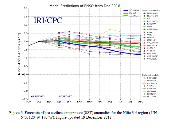
Not only is ENSO in La Nada, many models but not all, are predicting a strong La Nina by year end. NINO 3.4 ensemble forecast:
http://wattsupwiththat.com/reference-pages/enso/
“ENSO is current in “La NADA†and the 13-month smooth is touching the lower 1-sigma spread for multi-model means”
If you are talking about a 13-month smooth of temperatures, shouldn’t you also talk about a 13-month smooth of ENSO? Which, if I look at the 13 month MEI average (http://www.esrl.noaa.gov/psd/enso/mei/table.html) is quite negative (and, by my quick-and-dirty statistical estimate, more than 1 std. dev below the average 13 month MEI). Not that 1 std. dev of MEI index should necessarily correspond to 1 std. dev of global mean temperature. Certainly, if we go back a year, the 13 month MEI would probably have been more than 1 std dev above average, and the 13 month temperature was barely touching the multi-model mean.
So I don’t know if I’m saying anything interesting, except that the current “La NADA” should really be compared to current monthly temperatures, rather than 13 month smoothes.
“No wonder after long insisting that the trends are not inconsistent people are beginning to “explain†why the surface temperature are warming more slowly than projected.”
Sounds like we are up to stage 2 in (avoiding) admitting that you are wrong.
Stage:
(1) Denial
(2) Excuses (volcanic ash, anthropogenic aerosols etc)
(3) Blame (I thought the modellers knew what they were doing)
4) Distraction (ocean acidifcation is worse than we thought)
Expanding on my comment that not all models predict a strong La Nina by year end, here are predictions from NOAA’s site that neutral conditions will continue. (This will be an opportunity in just a few months to compare model predictions.)
http://www.cpc.ncep.noaa.gov/products/analysis_monitoring/enso_advisory/figure6.gif
Steve–
I had to do it…..
peter2108
I’ve been showing these so long, I take short cuts discussing where everything comes from. 🙂
I downloaded the data from the knmi explorer. I rebaselined and averaged.
You can also get gridded data from PCMDI, but I don’t do that. If you compare to the AR4 you’ll see my model mean trend matches theirs.
“Red” correction is to
a) Fit the trend with linear least squares. You could do that in excel or on a graphing calculator.
b) Find the uncertainty in the mean trend in the normal way assuming residuals are “white” (that is, residuals aren’t correlated). (EXCEL returns it. The formula is in my sophomore year math text.) Call this sm.
c) Compute the lag-1 autocorrelation for the residuals. (EXCEL can do this too.) Call this R1
d) Compute a correction equal to N/Ne= (1+R)/(1-R).
e) multiply to get the corrected sm_red= sm*sqrt(N/Ne)
This widens the error bars to the correct size if
a) The autocorrelation of residuals is AR1. That is R1=what you got, R2=R1^2, R3=R1^3 and so on. and
b) in the limit that you have lots of data points. (That is, if Ne is large, where N is the number of data points.)
This method is used very frequently in climate science (and other places). Santer used it in his paper criticizing Douglas, but it’s in lots of other places too. (I’ll refrain from answering more than you asked now….) 🙂
M
Well… actually, the graph shows monthly temperatures, 13 months smooth, and shows data from 1980-now. The relevance of “La Nada” is merely that’s where we usually see extremes in the smooth. The multi-model mean managed to hit the mean projection at the last “La Nada” and has hit the lower 1-sigma now. Temperatures have been oscillating in the lower range for models, and that’s true even though — in the mean– they were forced to appear to agree during the baseline.
I missed these surface temperature and model hindcast-projection comparisons.
Bob–
You’re probably rooting to see the ones that make people really mad– comparisons since 2001. 🙂
dlb: “Sounds like we are up to stage 2 in (avoiding) admitting that you are wrong.”
Maybe they were right? Maybe CO2 caused .2C warming and natural variation caused .25C of cooling and the net loss was only .05C (HADCRUT) over the last 10 years.
Maybe fossil fuels saved us from the next LIA.
“That means we would deem this observations inconsistent with models…” Shouldn’t that be that the models are inconsistent with observations?
Gary–
Opps. Thanks, I edited to “we would deem the multi-model mean inconsistent with this observation”
Peter/Owen,
To be fair, using the linear trend over the past 30 years to project warming over the full century is not a particularly good idea, given that the various model scenarios are driven by underling emission trajectories that by-and-large show accelerating emissions over the century.
Zeke/Owen/Pete–
Zeke is correct: We can’t use the linear trend to project. It’s there to provide a metric for what happened. We could have other metrics– the difference in the 1, 2 or 10 year smooth etc. Each metric has advantages and disadvantages.
Long period temporal smoothing has some specific short comings light of the fact that both models and data set to a common baseline in the recent past. For example: if we use 20 year centered smooth, the models and observation 20 year smooth are mathematically forced to agree in 1990 and any modeling errors must be very large for us to see deviations during the span of the data. Comparing trends after 2001 tends to solve some problems associated testing forecasts by actually testing hindcasts and merely comparing trends avoids some of the baselining issuse– but then some people get grumpy about “too short” time periods.
But the fact that trends are useful for comparing what was observed to what was predicted should not be read to imply the trend is expected to persist. Sometimes people forecast using trends, but sometimes trends can have other purposes. My observed trend on that graph is not a forecast.
I have a question regarding trends. Since the last global cooling trend was longer than the current warming trend, and because the earth is below GAT, can we say that, globally, earth has been experiencing a cooling trend?
Lucia, Zeke,
My comment was not related to the projection, but the the assumption that a temperature change on the order of +1.6 C, if it occurred, would not be threatening. With 5-7 degrees separating an interglacial from an ice age, I don’t necessarily buy the assumption (if that’s what it is) that a change of nearly 2 C would be benign.
Is it a core assumption of lukewarmers that such a change would be non-threatening?
Owen (Comment #81456)-I believe that two degrees has been generally found by a large number of “economic” studies assessing various impacts, to be the a “threshold” where net benefits stop and net “harm” begins. Mind you, that is the marginal boundary. Near it on either end the effects almost sum zero.
Mind you, many such studies are actually assuming many purported negative impacts of warming that flat out don’t exist.
In terms of the way this is supposed to be “addressed” in terms of policy, you (yes YOU) have to show that the impact (the harm) is measurable if you want to assert that others must pay to alleviate that harm. So far, no one has shown measurable harm, only hypothetical harm that depends on such strings of implausible scenarios as to almost certainly never happen.
Andrew,
I will look for such economic studies, as I would be most interested in reading them.
I did not make the claim that 1.6 C would be non-threatening, so I am not obligated to defend or deny it. I am asking if the claim is supported by studies (references?) or if it is an assumption. I don’t claim to know what a change of +1.6 would look like, but I admit I am suspicious of the claim that it would be benign.
Is the claim backed by evidence or is it seat-of -the-pants? That’s the question I am asking. I’ll look for the studies you have alluded to.
Was the RSS anomaly for August released?
ChuckL– I haven’t looked, but RSS probably has released their anomaly.
I don’t think this is a core assumption. The distinction is based on how much warming one anticipates, not whether that amount is dangerous.
1.6C seems great to me…bring it on!!!!! I have just lived through the coldest August I can remember…I am now considering turning the heating on, a good month earlier than usual…of course the world is warming…my bit of it is getting colder rapidly and therefore my response to global warming cannot be plotted against the temperature line.
Owen,
If you have a problem with 1.6 C, then you’ve got your work cut out for you.
There’s a lot of “concerned” organizations and people that see their role in life to limit AGW to a “manageable” 2 degrees.
Just google the words:
limiting global warming to 2 degrees
All the usual suspects show up, and they seem to think that’s a worthy target. All indications are that they would be extactic with 1.6 degrees.
Chuck L./Lucia,
I suppose that by now you will have checked yourselves, but the RSS anomaly for August has been announced and was 0.291c, compared to 0.328c in July. The N.H. anomaly was 0.449c, compared to 0.414c in July and the S.H. anomaly was 0.126c compared to 0.237c in July.
So the S.H. anomaly showed a sharp fall, unlike NASA/GISS, which increased from 0.55c to 0.63c. Interestingly however, the RSS -60 to -70 deg. anomaly increased from 0.607c to 0.717c while the -20 to -70 deg. anomaly decreased from 0.211c to 0.068c.
Lucia, I see on your chart that the line goes up and down. I know fashionable climate science says the ups are AGW. How does current climate science explain the many downs? (Sincere question)
Andrew
Andrew_KY: The answer is “weather” and “volcanic eruptions”.
Im sorry lucia, I was looking for specifc mechanisms, not generalizations. I guess ill ask someone with better knowledge of the subject. -Andrew
Andrew_KY and his clone: If you want more details on the mechanisms driving weather, you are going to have to do research on your own. I have better things to do than to deal with things you claim is not arguing by asking questions, but is, in fact, trying to argue by asking questions. After your journey talking to people who explain ENSO, oscillations, Lorenz and the Butterfly effect, come back and tell us what you learned about wiggles.
Lucia, I get that you do not fully understand the graphs you post.
Andrew
Andrew_KY–
You have come to the incorrect conclusion. Once again: If you want to understand why weather varies and results in “wiggles” in graphs of the sort I show, you are going to have to assign yourself self study and I am not volunteering to be your tutor.
Andrew_KY
Owing to your:
1) Continuuing to try to argue by asking insincere questions.
2) Making (1) worse by claiming they are sincere,
3) Working to get around moderation by creating a “clone” version of yourself and
4) repeatedly pestering Mosher and Neven to answer your argumentative questions.
I am escalating your level of moderation. You are now pre-moderated in addition to being given time-outs between comments. Also, one of your emails is banned. If you seek to get around this by using new email addresses, new names or some other mechanism, you will be fully banned.
If you are sincere in your wish to learn more about the physical mechanisms of ENSO, the AMO etc (which I doubt), I advise you to seek a method other than pretending to ask for lessons in blog posts. Go to the library. Take a class at a community college etc. No one– including me- is required to tutor you in meteorology merely because you post questions at a blog. In fact, no one– not Neven, not Mosher, not anyone is required to answer any of your questions.
The SRES “Special Report on Emissions Scenarios” and a1b is “A balanced emphasis on all energy sources” along with “rapid economic growth” and “A global population that reaches 9 billion in 2050 and then gradually declines” (Wikipedia Special Report on Emissions Scenarios).
What surprises me is the wildly non-operational nature of this “specification” (there is actually more which you can find in Wikipedia). Surely as CO2 is considered the overwhelmingly dominant driver of climate the scenario should be expressed in terms of CO2 levels – in fact there must be a translation of this socio-economic hand-waving into parameters to put into the models but these parameters do not seem to be available. This seems especially pertinent because it is becoming ever more apparent that the increase in CO2 is continuing and will continue in a linear fashion of about 4ppmv per year for the forseeable future. Are there no scenarios against assumed CO2 emissions? Are there any runs against scenario A1FI (Fossil Intensive – ie what is happening)?
Peter
Lucia:
It seems to me that your plot of temperature anomaly vs time reflects the IPCC’s error of confusing “predictions” with “projections.” A “prediction” is an extrapolation to the outcome of a statistical event. The SRS A1B models do not make “predictions” but rather make “projections.” A “projection” is a response function emanating from a kind of model.
A prediction is an example of a proposition; as such, it possesses the variable that is called its “truth-value.” The truth-value takes on the values of “true” and “false.” That its predictions have truth-values is the feature of a predictive model that imparts to it the falsifiability of its claims.
A projection is not an example of a proposition; it does not possess a truth-value and thus a model which like the SRES A1B models makes projections but not predictions does not have the property of making falsifiable claims. We cannot falsify the claims of the SRES A1B models from a comparison to the observed temperature because these claims are not falsifiable. However, through the mechanism of confusing projections with predictions one can convince oneself that projections are falsifiable.
Terry–
I am aware that SRESA1B models are “projections”. Note that I do call them projections. I am also aware that the rhetoric surrounding the IPCC communications makes the distinction between “projections” and “predictions” a distinction with little difference. Futher, I am aware that the IPCC themselves compare their “projections” from the TAR to data — just as I do here.
In any case, there is no reason we can’t compare projections to data and note that the projection is inconsistent with observations. Comparing the data doesn’t imply that anyone, ever claimed the projections in the AR4 had anything to do with what would happen in the future. But it does show us that if someone had made that sort claim or intimated it or believed it to be true, that sort of claim would appear to have been contradicted by the data. That is, if that claim had ever been made.
Re: Terry Oldberg (Sep 14 13:14),
The various SRES do project atmospheric CO2 concentrations. However, for the next twenty years or so, the projections are not significantly different. For the purposes of these posts, then, it hardly matters what scenario is used to feed the climate models.
has anyone computed the numbers of people for whom the phrase “global warming” means “it is getting colder”?
Will those climate models be able to give us an answer?
DeWitt–That too. But the fact is, even if it mattered, we can still compare projections to data and say whether or not the projections were consistent with data.
After that, someone can decides what that means based on how the projections were represented, how well something like the scenarios matched– or whatever claim someone might have made about the relationship between the projections and observations.
Though Terry may have a different opinion, I would suggest that there have been plenty of people who either intimated did quite a bit to give the public the impression that we should anticipate that future temperatures would more or less track projections. The SRES used to drive the model aren’t and weren’t described as things that were just picked out of a hat unrelated to what anyone thought might happen in the future. Moreover, because the multi-model means of the various SRES are nearly indistinguishable in the first few decades of this century, I think plenty of people discussing AGW have represented these projections as tantamount to predictions.
But, even if they had not, there is still nothing wrong with comparing observations to projections, and observing the projections is outside the range consistent with observations.
Owen:
Um, why?
Why would you have expectations in either direction?
Terry Oldberg,
That would be all very well, had it not been for the fact that over the last decade or so, there have been many “expert” climate alarmists hawking these “projections” around to the media as “predictions”, whether or not it was explicitly stated, it was implied. I believe that as far as the general public are concerned, these were “predictions”.
I suspect that we will hear a lot more of the future of the distinction between “projections” and “predictions”.
No one– including me- is required to tutor you in meteorology merely because you post questions at a blog.
.
Andrew_KY
While the above statement is true, I volunteer to answer your question in a format consistent with a blog post and to give you hints about studies which will get you nearer to the light.
Basically you were asking about the mechanisms of the system’s dynamics (in the following, system = hydrosphere+atmosphere+cryosphere).
1) We are interested in dynamical variables (temperature, pressure, velocity, energy, density, etc) as functions of space and time – f(x,y,z,t).
2) Such kind of variables is called in physics fields and that’s why we are looking for field equations first.
3) The field equations are known – they are called Navier Stokes equations. You may look them up at Wikipedia.
.
4) Now comes the moment for a yes or no question. “Can you deal with partial differential equations?”. For instance can you solve fast and correctly the Schrödinger equation for a hydrogen atom ? Can you explain in 2 sentences what are the weaknesses of Reynolds averaging of Navier Stokes?
.
5) If the answer is no then you must begin with that and expand in the direction of fluid dynamics.
6) If the answer is yes, then you know that solving the Navier Stokes equations for given initial and boundary conditions of the system would give you the velocity, pressure and temperature fields (5 equations, 1 vectorial and 2 scalar fields). Add the equation of state and you’ll get the density field too.
7) This actually COULD finish the work completely. If you know the values of the fields at every point and every time, you can trivially compute any kind of spatial or temporal averages (aka “regional climates”) and the problem is solved.
.
8)Unfortunately Navier Stokes can’t be solved for the system. It is not known whether continuous solutions exist in the general case anyway. Furthermore it is known that the solutions are sensible to initial conditions. From that follows exponential divergence of orbits (discovered by Poincaré in astronomy 100 years ago and by Lorenz in the atmosphere 50 years ago). Consequence is unpredictability. Dead end for the strategy which would want to solve (known) field equations in a deterministic way.
.
9) So if you don’t want to give up, you need to learn now more than “only” fluid dynamics. Basically we deal with an infinite dimensional phase space and that is where the difficulty lies.
To deal with that difficulty only 2 strategies are possible.
9.1) You try to reduce the number of dimensions of the phase space. The most dramatic reduction is to do space averaging because it gets you from infinity to a 6 dimensional phase space (average pressure, average temperature etc). You postulate that spatial variables don’t matter. This is an empirical approach because you don’t know what are the equations that these “averages” should obey if any. So you try some simple linear relations (like f.ex a linear relation between an average temperature and an average energy flux) and look what is best fitted to the data. 99% of papers about climate belong to this strategy.
9.2) If you reject the postulate that “spatial configurations of fields don’t matter”, then you have only a probabilistic theory left.
Indeed the non linear dynamics prove that under certain conditions, a chaotic system may be ergodic. The ergodic property basically warrants that there exists an invariant distribution of state probabilities in the phase space (finite or infinite dimensional).
This means that while you cannot deterministically predict the evolution of any individual orbit, you may predict the probabilities that the system will be at some undefined but far future time in this or that state. For instance all quantum field theories (Feynman’s path integrals) are of this sort and it works. In the climate science Tsonis attempts such an approach – the system’s behaviour is explained by a non linear interaction of spatially localised multidecadal oscillations (ENSO, AMO etc).
If you want to go deeper in this direction then you must learn Hamiltonian mechanics, temporal and spatio-temporal chaos theory as well as the ergodic theory. This also implies learning some more difficult maths – measurable sets theory.
9.3) And of course if the system is not ergodic (there are many in the nature which are not), then nobody has a clue how to deal with such systems otherwise than with numerical simulations on a case by case basis.
.
I hope this helps.
Great answer, Tom. Andrew_KY doesn’t deserve it. Nice work, lucia.
Re: bender (Sep 15 08:23),
Is this just a drive-by or are you back? I hope it’s the latter.
Tom–
Thanks for the answer for Andrew_KY. If he and you are agreeable, I’d be glad to send you his email address (both) and you can contact him to find out if he has any other questions about why the global surface temperature varies and would even if AGW were (or is) not happening. If he sincerely wishes to learn these things, I’m sure he’ll jump at the chance of tutoring in format that doesn’t involve the sort of distracting cross talk that happens in blog comments.
Lucia
I do not really know who Andrew_KY is so can’t say if he is agreeable or not.
I was a long time away from internet, just happened on this post, overflew it fast and noticed that he was asking questions that didn’t get answers.
As I had 10 minutes free, I just tried to answer them in a sincere and resumed way. This is the kind of things that I think blogs are for – people ask questions and other people volunteer answers.
Also the question (what are the causes of the system’s dynamics?) seemed to be rather on topic on a thread dealing with system’s dynamics.
Now perhaps there is something subliminal in this thread that I have missed and in this case I won’t mind if you remove my post.
Re: TomVonk (Sep 16 05:18),
Andrew_KY may or may not be interested in learning about informed answers to the questions he poses. He may or may not take your suggestions.
However, at least one other person (= me) benefitted from your overview. So, thanks for taking those 10 minutes. Funny how these things work 🙂
Tom–
I think it’s great you answered especially as other people might be interested in the answer. I think that’s good and it’s what blogs are for.
That said: Andrew_KY has a certain history ….
As Trenberth, Dessler and Santer (in their most recent papers) and lucia has shown, temperatures are within the range of uncertainty of a few climate models.
More specifically, temperatures are within the lower bound of the uncertainty range of the climate models with the lowest sensitivity.
The lower bound that shows no global warming that is. The runs that show no global warming that is. Therefore, the theory of global warming is still intact, since “no warming” is consistent with the global warming models.
Andrew_KY:
The multiple comments you posted doing nothing more than complaining about your being moderated were sent to trash.
Any of your future comments that are limited to discussing your views about the unfairness will not be approved. If you wish to discuss your original question about the wiggles in the temperature trend I will permit those to appear provided they do not also discuss the unfairness of your moderation and do not appear to be arguing by asking questions. Feel free to address any questions you like to Tom here. You are welcome to post here provided you do not behave in a manner I deem rude.
I want to thank Tom Vonk for answering my question. I do not know if it helps very much. What I would like to know is what specfic mechanisms drive the global average temperature anomaly down and up? Can someone provide a comprehensive list?
Andrew
“Can someone provide a comprehensive list?”
No.
Andrew_KY – you need to learn to fish for yourself, rather than keeping asking other people to give you fish.
Andrew_KY (Comment #81610),
I suggest you start with Wikipedia (“IPCC AR4”, plus lots of other subjects, like “global warming”, “atmospheric window”, “atmospheric aerosols”, “ocean heat accumulation”) and go on from there. Wikipedia has endless links to related subject matter.
.
Nobody should have to do that work for you…. after people try once or twice, the ‘boy who crys wolf’ syndrome sets in.
Andrew_KY,
I forgot one of the most important: blackbody radiation.
just wondering if you could add a spread against the “best-performing” model. Your post a few months ago showing the divergence in individual models was instructive, at least for me. The fact that there were some extremely over-cooked models forces the multi-model trend higher than it might be. There were a few models that seemed useful and it might be helpful to try to track these. (And if Mosher is around, you could call it “due diligence” and earn some Mosher points.)
diogenes– I can show the comparison different ways later on.