In my previous post, I showed the IPCC projections from the AR4 are inconsistent with Global Mean Surface Temperature (GMST) measurements collected since the time the IPCC projections were first published. To support that claim, I performed a linear regression, correcting for serial autocorrelation in the residuals, using a “Cochrane-Orcutt”, a standard method.
 Specifically, I found that the temperature trend over time that best fits the data is m= -1.1C/century, with 95% uncertainty intervals of -3.3 C/century < m < + 1.1 C/century. In the previous post, I showed a full graph. To the left, I’ve exploded the region of interest, and highlighted the IPCC uncertainty intervals associated with their near term projection of 2.0 C/century. The uncertainty range is indicated with the vertical yellow band. Notice that this is so small that it was practically invisible until I exploded the figure.
As you can see quite clearly, both the near term IPCC projections and their stated uncertainty intervals fall outside the uncertainty bands for the data.
After I posted my results, Steve Mosher asked me:
Lucia, how many months of memory does your model have, there was a huge swing from jan 07 to jan 08, could that be ‘creating’ the negative slope?

To answer the part of Steve’s question about the “memory” of this fit? Specifically, does it matter that the plunge from Jan 07 to Jan 08 is fast? Not really. The correlation for 1-month lagged temperature data is 0.59. This corresponds to an integral time scale (sometimes called ‘e-folding time’ ) of 2 months; data spaced at 1 year is nearly uncorrelated. (I could discuss this more, and place in context of weather. )
What about the big down swing from 07-08
The down swing in temperature from 07-08 does ‘create’ the negative slope in the trend line in the sense that the entire slope is ‘created’ by the data. That’s the way all linear regressions work. However, the “up-swing” from 06-07 counters this quite a bit. (Otherswise the trend would be really negative!)
So, why are the C-O results for the trend ‘so different’ from the OLS results.
Actually, the two trends of -0.1 C/century and -1.1C/century aren’t ‘different’; that is the difference is not statistically significant!
Cochrane-Orcutt involves a data transform, intended to remove the serial autocorrelation from the data. After transforming, one applies a linear fit. If you examine the data after transforming, you’ll see the up-ticks and down-ticks remain.
In principle, the trend obtained using either method is supposed give the “best fit” compared to the “true” value. This is true in the following sense: If you took zillions of data for a process, and could repeat the experiment over and over and over again, (by say “rerunning 2001-2008) you would expect the average trend over all experiments to match no matter which method you used.
The main problem with OLS is: If we estimate the uncertainty intervals using OLS, we will be way overconfident about the uncertainty in our result.
What would I have concluded if I ignored the serial autocorrelation?
| Best fit trend and 95% confidence intervals based on regression neglecting serial autocorrelation in the residuals (OLS) and accounting for serial autocorrelation (C-O) | |||
| Method | “best fit” trend, m. | range | Conclusions |
| OLS | -0.1 C/century | -1.2C/century < m < 1.0 | IPCC +2C/century outside 99.08% bands. |
| Cochrane Orcutt (C-O) | -1.1 C/century | -3.3 C/century < m < 1.1 C/century | IPCC +2C/century outside 99.4% bands. |
| Note: When doing C-O, I estimated the serial autocorrelation in the residuals based on the 2001-now data set. There is an alternate choice: use a “known” value based on a larger data set. I actually tried that. That results an an even more negative trend and also “reject” 2.0 C/century. | |||
If we examine the table above we see:
- Ordinary Least Squares does not correct for serial autocorrelation in the residuals. It results in a best fit trend of -0.1C /century. This is weakly negative and very few would have the ova to say this ‘supports’ the IPCC short term projection of 2C/century for the trend.
However, because the analysis technique assumes the data are uncorrelated, it significantly underestimates the uncertainty intervals. That said, based on these intervals, we would reject the IPCC estimate for the trend because the upper range of uncertainty interval based on the data is 1.0C/century and is less than 2C/century.
What those supporting the IPCC would respond is: You can’t reject the IPCC projections based on that analysis because you didn’t correct for serial autocorrelation.
That’s fair enough. But there are two possible cures: Do more analysis and correct for serial autocorrelation or wait to take more data.
- Cochrane-Orcutt corrects for serial autocorrelation. Using this technique results in a trend of -1.1C/century.
This is distinctly lower than obtained using OLS but happens to fall in the 95% uncertainty bands based on OLS. (It need not, but it did in this case.)
However, if we examine the uncertainty bands based on C-O, we find they are 3.3 < m < 1.1 C/century. Notice the -0.1C/century falls right in those bands; this implies the difference in the two results is insignificant statistically.
That is to say: the central tendency based on C-O agrees with that based on OLS. The main difference is the uncertainty intervals are larger.
These larger uncertainty intervals make it more difficult to falsify hypotheses. Nevertheless, even with these larger Cochrane-Orcutt uncertainty intervals, we still find the IPCC estimate for the trend falls outside the uncertainty bands for the C-O fit.
- What about falsification of IPCC’s prediction?
No matter which method we choose, the IPCC estimate is outside the uncertainty bands. Moreover if we examine the IPCC’s estimate for their uncertainty bands (which are only provided in graphical form), the entire range of uncertainty the IPCC applied to their estimate falls outside the current data set.
So, looked at both ways, IPCC near term prediction of 2C/century for the trend appears provisionally falsified.
I use the weasel term ‘provisionally’ because everything in science is provisional. If the data are found erroneous, or GMST suddenly rockets up next year, or the next year, or sometime in the next decade, then the IPCC projections could turn out to be right. (I would personally consider their stated confindence intervals too narrow, but, if the weather heats up, yes, they could turn out to be right.)
But, basically, the only way to make the IPCC projections to become “correct” is for the weather to heat up or the data to be found wrong.
More reading:
If you got this far, you should quickly go read Basil’s guest post at “Watt’s Up With That?” Reader’s will recall I previously mentioned he was the kind blogger who mentioned a statistical technique by name thus permitting me to read up on it! 🙂
Thanks Lucia for a thoughtful evaluation of the aggregate IPCC projections. I am glad you had the “ova” to make a strong declarative statement. I almost fell out of my chair when I read that but must agree. I am sure that all the modelers are not happy with current temperature trends and are contemplating eating their projections.
Boris,
I suspect you are mistaking the variability for the weather with the variability for the trend. It is true that if the IPCC graphic included the variability for the weather noise, we would see more scatter and greater variability. I could show the difference between the two calculations, but lucky for me, William Briggs already discussed this in You cannot measure a mean.
When testing the difference in mean trends (or just means of any sort), we are comparing the error band represented by blue lines in graphs like this:
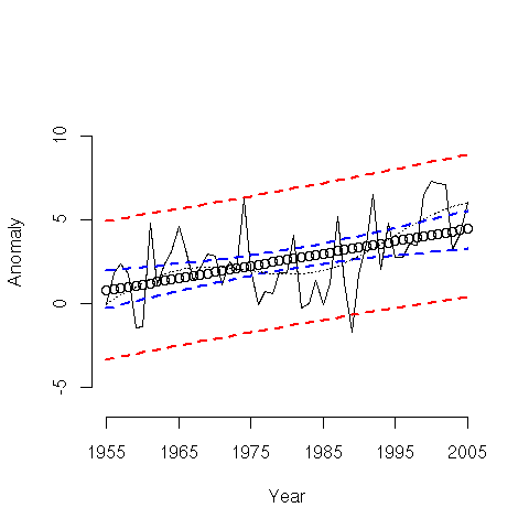 to the predicted trend and it’s uncertainty.
The weather noise you are discussing falls inside the red bands. Yes, the weather noise will fall outside the uncertainty bands for the mean.
It’s conventional when testing hypotheses to compare the mean trend to the predicted mean trend. This averages out the weather noise.
Of course, if you are suggesting that the IPCC bands include the weather noise, then the falsification I did is even stronger than I stated.
I think this needs some clarification. Perhaps it is partly the IPCC’s fault for not making their graphic clear, but if they were including short term variability into the uncertainties, we would see huge error bars immediately after 2001 (I’d guess these would be on the order of +/- 0.3`C at one year out–just a guess, however) The error bars would then shrink until we reach the 30 year projection. All in all, it would not be as pretty a presentation, but it would be better for discussions of this kind.
Comparing an 8 year trend to a 30 year projection is bound to give weird results, not matter what the data are. We know based on the Jan07 to Jan08 swing that internal variability can be at least 0.5`C (Unless someone wants to suggest an external cause, which is highly implausible.) Such apples and oranges comparisons don’t, I contend, allow such a conclusion as:
“provisionally” or not.
Not to say that the analysis isn’t interesting.
Yes, and if you calculate trends based on short snippets, you get values that are sometimes far from the true trend.
In other words, the short term variations in weather are defining the trend right now and not the changes in radiative forcing (whatever they may be). It takes longer than 7 years for the weather noise to “average out.” This is why the IPCC makes projections for thirty years.
How many ten year trends from Briggs’ figure would falsify the actual 50 year trend?
Boris– Brigg’s chart is generated data. My purpose is to show you the difference between the uncertainty intervals for a calculated trend and the uncertainty intervals for individual data points.
When doing hypothesis tests for claims, you use the uncertainty interval for the trend. Generally speaking the data themselves fall outside these trends.
As to your underlying question, which presumably related to my conclusions:
If the IPCC claim of 2C/century were true, less than 5% of 10 year trends exhibit trends lower than the trend determined based on the actual measured monthly data since the time the IPCC made their projections. (I think the value is actually less than 1%. I’d check further for you, but my sister and I have tickets to the Lyric Opera, and I need to leave soon.)
Or course, it takes a long time for weather to average out. That is why the confidence intervals associated with the trend I obtained are so wide. The 1 σ is 1.1 C/century, which is huge compared to the trend of -1.1C/century.
I am rather surprised we had such a strong excursion into colling, but it happened. It may be the 2.5 σ event. But it happened. No pointing at the distinction between weather and climate makes this go away. Climate is an average of weather. There is no specific number of years that defines a cut-off.
Oh– Boris, I should add:
The result I am posting absolutely does not falsify the 50 year trend. It falsifies the IPCC projected trend, which exceeds the 50 years trend, and pretty much any long term trend since the thermometer record begins.
My uncertainty intervals also contain the 100 year trend.
Yes. My point was that there are certain trends that would “falsify” the known trend for the data. Take 1975 to 1985 for instance.
The issue about the sudden downswing is not its effect on the trend, but on your assumptions about the nature of internal climate variability. Plunges like that are indicative of nonstationary processes that do not conform to any one AR model, let alone an AR(1) or even an AR(5) model. The jumps indicate times when the process lost its low-order autoregressive memory, as extremely high-order behavior or (what I think is less likely) exogenous perturbations kicked in.
Ocean fluid dynamics is a very high order process and Gavin knows it. He has no more clue than I or you do what to do about it.
Bender. Also changes in wind patterns seem to have more effect on local temperature than many would think. Viz SteveM’s posts on the Sheep Mountain Pine Trees and a relationship of ice damage to a change of wind direction, and the recent European Paper on Wind Direction and Lake Sediment.
Bender–
When stratospheric volcanos erupt, there are identifyable exogenous perturbations. But, right now, I agree there are no obvious ones (and likely, in reality, there are none.)
I’m perfectly willing to believe that the process is not AR(anything)! If the system is not stationary in moments higher than the mean I’m not sure any statistical analysis can be done at all. Can it?