
Roy Spencer posted the UAH January Anomaly for the lower troposphere: +0.72 Deg! Chicago was cold, but the globe was hot, hot, hot!
The graph above shows the temperature anomalies in the satellite records for both RSS and UAH, I’ve highlighted all January readings with outlines, and also show a dashed line at the this month’s level. This is the hottest January in the satellite record. For comparison, I show the multi-model mean projections for the surface temperatures from models forced using the A1B scenario. (Surface temperatures differ from temperature of the lower troposphere, but are useful for reference). The current temperatures as “weather” lie well above the multi-model mean if temperature projected using the A1B scenarios, but the least squares trend through data in the record lies below the multi-model mean trend.
For the first time ever, I won the quatloos. This should motivate me to modify the script to tally total quatloos won as I will no longer be in dead last place! You can look up your winnings on this bet below:
Results older than 2 months are not displayed avoid taking my site down.
Wait, does this mean that the “mini ice age” has been called off? http://www.dailymail.co.uk/sciencetech/article-1242011/DAVID-ROSE-The-mini-ice-age-starts-here.html
One month, be it warm or cold, is mostly just weather variability. However, it might be fun to set up a bet about how 2010 will place in the ever-so-important hottest years ranking, given the predictions by a number of folks that it might be the hottest on record. Its a long term bet, but if we wait too long we may already know part of the answer!
You’re right– I’d better set up the bet for 2010. It’s likely to be hot. El Nino is still present even if it might be fading!
Quatloos? Is this another star trek reference? (The original, not any of the later ones).
Love it!
Phil Jourdan
We even found a few paper quatloos somewhere. This is what they look like:

wow. and this in a “cool” phase and with a spotless sun.
which sceptic mail will include the part “it is a travesty, that we can t explain this”???
Big El Nino and a spike like 1998?
How does it affect the trend vs. models since 2000?
But where is the heat? Here in Australia (well Sydney anyway) its been mild. Were returning here to the cold wet cycle, with floods and monsoonal troughs up north.
tetris–
The trend for this decades starting either from 2000 or 2001 are still well below 0.2 C/decade with one negative the other positive. And that’s not “El Nino Corrected”, heh!
Tetris– February is fixing to have a hot anomaly too.
Well that’s the closest Boris and I have ever come to agreement on anything.
.585 – .59
And the El Nino is fading, cooler next month?
Lucia,
I noted something interesting about El Nino events at teh RSS site. They show the temperature variations as a function of both time and latitude. El Nino’s start as a strong warming, almost exclusively in the tropics, but as the warmth fades from the tropics (often with the on-set of La Nina), the El Nino heat moves as a slowly advancing wave into the temperate zones over most of a year after the El Nino is officially over. The pattern repeats almost perfectly with each El Nino, and resembles a ‘(‘ in shape.
.
So maybe the Chicago area will have a warmer 2010-2011 winter!
I would note on the weather front, even though the West Coast was warm in January, southern California, San Francisco… was AVERAGE!!! In other words, the West Coast contributed little if anything to any actual global heat wave!!!
Look to that temp smearing from the gridding!!!
Anthony,
El Nino may have peaked though that’s not even certain yet. Surface temperatures lag El Nino. So, the surface temperaures will likely peak after the El Nino peak. I haven’t looked to see if TLT temperature lag or lead either surface temperature or even El Nino. They are “noisier” than surface temperatures.
OK, I’m a moron. This post is satellite and I’m talking surface.
My very crude model seems to have been a pretty good prediction of the overall shape of this warming event. However each month has alternated between being about 0.1 degree over and under the line so I haven’t won anything. I did win once before I started using this model.
During most El Nino’s I looked at, Uah temps climb rapidly late in the year to peak in January, and decline slowly after that. The most significant part of the extreme tempeature response in 1998 was not the temperature climb up to January, but the fact it rose further in February, and slighly high again in April.
Looking at daily channel 5 values it is interesting to note that 2010 appears to be slightly ahead of 1998 (assuming 1998 is the 20 year record line). But very early days of course it wouldn’t be in the least surprising to see a fairly significant drop.
On the status of the El Nino it is definitely weakening, and on past history this is basically a guaranteed trend for this time of year. The weakening does seem to be unusually slow, and recently the strongest westerly wind burst so far this event is actually strengthening the subsurface warm pool in the mid pacific, although overall the subsurface is cooling.
This el nino is nothing like as strong as 1998, and it would be suprising to see it have the same temperature reponse, but I think 0.18 deg/decade warming and an average El Nino reponse would make it a line ball between 1998 and 2010. My model says 0.48 for 2010, compared to 0.51 for 1998. The 0.51 is average of the 12 monthly figures, and I don’t know what the official annual figure is.
If the cool PDO really is with us, then we should be more likely to see a stronger cooling in ENSO late in the year which would make it rather hard for 2010 to be an annual Uah record.
Edit: ESRL can give an idea of where globally it has been warm and cool. The warmth seems to be in tropical Asia, and Africa, and in Canada. Colder than normal Northern Europe and Asia.
http://www.esrl.noaa.gov/psd/map/images/rnl/sfctmpmer_30b.rnl.html
Anthony, do you have any comment on this article by three Guardian reporters concerning the police questioning of Paul Dennis, a skeptic climate scientist at UAE, who purportedly was in contact with you on occasions: http://www.guardian.co.uk/environment/2010/feb/04/climate-change-email-hacking-leaks
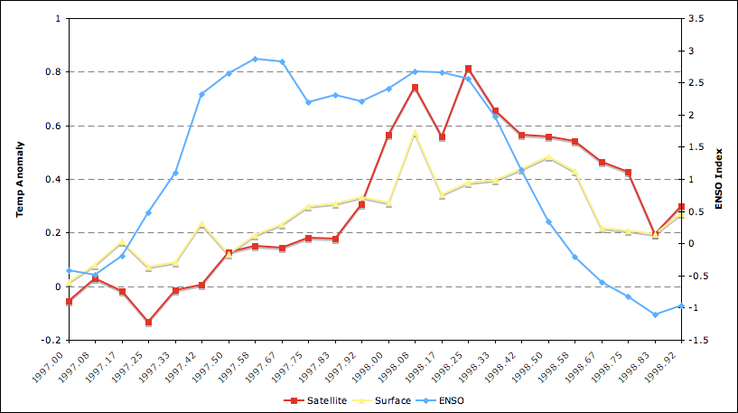
Here are surface and satellite temps compared to the ENSO index during the 97-98 event, for reference:
http://i81.photobucket.com/albums/j237/hausfath/Picture14.png
“Chicago was cold, but the globe was hot, hot, hot!”
Lucia,
I know you are excited about winning the Quatloos, but as a Denialer Smart Aleck, I have to take issue with your statement that the globe was “hot, hot, hot”. Sure it was “hot, hot, hot”… except for all the places that it wasn’t. Like all the “cold, cold, cold” places. How hot is “hot, hot, hot” anyway? 😉
Andrew
sod (Comment#32181)
February 4th, 2010 at 3:46 pm
Sod,
Congrats on your hit single.
http://www.youtube.com/watch?v=KcIP5w4H6Dw&feature=related
Lucia,
With UAH saying January was the warmest January ever recorded, has anybody did research into how the satellite handles snow-cover? I Believe the NH is covered in it’s largest ever percentage wise in snow. How does the satellite adjust for all the solar radiation coming back from the snow cover? Obviously with-out proper adjustment it would read higher. Ever been in the skiing in the moutains when the snow is reflecting all the sunshine off the snow?…..seems so odd that NH surface temperatures would read the highest ever and NH is covered in it’s highest ever amount of snow-cover….Side note here in MN on the Iowa border we have only one day it made it above freezing and many days below zeroF. The cold summer of 2009 in the upper midwest continues now into January. No “GW†here in the central US in 150 years….Sincerely, John
John P (Comment#32205),
I believe readings are in the extreme infrared/microwave region. Reflected visible light shouldn’t have any effect.
The globe wasn’t hot, hot, hot. It was hot, cold, hot.
in the microwave range, ice and snow are more transparent than water. snow and ice coverage are calculated from type of snow (crystal radii) in that area and then calculated using the brightness presented by the amsu, none of which could possibly answer the question of how much abnormal snow there is in any given area.
The 97-98 El Nino reached peak anomalies in April.
Will this fading El Nino still exceed the 97-98 event?
That’s what one might expect with an underlying warming trend.
What will the Argo heat content data look like for this
el nino event?
twawki (Comment#32185)
February 4th, 2010 at 3:56 pm
But where is the heat?
Twawki, according to Dr. Spencer, most of the heat (in the northern hemispere) was over the oceans as the jet streams pushed the polar air over land instead of the sea.
He indicated that the 09-10 cycle is closely following the 98-99 cycle and that the peak in the previous cycle was in February.
ClimateWatcher (Comment#32219)
Good question. First big el nino since Argo has been in operation. But probably not much. ENSO mostly moves the heat from the west tropical pacific to other places.
If I remember the physics correctly the process of snowfall releases heat to the atmosphere. Record NH snowfall in Jan. would release record heat to the troposphere. This and the moderate El Nino in the tropics may explain some of this anomaly, or… the warmers are right. It really is CO2 after all. We will have a better picture in a few months regarding this current weather/climate trend.
Due to the annual cycle present in the UAH anomaly we can expect their data to drop in the spring. Regarding snow and ice there’s significant microwave surface signal, but as long as the weighting curve doesn’t intersect the surface it won’t be too bad. Over high ground it is a problem which is one reason why RSS doesn’t cover the Antarctic.
twawki (Comment#32185)
Where is the heat? It is not at the surface, it is not in the sea, it is at an altitude of 14’000 feet. Of course it would not help to climb the Matterhorn to feel it; 0.7°C more do not mean much up there.
“Tetris– February is fixing to have a hot anomaly too.”
I just have to say that I appreciate the use of the immediate future tense here. Southern language is more sophisticated, y’all.
Re: Phil. (Feb 4 22:31),
That’s a good point about the cycle in UAH. It’s worth emphasizing that RSS is also showing a hot January. The anomalous warmth is not merely a feature of UAH.
“However, it might be fun to set up a bet about how 2010 will place in the ever-so-important hottest years ranking, given the predictions by a number of folks that it might be the hottest on record. Its a long term bet, but if we wait too long we may already know part of the answer!”
You could also bet on intrade if you are so inclined.
You can get 2010 as one of the 5 warmest years on record in GISS at 75.0 or even better. EZ money.
One of the five warmest? Oh, it’s going to probably going to be– though given the vagaries of weather, the choice of metric might matter. At a minimum, the first three months are El Nino influence. January is already in the pocket and very warm.
Here was the spatial distribution of the anomaly for the month:
Looks like the Arctic was the primary driver of NH temp anomalies, which isn’t too surprising. I wonder if GISS and Hadley will show strongly divergent anomalies due to differences in arctic interpolation methods?
Zeke–I’m waiting to see if GISS Temp beats the 2007 january anomaly (.87C) I bet it will beat 2002s 0.71C.
Boris,
The Intrade volume is so low that if I tried to bet any real money I’d swamp the market. Leaving $200 in an account for a year so I can make a 25% return isn’t really worth the effort.
Lucia,
We will see. I do think the gap between satellite temps and surface temps will be larger than normal this month, though that’s something of a given during an ENSO event.
I have a question, or two. It seems to me that these larger changes in some kind of average temperature might be results of two, or more, processes. The first is net radiative energy addition into or loss from the material associated with the measured temperature. The second is redistribution of the energy content already present in the materials that make up the Earth’s climate systems. I include the latter because these changes are frequently presented and discussed within the framework of large scale ( in both space and time ) quasi-cyclic phenomena ( El Nino, for example ). Maybe it’s a combination of these two processes. There may be other processes that are important, I don’t know.
So long as the interacting components of the Earth’s systems are not in thermal equilibrium, both increases and decreases in the measured temperature are possible simply due to redistribution of the energy content between the components. If the large scale quasi-cyclic processes are dominated by bulk motions and mixing of materials, interactions between open systems, I think it will be difficult to assign the temperature changes solely to radiative-energy transport processes.
If we could assign mass and specific heat values to the materials that are the subject of the measured temperature changes, we could make estimates of the size of the energy changes needed to obtain the indicated temperature changes over the time scale for which the changes occur. With this information, maybe we could estimate wether or not radiative energy transport is the dominant process.
Based on the assumption that both processes enter the problem, my question is as follows. How are the individual effects of each important process factored out of the measurement. It seems this would be useful if the objective is to assign increase in the temperature to a radiative-energy imbalance due to increasing concentrations of CO2 in the atmosphere.
Additionally, it seems to me that the spikes upward in temperature are very frequently assigned to be the result of what’s happening in a part of the Pacific Ocean ( El Nino ). If this is in fact an important consideration, how are the effects of the energy content already present in the ocean waters factored out from any increase in that energy content due to a net increase in radiative energy into the water? If these spikes are responsible for the changes in temperature, and do accurately reflect increases in energy content of the waters due to increased radiative energy transport, could the trend in any average temperature increase be determined by the trend of the peaks of these spikes?
Thanks for all corrections to incorrectos.
Dan,
That is indeed fertile ground. Unfortunately, as Trenbeth so famously remarked, “The fact is that we can’t account for the lack of warming at the moment and it is a travesty that we can’t”. He has a good article on our relative inability for us to effectively model short-term heat flows in the climate system here:
http://www.wired.com/images_blogs/threatlevel/2009/11/energydiagnostics09final.pdf
The reason why climate scientists have insisted on dealing with time periods over at least three decades when discussing climate is that most of the internal variability (e.g. ENSO, non-sustained volcanism, etc.) generally averages out.
“The Intrade volume is so low that if I tried to bet any real money I’d swamp the market. Leaving $200 in an account for a year so I can make a 25% return isn’t really worth the effort.”
You could probably get more action by taunting some right wing forums: Newsbusters, Pajamas Media, etc. 🙂
Re: Dan Hughes (Feb 5 16:23),
I think this is true in the short term. Without direct top of the atmosphere measurements of heat flux, we can’t distinguish between tropospheric temperatures rising due to a a huge blob of heat being released from the ocean, because of reduced out-going radiation or even Motl’s theory that temperatures rose some amount due to the rapid release of heat when water vapor froze into snow. In fact, strictly speaking, temperature could rise due to simultaneous relatively calm volcano eruptions, covering an area the size of Australian with hot molten lava while failing to spew aerosols to mask incoming radiation. That’s redistribution inside the planet’s envelope.
For the temperature change from January to February? Sure. If someone else finds all the data to let them assign these heat capacities, heats of fusion, temperautre etc. and then does the calculation, I’ll be happy to read it.
Lubos has a theory about snow condensing the warm temperatures in January. I don’t know if he gave a an order of magnitude estimate of the amount of anomalous temperature expected based on the some positive snowfall anomaly during January. But if he’s correct, the TLT temperatures should drop back to normal very soon because we really can’t anticipate having weather that dumps excess snow on the NH month after month after month. (And anyway, even if we did, the water has to evaporate before condensing, so it’s not like this process results in a build up of heat. We should see cooling where it evaporates and warming where it condenses.)
They aren’t factored out of measurement. The instruments measure temperature, not “temperature corrected for all but one process that cause it to fluctuate.”
If you want to dig up other data and account for other things to tease out whether you think the sharp jump in January was due to radiative process rather than some sort of shifting of warm or hot inside the earth’s climate system, give it a whirl. I think it’s a horrifyingly difficult accounting problem and you won’t have sufficient data to do it– especially not if you are trying to explain a Jan vs. Dec. variation.
UAH will still only be measuring temperature — which is fine. That will be one of the many pieces of data you might use in your exercise. To explain the fluctuation based on other phenomena you’ll need data that describes those phenomena in a way that lets you estimate the effect on UAH temperature.
Re: lucia (Feb 5 17:44),
There’s some internal evidence on heat flow from the RSS data. The ocean only 60-82.5 LT anomaly was 2.6 C in December and 1.6 in January. That’s higher than the land only anomaly for both months and very high historically. The AMO has been positive since June and sea ice in the Kara and Barents Seas, which are most affected by an influx of warm water from the Atlantic, have been well below average.
As far as snow and heat of fusion explaining the anomaly, show me data that says that snowfall in the Great North Woods of Canada was way above average in January and I might believe it. That’s the location of a lot of the positive anomaly. Ice formation in the Sea of Okhotsk is also slower than usual, which is consistent with the high anomaly over eastern Siberia.
here is australian mean temp anomaly for jan by BOM.
[IMG] http://i931.photobucket.com/albums/ad158/mobihci/jananom.gif [/IMG]
why is china red on that brightness map?
http://english.people.com.cn/90001/90776/90882/6874544.html
http://news.smh.com.au/breaking-news-world/six-people-die-in-china-cold-snap-20100113-m737.html
http://uk.news.yahoo.com/22/20100116/video/vwl-sea-freezes-in-china-cold-snap-d7f4ae7.html
mobihci,
-42C is the new measurement of “scorching hot” according to the latest climate science. 😉
Andrew
“Andrew_KY (Comment#32382) February 5th, 2010 at 8:09 pm
mobihci,
-42C is the new measurement of “scorching hot†according to the latest climate science.”
I get your point, but where does your number come from? The ICAO Standard Atmosphere has 5,5°F at 15’000 feet or -17.5°C at 5’000 m.
well it looks like the abnormally warm conditions over china are set to get worse over february-
http://www.china.org.cn/environment/2010-02/05/content_19372251.htm
“The worst sea ice in three decades on the country’s eastern coast has been threatening shipping and the livelihoods of fishermen since late last year.
The floating ice since late last year has caused more than 2.2 billion yuan ($323 million) of economic losses in Shandong province and more than 330 million yuan in Dalian, Liaoning province so far, the Xinhua News Agency reported last month. “