Today the Berkeley Earth Surface Temperature Project publically released their accumulated minimum, maximum, and mean monthly data. It is a composite of fourteen different surface temperature datasets, including:
1) Global Historical Climatology Network – Monthly
2) Global Historical Climatology Network – Daily
3) US Historical Climatology Network – Monthly
4) World Monthly Surface Station Climatology
5) Hadley Centre / Climate Research Unit Data Collection
6) US Cooperative Summary of the Month
7) US Cooperative Summary of the Day
8 ) US First Order Summary of the Day
9) Scientific Committee on Antarctic Research
10) GSN Monthly Summaries from NOAA
11) Monthly Climatic Data of the World
12) GCOS Monthly Summaries from DWD
13) World Weather Records (only those published since 1961)
14) Colonial Era Weather Archives
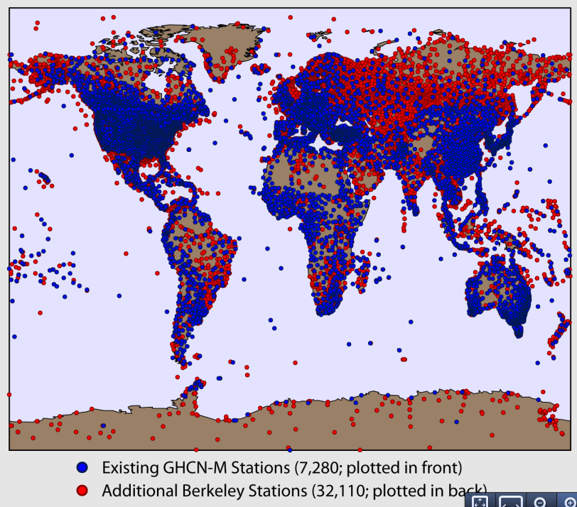
This represents an unprecedented amount of land measurement data available, with 40,752 unique station records comprised of over 15 million station-months of data. It is also an invaluable resource for those of us interested in analyzing land temperature data, as it provides considerably better spatial coverage than any prior datasets.
(Note: this is cross-posted at Judith’s Climate Etc.)
The overall picture is unsurprising: the Berkeley Earth data shows nearly the same long-term land warming trend found in NCDC, GISTemp, and CRUTEM records.

Note that the CRUTEM record used here is the Simple Average land product rather than the more commonly displayed hemispheric-weighted product, as it is more methodologically comparable to the records produced by other groups. The GISTemp record shown here has a land mask applied.
The Berkeley group does go considerably further back in time than any prior records, with data available since 1750 (or, more reliably, since 1800) with uncertainty ranges derived in part by comparing regions where coverage is available during early periods to the overall global land temperature during times when both have excellent coverage.
The Berkeley group also applies a novel approach to dealing with inhomogenities. It detects series breakpoints based both on metadata and neighbor-comparisons and cuts series at breakpoints, turning them into effectively separate records. These “scalpeled†records are then recombined using a least-squares approach. For more information on the specific methods used, see Rhode et al (submitted).
Having access to the raw data allows us to examine how the results differ if raw data is used and no homogenization process is applied.

Here we see published Berkeley data compared to two different methods using their newly released data. The “Zeke†method uses a simple Common Anomaly Method (CAM) coupled with 5×5 lat/lon grid cells, and excludes any records that do not have at least 10 years of data during the 1971-2000 period. The “Nick†method (using Mosher’s implementation of Nick Stokes’ code) uses a Least Squares Method (LSM) to combine fragmentary station records within 5×5 grid cells and only excludes stations with less than 36 months of data in the entire station history. The “Zeke†method employs a land mask to adjust the weights of grid cells based on their land area, while the “Nick†method does not. The dataset analyzed here is the “Quality Controlled†release, which involves removing obviously wrong data (e.g. a few 10000 C observations) but no adjustments.
The results show that our “raw†series are similar to Berkeley’s homogenized series, but show a slightly lower slope over the century period (and less steep rise over the last 30 years). How much of this might be due to differing methodological choices vs. homogenization is still unclear.
Finally, the newly released Berkeley data includes metadata flags indicating the origin of particular station data. This allows us to compare the standard Global Historical Climatological Network-Monthly (GHCN-M) data that underlies the existing records (GISTemp, CRUTEM, NCDC) to all of the new non GHCN-M data that has been added.

Here we see (using the “Zeke†method described earlier) that non-GHCN-M stations produce a record quite similar to that of GHCN-M stations, though there is a bit more noise early on in the record as the non-GHCN-M set has fewer station months that far back.
Steven Mosher has done extensive work on building a (free and open source) R package to import and process the Berkeley Earth dataset. Details about his package are below:
The first official release of the Berkeley Earth dataset can be a bit daunting at first, but everything is there for people to get started looking at the data. An R package BerkeleyEarth has been created to provide an easy way to get the data. First some background on the data ingest process. Berkeley Earth Surface temperature ingest many different datasets. Those dataset are then transformed into a common format. The package has not been tested with the common format and wont support reading daily data until a future release. The sources are defined in the file source_flag_definitions.txt. That file is read with the function readSourceFlagDefine().
The next step in the data process is to create a multiple value file. This file is created by merging the source data into one dataset. The various sites will have 3-4 series per site that make up the complete record. At this point only limited QC is done on the data. In future releases of the package the process of merging data and the QC applied will be documented. At this stage the package has not been tested on the multi valued dataset.
There are then two steps that get applied to the multi valued data: There is a quality control step and a seasonality step. After these two processes there are 4 datasets; they are all single valued datasets. The QC step applies quality flags to the data, removing those data elements that are suspect. The seasonality step removes seasonality. This is described in the main readme for the data. For the R package the following dataset was used: Single value, quality controlled; no seasonality removed. Over the course of time and with help from others the other single valued datasets will be tested as well as the multi valued dataset and the source datasets.
Reading the data:
There are three different functions for reading the main datafile: data.txt. That datafile contains 7 columns of data: The station Id, the series ID, the date, the temperature, the uncertainty, the number of observations and the time of observations. The data is monthly data, so the number of observations indicates the days of month that reported observations. The data is presented in a sparse time format. That means missing months are not represented in the file. Values indicating NA for a month are not provided.
A simple routine is provided for reading in this data as is: readBerkeleydata().  This function does two things. The size of the Berkeley dataset is such that it may overrun the users RAM. To manage this the function creates a memory mapped file of the data. On the first invocation of the function if the memory mapped file does not exist it is created. The function is called like so: Bestdata <- readBerkeleyData(Directory, filename = “data.bin”).  On the first call “data.bin†does not exist, so it is created. This takes about 10 minutes. Once that file is created, subsequent access is immediate and the program will return access to the file. This is accomplished using the package bigmemory. All 7 columns are returned as a matrix.
To access only the temperature data two functions are provided: readBerkekelyTemp() and readAsArray(). At present readBerkeleyTemp() is not optimized. That function will read the data and create a file back matrix for just the temperature data. It takes hours. Once the buffering is optimized this will be reduced. The approach is the same as with reading all the data. The data.txt is read and processed into a 2D matrix. If data.bin exists, it is read. The 2D matrix has a row for every time in the dataset from 1701 to present. There are columns for every station, over 44,000. Missing months are filled in with NA. There will be stations that have no data. Once the file backed matrix is created, access to the data is immediate, but the first call to the function takes hours to rebuild the dataset into a 2D matrix. As noted above, buffering will be added to speed this up. If your system has less than 2GB you are almost forced to use this method of reading. The function is called like so: Bestdata <- readBerkeleyTemp(Directory, filename = “temperature.bin”).  Again, if temperature.bin does not exist it will be created by reading data.bin or creating data.bin from data.txt. If temperature.bin exists it will be attached and access is immediate.
The readAsArray() function is for users who have at least 4GB of RAM or more. This function reads data.txt into RAM and converts it into a 3D array of temperatures. At this time the function does not create a filebacked memory mapped version of the data. The dimensions of the array are Station, Month, and year. All of the functions in package RghcnV3 use this data format. So for example, to read the data in and remove the stations that have no data, and window from 1880 to 2010 we do the following:
Berkdata <- readAsArray(Directory = myDir, filename = “data.txtâ€)
 Berkedata <- windowArray(Berkdata, start = 1880, end = 2010)
 Berkdata <- removeNaStations(Berkdata)
The array format has R dimnames applied so that the station Ids are the dimnames for margin 1, months are margin 2 and years are margin 3. Berkdata[1,â€janâ€,â€1980â€] extracts the first station jan of 1980. It’s a simple matter to create time series from the array. The array can also be turned into a multiple time series with asMts(). This function unwraps the 3D array into a 2d matrix of time series with stations in columns and time in rows. Berkdata <- asMts(Berkdata); plot(Berkdata[,3]) just plots the 3rd station as a time series.
In addition to temperature data there are various subsets of station metadata. For every subset of metadata from the most complete to the summary format there is a corresponding function: readSiteComplete() reads the complete metadata, and readSiteSummary() read the file that contains site Id, site latitude, site longitude and site elevation. These functions output dataframes that work with the RghcnV3 format. That means we can take a station inventory and “crop†it by latitude and longitude, usiing the RghcnV3 functions:
Inventory <- cropInv(Inventory, extent= c(-120,-60,20,50))Â
The package is currently at version 1.1 available on CRAN. The package RghcnV3 is also there.
Disclaimer: Both Steven Mosher and Zeke Hausfather are participants in the Berkeley Earth Surface Temperature project. However, the content of this post reflects only their personal opinions and not those of the project as a whole.
Great. People who want to see the data and the code now can.
I accidentally left it out of the main post, but their full MatLab code is here: http://berkeleyearth.org/our-code/
Zeke, I appreciate your efforts to keep us updated on what is new with global temperature compilations.
Your comparisons of temperature treatments without the homogenization step would be better if you had included the most interesting aspect of the data and that is trends – not that I would expect much difference. Trends calculated over several different time periods can be more informative.
Your introduction to this thread implied to me that integrating all the available data going into major temperature data sets significantly increases the station coverage of the globe. I have been recently attempting to determine how the operators of the CRU, GISS and GHCN data sets accumulate station data and process it. I was struck by the commonality of data used and the adjustments to it. In other words if someone combined all the these station data I would be hard pressed to see how it would significantly add coverage. I know there exists some “specialized” data from the Antarctica and Arctic, but I was under the impression that this was not extensive in numbers, although it might be in area represented. I have also been struck by the dominance in data sources that are sourced by GHCN/NCDC and in turn used by CRU and GISS. I know that the BEST land data attempts to reach further back in time to capture station data. Is that a large part of the increased coverage? Also adding stations in places like the US or Europe would not necessarily do much for infilling spatially since those areas are already well covered – depending, of course, on how localized one judges the climate to be.
I know that GISS uses GHCN V3 station data nearly exclusively and directly and then does their own correction for UHI – which I was told results in insignificant differences. CRU uses GHCN data directly for, at least, 1/3 of its total data and with the other data sourced (evidently in adjusted form from Met Offices) that is acquired from CLIMAT and MCDW which are in turn sourced from NCDC and used by GHCN.
More directly, I guess my question should be: where do all these additional station data come from in the BEST collection? Rereading your first few sentences again, please do not tell me that BEST is using redundant data that would be included in common in these data sets that you list.
Kenneth,
NCDC/GISTemp/CRUTEM all use GHCN-Monthly data, approximately 7k stations (GISTemp and CRUTEM also add a few hundred extra, but its not that significant).
Berkeley uses ~41k stations, about 34 thousand completely unique (and not used by any of the other records). A good portion of these come from GSOD/ISH and the U.S. Co-op network.
The third figure in my post shows what happens if you use only new (non GHCN-M) stations.
Wow, the apparent warming bewteen 1805 and 1825 looks alarming, something like 0.7°C/decade. Many bad occurrences must have happened to many things back then. It must have been worse than they thought.
Thanks, Zeke for the explanation. I should have more carefully read what I excerpted below.
“This represents an unprecedented amount of land measurement data available, with 40,752 unique station records comprised of over 15 million station-months of data.”
That is a lot of additional and unique data – and just when I thought I had the other data sets figured out. What would be great would be a map of where those additional stations are located.
Jeff Norman,
Mind the error bars. There is a -lot- less station data that far back.
Kenneth,
Here you go: http://i81.photobucket.com/albums/j237/hausfath/ScreenShot2012-02-18at114537AM.png
Zeke,
It must have been worse than they thought but nobody was certain?
😉
Personally I find it amazing that the temperature anomaly in 1825 could be about -0.2 ± 0.7°C with a lot less station data while the temperature anomaly in 1400 could be about -0.1 ± 0.5°C(*) with… well actually no station data.
😉
(*) MBH98
😉
Obvious you are not a climate scientist.
^u^
Sorry Zeke,
I’m just funnin’ with you. A bit of disclosure here…
Back in ’98 I was measuring temperatures in a flue gas duct with a thermocouple array using modified ASME/ASTM procedures and I wasn’t allowed to report temperatures with that kind of precision.
MBH98 was one of my very first AGW-WTF moments, it wasn’t so much the trend as the reported error bars.
#90489
Kenneth,
If you want more detail, there is a KMZ file (3Mb) here. You can click on it and it will show up in Google Earth (takes a little while to load). It shows BEST stations, and GHCN (and also GSOD, CRUTEM) in different colors. It has folders, described here.
If you use a few long series to compute the changes in temperature in a mesh of 5 deg x 5 deg, you’ll have a difference of about 0.5 deg / century between raw and homogenized versions. If, cons, you use 50 or 100 short series, you will have almost no difference between raw and homogenized trends and you will see roughly the value calculated with long homogeneous time series.
When someone will understand the origin of this behavior, many things will become clear.
Krakatoa preceded the year without a summer, but the temperature was coming down well before Krakatoa. Any thoughts?
The rise in temperature at the beginning of the 19th century would have been affected by the eruption of Tambora in April 1815, so be cautious trying to draw conclusions.
Thanks, Zeke and Nick. The additional BEST stations would appear to add significant spatial coverage. Now if we had a video like Jeff Condon uses to show Arctic ice changes over the years to show station coverage over time we would have even a better picture of spatial coverage over time.
I have been thinking that once we can validly use an algorithm with breakpoints like Menne and William apply to homogenize data without meta data a lot more raw data must become available for efficiently adjusting it into homogenized form. Menne and Williams have submitted their algorithm to a double blind test and it appears to work well if a large portion of the changes in means and trends due non climatic changes are sufficiently large. As I recall portions of that data in the simulation had meta data so the question becomes what happens without any meta data. I have been doing some analysis using breakpoint algorithms and to this time I haves questions that I have yet to resolve. When I finish I intend to put my questions to Williams at GHCN. My main concern is that a simulation of station temperature series can be established that truly tests how well and within what limits the algorithm captures the non climate breaks and ignores the true climate related breaks.
Kenneth Fritsch (Comment #90520)
“Now if we had a video like Jeff Condon uses to show Arctic ice changes over the years to show station coverage over time we would have even a better picture of spatial coverage over time.”
The KMZ file shows that, to some extent. The stations are in folders by decade of starting, and you can switch them on or off. But if you’re looking at pre-1850 times, BEST and GHCN are very similar.
Re video, you can run a movie here of the progress of GHCN stations year by year. Doesn’t have BEST, though.
Krakatoa preceded the year without a summer, but the temperature was coming down well before Krakatoa. Any thoughts?
####################
well the climate does have natural cycles of up and down.
Volcanoes occur randomly and you an be sure that a volcano will hit on the upside of a cycle or the downside of a cycle, either damping amplitide or enhancing amplitude.
My mistake. Tambora, not Krakatoa.
Krakatoa was in 1883. According to Wikipedia the “year without a summer” was 1816, so that would be Tambora. I think that the term may also have been used for a year following Krakatoa, but that might have been just casual usage.
Mosh,
Volcanic eruptions ‘may’ be random. I very much doubt that we know enough to be definitive (or it may depend on our definition of random).
If a major occurred at the peak of a cycle I doubt if we could tell if it had stopped (not just dampened) the upward leg or if the temps where heading down regardless?
Tony,
basically…
According to Wikipedia, another unknown eruption in 1810 left a sulphur trace in Greenland ice cores comparable to that of Tambora. I don’t know if that would be indicative of a comparable atmospheric veiling, but it may account for some of the earlier portions of the temperature minimum.
So now that you guys are part of the team, is BEST going to modify their UHI paper to use your improved metadata?
A better date for the earlier eruption is 1809 according the journal article reporting on the sulphur trace.
Cce,
And we are going to modify our UHI analysis to use their additional station data. Lots of interesting stuff going on there, but we will see where it ends up.
Cce.
The additional datasets and the latitude/longitude uncertainty
figures, give us some more options on metadata.
So, I was in the middle of rebuilding metadata from scratch and then switched off to push this data package out the door. Folks are also interested in seeing how the whole dataset is created.
The really cool thing about it is that you can subset by collection
as Zeke has done. With source flags in the metadata I can just
select GHCN, for example. This is really great. Also, some people
are asking for other data ( like precip)..
I’ll go back to metadata in a bit. Ideally, in my mind, one really needs a separate paper on metadata and the whole urban/rural classification problem. thats just my opinion and it changes daily.
Jeff Norman:
What kind of crappy system were you using that you couldn’t reach ±0.5°C in precision???
CCe,
Let’s also be clear about our roles at Best. We both volunteer.
we are invited to the staff meeting. We have no responsibilities
other than those we volunteer for.
Am I reading these graphs right? In the first figure, it looks like BEST runs from slightly cooler to even with the other records until ~1920s. In the third figure, it seems the data BEST added (Non GHCN-M) does the opposite. For example, it seems at 1900 the data added runs warmer than the GHCN-M data, but the BEST record runs cooler than all the others.
If I am reading the graphs right, it would seem BEST has some systematic difference in it which is “cooling the past” so much it overwhelms the fact 80% of the data it added is warmer (in the past). Does anyone know what that might be? Alternatively, can anyone point out how I’m misreading the graphs?
Actually, could someone just explain Figure 3 to me? There are three lines in it. One line represent the whole dataset. The other two represent subsets of that dataset (with all data falling into one or the other subset).
The “All” line should always fall between the other two lines since it’s effectively a weighted average of them. In other words, when you combine two subsets, the results should fall in-between the results of the individual subsets. This is a simple fact, yet it doesn’t seem to be the case here.
To see this, look at the first valley. The “All” (green) line falls below both the red and blue lines. This means the figure shows two values being averaged together to get a result lower than either value. That shouldn’t be possible. I thought perhaps the lines were just mislabeled, but that cannot be the explanation. There are places where the green line falls between the other two lines.
Am I missing something obvious, or does that figure really not make sense?
#90566
“The “All†line should always fall between the other two lines since it’s effectively a weighted average of them.”
You have to remember that the anomaly basis also moves. Suppose you start with GHCN-M, and think about the effect of adding not-M. If it’s 1885, not-M is higher and you’d expect the result to rise, a small amount, because the not-M numbers are few there. But you’re also adding not-M in the base period to calculate new averages. If they are higher there as well, the anomaly reference base will rise, and the 1885 anomaly will go down. And since not-M stations are a major part in this time, that may dominate.
I don’t know if that’s the explanation here, but it could be.
Nick Stokes, am I correct in understanding what you describe would be a single shift along the vertical axis? If so, it cannot explain what we see in Figure 3. If you look around 1963, you’ll see the green line is higher than both the red and blue line. That, combined with the fact the green line is lower than both the red and blue lines at various points means there must be some scaling to the issue. There is no way to generate them with just an additive shifting.
I get that adding data might shift a baseline (which I believe is basically what you’re suggesting), but that could not explain the oddity of Figure 3.
#90572
Brandon,
No, it’s not a simple shift. The relative effect of local disparity vs basis disparity is modulated by the local relative numbers of the stations.
I must say that it isn’t obvious to me that that this is the explanation here. But it needs to be taken into account.
Nick Stokes, I’m afraid your phrasing meant nothing to me. It may just be that I’m not familiar with the terminology you used, but I cannot glean any information from what you said. Could you explain what kind of alteration you’re describing or provide a reference which would allow me to understand what issue you’re discussing?
I suspect the difference in the lines has its origins in thje different geographical samplings of the two data sets over time, and predominantly the difference in the latitudinal sampling of the two data sets.
The reason for this conceptually is that there is a strong latitudinal bias in the warming rate (“the so-called polar amplification” effect), for CRUTEMP data (GHCN isn’t going to be very different).
Secondly there is almost no effect of latitude in the marine data set, meaning that land stations located near the sea will behave very differently than those that are inland. (Elevation of the site will act as a proxy for distance from the coastline.)
Unless you properly weight your method for reconstructing global mean average, it will be subject to systematic error associated with these effects.
It is possible to estimate the amount of bias in the data based on how the latitudinal mean of the data set varies over time.
Again this is what the mean latitude of the land-only stations look like (the “true” bias of land is around 17°N). And here is my estimate for the bias error in trend associated with the CRUTEMP algorithm.
Note that since this bias is in trend rather than offset, a positive bias means the reconstruction will “run cold” in decades prior to the baselining of the data.
Also, note that I only modeled the change in latitudinal distribution over time. One should also look at the fraction of stations near coast line at a given latitude versus time, this also introduces a bias in the trend, which also varies over time as the weighting of coastal to inland stations changes.
#90579
Brandon,
I’ll try some algebra. Suppose we’re combining two series with absolute temp A(y) and B(y) to make C(y) (y=year). The number of stations in each year’s obs is nA(y), nB(y),nC(y), nA+nB=nC. Then a simple weighted average is
C=(A*nA+B*nB)/nC
This is only a rough approx to how anomalies work, but let’s say each anom aA(y) etc is obtained by subtracting a mean, mA. So
aC(y) = C-mC = ((aA+mA)*nA + (aB+mB)*nB)/nC – mC
=(aA(y)*nA(y)+aB(y)*nB(y))/nC(y) + (mA*nA(y)+mB*nB(y))/nC(y) – mC
The first part is the weighted mean that you referred to. The last term is a constant offset. But the second term is also an offset that varies with year.
Now the series aren’t actually created by combining the absolute temps, and the anomaly calc is more complicated. But I’ve tried to show how a plausible combination can give a time-varying offset which could well take the result outside the range of aA and aB.
Thanks, Zeke/Mosher.
The first release had problems identifying duplicates. Has that been improved? That is, are the “non-GHCN” records a completely different subset than GHCN?
Cce,
There are about 200k station_ids in the Berkeley metadata, of which 160k are duplicates and 40k are unique. In this case, I’m separating out the 7000 GHCN-M stations from the unique (40k) set. I did run into this problem initially, however, before taking steps to remove duplicates. Note that the non GHCN-M list does include 20k or so GHCN-D stations that are not in GHCN-M.
Brandon,
There is also significantly different spatial coverage between the two sets, especially far back. Given the the global anomaly is area-weighted average of grid cells, different coverage could cause divergences like those you see. The “All” record is a combination of both GHCN-M and non GHCN-M stations.
Nick Stokes, I know how that could happen if you combined temperatures in the way your equation described. However, that requires the anomalies be calculated after the records are combined rather than before. I believe that’s not the case (and you say as much yourself). That means, as far as I know, the equation is just:
C=(A*nA+B*nB)/nC
And there is no opportunity for a time-dependent shift. This understanding is only supported by your comment:
The example you gave does make sense, but it hardly helps me understand what’s happening since you acknowledge it doesn’t apply here. I can’t simply look at it, accept it makes sense, then accept on blind faith some similar issue exists in a totally different calculation. If a similar issue exists in calculations using anomalies, I need to know where it arises.
By the way, you don’t have to write up any math for me (I don’t want to burden you more than necessary). I’m happy to work through it myself. I just need you to point me to where this adjustment supposedly happens.
Zeke:
I want to make sure I understand the idea correctly: The higher trends in the Non GHCN-M data set are in areas the GHCN-m data set already covered well, and they’re offset by (smaller) cooler trends in areas the GHCN-m didn’t cover as well. Since the warmer trends get averaged with larger amounts of data, they have less impact on the combined record than the cooler trends which aren’t averaged with as much data.
I can understand that. The problem I was having is I was thinking of this as a single case of averaging. That isn’t the case. The spatial averaging means there are two averages done, and once that happens, discrepancies like in Figure 3 can make sense. It seems counter-intuitive at first, but it does make sense.
Seems to me that the validity of measurement of the global land surface temperature anomalies is no longer much of an issue (after years of fulmination, recriminations, high dudgeon, and general abuse of climate scientists).
“What kind of crappy system were you using that you couldn’t reach ±0.5°C in precision???”
Carrick,
It wasn’t the measurement system, it was the where and what and why we were measuring. The ASME/ASTM procedures were quite explicite in how the measurments had to be made to be able to claim any degree of precision and/or accuracy for commercial reporting: aspect ratio of the duct; sampling point distribution; upstream configuration; downstream configuration; and duration of measurements. Nothing in our setup met the required ideal, hence my original note referring to modified ASME/ASTM procedures.
The duct was something like 8 ft by 30 ft at negative pressure and old which meant ambient air was leaking in upstream and sending streamers of relatively cool air into our array. Actually ~500 ± 5 K seemed quite reasonable to us and satisfied all of our requirements on all sides of the contract.
Now with this Berkeley data (and all its progenitors) seems they are claiming that between 1900 and 2000 the global land temperature anomaly increased from something like -0.50 ± 0.25°C to something like +0.7 ± 0.00°C or an increase of +1.20 ± 0.25°C.
I realise that these are anomalies and not absolute temperatures but in order to get the anomalies, at some point you must have had temperatures.
I interpret this anomaly information as people claiming that they know that in 1900 the global land surface temperature was something like 288.00 ± 0.25 K and that it is now something like 289.20 ± 0.00 K.
I don’t buy it.
“Seems to me that the validity of measurement of the global land surface temperature anomalies is no longer much of an issue (after years of fulmination, recriminations, high dudgeon, and general abuse of climate scientists).”
Owen,
Okay, great. With all this temperature data, what was the average land surface temperature of the world last year?
#90675
Brandon,
I really don’t know any more about it than what I’ve said. You raised a concern that the combined curve drifted (just) beyond the two components. I’ve shown that in a simplified method of combination (not the real one), that could happen. So it’s not a contradiction. If you still think there is a basis for concern, you need to do some more analysis.
Zeke,
In the first figure, what is the reference period for calculating the anomalies: 1940 to 1980?
Nick Stokes:
The problem is you did not offer your explanation as something that could exist if different methodology was used. You explicitly said:
You offered this as an explanation for the discrepancy I observed, yet you acknowledge it only applies to a methodology not used in the calculations underlying Figure 3. Why would I “have to remember” something that doesn’t apply to anything being discussed? Along the same lines:
How do you conclude the fact a methodology not used could generate the discrepancy observed means the discrepancy observed does not show a contradiction? You seem to be offering conclusions based solely upon things not relevant to the issue being discussed.
Alternatively, I could talk to people like Carrick and Zeke. They seem to give answers based upon things which are actually relevant to the issues being discussed.
Jeff, I routinely make nocturnal measurements with a relative accuracy of around 0.04°C. You don’t even need aspirated radiation shields to attain that accuracy (there’s a nice report on this sort of measurement here.)
I really don’t see a problem here with summing 7000 numbers, each with roughly a 1°C uncertainty and ending up with an accuracy that is better than 0.1°C. It just isn’t that mind boggling to me.
Jeff,
I think its 1961-1990.
Also, for folks discussing the accuracy of individual vs. aggregate measurements, this is an oldie but goodie: http://web.archive.org/web/20080402030712/tamino.wordpress.com/2007/07/05/the-power-of-large-numbers/
Carrick,
I do not doubt that you or I (or many other people) could measure temperature with a relative accuracy around 0.04°C at just about any time of the day with the right kind of equipment. Applying this accuracy to large moving volumes becomes problematic.
I did enjoy your nice report. A couple of things I noted:
1. In section “2. Measurements”
“The thermocouple data were collected at 5 samples per second… thermocouples located at 34 different levels on or near the main ATD tower… Each sensor was individually calibrated by NCAR ATD, and has an estimated field accuracy of about ±0.1°C.”
This sounds like a nice setup.
2. In section “4. Results”
“After applying all the corrections described in section 3 the resulting overall mean thermocouple measurements are shown in Figs. 6a and 6b. On average, the nightime temperature at the top of the tower was about 7°C warmer than air temperature near the ground.”
Okay, that sounds about right.
I wouldn’t mind so much if people just said the land surface temperature in 2000 was about one degree Celcius higher than it was in 1900. It’s when they insist on making it sound like their knowledge is more precise that I start disbelieving what they are saying.
Zeke,
I’ve seen your link before, thanks.
As you say, the accuracy of individual vs. aggregate measurements has been discussed thoroughly. I am sure that these aggregated measurements accurately record the average air temperatures inside the Stevenson Screens (or whatever device is use at the specific and various locations).
To presume that this value and accuracy applies to the entire global land surface without any caveats is quite a… presumption.
Look at the report that Carrick linked. Even with numerous, precise measurements using modern thermocouples recorded on data loggers they were not willing to say more than that the temperature was about 7°C warmer.
Jeff Norman,
There is a rather large caveat; its called homogenization. That said, sampling error and instrumental bias are two rather separate issues. Assuming that you had 20000 well-distributed instruments with no instrumental biases (e.g. station moves, instrumental change, microscale or mesoscale changes in surrounding environments, etc.), you could easily get to 0.1 C precision with instruments whose individual measurement error was 1 C.
“Assuming that you had 20000 well-distributed instruments with no instrumental biases…”
Zeke,
Too bad we don’t have that. If the IPCC was actually concerned about climate then they would have encouraged the UN to encourage all the member states to achieve something like that 20 years ago. Better late than never though.
How confident should we be that the average land surface anomaly between 1961 and 1990 is 0.00°C?
Awesome work guys! Really glad you were able to be part of their team and contribute. Makes me a lot more confident that it’s a potent data set.
Zeke – Is there enough daily data available that one could make a reasonable attempt at doing an evaluation of data based on the climatological year rather than the calendar year. By that I mean, for example, vernal equinox to vernal equinox. Also, instead of using calendar month averages (which really don’t have much climatological significance) use some other period with more climatological significance. Maybe something like the time for the solar zenith to migrate X degrees of latitude.
I really would expect the overall picture to be much different, but I do think such an endeavor might allow better analysis of oscillations and periodicities.
BobN,
I believe that there is only really good daily/hourly coverage from 1970-present, though I haven’t looked into it in detail. GSOD/ISH are the primary two daily/hourly datasets available.
Zeke – Thanks for the quick reply. If that is the case, I am disappointed. From the early announcements, I was really hoping that Berkeley would initially focus a great effort on getting the real raw data (i.e. dailies) digitized for as far back and for as many stations in the GHCN as possible and then focus on station-by-station QA/QC of the raw data. Such an effort on a relatively focused number of stations, though decidedly mundane, would have gone much further in my mind at reducing questions with the temperature record than all of the various new methods for combining and analyzing the record. Don’t get me wrong, the various new statistical approaches are all good, but ultimately, imho, having the highest possible confidence in the unadjusted original raw data from just 2000-3000 quality stations would really help put this thing to rest more than new methods of analysis or adding relatively un-QA/QC’d data from 20,000+ new stations.
ed. It would also allow future researchers the opportunity to go back to the original raw data and show precisely the effects of different adjustment approaches, in-filling approaches, etc.
Too bad this thread has been subsumed by Peter Gleick’s indiscressions.
“Assuming that you had 20000 well-distributed instruments with no instrumental biases…â€
Zeke, et al
I truly appreciate the work that you have done making this information accessable. Thank you very much.
Lucia,
A proposal/suggestion.
Let’s assume that each of the 20,000 well distributed instruments accurately and precisely records the temperature for the 1 km^2 area surrounding it (it doesn’t). This would still only represent 0.013% of the Earth’s land surface.
What is the confidence that these 20,000 measurements record the Earth’s average temperature; now, between 1961 and 1990, and 100 years ago? How should this temperature data be recorded: ±0.01°C, ±0.5°C, ±1°C? How does this change as you go further back in time?
But (they say) we are not reporting temperatures we are reporting temperature anomalies! Okay, temperature anomalies are derived from temperatures, what is the difference?
I haven’t really seen this addresses anywhere (at least recently). Perhaps you could toss this around at the Blackboard (assuming you haven’t already and if you have, could you point me in the right direction?)