RSS posted their anomaly for March, 2010: 0.652C . The temperatures are plotted below.

As you can see from the plot, this march beat March 1998’s anomaly of 0.586C. It is exceeded by Feb., April, and May of 1998 which hit 0.736C, 0.858, and 0.668C respectively. The average for the first three months of 2010 is 0.6267C, which is the warmest start of any year, beating 1998s Jan, Feb, March average of 0.624C. However, if we look at all possible three month averages, we find Feb, March, April 1998, still holds that record exhibiting an average value of 0.727C.
El Nino seems to be waning, but high temperature also seem to lag El Nino. There’s a pretty good chance 1998’s record will be broken. Or maybe the earth will cool in April.
Does anyone know when the Nino anomalies peaked for this cycle and how it compares to the peak in 1998? I wonder when we should expect to see a maxiumum in RSS/UAH based on this year’s Nino anomalies.
The El Nino is fading and La Nina conditions by the end of the year. Thus saith the models:
http://iri.columbia.edu/climate/ENSO/currentinfo/SST_table.html
Dr. Spencer just released UAH March value: +0.65 C
JK–
It’s difficult to say. People suggest a 2-3 month lag between various El Nino indices and surface temperatures. The ONI is reported by 3 month averages and peaked at 2.5 in NDJ. 1997-1998 and then fell during 1998 hitting 0 for the MJJ. This result was a very warm start to 1998. The year ended with a La Nina
The ONI hit 1.8 in NDJ 2009-2010, and but dropped to 1.7 in DJF and dropped to 1.5 in JFM.
So, the current El Nino appears to have had a milder peak than the 1998 El Nino. However, we can’t be sure El Nino will fade precipitously. It’s predicted to drop off, but that’s a prediction. It might hang around past July.
Thanks Lucia.
I find this a bit interesting. The 3.4 anomalies for this year weren’t super high, but when you look at the UAH tropics anomalies (which obvious contain a lot more than 3.4, but are definitely in tune with Nino), the values associated with this Nino are the highest in the dataset outside of the 1998 Nino.
I wonder how much can be compartmentalized into a) this Nino having a larger impact than the 3.4 numbers indicate vs. b) non-Nino sources of temperature increase (AGW, whatever).
http://vortex.nsstc.uah.edu/data/msu/t2lt/uahncdc.lt
JK–
I don’t think seeking to refine the ENSO connection to make a precise comparison of 1998 to 2010 is futile. I compare because people are interested in knowing whether we have yet broken records, or are likely to do so soon.
I think RSS will break the 1998 peak within 5 years. It will be broken during an El Nino year. There is a good chance we’ll break it this year. But we can’t be sure.
Point of curiosity: have you considered supplementing your line of “lukewarming” gear with some “Warming quite precipitously, actually” items?
Robert–
Well… could you define “precipitously”? Currently, the annual average GISSTemp lies well below the mean based on the average over 55 runs forced using the SRES. This seems pretty consistent with the notion the models are over predicting to me.
Of course TLT anomalies are reaching record levels following the peak of the 2009/10 El Nino. TLT anomalies of the Mid-to-High Latitudes of the Northern Hemisphere (the RSS 20.0/82.5 data) rose in a step in response to the 1997/98 El Nino. (Note how there is little to no response in this dataset to the La Nina of 1998/99/00/01.)
http://i44.tinypic.com/65766c.png
There was a similar but smaller step after the 1986/87/88 El Nino as well, but the Mount Pinatubo eruption makes it difficult to see. Discussed it in the following post. The effect is tough to miss in the Hovmoller (time-latitude) plots:
http://bobtisdale.blogspot.com/2009/06/rss-msu-tlt-time-latitude-plots.html
Regards
“Warmest March In Record!”
.
We’re all gonna fry soon!
.
* Skin cancer rates will soar
* More deadly strains of mosquitoes in wetland areas could also cause malaria outbreaks. Lyme disease – carried by ticks – will become more common. Malaria will return to the UK.
* Thousands of immediate heat-related deaths
* The number of people at high risk of flooding will more than double to 3.5million by 2100.
* More cases of food poisoning a year, including salmonella.
* Number of people at high risk of flooding will more than double to 3.5million by 2100.
* Arctic will be icefree this summer.
.
Don’t tell me I didn’t warned y’all…
Fred Nieuwenhuis,
The majority of the models are not predicting a la nina by the end of the year. It looks fairly neutral to me. I think lucia called it ‘la nada’.
” This seems pretty consistent with the notion the models are over predicting to me.”
Understanding of course that the slogan “annual average GISSTemp lies well below the mean based on the average over 55 runs forced using the SRES” would not move very many coffee mugs, the seven-year period chosen, from 2001-2008, does not show a warming trend at all, indeed a slight cooling trend, as the helpful trend lines demonstrate. Why not update them with more current data? And possibly an option for customers who want a graph at a timescale that is actually informative (30+ years), which would of course show the warming trend which you acknowledge exists?
Could we call that warming “precipitous”? Yes, I think we could. The warming is rapid, dramatic, and abrupt. Look at a temperature reconstruction of the last thousand years, and whatever it says about the MWP, you will see a rapid incline at the end unlike anything else in the record.
Now, this precipitous change may be over or under any given set of predictions. The word does not derive its meaning from our prior expectations (as if I had called it “unexpected” or “surprising.”) It’s precipitous compared to the rate of change seen with non-anthropogenic forcings.
Robert–
I’m confused. Are you trying to discover whether I plan to create a mug to communicate your interpretation about something? Or trying to convince me that some interpretation you think is useful is correct?
Cafe press lets anyone who wishes open a store. If you want to create the mug of your dreams, that communicates an idea you want to communicate, go ahead. You can even use the word precipitous if you like. When I create a mug, it sells about 10 issues immediately, and pretty much nothing after that. It’s not much. I’m not planning to constantly update the mugs this week. But, as I said, if you want to do something, go ahead.
Robert (Comment#39959) April 5th, 2010 at 9:27 pm
If you find the hockey schtick reconstructions convincing.
The El Nino effect is often described with hotter surface sea temperatures west of Sth America and colder SST around Indonesia. If there is both cooling and heating in the tropical belt, why does the global temperature rise about the time of an El Nino? Where does the additional heat come from?
As to the pattern of change of both SST and UAH temps during 1998-9, the hot year, there are quite complex time patterns when you compare the land temps with surrounding years. Here’s an example of an inland Australian desert site where, month by month, I have subtracted 1997 from 1998.
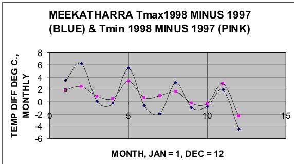
http://i260.photobucket.com/albums/ii14/sherro_2008/MeekaJ.jpg?t=1270553138
The four-peak difference graph is a feature of many of the similar exercises I have done at Australian stations. To date, I have been unable to find a clue as to mechanism derived from timing at different locations. Has anyone found monthly regularity? Can anyone show where the lad hot spot)s) started and how fast they spread? I would think this is rather fundamental to the understanding.
For interest, I have done a similar exercise on the UAH data in year 2008 form. There seem to be 4 lobes again, or at least 3 1/2, with the high amlpitude curve being over tropical ocean.
http://i260.photobucket.com/albums/ii14/sherro_2008/uahcolor.jpg?t=1270553226
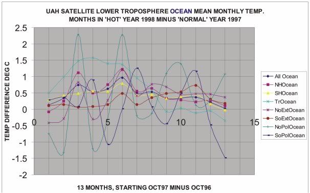
Please be aware of the limits of subtracting just one year from another. The aim of these graphs is not to explain, but to arouse curiousity.
Lucia,
My Mug needs some stain removal. Does your mug business take care of that? I’m sure mine is still under warranty. 😉
Andrew
Andrew_KY
All fulfillment/ warranties etc. are through CafePress. Have you tried filling the mug with chlorox bleach? (The inside of mine also has coffee stains. )
Re: Geof Sherrington (Apr 6 05:29),
Strictly speaking, if I understand this correctly, there should be no additional heat from an El Nino. What happens is that the heat distribution changes and the result is a change in the average surface temperature, but no change in the total system heat content.
DeWitt Payne (Comment#40002): An El Nino can discharge significant amounts of heat from the tropical Pacific. Refer to the ~0.4 GJ/m^2 drop in tropical Pacific OHC during the 1997/98 El Nino. And note how quickly the La Nina recharges the tropical Pacific OHC:
http://i36.tinypic.com/eqwdvl.png
Graph is from this post:
http://bobtisdale.blogspot.com/2009/09/enso-dominates-nodc-ocean-heat-content.html
The heat released by the El Nino is transported poleward, raising TLT anomalies outside of the tropics. Refer to the following Hovmoller available from RSS. Note the lagged rise in TLT anomalies outside of the tropics during and after the 1997/98 El Nino:
http://i42.tinypic.com/2hfukjm.jpg
The updated version of that Hovmoller is found here, Figure 8:
http://www.ssmi.com/msu/msu_data_description.html
Note also how the elevated TLT anomalies in the mid-to-high latitudes of the Northern Hemisphere linger during the La Nina of 1998/99/00/01. Discussed that in this post:
http://bobtisdale.blogspot.com/2009/06/rss-msu-tlt-time-latitude-plots.html
And of course, as you noted, there are also the changes in atmospheric circulation which also cause changes in surface temperature. Wang (2005) “ENSO, Atlantic Climate Variability, And The Walker And Hadley Circulation” provides a detailed discussion:
http://www.aoml.noaa.gov/phod/docs/Wang_Hadley_Camera.pdf
And there’s Trenberth et al (2002) “Evolution of El Nino–Southern Oscillation and global atmospheric surface temperatures.”
http://www.cgd.ucar.edu/cas/papers/2000JD000298.pdf
Regards
Re: Bob Tisdale (Apr 6 15:03),
I shouldn’t have said no net change in heat content. The effect of an El Nino should be to lower total heat content somewhat and a La Nina to raise it. Absent other effects, though, shouldn’t the long term heat content series be stationary?
As I understand it El Nino simply is a heat transfer mechanism. It releases heat stored in the ocean to the atmosphere during times of low solar activity. La Nina absorbs atmospheric heat and transfers to the ocean during times of high solar activity. Natures climate moderating effect. This effect is still poorly understood and was essentially ignored by AR4 but the correlation is very high as I recall… 96% perhaps over the last 200 years??
ivpo
No. The correlation between surface temperature and ENSO has not been shown to be 96% over 200 years. Not …. even…. close….
I also don’t think ENSO is synchronized with solar.
If one is looking for the physical mechanism for how an El Nino or La Nina impacts global temperatures, it is through the out-going long-wave radiation in the Nino 4 region mainly.
As an El Nino is winding up, very significant tropical convection storms develop over the international dateline region / over the Nino 4 and Nino 3.4 region and the heat from an El Nino is, effectively, held in the atmosphere over a big enough area that it can filter out and impact most of the northern hemisphere at least (the southern hemisphere is not as affected).
This also provides an explanation for the lag affect as well. These impacts occur a month or two behind the sea surface temperature trends.
Out-going long-wave radiation over the Nino 4 region has been as much as 50 watts/m2 below normal over the past few months (smaller regions are 90 watts below the normal of 240 watts in total). This is the same pattern that occured with the 1997-98 El Nino (slightly bigger) and other El Ninos and the opposite impact occurs with a La Nina – out-going long-wave radiation can be 50 watts above normal. 50 and 90 watts/m2 are very big numbers.
http://cawcr.gov.au/bmrc/clfor/cfstaff/matw/maproom/OLR/ts.r11.l.gif
http://cawcr.gov.au/bmrc/clfor/cfstaff/matw/maproom/OLR/map.last3month.gif
1997-98 OLR Map.
http://cawcr.gov.au/bmrc/clfor/cfstaff/matw/maproom/OLR/ARCHIVE/map.3mths/19980101.gif
lucia (Comment#40040) April 6th, 2010 at 4:05 pm
No. The correlation between surface temperature and ENSO has not been shown to be 96% over 200 years. Not …. even…. close….
I also don’t think ENSO is synchronized with solar.”
Lucia,
Here is what I have on the correlation between solar activity and ENSO cycles. Unfortunately some are still behind a pay wall. These guys all see a strong solar/ENSO relationship with La Nina occuring near peak solar activity and El Nino during low solar activity. Did they miss something?
http://www.nat-hazards-earth-syst-sci.net/2/83/2002/nhess-2-83-2002.pdf
http://www.nsf.gov/news/news_summ.jsp?cntn_id=115207
http://www.agu.org/pubs/crossref/2004/2004PA001031.shtml
ivp0,
There seems to me to be a basic problem with the statement “with La Nina occuring near peak solar activity and El Nino during low solar activity”.
La Ninas and El Ninos occur far more frequently than just at the ends of the solar cycle. For example, we had a la nina in 2008, with low solar, and we have an el nino now, with high solar.
This is of course argument by single example, which is pretty worthless. But simply looking at the numbers here, which track el nino/la nina since 1950, you can see that there are often cases of la nina and el nino running into one another – evidence against the sun theory, and certainly evidence against a 96 per cent correlation over the past 60 years ….
I mean to say:
“For example, we had a la nina in 2008, with low solar, and we have an el nino now, with *low* solar.”
1954 minimum : la nina
1958 maximum : el nino
1964 minimum : el nino/la nina
1968-71 maximum : la nina/el nino/la nina
1976 minimum : la nina / el nino
1981 maximum : nothing
1986 minimum: el nino
1990 maximum : nothing
1997 minimum : el nino
2002 maximum : el nino
recent minimum : la nina / el nino
A simplistic and very rough analysis, of course, but no prima facie evidence of a link. Sometimes they match, sometimes they do not.
Re: ivp0 (Apr 6 23:20),
I don’t see any 96% correlations between ENSO and solar in that paper. I see 92% correlations between various ENSO metrics in table 1. That is, 92% between SOI and NINO 3+4 Of course those are correlated– but SOI isn’t solar.
Table 2 has some correlations between ENSO and solar indices. None are near 96%.
Where do you think you see r=0.96?
Allow me to clarify. I am not a solar physicist, I simply read a lot. My recollection of a 96% correlation was purely that; recall of a paper I read some time ago. The solar/ENSO connection theory was suggested over 20 years ago along with early predictions that our current cycle 24 would arrive late and stumble a bit. It has.
Since 2007 solar physicists have become keenly interested in historical solar activity cycle evidence and current solar activity to improve our understanding of this phenomena.
As I understand it solar activity is far more complex than the 11 year (actually 9-13) sunspot cycle. Discovery of longer cycles (Milankovich and Gleisberg being the most well known) including changes in solar wind, UV radiation, magnetic flux, and polarity reversal do suggest a pattern of influence over weather, ENSO, and climate. When a long cycle coincides with a short cycle there is an amplifying effect here on Earth. When a long cycle is out of sync with a short cycle there is a cancellation effect similar to wave cancellation. Sometimes ENSO will be magnified and sometimes nullified based on these converging solar activity cycles. While ENSO does appear to have a solar connection it is clearly not locked to an 11 year sunspot cycle. The recent studies I listed above are generally in agreement on this and with earlier studies suggesting a solar/ENSO connection.
Ivp0
Fair enough. It’s just that if the correlation was that high, it would be so obvious we’d all know it.
I think the paper you pointed to suggested a weak link between some solar thingie and ENSO. Maybe there is one. One difficulty with the claim in the paper is that there are so many ENSO metrics and so many different solar metrics that one might worry that there is a chance that the results are just spurious correlation from a fishing expedition. If the relationship is real, then the correlation will continue in the future and the results will be confirmed. Right now, I don’t know. But it seems you are correct that at this connection does appear in the peer reviewed literature– I wasn’t aware of that.
As I understand it El Nino simply is a heat transfer mechanism. It releases heat stored in the ocean to the atmosphere during times of low solar activity. La Nina absorbs atmospheric heat and transfers to the ocean during times of high solar activity. Natures climate moderating effect. This effect is still poorly understood and was essentially ignored by AR4 but the correlation is very high as I recall… 96% perhaps over the last 200 years??
funny, but even the completely debunked McLean paper only found a 81% “explanation with trop temperature. (page 16 of the pdf)
http://icecap.us/images/uploads/McLeanetalSPPIpaper2Z-March24.pdf
and that is after they removed the long term trend…..
Sod,
Sorry if I did not make myself clear. I was referring to a solar/ENSO relationship and not an ENSO/mean global temp relationship. The recent studies I listed are far more acurate then my memory but are in agreement with this theory.
Lucia and ivp0: A quick comparison graph of NINO3.4 SST anomalies vs scaled sunspot numbers:

http://i39.tinypic.com/2i97evq.png
@Alex: “If you find the hockey schtick reconstructions convincing.”
Alex, you have a tautology problem.
All reconstructions, whether based upon ice cores, tree rings, borehole data or some combination of the above, show that the unprecedented warming in the temperature record over the recent past is also unprecedented over the lat 1,300 years.
Hence, all scientific reconstructions have a “hockey stick” pattern, and Mann’s original study has been validated over and over again, and supplemented by other studies reaching the same conclusion.
The only reason to deny these findings is precisely because they prove unprecedented warming. Those, like you, who reject multiple lines of empirical data as “schtick” haven’t a leg to stand on. 😉
@lucina: “I’m confused.”
I have no doubt.
What I am suggesting, stripped of any attempt at humor, is that your obviously very firm grasp on the empirical fact of global warming stands in sharp contrast to the misleading, cherry-picked, downright absurd stuff you are marketing. You would never submit those sorts of graphs in your peer-reviewed work, I am sure.
You are of course entitled to peddle whatever you like; but I find the dichotomy remarkable; so I remarked on it.
Robert (Comment#40179)
“Alex, you have a tautology problem.”
Robert, you have a credulity problem.
Robert–
I think many of the things you wrote show that you are confused about what the mug shows. It shows the temperatures predicted by the models compared to what we observed, both on a common baseline. You seemed to suggest this is somehow “short term”. It is not. We would get the exact same deviation if we showed the full graph.
At the time of the making of the mug, the annual average models anomalies were higher than the observations. Now, nearly a year later they still are. I don’t read anyone clamoring to buy a new mug, and qualitively, new mugs would provide the same message: The models annual average temperature anomalies currently exceed the annual average of observed anomalies. If you want to make different mugs with ‘medium’ different time periods that mask this fact by making everything smaller — or make mugs with a longer time period which will show that, when set to a common baseline, the models under predict temperature back in 1900, thereby showing this tendency to show higher trends is exhibited when we use longer term graphs, you can go ahead and do so.
Of course this graph wouldn’t appear in the peer reviewed paper. One of the requirements is that graphs must be specifically connected to the exact point being discussed in the paper. This has nothing to do with whether or not the graph on the mug is “right”, “wrong”, or anything else.
If the potential market population is not completely satisfied with the design of the doggie dishes and coffee mugs, perhaps another approach should be considered.
How about you slap a pic of Miss March 2010 on a cup with the caption “Hottest March on Record”
People are funny aren’t they? Last time I checked it was still a free country with excellent first amendment laws regarding freedom of speech. It is your right to print anything you want on those mugs, mouse pads and dog dishes here in the good ol’ USA. I suppose if someone doesn’t like them, they won’t buy them. Enjoy!
ivp0-
I’d go further and suggest that if Robert wants to make some point, he’d be better understood if he made it directly. The fact is, if he tries to make similar graphics for mugs, the observations have been oscillating below the projections, just barely touching at the tops of strong El Ninos. GISS may touch soon– I suspect it will in a few months. Hadley is still well below.
We are all waiting to see if the observations ever manage to penetrate the multimodel mean and stay above for any amount of time (as they should if the multi-model mean is not biased high.)
But not-withstanding Robert’s suggestion, there is no particular need for a new mug yet. We may need one when GISS and Hadley break through the multi-model mean. I don’t think anyone will buy one–but at least at that point I can write a new haiku with a new question.
“The only reason to deny these findings is precisely because they prove unprecedented warming.”
Robert,
This is nothing but assertion.
You can do better. 😉
Andrew
‘How about you slap a pic of Miss March 2010 on a cup with the caption “Hottest March on Record‒
MikeC,
She Blinded Me With Science!
Andrew
Lucia,
Could you not do a ‘Lake Woebegon’ Special Edition mug for Robert?
Any unsold surplus could perhaps be sold to the Dept. of Education.