There has been a lot of productive work in surface temperature reconstructions over the last few months. We have refined our earlier approaches by incorporating factors like land/ocean masking and zonal weighting. We have also gotten access to a few differing sets of land and ocean data:
- GHCN and GISS STEP0 (GISS for short) outputs for land temps
- HadSST2, HadISST/Reynolds, and ERSST ocean surface temperature series
By looking at different combinations of these series as well as different reconstruction techniques, we can finally produce reasonably good replications of the three main global land/ocean temperature series, GISTemp, HadCRUt, and NCDC, using the original unadjusted data sources.

(click images to embiggen)
This post will be primarily concerned with looking at the effects of differing choices of land temperature series, ocean temperature series, and methods (particularly interpolation). It does not explore the effects of differing anomaly methods (CAM, RSM, FDM, or Least Squares Method) or differing gridding methods (e.g. 5×5 grids vs equal-size gridboxes), though one of the possible takeaways is that these choices are relatively insignificant in the results.
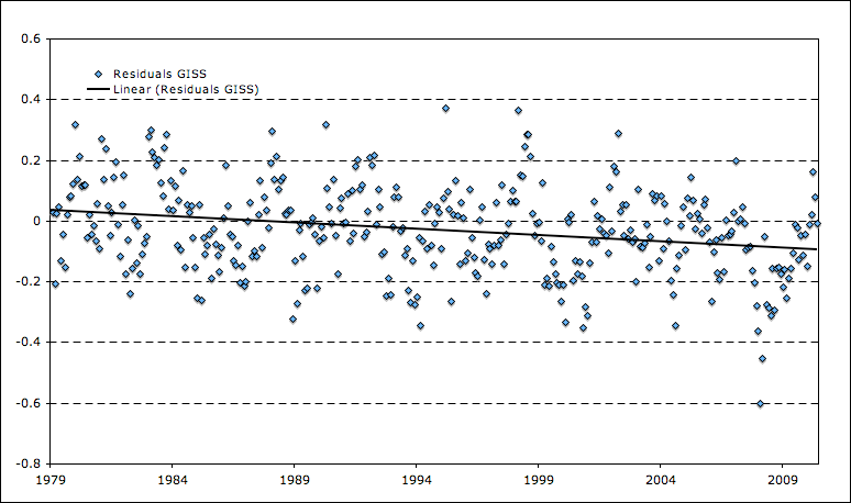
The image at the start of the post presents a replication of GISTemp using either GHCN raw or GISS land temp data coupled with HadISST1/Reynolds ocean data and the effects of interpolation. The latter factor is estimated by taking the difference between standard GISTemp values and those from a version of GISTemp run for only areas covered by HadCRUT, which effectively filters out the net effect of 1200 km interpolation. Its worth noting that the difference between using GISS Step 0 and GHCN raw land data is fairly negligible, despite the fact that GISS Step 0 presumably uses adjusted (rather than raw) USHCN data as well as Antarctic station data. Similarly, its notable that the GISS urban adjustments (via nightlights) don’t appear to have a large impact vis-a-vis the unadjusted data, a point that others have previously made.
There are four distinct sets of data we will be attempting to replicate:
- GISTemp
- GISTemp uninterpolated (e.g. Hadley area)
- HadCRUT
- NCDC
While all series by-and-large use the same land temperature data (GISTemp uses raw GHCN plus the full USHCN set for the U.S. and Antarctic stations, NCDC simply uses adjusted GHCN, and HadCRUT uses GHCN plus a small amount of additional non-public station data), they differ in their ocean surface temperature datasets. Specifically, HadCRUT uses HadSST2, GISTemp uses HadISST/Reynolds, and NCDC uses ERSST.

Here we can see all four major series, which are similar but differ a bit, particularly in recent years. Lets try to replicate each, starting with GISTemp run using the Hadley area (e.g. with no interpolation):

Next up is HadCRUT:

When using HadSST2, we see a bit of divergence early on in the series. This is due to the performance of my particular anomaly method when coverage is spotty, and manifests itself in HadSST2 because unlike other SST series it does not infill missing SST values.
Finally, we have NCDC:

To examine the effects of the choice of the ocean temp series, we can compare the results using each with the same land temp record:

Remember not to dwell too much on the pre-1915 divergence for HadSST2, as its likely an artifact of my approach. We can also zoom in a bit to recent years, as its the period that we are often most concerned with:

Over the last 50 years, the choice of SST series makes a small difference in the resulting trend. Specifically, over this period we find:
- HadISST/Reynolds    0.126 C per decade
- HadSST2Â Â Â Â Â Â Â Â Â Â Â Â Â Â Â Â Â Â Â Â Â 0.130 C per decade
- ERSSTÂ Â Â Â Â Â Â Â Â Â Â Â Â Â Â Â Â Â Â Â Â Â Â Â Â 0.117 C per decade
Apart from its choice of SST series, GISTemp differs from other temp series in its choice to use 1200 km interpolation. While this choice has little practical significance for areas with high station density, it does have a large impact on areas in the arctic with poor station coverage. Specifically, series such as HadCRUt and NCDC that do not including interpolation implicitly assume that areas with no coverage have the global mean anomaly, whereas GISTemp makes the choice to assign these areas an anomaly derived from the closest available stations. The pros and cons of this method is debatable, and the net effect is to somewhat increase the trend vis-a-vis no interpolation. The following figure shows the specific effects of interpolation on the global anomaly for each year:

What can we learn from this exercise? It seems that the choice of land temp series, SST temp series, adjustments (raw vs adjusted GHCN, USHCN, urbanization corrections via nightlights, etc), anomaly method, and gridding method does not make an immense difference; regardless of the way you put it together, the data will produce a global surface temperature anomaly similar to the ones in the graphs above.
For those interested, an excel sheet using all data shown in the charts in this post can be found here. An updated version of the spatial gridding and anomalization model with support for all different land and ocean temp series can be found here.
Update
Tom Fuller asked about how recent rates of warming compare to models. I know this is more Lucia’s territory, but I recently took the time to update my version of the chart so I figured I’d stick it in here:

Blue lines are individual model runs, red line is the multi-model mean. Black lines are the 5 temp series (GISTemp, HadCRUt, NCDC, UAH, RSS) and purple line is the temp series mean. While temp records to generally lag the multi-model mean by a bit, its not looking as discrepant as in those heady La Nina days of ’08.
To preempt some obvious objections, this post only deals with the reconstruction techniques using the same underlying datasets. If you want to compare (somewhat) different land temp data, Ron Broberg (http://rhinohide.wordpress.com/2010/05/23/gsod-global-surface-summary-of-the-day/) and Roy Spencer (http://www.drroyspencer.com/2010/02/new-work-on-the-recent-warming-of-northern-hemispheric-land-areas/) have both done some interesting initial work with similar results to GHCN globally.
I really like this work Zeke.
I’m thinking that the way you want to characterize this is “methodological uncertainty” So, lets say from 1950 to today,
what do methodological choices do to trends.
1. Your decision on which stations meet your base period requirements ( X years in the 1961-90 period)
2. decisions about how to treat unmeasured data
A. use global mean for artic
b. extraploate
c. use the SST under ice
d. leave empty
3. decisions about grid size
4. decisions about data sets.
You vary ALL those choices and you have an idea about how much uncertainty comes from these “defensible choices”
“HadISST/Reynolds 0.126 C per decade
HadSST2 0.130 C per decade
ERSST 0.117 C per decade”
Put another way, the difference in trends varies from .117 per decade to .130 per decade. Now throw the other variations in.
What choices lead to the lowest estimate and what choices lead to the highest estimate. The issue is that these “choices” are all reasonable, and one set of reasonable choices can lead to an estimate that differs by perhaps 10% or more. This uncertainty is never estimated in the various series.
Could I ask a naive question about climate change? Model assumptions seem to be that global warming will accelerate to a damaging rate of increase during this century.
As it has yet to happen, it would appear to me that every year that passes without this increase make the required level of increase more heroic in order for assumptions to retain validity.
We are now 10% through the century. I read (I think at Tamino) that if temperatures do not break records by 2014, that the models are in pretty big trouble.
Whether temperatures are increasing by 1.3 C per century or 1.17, that’s a long ways off from 3, 5 or 6. Don’t they have some serious catching up to do?
Tom,
But nobody expects a trend of 3, 5 or 6 C per century at this time.
Inasmuch as models are useful, one thing to look at here might be the individual model runs that did not show much warming over the last ten years. Preferably if those runs come from models for which we have multiple runs. See what they do, down the road. It may not tell you about reality, but it’ll tell you what that model does.
Tom fuller,
Prepare yourself for an onslaught of reasons why this doesn’t matter, and how rapid acceleration is just around the corner.
But yes, I think you are right; the warming is most likely substantially overstated, and this will become (comically) apparent over the next 10 years. The current rate of rise, and the lack of rapid heat accumulation in the ocean (ARGO), are hard to make disappear by waving your arms.
Tom Fuller,
Good question! Lucia might be better poised to answer it, since she is publishing a paper with James Annan and a number of other folks on the subject.
You should bear in mind that the rate of temperature increase is not projected to be linear over the century (this was Monckton’s mistake back in the day). If you want to compare observations to individual AR4 model projections, you can find them in the Model Data Norm tab of this spreadsheet: http://drop.io/0yhqyon/asset/temp-data-xls
I’ll also stick my version of ye olde multi-model comparison as an update in the bottom of the post.
Zeke,
“Lucia might be better poised to answer it, since she is publishing a paper with James Annan and a number of other folks on the subject.”
When will it be published and where?
“During the six years of in-situ measurements [2003-2008], an oceanic warming of 0.77 +/- 0.11W/m2 occurred in the upper 2000m depth of the water column.â€
http://www.euro-argo.eu/content/download/49437/368494/file/VonSchukmann_et_al_2009_inpress.pdf
SteveF—
It’s perpetually being reviewed. 🙂
Zeke,
Thanks for the spreadsheet. Do you and Lucia use the same set of models and runs from those models? Your post 1979 trend for the models (0.18C per decade?) is lower than I remember seeing before (about 0.2C per decade)
cce (Comment#46989),
That single paper conflicts with several others, as you are probably aware. The consensus seems to be (at least according to Josh Willis from JPL) accumulation in the deep ocean of ~0.1 watt/M^2. Several papers independently find little trend in the top 750 meters.
SteveF,
Should be the same, since I got the model runs from Lucia awhile back. Lucia tends to distinguish between volcano and non-volcano models, however, while my chart has them all lumped together.
Tom–
The trend for the multi-model mean using the A1B sres is indistinguishable from linear + small amount of noise during the first 20-30 years. We can’t compare 2050 data to anything about the models yet.
Do you mean “You bet” where he suggested a bet he would be willing to place? That article seems to have been deleted, but it’s still in cache. http://webcache.googleusercontent.com/search?q=cache:4QSqMJ7T69sJ:tamino.wordpress.com/2008/01/31/you-bet/+site:http://tamino.wordpress.com/2008/01/31/you-bet/&cd=1&hl=en&ct=clnk&gl=us&client=firefox-a
That analysis is not based on models though. I also don’t think he discusssed when records would be broken.
Maybe Gavin wrote something about breaking records? There probably is some half life for breaking records that can be computed assuming the models are correct. It’s not a very good way to test a model though.
I’ve done both.
Lucia,
RC’s chart of how frequently you’d expect (based on models) a new record temperature is in the same post as the one with the histogram of trends from individual model runs.
http://www.realclimate.org/index.php/archives/2008/05/what-the-ipcc-models-really-say/
Thanks Carrot!
lucia (Comment#46998) June 25th, 2010 at 3:22 pm
“I’ve done both.”
Does this change the slope of the trend line?
“It’s perpetually being reviewed.”
Can you better define perpetually? 🙂
Thanks, all–esp. Lucia and Zeke. Would I be correct in thinking that the wide range of light blue in that last figure are not error bands but differing ranges of the ensemble?
Tom,
Yep, each light blue line in the figure is an individual model run (or the mean of runs for an individual model). The error band of the multi-model mean will likely be a tad smaller (Lucia has calculated it before), though some folks (e.g. JA) dislike the idea that the mean of all models is necessarily more accurate than any individual model run.
Individual model runs. Each individual run has wiggle. You only recover the fairly smooth trend when you average them all together, because the wiggles are not in phase with each other from run to run, model to model.
Zeke,
About that – I took a look at that spreadsheet, and it does look like for the models that submitted several runs, there is only there an average. Is that correct? If so, that’s throwing away some of the most interesting information, by not having the individual instances of those models there. Or am I misreading?
Carrot,
You are correct, models that submitted multiple runs are only represented by a single mean. You can see that in the GISS Model E runs, for example, which are not as noisy as they should be due to averaging:
http://i81.photobucket.com/albums/j237/hausfath/Picture443.png
I wonder if anyone has a spreadsheet handy with all the individual model runs?
Zeke,
“To preempt some obvious objections, this post only deals with the reconstruction techniques using the same underlying datasets.”
thank you for the clarification. I was about to yell about your post statement “using the original unadjusted data sources”.
kuhnkat,
Well, GHCN v2.mean -is- about as raw as you can get (ocean temp data is more complicated due to bucket corrections and infilling done in non-HadSST2 datasets). While they might have a large effect for individual stations or even regions (e.g. the U.S.), its pretty clear that the net effect of adjustments is small globally for the land temp record by any measure.
Zeke,
each model is run with different assumptions. Could you please explain how it is OK to average these when the outputs from one model does not exist in the world of the other models?
How can you average different worlds to have a meaningful result in THIS world?
Zeke,
“…its pretty clear that the net effect of adjustments is small globally for the land temp record by any measure.”
You shouldn’t have a problem getting the raw data and proving this then?
kuhnkat:
I think we’ve been through this.. when we say ‘adjustments’, we’re talking about starting with monthly means, and doing things to them to correct for station moves, UHI, TOB, etc, etc. Usually when saying raw, it’s the unadjusted monthly means being discussed. And that is the starting point for most of Zeke’s analysis. If by ‘raw’ you mean the lab books of the volunteer from 1950 who was manually recording observations,then no, that isn’t what Zeke has.
kuhnkat,
Here is GHCN v2.mean compared to v2.mean_adj:
http://i81.photobucket.com/albums/j237/hausfath/Picture446.png
Note that GISTemp does not use adjusted GHCN data; rather, they do their own urbanization adjustment which has a much smaller effect than using v2.mean_adj would.
“Tom,
But nobody expects a trend of 3, 5 or 6 C per century at this time.”
JFC! I’ve been out there wrestling my denialist friends to the ground, telling them that we were headed for runaway temperatures and planetary hell…. and now our claim is: “no one is saying… 3, 4, 5 or 6”. I thought we agreed that the (IPCC’s) upper limit was determined to be “conservative” and everything pointed to much, much worse effects of warming. What the hell happened to all the headlines: “Global warming accelerating faster than predicted”? For God’s sake, throw me lifeline here…please tell me it’s going to get hotter than <2* century!
1) The ocean does not end at the first 750 meters.
2) http://sealevel.colorado.edu/current/sl_ib_ns_global.jpg
3) Energy is either melting land ice, warming the oceans, or both.
Zauber,
We should all be hoping for no warming at all, but alas, carrot was just pointing out that no models predict linear warming over the century; rather, the rate of warming is projected to increase with increased emissions, decreased aerosols, etc. Even the most pessimistic scenarios (eg A1F and A2) are indistinguishable from A1B or B1 over the next decade or so.
cce (Comment#47026),
Of course the ocean does not end at 750 meters, but the consensus appears to be that the extent of deeper warming is not great.
The sea level trend is reasonably consistent with measures of increase in ocean mass (GRACE) plus a modest ocean heat accumulation.
The energy needed to melt a quantity of land bound ice equivalent to a couple of millimeters of increase in sea level is extremely small compared to Earth’s energy budget. I suggest you do the heat calculation (using the heat of fusion of ice) and verify the required annual imbalance in watts per square meter. If you have doubt about how, I can show you the calculation. But in any case, nearly all net imbalance in energy for the earth must end up in the ocean.
Another naive question, then. (I think I know the answer but I want to be sure I can explain it in plain English to my readers.) The model mean is dead center on today’s temperatures. I am assuming that is because the models are fed current temperatures and then re-run, not because they actually said eight or nine years ago that the global mean temperature would be what it is today. Is that correct?
The model projections are frozen in time. So you can assess the runs for AR4 now, or at any time in the future, just as the runs were when they were published.
PS, Fuller, if you’re looking for the sceptic spin to give your readers on your “dead center” observation, your instincts need re-calibrating. What you’re looking for: it took an El Nino to get the temperatures up there, and now the temperature will fall away from the model mean again as the El Nino passes.
Time will tell.
By the way, kudos to Zeke for lining up the projection anomalies with the observed anomalies on the same baseline. I love it when somebody (I think Monckton’s done this) arbitrarily chooses a high point in the observed record, some El Nino year, and then extrapolates a line from there at 0.2 C/decade (or I think with Monckton, even a higher trend, trying to linearise out the acceleration projected towards the end of the century)
Tom,
To elaborate a bit: the AR4 models were initialized from 2000 (e.g. they use no real forcings post-2000, but generally do use real forcings pre-2000). That said, the models were finalized in 2005, so its possible, albeit perhaps unlikely, that some 2000-2005 validation influenced model selection.
Also, you seem to somewhat misunderstand how climate models work. Climate models are not fed or fit to any historical temperatures at all; rather, they take discrete forcings (CO2, other GHGs, aerosols, albedo, solar, volcanoes, etc.) and feed them into a coupled atmospheric/ocean general circulation model. Gavin wrote a reasonably good primer on the subject a few years back: http://www.giss.nasa.gov/research/briefs/schmidt_04/
As far as being centered on today’s temperatures, well, its just coincidental. It also depends a bit on what baseline you use (my chart uses the same 1979-1998 baseline that UAH/RSS use).
Thanks to both of you–glad I asked. More study in order. The sad thing is I think I read Gavin’s primer a year ago and just forgot it.
In fact, I wrote about the models’ success in modelling the 0.5 C drop after Pinatubo based on that.
Zeke:
James Annan has a series of posts on the use of the multi-model mean. (See e.g. this.)
I’ve been pretty critical of the use of multi-model means in climate science for a while (other than when adopted as “standard practice”), so it is cheerful to see somebody in the field explore what is wrong with them. … and nice to give a good shout out to James’ Empty Blog too.
Tom
No. These models were not feed current temperature and re-run. These are the same exact runs that were run were used to make projections based on SRES with an official publication date of 2001. If you smooth the data with a 12 month filter to take a little noise, the obs. have been hitting or slightly exceeding the multimodel mean at the top of earth el nino’s and been well below during la nina’s.
Owing to the math involved in trends, the least square trends computed for starts years going well back remain below the multi-model mean trend. That is to say: The obs. appear to be oscillating around a lower trend than the multi-model mean. But yes, near the tops of El Nino’s the absolute temperatues are near the mean that we would expect averaged over many hypothetical El Ninos and La Ninas.
I usually use Jan 1980-Dec 1999 because the AR4 projections are given relative to that baseline. This choice “forces” agreement on a during that baseline period. It doesn’t force the trends to match, but it forces the average for models to match the average for the obs. So, it’s important to keep that in mind when comparing.
Tom, we could make the models look worse based on anomalies using a baseline of 1900-1920. I’m not sure which choice of baseline gives the absolute worse possible appearance.
Huh, and here I was, thinking that Zeke’s link to Gavin was non-responsive to Fuller’s question because the link doesn’t discuss how you might spin up a coupled model.
That’s not a simple issue, in itself – lots of nuance and difficulty there. You need to start the model off with some physically reasonable condition for the ocean. One way of going about it is to seed the oceans with something taken from recent observation, then run the model backwards through the historic forcings to get back to a pre-industrial state, let it run there for some hundreds of years to let it stabilise a bit, then step forwards again in time using the historical forcings and finally the scenario forcings for the future.
So the model results are whatever they were. But as I alluded before, you can play games with how to display the resulting anomalies. Zeke did it right by showing actual model results including the hindcast period, overlaid with observation, with everything normalised to the same baseline.
Pick a five year span around that hump around 1940. That should give a decent offset between observation and model for all other times.
Tom Fuller (Comment#47029) June 25th, 2010 at 5:54 pm
The current generation of models are not fed temperatures, there is not point in doing so. New generation models which are not mature yet are attempting to use temperatures. Your assumption says more about your prejudices than the models.
And back to what Zeke actually did. You tell us that this is not a study of different station combining methods, etc. Fine, because that doesn’t seem to matter much so long as you aren’t named EM Smith.
But that said, you didn’t tell us what you did. I’m assuming it’s the same as last time you summarised that – basically the CAM, with 5×5 grids was it? I’m a little thrown off because of the use of ‘we’ in the first paragraph, where ‘we’ includes people using methods different from yours.
Carrot,
Writing papers tends to engender an unfortunate habit of never using “I”. But yes, its the same 5×5 grids and 1961-1990 CAM as before. The only real changes are using new datasets (GISS Step 0, various SST sets) and a land mask. Still gets us pretty close to each actual temp record.
Carrick,
Yep, I’ve followed a lot of JA’s stuff on his blog. It makes intuitive sense, since not all models are created equal, and the IPCC is subject to some silly political pressures to avoid favoring any particular modeling group, even though some are undoubtedly better than others. Within the context of multiple runs of the same model, there is much more to be said about the validity of a model mean, though it still won’t capture underlying variability.
Thanks, bugs. Try and learn something, get kicked…
I think this gives a nice overview, not just of these new initialised models, but of general issues of weather vs climate, etc.
http://journals.ametsoc.org/doi/abs/10.1175/2009BAMS2778.1
If you’re going to try to initialise the model from current observations and go forwards from there, you’re going to need good data on the current state of the oceans down to some depth, and not just the surface – is that the basic lesson so far?
Zeke:
JA has an argument that goes beyond just all models not created equal. In the above link he proves that
When you average models together, their variance is reduced, and that improves the apparent agreement of model to data, regardless of whether or not the mean of the models is “centered on truth” (which in general it is not or at least is not provably so).
I think JA would say (and I would agree) there is little or nothing positive to be said about averaging models together.
In other fields (where we are blessed with some models that actually work), the models that replicate the data are said to be “validated” and those that can’t (in some statistical sense) are said to have “failed validation”.
If none of the models can separately describe the data, the appropriate interpretation is “either the models are wrong, the data are wrong or both”. Combining models is just bad science.
Tom Fuller (Comment#47058) June 25th, 2010 at 9:48 pm
You do plenty of kicking yourself.
Steve,
I see three possibilities based on observations:
1) Melting of land based ice is dramatically higher than models predict, while OHC increase remains modest.
2) OHC continues to rise rapidly
3) OHC and melting of land based ice continue to increase, their combination resulting in SLR at the upper end of model scenarios.
Rergadless, I expect little opportunity for comedy in the coming years.
The increase in OHC since 2003 has either been slight or large (coinciding with the transition from solar max to solar min, I might add). Given estimates of past OHC changes, I don’t see the last six or seven years in any way inconsistent with expectations. There have been several “plateaus” in the data, followed by rapid increases, so if you are expecting to laugh yourself silly over the next ten years, history is not your friend. The fact is that 2003 to 2009 is the warmest or among the warmest seven year period in any dataset regardless of the instrument or methodology (ohc, land surface, sea surface, satellite, radiosonde). Apparently, no matter how warm it gets, warming always occurred in the past, but is never occurring now.
p.s. Could you please point me to papers that establish the deep warming consensus. Thanks.
Thanks, bugs. Try and learn something, get kicked…
.
in general, you should not write posts about stuff, which you do not understand.
.
Zeke knows a lot about the things, that he writes about. but he doesn t draw wild conclusions from them.
.
your questions demonstrated a serious lack of understanding of the models subject. yet you are planning a post. and you often draw pretty wild conclusions.
Carrot Eater:
“One way of going about it is to seed the oceans with something taken from recent observation, then run the model backwards through the historic forcings to get back to a pre-industrial state, let it run there for some hundreds of years to let it stabilise a bit, then step forwards again in time using the historical forcings and finally the scenario forcings for the future.”
“let it run there for some hundreds of years” Would this be running a loop while adjusting variables (forcings) – loop period being hundreds of years?
Any “hundreds of years?”
Surely not let the machine crank for hundreds of years real-time?
sod wrote:
“in general, you should not write posts about stuff, which you do not understand.”
Can you at least sometimes heed your own advice?
j ferguson
The forcings are left alone at the pre-industrial settings for those hundreds of years. You leave it alone, let the model adjust to those forcings; you can then publish a control run where the model just keeps integrating forwards with the pre-industrial forcings, and finally you cue up the historically observed changes in forcings. Starting the 1850-present day run at different random points in the control run will then give you different wiggles through the 20th century and into the future.
Mind, what I’m saying may not be generally true for all groups. Everybody has their way of spinning up. Nor am I a climate modeler, so what I’m saying may not be entirely accurate…
Carrot Eater:
you are quite helpful here. Next question:
“you cue up the historically observed changes in forcings.”
Does this mean a switch from pre-industrial forcings to “observed” forcings? would they be inserted or substituted as the “observations” become available? MIght pre-industrial forcings if not “observed” be hind-cast for insertion in the models.
Are these questions nuts?
Would all (or most all) become clear if I read Gavin’s paper on this subject?
bugssodYou are not the admin here. You are not a co-blogger. Tom Fuller asked a question beginning with “Another naive question, then.” People have answered his question, and better yet, the question fostered further discussion about spin-up.
Please do not try to interfere with this process, which brings forward good results.
Comments on ‘replication’
.
we have: same code (GISTEMP), refactored code (CCC), and independent code (Zeke, Nick Stokes, JeffId/RomanM, Chad)
.
we have: same CLIMAT surface data sets (GHCN unadj and adj) and (coming soon) semi-independent SYNOP surface data set (GSOD) (I consider the GISTEMP STEP0 to be a variant of GHCN)
.
we have 3 ocean data sets: HadSST2, HadISST/Reynolds, and ERSST
.
As far as I know, there is one more instrumental record to consider: METAR
.
Other than that, the next step is to consider instrumental / satellite integrations. Of course there is MSU lower troposphere channels. But is there anything else up there doing something that can be used to infer surface temps? Will cryosat be able to provide better polar coverage that can be integrated.
.
BTW – I’m thinking that GSOD is a subset of the ISH dataset. The fact that ISH is only available on .gov and .mil sites makes me tend to believe that there are Intellectual Property rights issues associated with it and that GSOD is the IP-free subset. Just guessing.
j ferguson
I don’t completely understand your question. They integrate for a long time with a constant set of forcings, corresponding to the sun/volcanoes/CO2/aerosols/etc of 1850 or 1880 or whatever. Year after year after year of simulation at 1850 forcings.
Then, when you feel good and ready for it, you say OK, I’m declaring my model to be at “1850” now, and when the model has stepped forward to “1851”, I’ll change the forcings to 1851’s forcings. And so on.
To do this, you need a historical record of forcings to trace through, as you advance from 1851 to 1852 to 1853 and so on. For the GISS model, that trace is here (they start 1880):
http://data.giss.nasa.gov/modelforce/RadF.gif
http://data.giss.nasa.gov/modelforce/RadF.txt
The groups publish the integration from “1880” to now and beyond, but they may also publish some of the control run of perpetual “1880”, as that also tells you interesting things about the model and how realistic it might be.
Carrot Eater,
you understood my question better than I did. Thanks for your patience, Now to get back to rebuilding M/V Arcadian’s waste treatment system which is SWMBO’s item for today’s menu.
I just learned a new acronym
Another naive question, then. It was my understanding that the last generation of general circulation models did have parameters regarding an assumed sensitivity as inputs, and were periodically tweaked to align with atmospheric performance. Is that another old wives’ tale? Would anybody be able to characterize this generation of models in terms of what was learned?
In fact, two: I have also heard that any nation in UNEP can include a model of their creation for inclusion in deliberations, and that there is in fact a wide difference in fitness for purpose. Another old wives’ tale?
I’m starting to feel like Lt. Colombo here–just one more question, then–I have also heard that the very earliest models, tracking just a few variables, performed quite well. Another old wives’ tale?
Tom
Sensitivity is not assumed as an input in models.
It is a result of parameterizations for things like clouds, effect of the fraction of water vapor in a grid cell on radiation, rate of mixing in the oceas &etc. Some parameterizations have strong foundation in phenomenology; some have less support. All are affected by the fact that models have coarse resolution. (So, for example, if the model only computes an average level of water vapor for a huge grid cell, the magnitude on earth would vary across the cell. This could have consequences if you try to estimate the effect of water vapor on the average of anything else in the cell.)
After modelers pick all these, they can run C02 doubling test cases and determine the sensitivity for this model. They can also run tests to discover time constants for their model. Modeler do do these things. (That’s how they know their models result for sensitivity. 🙂 )
What modelers can still do even after this is pick forcing that will make their model better match 20th century temperatures. So, if you know your models sensitivity and time constant, you can anticipate whether your model will need to be driven by higher and lower forcings to better match 20th century values. Modelers do select forcings withing the range that has experimental support– but that range is wide.
Kiehl(?) found that there is a correlation between forcings selected and sensitivity of models and that correlation is in the direction that would result in better matches of 20th century than if they just pulled forcings totally at random from the range given experimental support.
Of course that doesn’t mean the modelers actually picked their forcing based on the known sensitivity. OTOH, it’s quite a coincidence.
lucia (Comment#47092) June 26th, 2010 at 7:12 am
“bugs
in general, you should not write posts about stuff, which you do not understand.
You are not the admin here. You are not a co-blogger.”
I think the objectionable comment came from sod, but bugs should probably also read your reply.
Is that then where Lindzen’s comments about using aerosols to make figures add up come from?
Models have parameters, for sub-scale physics and for lightening the computational burden. But there is no such thing as a parameter which says “because of my current value, the sensitivity is 3.8, so if you want a different ‘assumed’ sensitivity, tweak me!”. Sensitivity falls out as an output, not an input. What parameters are there are either mathematically obtained, or bounded by observations relevant to whatever process you’re trying to capture by parameterisation. Say if you have a cloud parameter, then you’ll constrain its values from observations about clouds. Of course, not every parameter can be well constrained by observation, nor every subscale physical process be well described by parameterisation.
Now since you’re interested in sensitivity, that brings up a question, maybe in the direction you were headed: Are there some parameter values or parametisations which are not well contrained by observation, yet which have some substantial impact on the sensitivity that falls out of the model?
I’m pretty sure I’ve read a paper that did a sensitivity analysis (no pun intended) of that sort.. anybody? I can’t quite place it.
A related question would be whether the parameterisation can be successfully extrapolated to a climate that’s headed someplace different from how it is now. Hence there’s value in seeing how your model behaves when you try to recreate ice ages and other events far outside the range of today’s observations.
The radiative-convective models from the 1960s and 1970s did pretty well, for what they were. Manabe, Wetherald, Ramanathan. These models were able to predict things like stratospheric cooling. But there’s only so much you can do with them. I guess it depends on your expectations.
cce (Comment#47064),
Those are the three possibilities, of course.
Measures of increasing ocean mass and OHC do suggest that most of the recent rate of sea level rise has been due to melting of ice, not OHC increase. This makes some sense to me; current average temperatures are in fact about 0.5C warmer than in the early 1970’s, and significantly more than 0.5C warmer at high latitudes, so there is no surprise that the glacial melt rate is higher and contributes significantly to the rise in sea level. The contribution of glacial melt ought to remain higher, even if the temperature trend were to remain relatively flat, since the rate of melt depends on temperature, not the rate of rise in temperature.
If you go to Pielke sr’s blog and search on Trenberth or Willis you can find some discussion about the consensus on OHC.
I assume from your comment that you understand the heat required to melt enough ice to raise the sea level by a few mm per year does not itself represent a significant energy imbalance; any significant imbalance has to show up as increased OHC.
carrot eater (Comment#47113),
I can’t remember the author (maybe others do), but I think you are referring to the study which compared the aerosol forcing contribution used in a number of well known models to the diagnosed climate sensitivity from those models. The paper showed very clearly that there was a relationship: models that diagnosed high sensitivity assumed high aerosol forcing, models that diagnosed lower sensitivity assumed lower aerosol forcing.
Which of course just means all the modelers tweaked either the assumed aerosol effect or the model to get concordance with the known instrument record. Nothing nefarious going on, but it does show that different models (all based on the same basic physics) are in no way all correct, even if they all “hind-cast’ reasonably well.
Tom Fuller: Yes there is inevitably some ‘tuning’ of climate models and/or their assumptions about aerosols to make them match the historical temperature data.
No, that isn’t what I was talking about, but maybe what you’re talking about is this one?
“Why are climate models reproducing the observed global surface
warming so well?”
Knutti, GRL 2008.
Re: Zeke (Jun 25 18:33),
Also, you seem to somewhat misunderstand how climate models work. Climate models are not fed or fit to any historical temperatures at all; rather, they take discrete forcings (CO2, other GHGs, aerosols, albedo, solar, volcanoes, etc.) and feed them into a coupled atmospheric/ocean general circulation model. Gavin wrote a reasonably good primer on the subject a few years back: http://www.giss.nasa.gov/resea…..chmidt_04/
As far as being centered on today’s temperatures, well, its just coincidental. It also depends a bit on what baseline you use (my chart uses the same 1979-1998 baseline that UAH/RSS use).
I would say I have an Acropolis for sale, if it were not a black humor joke, with the way the greek economy is going 🙁 .
The plot you give in the update, has a 1C range for all these models.
The range appears because of choosing initial conditions to the multitude of parameters entering in the GCMs different for each run, so as to “simulate” the chaotic initial conditions in the real world.
Now as far as probabilities are concerned, any path within that range is equally probable, so one could even have diminishing trends and still talk of the models agreeing with the future.
What is the guarantee that the initial condition parameters were not chosen with an eye to back fitting the known temperature anomaly records? Out of all the phase space of initial conditions, how were these chosen that give the path close to measurements? Certainly not randomly.
The fact is that the GCMs do very badly on clouds, and even on temperature itself, being off in the absolute value. One is allowed to be suspicious that the anomalies were targeted for a complicated by proxy fit.
For weather predictions one allows for present conditions and walks the parameters to the future, and that is fine.
Except the predictions are valid for a limited number of time steps before they diverge from real life, five days is a great hit, In my region sometimes even in a day the solutions diverge.
I expect the same problems with the GCMs morphed into climate predictors, and would not bet on their predictions as far as 30 years,which is the usual time interval for weather to turn into climate.
Thanks, all, for your help and kind words of encouragement. The result is a bit more vanilla than I had hoped, but here is what I came up with: http://www.examiner.com/examiner/x-9111-Environmental-Policy-Examiner~y2010m6d26-Global-warming-This-magic-moment
Obviously, if there are errors of fact in this I would be happy to hear about them. But it’s vague enough that it will end up being differences in opinion, I suppose.
Yeah, that’s vague enough that there’s nothing really right or wrong about it.
Perhaps one other point for you, Fuller – when Zeke said it was a coincidence the two series matched, it was true in a different regard, as well.
Even if the models are doing a good job, you would not necessarily expect the observed global mean temp anomaly to match the multi-model multi-run mean at any given point in time. Reality wiggles. The multi-model multi-run mean wiggles much less. This is implicit in what Lucia and I wrote above, and it’s also implicit to what you wrote, but perhaps it’s worth making explicit. In other words, in this case, a broken clock might be correct twice a day (at least for a decade or two), but a working clock will also appear wrong most of the day, in terms of the observation you made.
Tom,
I’m not sure which comments, but if Lindzen said something like that, it’s probably from the fact that modelers can select from a range of forcings and there is some evidence to suggest they very well may select those forcings that result in better agreement for temperature rise during the existing instrumental period.
Clouds. (Of course it depends on the precise definition of “not well constrained” and “substantial impact”.)
annaV
Nothing guaratees this, but since the runs for the AR4 involve a long “spin up”, this would be very, very difficult. I don’t think anyone suggests that the IC’s at the beginning of the spinup are chosen in this way.
So what TSI reconstruction is used in the models quoted? If clouds are not well understood or measured prior to ~2002, why then assume any model can hindcast or be used as a predictive tool to any degree of confidence?
Also, how can the upper 2000m of ocean warm without being detected in the upper 700m? And how can the upper 700m warm (the 2002-2003 jump) without being detected in the SST?
Just wondering.
carrot eater, where has the stratospheric cooling taken place that agrees with GCM based on GHG?
“carrot eater, where has the stratospheric cooling taken place that agrees with GCM based on GHG?”
In the stratosphere?
Ramanathan et al. often refer to aerosol “masking” of CO2 warming. The reason behind this seems simple: that GMST does not seem to have kept up with CO2 forcing. If one assumes that CO2 forcing and the temperature records are both correct, then a third factor must account for the lack of response. Aerosols are not well constrained and represent a potentially large forcing.
The forcing estimates, at least according to IPCC AR4, can be seen in this chart:
http://i23.photobucket.com/albums/b370/gatemaster99/forcings.png
For the so called “direct effect”, the uncertainty is sufficiently large that almost the entire effect could be eliminated, or it could be nearly double the mid-range estimate. The uncertainty is +-80%, so that itself is not well constrained. The uncertainty for the indirect effect is also very large, ranging from ~43% of the mid-range estimate, to ~157% of the “best estimate”.
Making matters worse, is that this is just the uncertainty of the forcing magnitude. My understanding is that the time history is essentially unconstrained before ~1970. The time history of GISS’s forcing estimates for aerosols seems extremely arbitrary-it goes down approximately linearly until about the 90’s, as I recall.
Re: Robert (Jun 26 14:05),
Sometimes my english grammar is not up to snuff. Let me rephrase:
Where is the data that supports GCM predictions of a cooling stratosphere due to rising GHG, namely CO2?
Can you understand that?
oliver:
Kind of like this:
GISS-Model E forcings.
As I understand it these forcings are the inputs to the model (they’ve already converted CO2 concentration to W/m^2). And they pretty much know how much forcing you need to get e.g. 3°C/doubling CO2 versus 4°C/doubling. In a “first principle” model, you’d only have the radiative forcings and the rest would be taken care of by the water vapor feedback for example.
I also think it’s the case that the aerosols have been picked to “tune” the model to give the right temperature curve over the observation period.
I don’t think it’s quite accurate to describe these numerical simulations as “blind” to the temperature record.
Carrick
Maybe you mistyped, but this sentence doesn’t make any sense at all.
Unless you’re trying to say there’s discrepancy between models on how much forcing you get for a given change in CO2 concentration. There is a bit of spread in that, but I think they’re all pretty much around what you get from the simplified logarithmic equation.
CE, it is my understanding that the amount of forcing you get for a given CO2 concentration does change between models.
Am I wrong?
Isn’t this the primary way you get “high sensitivity” models versus “low sensitivity” ones?
DG, are you looking for something like this?
MSU satellite lower stratosphere:
http://vortex.nsstc.uah.edu/data/msu/t4/uahncdc.ls
Radiosondes:
http://cdiac.esd.ornl.gov/trends/temp/angell/graphics/global.gif
http://cdiac.esd.ornl.gov/trends/temp/angell/angell.html
Note, however, stratospheric cooling due to increasing CO2 is complicated by changes due to changing ozone.
Somewhat, but not really worth talking about – that’s not where the real differences are. This part’s the easy part – radiative transfer. At some point years back some of the model groups actually did an intermodel comparison on this one, to root out errors because they really should more or less agree on this aspect.
Absolutely not. Those differences are in the feedbacks, which have nothing to do with how you translate from a change in CO2 concentration to RF. It’s how the model responds to that RF that matters.
the mid strat is where you get a cooling that’s more CO2-related than ozone-related. lower strat, ozone is confounding. That said, I think I heard the ozone-related effect is letting up, with the ozone layer slowly recovering.
if you want a graph of model results compared to observations.. eh, I don’t know where there is one online. The lower strat is still a bit messy; anybody?
In any case, I think it’s impressive that any strat cooling was predicted by models back in.. eh, late 60s/early 70s I think..late 70s at the latest, given how subtle a mechanism it is.
Can someone tell me why Pat Michaels, John Christy and Joe D’Aleo are commenting on my post about this? And why they’re disagreeing with Zeke’s representation above?
Cherry-picked baseline. Er, gooseberry packed crust.
===================
You can see the stratospheric cooling clearly identified in Manabe and Wetherald, 1967
http://www.gfdl.noaa.gov/bibliography/related_files/sm6701.pdf
Fuller,
Point 2 is the predictable one and related to my comment about the broken clock and working clock; it’s perhaps why nobody else looked at Zeke’s graph the way you did. Comparing individual points doesn’t tell you much of anything about how accurate the model mean trend is going to end up being. At some times, in the first say 20 years, the two series will just happen to intersect, even if the trend eventually turns out to have been only 50% of what was predicted. Most of the time, the two series won’t intersect, even if the model mean trend was spot on.
The other point about baselines.. eh. Use a different baseline, and the (constant) vertical offset between the two series will change. I don’t see anything particularly wrong with Zeke’s choice. If you’re motivated to shop around for the baseline that maximises the visual difference, then maybe you’ll be upset and suggest a baseline that makes it look worse (for that I suggested the period around 1940 if you have the 20th C run data on there; Zeke does not). The baseline should just end no later than when the model switched from observed forcings to the projection scenario.
I wonder if the people upset about Zeke’s baseline said a word about Monckton’s ridiculous graphs that purport to do the same thing (model-ob comparison)
Just noting that Zeke’s IPCC AR4 model forecast chart has a little downdip in the growth rate per decade right now (which makes it a little hard to compare to the current temperature trends) [thanks for making the data available Zeke].
The 2009-2010 growth rate in the models is only about 0.18C per decade while it was higher at about 0.25C per decade around 2000 and will reach over 0.30C per decade by about 2035. [you can’t get to +3.25C by 2100 at only 0.20C per decade].
You can see this in an adaptation of Zeke’s chart here (hope you don’t mind) which simulates the IPCC A1B Scenario out to 2100.
http://img651.imageshack.us/img651/2783/schart.png
Thanks, CE, that does make sense. Is it then the case that they treat all of the forcings the same? So regardless of the forcing, it would get the same water vapor and cloud feedbacks?
Sorry for the noob questions, but I’ve still never found an exact statement of the mathematical formulation used in modern codes (the closest I have so far is the Hansen ’83 reference).
Tom, you kind of focused on the “right in the middle today” aspect of the graph. They are pointing out that the real world trend is lower than the modeled trend which is not blazingly obvious in Zeke’s chart since he did not draw trend lines for the models or the real world. I don’t think anyone around here is denying that. The real world trend has been a bit lower than the trend in the modeled means. More so if you stop counting at 2009, less so if you include 2010. Is it enough to discredit the models? Not yet. Not enough time, not enough divergence. But if the relatively ‘flat’ temps over the last decade persist into the next, then the real world will discredit those models.
Tom,
The baseline shouldn’t matter that much; it’s effectively the same baseline that Lucia uses for her graphs. Ron is correct that a chart showing trends would better highlight the differences; spaghetti charts with noisy data are rather bad at showing small to moderate divergences. That said, observations and model are not -that- divergent.
Feel free to play around with the data in the spreadsheet I linked earlier, change the baseline (though you’d need to dig up additional model data to create an earlier baseline), and create a chart showing the difference between various temp series and the multi-model mean.
Carrick
That is a great, great question, because most lay skeptics seem to have an extremely wrong answer to it, while most lay consensus types have a slightly wrong answer to it.
The first order (but somewhat wrong) answer is: yes. all forcings are created equal. 1 W/m^2 of CO2 is the same as 1 W/m^2 of solar. My toy single column single slab atmosphere model doesn’t care what caused the radiation imbalance.
The second order answer is: In a more sophisticated model, not quite. Things like regional distribution matter.. and aerosols aren’t well mixed. So 1 W/m^2 of X might have the same effect as 0.8 W/m^2 of Y.
The concept is ‘efficacy’. It’s not a model input, but it’s a model output.
The paper is http://pubs.giss.nasa.gov/docs/2005/2005_Hansen_etal_2.pdf
I think the concepts therein are underappreciated. I won’t pretend to have it figured out myself, because I don’t.
Tom,
Here are a few charts showing the difference between the multi-model mean and various temp records. They show that various temp records are running a bit lower than the multi-model mean, despite the fact that all are higher for the last few months.
GISTemp – Multi-Model Mean
http://i81.photobucket.com/albums/j237/hausfath/Picture11-1.png
Temp Series Average – Multi-Model Mean
http://i81.photobucket.com/albums/j237/hausfath/Picture15-2.png
UAH – Multi-Model Mean
http://i81.photobucket.com/albums/j237/hausfath/Picture16-2.png
Hi Zeke,
Thanks for this. Can I grab one and use it for my post? I’m thinking of writing an update–can you sense check my language here?
Update: As several commenters have noted, both the temperature record and the average ‘predictions’ of the models can be represented in a variety of ways. I ‘cherrypicked’ this one solely because I liked the symmetry of having both records meet today. It would have been easy to pick different looks at the temperatures and/or model averages that would have given a different picture.
For a ‘fuller’ (sorry) explanation of this, I’d advice clicking over to The Blackboard.
Tom,
Feel free, and your language looks fine.
Without min max, we have zero idea whether the claimed increase in mean temperate is a rise in the min or a rise in the max or a combination of the 2.
Considering the 25 state temperature records int he 1930’s, I suspect that all we are seeing is UHI causing the min’s to rise a bit.
Thanks a lot, Zeke–and everyone else. Now I’ve given MT another reason to call me a dummy over at his place. Sigh. (I just didn’t think models were all that important in the grand scheme of things…)
I’ll note that about half the model runs also run below the multi-run multi-model mean for any given time period… (see my favorite histogram http://www.realclimate.org/index.php/archives/2008/05/what-the-ipcc-models-really-say/ )
So that in itself isn’t interesting. What’s interesting is how much above or below that mean you are, and whether this is particularly surprising given the length of time you’re looking at. Which goes back to the stuff Lucia does, and presumably the tightened up version of that will end up being published, sooner or later.
I’m just hoping the modeling groups can produce more runs for each model, for AR5. How about 10 from each of you, huh? Then we can stop with this multi-model stuff, and look at several ensembles, each coming from the same model.
Zeke, UAH temperature is effectively measured at a higher altitude (4km), so one shouldn’t compare GCM surface temperatures directly to them.
Of course that doesn’t help the disagrement much. This reference summarizes altitude effect on temperature trend for three different models (see green lines, figure 2). According to that study at least, temperature trends in the models should grow with altitude not decrease.
Edit: 4k corresponds to roughly 600 mbar.
Walked past 4km alt on Tuesday
Live pretty close to 3km.
Work at 2km.
😉 (not my pic)
Carrick, Your link’s busted.. and if that’s a link to Douglass, it may as well be. But no matter, you don’t need Douglass to say that the model tropospheric trends are amplified in the tropics, as compared to the surface. They are. Though I thought you should use a different UAH channel to get the altitude you want; not sure about that, I know next to nothing about the MSUs.
Zeke (Comment#47165)-As much as we all enjoy eyeballing trend lines…what are the quantitative values for the slopes?
It also is worth noting that a comparison of the multimodel mean for the LT with UAH (or even RSS) would almost certainly be even worse than comparing the UAH LT trends to the surface temperature model mean.
carrot eater (Comment#47164)-NRC 2005 “Radiative forcing of climate change: Expanding the concept and addressing uncertainties.” is probably at least as good a reference for information on the idea. Certainly broader in scope. Roger Pielke Senior also often raises the issue of the importance of climate forcings which are not homogeneous spatially. If anyone wants a concrete, real world example, in spite of the fact that the annual cycles of solar radiation result in no, or almost no net TOA global mean forcing, there is an annual cycle in global temperatures, which results from different distributions of land and ocean, and the fact that the system obviously cannot equilibriate over such a short time. If someone wants an example that deals with climate timescales, well, Milankovitch and the Ice Ages basically serve as proof of concept. In that case, why North Hemisphere insolation should drive northern and southern glaciations is poorly understood, and obviously can’t be due to the land/ocean distribution, given the timescale. But even neglecting that, the TOA Hemispheric forcing from Milankovitch is pretty small. Even and extremely sensitive climate couldn’t get as much temperature change as apparently results. But the latitudinal distribution and even the season distribution of insolation is also greatly altered.
Of course, the CO2 and CH4 changes as feedbacks help explain the size of the changes, but the spatial and seasonal distribution of insolation must be crucial to get the changes going in the first place.
Sorry for ranting.
Andrew:
That wasn’t a rant, that was good. I was also thinking about the initiation of ice ages – that’s a good example.
Carrot Eater: It’s Douglas 2004, which is looking at three global climate models … and global temperature trend with altitude, not just tropical. I see no reason to doubt either the analysis of radiosonde data (which are fully consistent with satellite measurements) nor their characterization of global climate model outputs.
I’m not an expert on satellites either. MagicJava was looking into UAH for a while. He’s quit updating.. I’m hoping he’ll start back up. I’ve been told that reliable sea surface temperatures from satellites are available. I’d be really surprised if they varied at all from modern buoy measurements.
fixed link (extra “f” at the end.)
Again, focus on Figure 2. This should be reliable. I’m not endorsing a viewpoint, just looking for a summary of data/model comparisons.
Andrew FL,
“in spite of the fact that the annual cycles of solar radiation result in no, or almost no net TOA global mean forcing”
.
I’m not so sure about that. The TOA intensity is about 7% higher in late January than in late July, due to Earth’s elliptical orbit. I’m not certain, but this may account in part for the annual cycle in OHC that can be seen quite clearly in ARGO data (peak ocean heat content comes about 40 days after the peak in solar intensity, which seems about right, since ocean heat content should lag solar input). Of course, differences in % land area between north and south hemispheres should also be important, since the albedo of ocean surface is much lower than land, boosting the southern hemisphere’s net energy input compared to the northern hemisphere.
SteveF (Comment#47180)-I couldn’t remember exactly how much the variation in the TOA radiation was globally due to the nature of the orbit. I’m not sure about a figure like 7%, sounds a little high. Either way, most of the variation in the forcing cancels out. And the fact that there is an annual cycle can be essentially put down to the fact that the NH cycle is considerably greater in amplitude, so the average of the hemispheres doesn’t cancel out. I had always thought that this was mostly due to the land-ocean heat capacity differential, but would like to see a more exact analysis.
Andrew FL,
See the Wikipedia entry on “sunlight”:
“The actual direct solar irradiance at the top of the atmosphere fluctuates by about 6.9% during a year (from 1.412 kW/m² in early January to 1.321 kW/m² in early July) due to the Earth’s varying distance from the Sun”
Sorry, I said late January and late July, it is early January and early July.
There are no doubt multiple factors contributing to the OHC cycle, but a 6.9% swing seems too big to discount as not important.
Andrew_FL, 7% is about correct. The Earth’s eccentricity is 0.0167.
You can write:
e = (ra – rp)/(ra+rp)
where rp (ra) is the perihelion (aphelion) distance.
Solving for ra/rp gives:
ra/rp = (1+e)/(1-e)
The ratio in TOA between aphelion and perihelion is of course:
(ra/rp)^2 = (1+e)^2/(1-e)^2 = 1.069
Or 7%
Andrew_FL, I was also confused why you thought that “Either way, most of the variation in the forcing cancels out.”
I don’t follow.
You can also see why a small eccentricity matters by expanding (ra/rp)^2 in “e”:
(ra/rp)^2 = 1 + 4 e + 8 e^2 + …
It’s these large coefficients in the expansion that lead to such a large effect.
By the way, Ron, that’s a beautiful view. Does it have a name?
Carrick (Comment#47184)-Because the variation is much more than 7% for the hemispheres considered separately.
Hi all,
Zeke (and others), John Christy sent me an alternative view that is remarkably different to what is here. I’ll try emailing it to Lucia, but in case she has a life or something, it shows a dramatic divergence between model averages and temperatures from all datasets. Problem is, his chart ends in 2000.
Any comments on that?
“Problem is, his chart ends in 2000.”
I could see how cutting out the hottest decade in the instrumental record could help someone with “hiding the incline.” But obviously that’s not kosher. Stop dates, just like start dates, can be cherry-picked to show whatever one wants to.
Andrew_FL:
In which respect? According to the Earthshine albedo measurements, the bond albedo only varies by a percent or two annually.
Ocean looks appreciably different to land in satellite measurements only for near vertical incidence. You can see this for example in Ceres’ data (note this was for March, 2005… a fair choice for comparing the two hemispheres.)
Of course, from the perspective of OHC, clearly DJF matters a lot more than JJA :-).
Robert, I’m guessing Tom meant Christy started in 2000, which is when the model predictions start.
There are obviously some people working fast and furious to try and spin what Zeke and others have found.
Actually Carrick, Robert’s right on this one. The chart is an old one, by the look of the format, and starts in 79 and ends in 2000.
Mr. Tobis is playing an eeeeevil game with me. He has posted two of my comments and is holding others back out of sequence. He wants me to apologise for having written (well, co-written) a book on the issue that must not be named.
Actually, John Christy’s charts say they go to 2009, but they look very different to what’s here. Wish I could post them.
Tom:
Then Robert is indeed right. For UAH, adding 2001-2009 does in fact increase the slope (1.26°C/century) versus (0.94°C/century). That would explain why it looks less favorable.
Oddly (nature of LSF) if you only use 2001-2009, you get a negative slope (-0.85°C/century).
Carrick (Comment#47191)-Albedo and incident solar radiation are two very different things. In the Northern Extratropics (30-90 N) the annual insolation cycle amounts to a variation of about +-53% from the mean, in the Northern Tropics (30-0 N) about +-20% of the mean, a little less than +-26% in the Southern Tropics, and about 57% in the Southern Extratropics…Unless my math is off.
Re: lucia (Jun 26 13:02),
I am not saying particularly the initial conditions. A scenario would be to run roughly 100 runs, and pick those that come close to the temperature anomalies plot to refine further and just use those. Does anybody know how many runs were rejected?
During my working days I have worked extensively with Monte Carlo simulations. A Monte Carlo simulation in particle physics works by having the functions that describe the system in subroutines, and then throw random numbers according to those functions and create artificial events. It is a way of integrating when integrations would take forever.
The random numbers are weighted by the probabilities given by the functions describing the whole system, instruments and targeted physics.
A GCM run seems to be analogous to one set of thrown random numbers, one event for particle physics . What are the functions that weight these random numbers? Initial condition constants and internal continuous constants? (I appreciate that there is immense difference in the scope of modeling particle physics and earth dynamics).
Seems to me it is the taste of the modeler, and not a physics/data imposed function. If it were not so, then the clouds would be better fitted, as would the absolute temperature. It seems to me they played it like a tune, listening to the anomalies and CO2 feedbacks, and that is why other crucial stuff are off ( gave a summary on http://wattsupwiththat.com/2010/06/25/the-trend/#comment-417908 the last part).
I may be wrong, but if I had come up with such bad fits to most data except the shape of a resonance, I would have been blacklisted in my field. And whether a resonance exists or not is not a fulcrum for billion dollar decisions.
Responding to Tom Fuller’s comment way back at the top of the thread:
“The model mean is dead center on today’s temperatures. I am assuming that is because the models are fed current temperatures and then re-run, not because they actually said eight or nine years ago that the global mean temperature would be what it is today. Is that correct?â€
In the first chapter of AR4 there is a comparison of observations to FAR, SAR, and TAR projections: http://www.ipcc.ch/publications_and_data/ar4/wg1/en/ch1s1-2.html. It only goes up to 2005 but it suggests the FAR projections were too high and SAR projections were too low. Extending the TAR projected trend forward to today, the observed trend is about in the middle of the projected range. Although the TAR was published only nine years ago, the modeling used had been in development for many years before that (I think I’ve read somewhere that the projections were essentially independent from observations after 1990).
Yes, you are wrong. The models are looking at long term trends, and make no claims about being able to model the short term, that is decadel level, variations. That is because the in the short term such cyclical changes as ENSO will overwhelm the underlying long term trend. The models do exhibit similar cycles, but not at the the same time as the real ones. Clouds are a problem because the current grid sizes are too large to give a realistic representation of clouds. That is not the modelers fault, they have to play the hand they have been dealt. New models are attempting to overcome these limitations.
Zeke,
I’m late to this thread, but congratulations – you’ve patiently ironed out a lot of wrinkles, and these matches are very good.
bugs:
Unfortunately short-term climate variability affects the long-term trends through the modulation of climate feedback (e.g., modulation of albedo).
1/< 1- f > ≠< 1/(1-f) >
Some AOGCM models do attempt to characterize shorter-time scales summarized here and do a pretty decent job, given the coarseness of the modeling.
By the way, for Oliver and MT, see Figure 5 of the prior reference, which shows the ENSO autocorrelation function. I won’t need to remind you that autocorrelation is just the inverse Fourier transform of the power spectrum.
Very strong periodicity in the autocorrelation function these authors found. This seems to contradict both of your claims on ENSO periodicity and the lack of distinct spectral peaks in the PSD.
Tom, they are spinning you dizzy. The IPCC projections depend upon a high and positive value for water vapor feedback, and empirical observations are debunking that. You cannot explain three episodes of temperature rise at the same rate in the last century and a half with CO2 rise in only one of them. That one bit of data alone argues for a low climate sensitivity to CO2.
=============================
Heh, I know it’s true; Phil Jones told me so.
===================
Carrick, that’s Mt Evans to the left and Mt Bierstadt to the right.
In that pic, you can’t quite see the shoulder to the right of Bierstadt which is where the trail for the ascent lies.
And just a note since no one addressed it and its bugging me … above you stated
I’m pretty sure you know this but just to make it explicity … Globally, temps should rise in the troposphere, drop in the stratosphere. There is a latitude zonal effect as well (warming/cooling not evenly distributed).
And another reference for stratospheric cooling:
See chapter 5: http://www.esrl.noaa.gov/csd/assessments/ozone/2006/report.html
Ron Broberg (Comment#47223)-Wow, all this time I thought that extensive upper stratospheric temperature data was nowhere to be found! I wonder why I’d never heard of SSU’s before?
Well, cool find anyway!
Ron: Thanks for the link… yeah I was referring to the troposphere, sorry that I wasn’t more precise.
I guess I need to quit being lazy and download some of the model outputs. If you know of something that discusses zonal effect, I’d be interested in seeing it. Otherwise I guess that’s the only other recourse.
What bugs me about all of this is most of the model-data comparisons are done with respect to surface temperature, which being in the atmospheric boundary layer, should be one of the least reliable places to compare to global mean temperature.
So often, it’s staring you in the face if you just start with AR4 WG1, and then go to the source literature from there.
http://www.ipcc.ch/publications_and_data/ar4/wg1/en/ch9s9-2-2.html
Strong latitudinal effect is expected on the trop. amplification.
Thanks CE, I did look at the IPCC report this morning. I saw the part on the tropical amplification, I just missed those figures I guess.
Hiding in plain sight indeed.
Here’s the figure of interest.
The previous link isn’t working for me, but do you mean to say that periodicity in the AOGCM outputs trumps real-world observations?
oliver:
Those were real-world observations as well as model output. Sorry to disappoint.
Here’s the relevant figure
 Dotted line is data.
I’m still waiting for something from Oliver or MT besides anecdote that supports their argument that the ENSO does not have well defined frequencies associated with it. As far as I can tell “real world data” does not support this line of argument.
I thought you were referring to the AOGCM results because your link was embedded in the comment:
“Some AOGCM models do attempt to characterize shorter-time scales summarized here …”
What should I be focusing upon in this picture?
Lucia,
Oops — May I ask you to add one closing tag after the first use of the word “observations” (in the first quoted block)? 😉
Oliver
Oliver, here is the accompanying text. Draw your own conclusions, but what they are saying is largely consistent with what I found in my own analysis.
One thing that I thought was interesting was the 6-month relaxation time they find for the underlying AR(1) process. Beyond that, I think it’s clear that the literature supports the notion of distinct, relatively well resolved spectral periods in the ENSO, a point both you and Michael Tobis seem to have disputed.
Oliver, sorry for the misunderstanding.
Here’s the associated text:
I don’t think the narrative that ENSOs are associated with very broad spectral peaks is consistent with data.
Re: Ron Broberg (Jun 26 16:04),
So, no cooling of the stratosphere since at least 1995, but it’s because of complications. It seems like there always “complications”. The cooling that has occurred appears to connected to the volcano eruptions of Mt. Pinatubo and Crichton, making “long term” trend bogus.
Also, I found this recent paper:
.
.
http://www.jstage.jst.go.jp/article/sola/5/0/53/_pdf
“may relate to a possible recovery” doesn’t seem too reassuring.
As near as I can determine, both IPCC AR4 and GISS are based on TSI reconstructions per Lean 2000, which IIRC is considered erroneous. If that’s the case, why isn’t that being discussed, or is it?
if current models are updated using the most recent TSI reconstruction data, then that means some other parameter(s) would have needed adjusting.
Also, the ubiquitous missing “hot spot” has been discussed at length over at CA. Nothing here supports the models any more than it did then.
http://climateaudit.org/2008/12/28/gavin-and-the-big-red-dog/
According to Roy Spencer recently, the “hot spot” still doesn’t exist per GCM.
The Hadley Centre updates the Hotspot chart sporatically from the radiosonde measurements (HadAT). Not too much happening except there is northern latitude warming at lower levels than the 200 mb to 300 mb expected hotspot zone.
http://hadobs.metoffice.com/hadat/images/update_images/zonal_trends.png
September 2009 doesn’t show much going on.
http://hadobs.metoffice.com/hadat/images/update_images/last_month_zonal.png
Other related charts at:
http://hadobs.metoffice.com/hadat/update_images.html
AnnaV
I’m a little late… but I think this might answer your questions about ICs.
As far as I am aware, no runs were rejected. The amount of computer resources for even 1 run is so large that even if I were 100% cynical, I would never, ever, ever suspect the modelers of doing this.
I think this analogy is strong. One big difference between particle physics and GCM’s is the amount of time it takes to create a single run. Your individual model runs are likely quick. GCM models runs are s__l__o__w.
I’m not sure people think of the situation as using “functions”– unless you think of the entire GCM as the function that generates the distribution of numbers that describe “weather”.
Mostly, these days modelers run something called a “spin-up”. The set the forcings for what they think is … oh… say 1850. (Some models might be 1900 it varies.) They guess the conditions for “weather” 1850 based on data. The goal is simply to get a close guess to avoid having to run the model for ever and ever to get to “model 1850”.
They then run the model with 1850 forcings; during this time, the if you were to watch GMST and apply a linear fits, the temperature would drift toward the climate that model predicts for those forcings. They keep running they think the “weather” conditions reach a pseudo-equilibrium for that model. This will be diagnosed by noticing important variables are no longer drifting– so for example, the global mean surface temperature will wiggle around, but it will no longer show a trend.
Now they have “model 1850”. After that, most modeling teams run another 100 years (or so) using the same forcings. In principle, this gives a range of “weather” their models would find consistent with 1850 forcings (assuming 1850 forcings really stayed frozen.)
Modeling teams running more than 1 model then pick IC for a 20th century run from some point inside that last 100 (or so) years. A group that planned 5 model runs and had a final period of 100 years would likely pick IC sort of like this:
run 1: final year.
run 2: Final year- 20 years.
run 3: Final year- 30 years.
run 4: Final year- 40 years.
run 5: Final year- 50 years.
The goal is to start at different places in any ENSO/PDO/AMO/XYO cycles and they just spread them out. (Note this method is supposed to guarantee each run *will* give a different specific “weather” result from other models. Their weather is in no way timed to match earth.)
For these 5 runs, they will varying forcings to ‘match’ what they think happened during the 20th century. (Some potential for tuning is possible here. The modelers generally know the sensitivity of their model based on different sent of runs. So, in principle, it is possible for modelers whose models have low sensitivity to pick aerosols and even solar estimates that will result in higher trends, and modeler whose models show high sensitivity to pick aerosols and solar estimates that result in lower trends. This has nothing to do with IC’s.)
Around 1999 or 2000 (and for some models 2003) the modelers switch to projected forcings from the SRES.
Some groups ran more model runs for the 20th century than the projections. In this case, they would uses some fraction of runs 1-5 for projections. I’m not sure whether a group doing 3 projections would pick 1-3 or 1, 3 & 5. (I’d go for 1, 3, 5 myself. But that’s just me.)
But really, there is no evidence they picked “the best 20th century matching” runs to project forward. Even if they did I’m not sure in what way that would matter. The runs that were not projected forward are still available for comparison to data. So, any problems with matching the 20th century in discarded models would be noticeable to the peanut gallery.
Yes, given that so many groups couldn’t manage to submit more than 1 run, it’s rather unlikely they had the time and computer resources to do 100 of them, and bury the 99 they didn’t like for some reason.
I don’t think it’s humanly possible to predict the phase (in the model) of ENSO, etc in 2010 based on different choices of when to break the control integration and move into the 20th century run. I’d consider the choices of when to start the forward run to be random enough to be worthy of the name.
Carrot Eater:
If I ran with a crappy set of parameters, it probably wouldn’t take a full run before I realized this, and stopped it. I wouldn’t call not reporting a poor set of parameters (e.g., a run-away climate) “burying” it.
Some of my own modeling involves some amount of tuning (this is in a problem where many of the parameters aren’t know ab initio). I see nothing wrong with tuning and the only reason to show poor model parameter choices is to illustrate what goes wrong if you’ve picked a poor choice. (Like with the global climate models, I can get a model that is too “active” or too “passive”. )
Aerosols are an example of tuning in climate models…can Lucia or somebody discuss how much this varies between models? The forcings aren’t ICs, but they are still part of the model input. There is no (inside AOGCM) physical basis for one particular TSI curve over another for example. Even CO2 over time is most base on human folly not fundamental science, so even if you knew the exact value 1800-2000, that doesn’t help you predict it’s trajectory post 2000. (Having standard scenarios makes it easier to compare models, but it doesn’t make any of the models more “right”.)
Another model parameter is stratospheric drag…this is a strictly ad hoc parameter as I understand it designed to stabilize the models.
At the moment, I’m not as interested in climate models that can reproduce instantaneous weather patterns (that is a bit far-fetched), but whether it can predict the ensemble of weather for a particular set of forcings over time accurately.
If we view weather as climate-generated noise, if you only run the model once, I’m not sure what can actually be learned from it. How do you assess the reality of an ensemble of one?
The agreement of global temperature databases seems somewhat moot as (I thought even Congress was informed) that the three were intertwined, i.e. largely based on the same data. Also, that this basic data was compromised by the UHIE and unreasonable adjustments as shown by Watts et al with the myriad of raw vs adjusted datasets of individual stations (the “smoking gun” of Darwin}. Plus, whole countries – New Zealand, the former Soviet Union, have been distorted by wishful data (Salinger in NZ, the need distortion of cold temperatures to get fuel monies in Siberia). Is it not true that the basic data is questionable, and so the analysis goes only to say the lies/misrepresentations are internally consistent?
Carrick,
My statement was for once you’ve gotten your model structure and parameters to its final status, at least for that publication.
Of course you change your model as you develop it. As you develop it, you’ll get some non-physical results and drift, so you tinker and try to fix it. That said, I think a lot of that development takes place in integrations they do before they attempt a 20th C run, or even with the atmosphere and ocean decoupled from each other.
Um, by the very fact that we the model groups run over different scenarios going forward is explicit acknowledgment that you can’t predict future forcings. That isn’t a profound observation. You only hope that the difference scenarios bound that which is possible.
As for running a model just once – as I’ve said many times, it frustrates me when this is the case. You can’t get a good feel for how that model behaves. But regardless of the path it takes, presumably the different runs from the same model would all be in the same ballpark by 2100.
Ugh, Zeke, you might want to expand your disclaimer about data sources a bit, and make it a permanent fixture on all your posts.
Proctor:
Not moot at all. For years, we’ve been hearing from some sceptics that global warming is just an artifact of mysterious adjustments or allegedly secret algorithms, and that the raw data doesn’t show the same thing. Well, through Zeke’s many posts we see that the raw data does show the same thing (some of the above graphs are not from raw data, but most of his preceding work has been), and an independent person can reproduce the ‘official’ results by implementing his own algorithms, and (not shown here) the results you get are not very dependent on how you do the processing.
For the sceptics to now say that this isn’t interesting is for them to move the goalposts.
Something Zeke has been exploring.
Watts hasn’t shown diddly. WUWT picks out a station here and there, says they don’t understand the adjustment that is made (while making zero attempt to understand it), and then decides the whole thing is somehow corrupted. That isn’t analysis or science.
Zeke has actually done the math, and has shown over and over that using the raw data, previous to any of the adjustments that Watts doesn’t like, gives you pretty much the same results as using the data that has been adjusted. So this goes back to the first point – perhaps you don’t appreciate that in many of his posts (though not this one), Zeke is using unadjusted data.
As Carrot mentions, there really is no completely independent temperature data set apart from satellites. Even alternative sources like ISH or GSOD are by-and-large drawing from the same set of stations as GHCN, and unsurprisingly show the same trends.
If you take the raw GHCN, ISH, or GSOD data and combine it with any of the major SST datasets, the results will be largely in line with those of GISTemp, NCDC, and HadCRUt. The results might differ by +/- 10% or so between series, but the takeaway is the same; namely that the observed rise in temperatures over the last century is present in the raw data and not introduced by any nefarious adjustments or cooking of the proverbial books. There are plenty of open questions about what adjustments -should- be made (e.g. for things like TOBs, sensor changes, and UHI), and we’ve explored all of those in detail in prior posts.
Carrot Eater:
Of course it’s not profound, but it’s still important to acknowledge, if you want to think of AOGCMs performing any type of forecasting (you are explicitly doing this when you compare a particular models output to global mean temperature for example).
If you don’t know the forcings from say 2001 to 2100, there is no way you can predict climate. The best you can hope for (and that may even be forlorn) is that you can estimate the effect of an increase in CO2 on temperature were a particular CO2 scenario to pay out.
I’m not sure how realistic even that is, because anthropogenic activity does a lot of other things than produce CO2. It causes change in surface coverage, changes in water available, changes in aerosol concentration etc. Everyone here has already acknowledged the importance of aerosols, they represent a big mystery factor for forecast of future climate.
My point is this sounds more like a sociopolitical economic model than a physical one, to get all of this right.
Lucia said:
“Kiehl(?) found that there is a correlation between forcings selected and sensitivity of models and that correlation is in the direction that would result in better matches of 20th century than if they just pulled forcings totally at random from the range given experimental support.
Of course that doesn’t mean the modelers actually picked their forcing based on the known sensitivity. OTOH, it’s quite a coincidence.”
Is this the reference you were looking for? https://www.atmos.washington.edu/twiki/pub/Main/ClimateModelingClass/kiehl_2007GL031383.pdf
Zeke,
I’m not sure I agree with the ISH/GSOD is the same data set as GHCN. At this time, I don’t even know that for the same station id, the data is coming from the same set of instruments or the same microsite. And of the 20000 station ids in GSOD, I only get an immediate (and unverified) match with about 3000 GHCN stations. If you or CE or someone knows more, please clue me in.
Ron,
Fair enough, I meant that ISH/GSOD is largely inclusive of GHCN, rather than concomitant. So it is somewhat independent in-as-much as it contains a much larger number of stations, at least over the last 4 decades.
The solar cycle is stronger the higher you go which will counteract stratospheric cooling depending on where we are during the cycle. Likewise, ozone recovery will also counteract stratospheric cooling. SSU data (which includes the ~40-50 km altitudes most relevent to GHG cooling) ends in 2005.
PaulD, great reference. Thanks.
These papers detect the tropical troposphere “hot spot” within observations.
“In the tropical upper troposphere, where the predicted amplification of surface trends is largest, there is no
significant discrepancy between trends from RICH–RAOBCORE version 1.4 and the range of temperature trends from climate models. This result directly contradicts the conclusions of a recent paper by Douglass et al. (2007).”
http://ams.allenpress.com/archive/1520-0442/21/18/pdf/i1520-0442-21-18-4587.pdf
“Insofar as the vertical distributions shown in Fig. 3 are very close to moist adiabatic, as for example predicted by GCMs (Fig. 6), this suggests a systematic bias in at least one MSU channel that has not been fully removed by either group [RSS & UAH].”
http://web.science.unsw.edu.au/~stevensherwood/sondeanal.pdf
“The observations at the surface and in the troposphere are consistent with climate model simulations. At middle and high latitudes in the Northern Hemisphere, the zonally averaged temperature at the surface increased faster than in the troposphere while at low latitudes of both hemispheres the temperature increased more slowly at the surface than in the troposphere.”
http://www.nature.com/ngeo/journal/v1/n6/abs/ngeo208.html
“We find that tropospheric temperature trends in the tropics are greater than the surface warming and increase with height.”
http://www.atmos.washington.edu/~qfu/Publications/grl.fu.2005.pdf
“At middle and high latitudes in the Northern Hemisphere, the zonally averaged temperature at the surface increased faster than in the troposphere while at low latitudes of both hemispheres the temperature increased more slowly at the surface than in the troposphere.”
http://www.atmos.umd.edu/~kostya/Pdf/VinnikovEtAlTempTrends2005JD006392.pdf
Carrick
I think that’s all fairly explicit in the whole enterprise. But if you want to point it out some more, sure, do so. But this is one of the reasons you might call these projections, and not predictions.
That’s always been the case, with regards to coming up with realistic forcings scenarios. And uncertainty in forcings is not just in economics and human behavior – you can’t predict whether 2050-2100 will be unusual in terms of volcanic activity, or solar activity.
So far as I care, it’s the job of the scientists to work out the model physics. Let the economists advise on what would be interesting scenarios to run.
CCE, it seems a bit odd that the majority of the atmospheric data and the satellite measurements both suffer similar but unrelated systematics.
Do you understand the explanation for why there would be a systematic effect in the tropical latitudes for radiosonde data but not at temperate ones.
At first blush this seems implausible, because the same thing that protects surface temperature measurements (anomalization) also protects radiosonde data. You might end up with an offset bias that depends on latitude and altitude, but how that translates into a bias in temperature trend that varies “just so” with latitude seems to beg for a lot of imagination.
I would be careful about making any offhand statements about GSOD/ISH vs GHCN… until Ron sorts it out. Ron’s on his own, I’m afraid, except for clues he might get from NOAA. There are surely stations that appear in one, but not the others. As well as different standards of QC.
This is different from GISS/CRU/NCDC/JMA on the monthly averages, where they do pretty much overlap. Once some station’s long term monthly averages become freely available, they’ll generally all pick it up. With CRU having added some not freely available stuff, or stuff that’s only available pre-adjusted by the national weather bureau. And JMA uses every last CLIMAT report that comes out, whereas GHCH v2.0 excludes some newer fragmented records, largely out of bureaucratic inertia I think. Maybe they’ll write 3.0 to make it easier to add new stations as they come up. Maybe 3.0 will give out free beer and chocolate. I have high hopes for 3.0, you see.
Let me try this again.. if it comes up duplicate, so sue me
I would be careful about making any offhand statements about GSOD/ISH vs GHCN… until Ron sorts it out. Ron’s on his own, I’m afraid, except for clues he might get from NOAA. There are surely stations that appear in one, but not the others. As well as different standards of QC.
This is different from GISS/CRU/NCDC/JMA on the monthly averages, where they do pretty much overlap. Once some station’s long term monthly averages become freely available, they’ll generally all pick it up. With CRU having added some not freely available stuff, or stuff that’s only available pre-adjusted by the national weather bureau. And JMA uses every last CLIMAT report that comes out, whereas GHCH v2.0 excludes some newer fragmented records, largely out of bureaucratic inertia I think. Maybe they’ll write 3.0 to make it easier to add new stations as they come up. Maybe 3.0 will give out free beer and chocolate. I have high hopes for 3.0, you see.
“If you take the raw GHCN, ISH, or GSOD data and combine it with any of the major SST datasets, the results will be largely in line with those of GISTemp, NCDC, and HadCRUt. The results might differ by +/- 10% or so between series, but the takeaway is the same; namely that the observed rise in temperatures over the last century is present in the raw data and not introduced by any nefarious adjustments or cooking of the proverbial books. ”
That’s a really important point Zeke that I think many people miss. BTW have you looked at what happens to your answer if you do a 1 degree X 1 degree binning? I know you have ocean data in that gridding.. that would be an interesting line to at least draw and discuss. Beyond that you’ve got all the serious method issues put to rest.
Carrot,
Word on the street is that GHCN 3.0 will be released first, applying the Menne inhom algorithm but not including any new station data. GHCN 3.1 will come out a bit later and will have updated station data.
Zeke (and others), I have just put up a short article about models and have put up a graph given to me by John Christy. I don’t want to steal you away from Lucia, but I would appreciate your opinion of what he wrote.
http://www.examiner.com/examiner/x-9111-Environmental-Policy-Examiner~y2010m6d28-Global-warming-and-climate-models
Mosh,
1×1 gridboxes mean that areas with higher station density tend to have a spatial bias in the global mean vis-a-vis a 5×5 grid. The net result is less warming over the century but more over the past 50 years:
http://i81.photobucket.com/albums/j237/hausfath/Picture447.png
1900-2009 (C per decade trend)
5×5 grid: 0.070
1×1 grid: 0.061
1960-2009 (C per decade trend)
5×5 grid: 0.210
1×1 grid: 0.216
Tom Fuller,
Have a high-rez version of Christy’s graph by chance? The one you posted is very difficult to read.
I have a feeling that we are all just presenting different ways to visualize the data rather than different results per se.
You can see the figures from the upcoming paper by Patrick Michaels, Chip Knappenberger, John Christy, Chad Herman, Lucia Liljegren and James Annan here: http://moyhu.blogspot.com/2010/05/what-difference-four-months-makes.html#more
Re: lucia (Jun 28 07:23),
Thanks Lucia.
Let me clear this: when I say 100 rough runs, I mean runs that do not take enormous time, by making large grids and large time steps just to see which way the trends are, and then choose and refine? That is what I would have done were I designing a GCM :).
Let me try to formulate what I mean about a probability function controlling each run .
You say :They then run the model with 1850 forcings; during this time, the if you were to watch GMST and apply a linear fits, the temperature would drift toward the climate that model predicts for those forcings. They keep running they think the “weather†conditions reach a pseudo-equilibrium for that model. This will be diagnosed by noticing important variables are no longer drifting– so for example, the global mean surface temperature will wiggle around, but it will no longer show a trend.
Those original 1850 forcings have a probability function attached, even if it is the taste of the modeler. The same for each intervention that you describe, there should be a probability function. Since they are creating “measurements”, I would expect those probability functions to be the error functions for the quantities used. If this were true, then one could use the spread of the runs for a model as an error band.
Again, I appreciate the complexity that enters the problem, and the large number of decisions that have to be taken by the program while processing the runs, as deciding cutoffs to avoid unphysical regions.
I think we have to wait for the next generation of computers to get any reliable, repeatable GCM outputs that one could reproduce at the drop of a hat, instead of having to store runs.
Carrick,
Without rereading those papers, I can think of these reasons:
1) Radiosondes have various well known, but hard-to-quantify cool biases that makes homogenization difficult.
2) Radiosonde coverage of the tropics is abysmal.
3) UAH and RSS diverge significantly over the tropics mostly due to their diurnal corrections.
4) UW and UMD diverge even more due to their attempts at removing the influence of the stratosphere. The fact that the tropopause altitude varies by latitude might be another confounding factor.
Is that the latest?
Well, then, I will look forward to free beer and chocolate issuing forth from 3.1
Carrick said:
“Some of my own modeling involves some amount of tuning (this is in a problem where many of the parameters aren’t know ab initio). I see nothing wrong with tuning and the only reason to show poor model parameter choices is to illustrate what goes wrong if you’ve picked a poor choice. (Like with the global climate models, I can get a model that is too “active†or too “passiveâ€. )
Aerosols are an example of tuning in climate models…can Lucia or somebody discuss how much this varies between models?”
I am not the expert you are looking for. I, however, found this summary (written by a law professor) to be interesting. Global Warming Advocacy Science: A Cross Examination, Jason Scott Johnston. You can download a copy here: http://papers.ssrn.com/sol3/papers.cfm?abstract_id=1612851
Take a look at section (B)(2), starting on page 26, “Obscuring Fundamental Disagreement Across Climate Models in both
Explanations of Past Climate and Predictions of Future Climate”
The article ties together in a readable summary some important issues concerning the tuning of models and the “ability” of models to replicate past climate. It highlights the article by Kiehl I cited above. If nothing else, the citations contained in the article will get you to primary sources that may be helpful to you.
Zeke,
Thanks!
“1×1 gridboxes mean that areas with higher station density tend to have a spatial bias in the global mean vis-a-vis a 5×5 grid.”
I’m not so clear on that description.
Lets suppose you have a 10X10 Grid
That’s 4 5*5 grids. and lets suppose they are equal area.
in 3 of the 5*5 grid you have one station. in the 4th you have
100 stations.
When you average the stations in the grid, you get 100 stations collapsing to 1 series. Then for the whole grid you have 4 series equally weighted. which of the 4 most reliably captures the temp of its grid? if you regrid down to 1 degree, you’ll end up with missing grids. So, i’m not clear what you mean by spatial “bias”
In any case there isnt anything magic about 5 degrees, but its GOOD to see that this choice doesnt drive the final result.
Showing the method is robust WRT these “choices” is important.
It would be cool to do the extremes:
1. The choices that lead to the greatest rate of warming
2. The choices that lead to the LOWEST rate of warming.
For a period I would pick 1979 and on.
High estimate:
Those choices ( grid size, ocean dataset, etc ) that lead to the highest rate
1. HadSST2
2. 1×1 grid
Those choices that lead to the lowest rate:
1. ERSST
5. 5X5 gridding.
Then throw the two satillite trends in there and see what you get.
hmm
Zeke, I emailed it to Lucia the other day. As I don’t have your email address and am going out of town for two days, perhaps she would be kind enough to forward my email to you.
As I mentioned in my article, I think you’re right about differing presentations of the same or similar data.
Mosh,
I mean spatial coverage as in geographic bias. E.g. some parts of the globe are more heavily sampled than others. When you have relatively large grids (5×5, 10×10), pretty much the whole world apart from some Arctic areas and parts of Africa are covered by a temperature-containing grid cell. With 1×1 cells, however, which are 1/25th the size of 5×5 cells, much less of the globe is covered. So you end up with situations where highly-sampled places like the U.S. and Western Europe, which only represent a moderate fraction of the global landmass, make up a good portion of the area covered in a 1×1 gridded globe and punch above their proverbial weight in the resulting global temp anomalies.
It would be useful for someone with better GIS-fu than I to map the two side by side, and show the % of global coverage that occurs in various countries in 1×1 compared to 5×5.
Zeke, understood. thx
poop?
temperature is a local measure.
To pose a temperature for larger bodies one must
EITHER
-have a homogenouous temperature all over (which we do not have)
OR
-settle for an “averaged” temperature measure that is indicative for the staistical kinetic energy of the earth climate system.
The only way for the latter if that were to be attempted with any seriousness, would be to process the sites temperatures (ALL of them) , spatially interpolated for geometric discrepancies, process over their energy content which is done via their radiation quality, which is ove Tsite ** 4 (ie fourth powers)
Science would be to average the fourth powers.
All the rest is cloud cuckoo Mickey Mouse jeep them busy “we are important becuz we have published”.
stick 2 knitting
this lucia name is that the real name or a cute reference to the Hotel where the Prophet usually checks in ? (Hotel Lucia)
prophet hotel
Lucia/Zeke,
Thanks for setting me straight on the raw data sets used (except for this post) and that Watts complaints about the 1500 data points currently used for the trends do not have significant numbers of errors to compromise the trend result, which I don’t doubt, by the way. It is the total temp rate change since CO2 became the dominant factor that I am unsure about, as that is the fundamental starting poiint. Still, from ’75 to now there is about 0.6* of warming in the graphs (except Zeke’s last, where it is 0.9*C or more??). So, without the forcing of CO2 dominating the rise, what would the rise have been and been like? That would be the “natural” forcing, with the patterns of ENSO, the sun etc. What amount since 1975 is “natural” in these models? None? That wouldn’t make sense, considering the change since the mid 1800s.
this is actually quite a posh hotel? Did the beloved prophet vet the carbon offsets?? he wants us to cycle and eat bark from the trees but 500+ dollar a night hotels must be CO2 rich ??? wot goes wrong with the libtardo gospel??
Proctor
Why would that not make sense? I’m not saying it is ‘none’, but it could be, it could not be. Natural forcings aren’t invariant and unending.
In any case, your question simply cannot be answered without a model of some sort, and none of the people posting here have got one. Well, some of them have statistical curve-fit models, but nobody’s got a physical one.
So all I can do for you is leave you in the hands of ye olde ipcc reporte. Take it for whatever you think it’s worth.
http://www.ipcc.ch/publications_and_data/ar4/wg1/en/ch9s9-4-1-2.html
n/m
http://bobtisdale.blogspot.com/2009/03/large-1945-sst-discontinuity-also.html shows the non-temperature disturbance around 1939 to 1950 (ish). All the graphs above have the hump (Tom Wigley’s ‘blip’ in the UEA emails) starting in 1935 (ish).
I don’t believe the records, adjusted with some determination around that region, match reality. So I also don’t understand how the simulations can match non-reality. Surely people can’t just be curve-fiting?
JF
(BTW Bob, there’s a wind blip that matches the non-temperature variations you show in a series of graphs I have lost — by the FOA IIRC — with a maximum wind increase of about 7 m/s in the NA basin.)
The interesting thing is the simulations match least well in the 1935 to 1950 period (see the link in comment #47417). That is the time where the observations most depart from the multi-model mean, though they are still (just) within the range of individual simulations. So maybe the models are actually more accurate than the observations for that time period?
Carrick (Comment#47212) June 27th, 2010 at 8:06 am
I think they are saying what I said. The models come up with ENSO type cycles, but they cannot predict when they will happen in the real world. That is, they will happen in the models own time period.
knittingintnl – yes, Hotel Lucia is a nice hotel in Portland. My wife and a friend stayed there last year (long after the visit of Gore…hope they cleaned the rooms well ;-).
Here is my question which has likely already been answered above, but I didn’t see it. My understanding is that numerous models are providing their own single ensamble results into the larger group (which can then again be averaged for the overall ensamble). But for a particular model, what part of the input parameters are stochastically modeled (i.e., why are not the models deterministic for a given set of forcing inputs)? Or are they deterministic in hindsight but only stochastic going forward to account for the unknown future forcings?
Thanks!
Geiger
Each run is started at different initial conditions; those initial conditions are somewhat random though hopefully physically realistic. Hence each run will be different from the next, even with the same model.
Beyond that… I don’t know this – is there any stochastic or Monte Carlo type behavior within a single run? Any random perturbations, related to Kelvin or Rossby waves? Or is it purely deterministic, given you start with the exact same initial conditions?
eater – I would assume that future forcings (solar, CO2, sulphates, etc) are described probabilistically…and maybe PM from volcanos? Well, I suppose the anthro influcences could be prescribed based on the different scenarios…but solar?
“If you take the raw GHCN, ISH, or GSOD data and combine it with any of the major SST datasets, the results will be largely in line with those of GISTemp, NCDC, and HadCRUt. The results might differ by +/- 10% or so between series, but the takeaway is the same; namely that the observed rise in temperatures over the last century is present in the raw data and not introduced by any nefarious adjustments or cooking of the proverbial books. â€
I agree that this is an important result and I am somewhat amused that it is being reported on a “semi-heretical” blog 🙂 However, as a layman, it leaves me scratching my head. One of the major reasons for making the adjustments was to correct for urban heat island effects. So should one conclude: 1) the urban heat island effect doesn’t exist? 2) It exists, but is not of sufficient significance to effect temperature trends? 3) it is significant and the current adjustments are inadequate? or 4) we don’t know?
The GISS adjustment, which is motivated by trying to remove UHI, is relatively minor in its overall impact.
You can either hypothesize that there wasn’t much UHI contaminating the land record to begin with, or the GISS adjustment is somehow not good enough.
Keep in mind that the the ocean contribution is some 70%, so a relatively minor adjustment on land stations will look even more minor once you add in the oceans.
adding – there are many, many other reasons to make adjustments to raw data, though – if the weather station moved, or new equipment was installed, you’ll get some step change there. If the time at which the temperatures for the previous 24 hours is recorded changes, that’s a change. All sorts of things can happen, that would cause the thermometer to report changes that aren’t related to the climate.
In general, if a lot of those things cancel out globally when you look over thousands of thermometers, then you can adjust for them, and still end up where you started anyway, in the global mean.
By cancel out, I mean that some station moves will raise the temp, some will lower the temp; if you randomly get some of each, then it washes out in the overall picture. That’s pretty much what happens with the adjustments made by NOAA or CRU for the global set.
In the US though, they are not thought to cancel out, so the adjustments made by NOAA for the US do have some noticeable effect on the trends.
If you take the raw GHCN, ISH, or GSOD data and combine it with any of the major SST datasets, the results will be largely in line with those of GISTemp, NCDC, and HadCRUt.
Does anyone know what is the justification for combining air temperature at 2m above the land surface with temperatures of the ocean surface? The correlative of ocean sst is land surface temperature, so it seems to me to be an apples and oranges combination.
When you get to that level, how do you even define ocean surface? At precisely what depth are the different measures? There’s subtlety here, when you look into it.
What helps you is that you’re using anomalies. You only care about changes over time. And the changes over time at 1 cm, 1 m and 2 m should be more or less in accord, surface boundary layer or no.
Re: cce (Jun 28 10:42),
http://tinyurl.com/y8sxjl5
http://climateaudit.org/2008/05/27/leopold-in-the-sky-with-diamonds/
Mosher: data meet the meat grinder. sausage on the other side. 🙂
SM: The Raobcore approach is based on the diametrically opposite approach. They make no attempt whatever at prior quality control – that would be “subjectiveâ€. They essentially dump all data into their network, regardless of quality or inhomogeneity and rely on automated adjustments through changepoint analysis to sort the mess. My entire instinct is against this sort of approach – which reminds me all too much of Mannian analysis of the North American tree ring network.
http://climateaudit.org/2008/05/27/leopold-in-the-sky-with-diamonds/
a
a
a
http://tinyurl.com/2bsw43s
These findings the RSS method for creating the diurnal correction (use of a climate model) is cause for discrepancies between RSS and UAH databases in the LT channel.
http://tamino.wordpress.com/2008/10/21/rss-and-uah/
This was also discussed at Tamino’s where he was slamming UAH and one of the authors until the he (Randall) showed up and pinned Tamino’s ears back, then conceded that RSS was not superior to UAH. Unfortunately he deleted the thread.
a
a
a
“The observations at the surface and in the troposphere are consistent with climate model simulations. At middle and high latitudes in the Northern Hemisphere, the zonally averaged temperature at the surface increased faster than in the troposphere while at low latitudes of both hemispheres the temperature increased more slowly at the surface than in the troposphere.â€
http://www.nature.com/ngeo/jou…..eo208.html
http://tinyurl.com/39lhd3a
http://tinyurl.com/36fdrpj
a
a
a
http://tinyurl.com/7wxfqw
Yet more than a dozen years later, a technique that was discarded as being physically implausible by the original developers of satellite-based temperature histories rears its head again. That Fu et al.’s physically impossible result made it through the review process at Nature magazine is unfathomable.
http://tinyurl.com/26uaozz
Spencer said Fu’s team overcorrected for the stratospheric impact and he criticized “Nature” for not asking him or Christy to review the paper prior to its publication.
“This is in spite of the fact that we are – arguably – the most qualified people in the field to review [the study],” Spencer wrote. “… the damage has already been done. A paper claiming to falsify our satellite temperature record has been published in the ‘peer reviewed’ literature, and the resulting news reports will never be taken back.”
a
a
a
http://www.atmos.umd.edu/~kost…..006392.pdf
When in doubt use a climate model (hypothesis) to validate a climate model (hypothesis).
Of course there’s always Santer 08 to back you up 🙂
McIntyre describing Christy’s East Africa paper. The first sentence:
“Christy et al (J Clim 2009), Surface Temperature Variations in East Africa and Possible Causes, is a really excellent article that will interest many readers interested in surface temperature data sets.” Christy uses Haimberger’s breakpoint algorithm and yet there’s nary a mention of how “Mannian” it is. Haimberger apparently tastes better than sausage.
http://climateaudit.org/2009/07/19/christy-et-al-2009-surface-temperature-variations-in-east-africa/
[An aside, I don’t entirely understand it, but Haimberger’s method might be a good candidate for homogenizing the surface data within the various amatuer efforts. After all, it’s Christy approved.]
Haimberger produces two datasets, RICH and RAOBCORE, with the latter producing the highest trends and receiving most of the lip service despite the fact that RICH also shows enhanced warming of the tropical troposphere.
And while we’re on the subject, look at this post from McIntyre:
http://climateaudit.org/2008/12/28/gavin-and-the-big-red-dog/
Look at his temperature plots. How can anyone who had written so much about the tropical troposphere not bother to learn what the satellite trends actually mean? Sheesh.
Re: The Randall paper.
He critiques RSS v3.0/3.1, which has since been superceded by 3.2.
http://www.ssmi.com/data/msu/support/Mears_and_Wentz_TMT_TTS_TLS_submitted.pdf
http://www.ssmi.com/data/msu/support/Mears_and_Wentz_TLT_submitted.pdf
Re: Fu and Johanson
You’ll excuse me if I don’t accept a blog post (2004) from Michaels/Knappenberger and referring to an earlier paper as an authoritative rebuttal. I also love this quote: “[Spencer and Christy] were able to produce the now famous lower tropospheric temperature history, one that is essentially free of stratospheric effects, and one that shows only about half as much global warming during the past 25 years as does the network of surface thermometers scattered across the globe. Just a few weeks ago, the latest in a long line of publications again demonstrated the confidence we can all have in that [UAH] dataset.” Yeah, so much confidence that skeptics barely noticed when UAH’s calculated trends jumped a mere 40% with a single correction a year later. Details, details.
Re: Thermal winds
I understand Pielke’s submitted something. We’ll see.
Re: GCMs and the diurnal correction
Using a GCM to calculate the diurnal correction is perfectly reasonable.
Regarding the Haimberger homogenization method and its possible use for the surface record, it is documented here:
http://www.univie.ac.at/theoret-met/research/raobcore/RAOBCORE1_ccc.pdf
and here is Christy’s East Africa paper:
http://www.openmarket.org/wp-content/uploads/2009/08/2009_christynm_rev1.pdf
Zeke (or anyone else…), there’s a discussion about the GHCN adjustments going on over at John Cook’s site. See this comment:
http://skepticalscience.com/argument.php?p=2&t=81&&a=110#17292
and the ones following it. One commenter claims to have found evidence of strange patterns in the GHCN adjustment process, but others dispute it. There is also some talk about gridding, and references to your temperature analysis.
What do you think? Is Peter right about the adjustments? Is your work being described accurately over there?
Re: cce (Jun 30 01:15),
cce:
I don’t pretend to understand the Haimberger methodology or its significance.
The Christie paper is interesting. However, the notion that a warming trend which appears only in the average minimum temps but not in the maximum temps is attributable to land use, clouds or other issues rather than greenhouse gases struck me as rather conclusory.
On the one hand, disproportionate warming at night in dryer areas is (as I understand it) exactly what greenhouse theory predicts. On the other hand nocturnal temps are a more complex ballgame in terms of possible causes and effects. This is an issue right in Pielke Sr.’s wheelhouse, so to speak. See, e.g., this or this.
When the addition or loss of a small fraction of a degree provides (psychological?) vindication or refutation of the IPPCC trendline, these kinds of issues should probably get more empirical attention than it appears they do.
The incomparable Zeke is correct that the factors he lists do not make an “immense” difference but a difference does not need to be so “immense” to go from a lukewarmist (or even denialist) vindication to a low-end confirmation of the models. Nick Stokes’ interesting analysis linked in the comments above seem to indicate that 3-4 months of a strong El Niño or La Niña push is enough to determine whether the recent warming trend is zero or an IPCCish 0.2 deg/decade. In the small available timeframe we are all scrutinizing, it seems we are still picking the flysh*t out of the pepper while the nature of the data does not permit larger certainties.
Not really. Nick’s analysis really doesn’t show much.
Strictly speaking, the method of testing models in the paper Nick is discusses checks whether recent trends fall outside the “weather” we expect to see if the IPCC models are not only right about the trend but also right about the magnitude of weather noise.
We have been seeing periods when long term, medium and short term trends are simultaneously in the region that should be relatively rare. So, we weren’t seeing only rare short term trends that one might cherry pick out of a record; we were seeing rare medium and long term trends.
This is worth noting and reporting.
What Nick shows is that if we change the end point, the short term trends don’t necessarily stay in the “rare” region; the sometimes move back in. This is not surprising. It’s related to the issue of “statistical power” and “beta error” I’ve discussed frequently here. This issue tells us that we shouldn’t interpret fail to reject to confirm models.
Whether the models are right, we expect the N month trends to oscillate around mostly inside the ±90% confidence interval spread for N month trends from model runs and inside the 95% and even larger fraction of the time.
Or in other words we should expect N month trends to fall outside the 90% or 95% confidence intervals fairly rarely. But we are beginning to see this, and it’s not just happening for short trends, it’s happening for medium and long ones.
Notice in Nicks graph, the long term trends barely budge as a result of El Nino and La Nina and still show warming in the low end of what the models suggest. What this means is the long term earth trend is in the low range of predicted trends even though we know the end points for computing the trend show elevated temperatures owing to El Nino. So, the slow warming longer term trends are not due to having done the analysis with an end point in a La Nina– they are slow despite ending in El Nino.
His analysis showed that which should be intuitively obvious: that the short term trends (say, < 5 or < 10 years) will change fairly rapidly, so it's unclear what you'll learn by looking at them at a single snapshot in time. The putative graphs from your paper in preparation show trends over those time spans, hence that reply from Nick. Now, since we can't see the text of that paper, nobody knows what point, if any, you were going to make using the short end of the scale.
As for the long end of the scale – well, unless your name is Steven Goddard (auteur of this masterpiece http://wattsupwiththat.com/2010/06/25/the-trend/), you won't be surprised that a few months won't change a 15-year trend very much. So that end will be more stable. What we unfortunately don't have is a 100 spare Earths, to see what the true distribution of 15-year trends would be, if all forcings were the same on each Earth. Alternately, we could use a single Earth with centuries of history under steadily increasing forcings, but we haven't got that, either. Instead, we rely on seeing whether the sample size of one real observation fits within the distribution of model results.
Lucia
“It’s related to the issue of “statistical power†and “beta error†I’ve discussed frequently here. This issue tells us that we shouldn’t interpret fail to reject to confirm models.”
Don’t expect people to get Beta, especially when they are testing models they believe in.
Carrot Eater,
Thank you for your reference to the IPCC charts showing non-CO2 projected impacts. There are so many points and counterpoints that one loses track of the original position from which the climate change arguments arise.
The cooling trends globally and (reviewing the regional projections as well) or at least minor warming trends for projections leaving out the CO2 component are surprising, if certainly possible. Why a warming trend from 1850 should end in 1970 leaves me baffled, but that is an assumption which might be true. If, however, a small warming of the pre-1970 time continues, even with down cycles, for another 30 years, the interpreted AGW component of 0.6 to 0.9*C since 1970 is inadequate. If, instead of dismissing solar/cloudiness/cosmic rays as warming elements, they are added in, one could say that the situation will be worse, OR that by not giving them enough general credit in the model for pre-1970, going forward the model is seriously flawed.
At any rate, your great work shows the robustness and reproducibility of the models. This is extremely important. The potential for change in AGW component from 0.6/0.9*C to 0.4/0.7*C or lower is also extremely important, expecially for the 30% of records that are from the land. It is the land that determines a peoples future life, after all, as that is where we live. Any exaggeration of the land records projects an alarming increase as water vapour feedback mechanisms are multipliers. A 0.5*C exaggeration over time from compounded pessimisms means, by IPCC thinking, a 1.5*C excess projection, taking us from a historical climb to a hysterical climb.
Back to the (be)laboured point: Now that you know that the climate models are internally consistent and provide unique solutions, what can be done to check for sensitivities (or has been done)? If the model design were to attribute the last 35 years of temperature change to some “natural” components, and the land records some component of mal-adjustment, what would the future look like?
In Calgary, where I live, we easily have a day-night variation of 15*C in summer and 20*C in winter, without considering weather systems coming and going. Within my life here the winters have become noticeably warmer, with much less frequent cold spells of -35 to -45*C (thank the Lord). The summers’ changes have not been so noticeable, even by planting times or growing season length. The local temperature rise is probably from reduced winter extremes. If true, that means that at least here CO2 is not the primary driver. Local conditions may trump global conditions. Or tell us that many, many temperature rises cannot be attributed in their primacy to CO2, even though all share the same atmosphere.
So, again, models may model the past very well but for the wrong reasons. We need to know sensitivities to those reasons. Not a Monte Carlo spread, but a series of “what ifs”. I don’t know if you’ve done this or can do this. It would be significant if non-IPCC connected modelers did so, as there would be an independent series of projections to compare the primary CO2 driver death-to-us-all scenario to others that match history without maintaining CO2 as the Jason of Nightmare on Elm Street figure it has become.
Thank you for all you do. My skepticism is more of the technical manager’s overview, in which he notes the apparent reasonableness of components, yet is uncomfortable with the consequences of combining all of them, suspecting that small errors or exaggerations compound and misrepresent the final outcome.
Just so we’re clear, none of my work is presented here. It’s all Zeke’s stuff you’re looking at.