In comments of my post discussing NOAA temperature anomalies, PeteB wrote
Perhaps ‘weather’ is not the right word, but there is a fair amount of chaotic random behaviour up to about 10 years, whereas > 15 years the forced trend starts to emerge properlyIndividual realisations, even from the same model, will show very different trends over 10 years or so because the ‘weather portion’ will have a big effect on the trend.
Saw this from rc
http://www.realclimate.org/images/runs.jpg
The linked image is from a Real Climate. As if often the case, the image and content of the post seems somewhat misleading. In this particular case, owing to the choice of colors used to illustrate individual runs and the wording in the text of the post many readers will be lead to believe that the variability across the runs (i.e. realizations) arises from the “…the impact of the uncorrelated stochastic variability (weather!) in the models”.
This is a partial truth. It is also evident that many climate-blog addicts have developed the impression that the variability shown in the figure from RC actually does does arise from “weather!”.
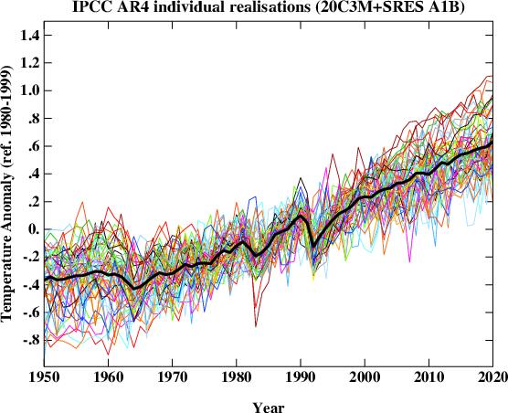
The more complete truth is better illustrated by creating a plot with slightly longer time period smoothing (approx 2 years) in which all runs from identical models are assigned colors and instead of creating a “connect the dots” plot connecting 1 year averages computed at 1 year intervals, I compute the 25 month average monthly. This permits the eye to better follow any individual trace.
Such a plot with all temperature runs baselined to the period from Jan 2001-Dec 1999 is shown below:

(Note: The vertical trace identifies 2000.
Notice in the plot above, the temperature anomaly traces form bands of colors. However large the “weather!” noise is, it is not sufficient to cause any the 25 month average temperature anomaly from any run in ncar_ccsm fall below the observed temperature at any time after Jan 2001. While the bright orange traces for ncar_ccsm do exhibit stochatic variability about their mean trend, those bright orange lines form a tight cluster. If one was to analyze the full set of models, they would find that relative to the full collection of runs the trends in ncar_ccsm are correlated. This is because they share a forced mean. That forced mean differs from the means from other models, and happens to be on the high side.
It is also fairly easy to identify distinct bands of color which show the region in which realizations of a particular model (runs) will travel. To illustrate this more clearly, I’ve created a version of the previous figure eliminating two of the noisier models:

Visitors examining this graph may well wonder:
- Are there any fancy statistical tests to diagnose the obvious fact that the trends in different models are different? (Answer: Yes.)
- Is internal variability (“weather!”) the reason every single run from giss er tracks lower than every single run from ncar ccsm? No.
- Does our inability to distinguish the correlation between trends from runs from individual models mean we can’t estimate the forced trend from a 10 year sample? No.
- Are there fancy statistical test to diagnose whether the variability of 10 year trends across different models differ from each others? For example Is mpi_echam5 much noisier than the other models? (Answers: Yes and Yes.)
- Why did RC display a graph where the color choices disguise the fact that much of the variability across the runs is associated with different forced responses in different climate models? Beats me.
Anyway: Weather noise exists. Weather noise in models ain’t as big as RC’s post might lead you to believe. Currently, the observations are tracking below the multi-model mean. I suspect this will continue.
Update May 26: Michael Hauber suggested I create a graph using the same years Gavin did:

The distinct trends for models remains apparent.
This doesn’t have proper labels or titles yet, but I thought Michael might like this graph too:

Clearly, you put a lot of effort into these graphs, which seem to be much more complex than I’ve seen here before.
I wish that I could better understand which lines are the observed temperatures, and which are projected? My brain is moving at the speed of molasses…
Oh Duh, now that I zoomed in super close, I see them in the light and dark gray. Maybe one more vertical tic to highlight the end of the observational period, to remind us all of the difference between models and data?
To the extent possible, that ‘dancing gif’ presentation might be a grand way to show things stacking up, one group at a time, and then the aggregate… I did a few simple blinkers for Cheifio once and they were a juge effort, but Tisdale seems to crank out some very complex material now as dynamic gif. Maybe he can tell you an easy (or at least less difficult) way to make them.
Anyway, thanks for this ongoing fine effort.
RR
ruhroh–
I absolutely abhor dancing gifs and generally find them unelightening. I also don’t know how to make them. As I abhor them, I will ignore any instructions volunteered.
Hi Lucia,
Thanks for a very instructive post. Squinting a bit, it seems to me that the models called “giss_aom” and “giss_model_e_r” look the most reasonable. What do we know about these models? What kind of climate sensitivity do they predict?
julio–
I don’t know what their climate sensitivities are.
There are a number of models that can’t be excluded based on 10 years worth of data. The very noise models can’t easily be excluded and will be difficult to ever exclude owing to how noisy they are. But the giss models are a set that don’t have extremely high short term weather noise and whose trends can’t be excluded by the recent short term stall in warming.
Lucia,
I agree a lot of work has gone into these model comparisons. I’m slightly confused as to the accuracy of the ‘observed data’ lines in grey. According to the GISS and HadCRU datasets, the current global temperature is at least 0.2 deg C cooler than the 1998 peak. In your graph, the current temperature is roughly equal to 1998. Am I mis-reading them?
Arfur–
These are 25 month smoothed observations not monthly means. Plots of monthly data of 57 runs would be very noisy.
Lucia,
Thanks – I learnt from that post
equilibrium climate sensitivities and transient climate responses for ar4 models
http://www.ipcc.ch/publications_and_data/ar4/wg1/en/ch8s8-6-2-3.html
A superb job in unscrambling the … er … lack of clarity.
Congratulations.
lucia:
Not sure I understand numbered point 3 above. Does it mean that the models’ structural assumptions are sufficiently different we don’t really expect them to predict the same trend? If that is so, why does anybody bother with the “model mean” as if it were some integrated thing, some coherent entity?
At what point do we instead start eliminating/ignoring individual models on the grounds that they (how shall I put it..) suck? For example, the models with the orange lines in the last figure above are about 25 lengths behind at the top of the stretch, so to speak. The vast amount of rapid warming required to get them back in the running seems increasingly implausible.
George–
Presumably, yes. The individual models structural assumptions result in different forced trends even when identical forcings are applied. This should not be particularly suprising as different models also have different steady state global surface temperature after spin-ups with similar levels of forcing. The latter fact is obscured by expressing everything in anomalies.
I think this is a topic of on going research by honest to goodness climate scientists.
PeteB,
Thanks for the link to the list of model sensitivities.
.
I can’t see a consistent correlation between Lucia’s graphic and the stated immediate or ultimate sensitivities. There does appear to be some correlation between lower stated immediate sensitivity models and the lower trend lines in Lucia’s graph, but the correlation does not look all that strong. Perhaps another factor (like assumed future man made aerosol effects) is also influencing the trends.
Re: SteveF (Comment #76258)
You’re right, Steve. According to that table, the highest-trending model (CCSM3) has the same ECS (2.7) and TCR (1.5) as GISS-ER, which, instead, looks fairly reasonable; and one of the lowest trending, MRI-CGCM2.3.2, has ECS = 3.2 and TCR = 2.2, so go figure.
Unlike the equilibrium climate sensitivity, the transient climate response should be reasonably constrained by the observations to date, and it seems to me that the only way you can think it is as high as 2.2 C is if you postulate a *huge* aerosol offset, so that’s probably what’s wrong with that particular model…
Lucia,
I am puzzled by this comment. It seems to me that the high variability itself (or alternatively, low variability) could be used to statistically exclude some models from being plausibly accurate representations of the Earth’s climate.
Nice article.
The 25 month moving average multi-model mean follows 3.89*ln(CO2a1b) – 26.75C to the T. It does not vary by more than +/- 0.03C from this formula.
This is just the average of what the individual models have programmed in and each one will be slightly different. The highest one is at 5.9*ln(CO2) and the lowest one is about 2.7*ln(CO2)
By way of comparison, instantaneous 3.0C per doubling is 3/ln(2)*ln(CO2/280) = 4.328*ln(CO2) – 4.328*ln(280) = 4.328*ln(CO2) – 25.1C (with 1850 at about -0.6C)
So, the multi-model mean is just a formula for the GHG/CO2 forcing with a small lag built-in.
Nothing magical. The models are just math formula or, at least, all the equations in the models just reproduce a math formula.
julio (Comment #76260),
Another possible explanation is how different models handle projections of ocean heat uptake. A very high ultimate sensitivity model could give a low current trend if it included a large ocean heat uptake rate.
SteveF–
Yes. Different ocean heat uptake can affect the evolution of temperature given similar climate sensitivities. (There is, after all, a reason why long term climate sensitivity differs from transient climate sensitivity.)
One thing to keep in mind when considering transient response versus today’s response: The definition of ‘transient response’ is that which takes place as a result of a 1% per year increase in CO2 concentration… currently ~4 PPM per year. The actual CO2 rise is closer to 2.25 PPM per year. Other forcing agents (tropospheric ozone and N2O are increasing) add a bit to the increase in forcing from CO2, but the current rate of rise in forcing from GHG’s is for sure substantially lower than that for a ‘transient response’; this means that the current sensitivity value should be somewhat higher than the stated transient sensitivity, but lower than the ultimate response. The slower the applied forcing increases, the closer the measured (current) response must be to the ultimate response to that applied forcing.
SteveF–
Is this true? I have to think about this a bit.
Do you have something that discusses this.(I’m trying to think about response with ‘two-box’ type simple models, but I can’t do that in my head. And… I’m going to the gym now because I’ve been lazy and put 5 lbs back on!)
Lucia,
Thanks for explaining. I missed that.
Re: Bill Illis (May 24 13:18),
Lets see if I can clear this up a bit.
To simulate the effect that more C02 has on radiation coming in and going out we use two different types of codes. line by line codes (LBL) and ‘band” models.
The LBL codes are the most accurate and these have been verified against observation. If your engineering application has time to run them then you use a LBL code. So, if you want to know how radiation trvels through the atmosphere, up or down or in any direction, you run an LBL model. For example, If I was designing a space platform and I wanted to detect an IR signal coming up from the ground ( like a tank with its engine running) I might run an LBL model to refine my sensor design. Or if I’m looking at satillite data and trying to estimate the SST or to figure out cloud cover I would take my raw sensor data and run it through these RTE codes. If I dont have the processing resources to run this detailed model I’ll run a band model. This doesnt consider every spectral line, but instead operates on a band level.
Band models are also verified against LBL models and Observations. When you look at the results of these models you can see that the output can be “fit” by a log equation.
In a GCM one does not use this log equation. Typically a band model is used.
The GCMs are tested to make sure that the RTE which are encorporated into the models are validated against stand alone RTE codes
That exercise is call an intercomparison
http://gcmd.nasa.gov/records/GCMD_CDIAC_ICRCCM.html
Abstract: The Intercomparison of Radiation Codes in Climate Models (ICRCCM)
study was started under the auspices of the World Meteorological
Organization (WMO) with the support of the U.S. Department of Energy
(DOE). The ICRCCM produced benchmark longwave line-by-line (LBL)
fluxes that may be compared against each other and against other
models of lower spectral resolution.
Or here
http://circ.gsfc.nasa.gov/
lucia (Comment #76266),
I am pretty sure it is true. If one supposes a modest ocean lag (say, 15 years exponential approach constant), and then increases forcing slowly (say double CO2 over 150 years) then the difference between the ultimate sensitivity and the measured sensitivity will always be smaller than if the forcing were being increased more quickly. In the extreme case (extremely slow rate of increase in forcing compared to the lag constant) the current response and the ultimate response are always essentially identical.
I guess we can wait for Gavin to explain the carefully chosen colours on his graph.
steven mosher (Comment #76268)
May 24th, 2011 at 1:58 pm
————————
Just because a line-by-line radiative transfer model is used does not mean that they actually differ at the end of the day from a simple calculation or that they are accurate (see today for example).
Let’s take the example where temperatures reach +2.0C around 2045. If the line-by-line climate model average is off by 0.03C from the simple formula at that time (which it is), then it is the equivalent of just 0.17 watts/m2 difference. 401.00 watts/m2 versus 401.17 watts/m2. ie. Nothing.
The detailed line-by-line radiative transfer model with CO2 at 511 ppm is no different than 3.89*ln(CO2) – to the 0.17 watts/m2 that is.
Re: Bill Illis (May 24 19:20),
“Just because a line-by-line radiative transfer model is used does not mean that they actually differ at the end of the day from a simple calculation or that they are accurate (see today for example).
Let’s take the example where temperatures reach +2.0C around 2045. If the line-by-line climate model average is off by 0.03C from the simple formula at that time (which it is), then it is the equivalent of just 0.17 watts/m2 difference. 401.00 watts/m2 versus 401.17 watts/m2. ie. Nothing.
The detailed line-by-line radiative transfer model with CO2 at 511 ppm is no different than 3.89*ln(CO2) – to the 0.17 watts/m2 that is.”
Did you read anything?
The LBL models are run and tested against observations. verified.
The Band models are run and tested against observations and LBL. verified.
In one study of LBL models, the author fit a curve ( the log curve) to the LBL.
OF COURSE it matches. I explained where that Log model came from.
The GCMs use Band models. Not a log curve. Go read the code. Go read the inputs.
You cannot simply look at the temps in 2045 and think you are just seeing the C02 response. You write ” If the line-by-line climate model average is off by 0.03C from the simple formula at that time (which it is)”
This shows you havent even kept the models sorted correctly.
Great graph! Since there seems to be “outlier” models, what happens if we plot the multi-model median instead of the mean?
.
Graeme: I guess we can wait for Gavin to explain the carefully chosen colours on his graph.
.
Well, the GISS models are among the most accurate in the bunch, so far.
toto (Comment #76280),
Well, in trend they are indeed far from the worst. But how well they match variability is another important issue; they don’t look so stellar in that measure.
OT but UVA forced to hand over all docs!
Lucia,
In re-reading your post I was struck by the phrase:
“The more complete truth is better illustrated…”
.
The lack of complete truthfulness you point to in Gavin’s spaghetti graph reminds me more than a bit of the difference between ‘true’ and Stephen Colbert’s frequently used adjective ‘truthy’. I guess Gavin’s graph could be more accurately described as truthy, not true. 😉
SteveF (Comment #76286)
May 25th, 2011 at 6:23 am
So because he has not presented to the exact graph you wanted, he is lying. How do you do a rolleyes smiley?
bugs
Whether or not he was lying depends on whether it occurred to him to consider the possibility that some of the spread arose from differences in models. If it just never occurred to him and he honestly thought the whole spread was due to “weather!”, and he wrote a post that gave that impression to readers, then he would not be lying. He would merely lack insight.
Not lying, just confirmation bias. He had a point he was trying to make and saw a graph that appeared to support his position. Colors were probably autogenerated so you get the colored spaghetti. He didn’t notice or care to notice the patterns that you did because what he saw supported what he wanted to see.
Similar to the arguments where warmists tout the “highest temps on record in the past x years” and the skeptics use the same data to say “temperatures have not risen in the past x years”.
“confirmation bias”
In other words, “only present information that you think supports your position, and ignore or attack the rest.”
Andrew
bugs (Comment #76288),
I am not sure how a description of ‘truthy’ gets converted in your head to lying.
.
I think that, like most advocates, Gavin is quite careful how he presents data…. it is usually (always?) presented in the way which best supports the position he is advocating. As Lucia pointed out, it could be just that he is remarkably lacking of insight. But I think Gavin is far too smart for that to be the case. I haven’t seen Gavin explain that some models are clearly ‘wrong’ (at a high degree of statistical confidence) compared to the measured temperatures since 2001. If he has said that (and I really doubt he has), then I will admit I am mistaken about him WRT this subject.
Lucia, do you think gavin knows that the modelE spread is very narrow. Too narrow?
steven mosher-
Presumably he knows it’s narrower than Model EH. I would be surprised if he doesn’t know that each model has a different mean trend and so the spread of the model trends is not due to “(weather!)” only. The difficulty is that if you admit the spread of the model trends is not due solely to “(weather!)”, then it become difficult to attribute the recent 10 year trend to “(weather!)” with noise comparable to a typical individual model. (Some models do have very wild “(weather!)”.
Re: lucia (May 25 13:53),
Yes, Here is another weird thing to think about. When models are selected for attribution runs, they only use models that have a minimal drift after spin up.
So, with forcing held constant a model is spun up for 1000 years or so, till it reaches stability. Then if it doesnt exhibit drift it’s ok to use for attribution studies.
Those control runs would be interesting to look at. its also interesting to wonder what unforced variability means in this regard.
I’m thinking that some models dont exhibit anything close to what we call weather.
steven mosher–
Hmmm… yeah. It’s clear to me that a “true” aogcm type model should have a quasi-steady state as in– if you run it with constant forcing for a millions billion years, you should see global surface temperature stay on some sort of attractor– which pretty much does let it be stationary at sufficiently long time scales. But that’s observation doesn’t let us say “drift over 1000 must be less than xC”. So, yes, it does seem like the spin up imposes a requirement that there be very little energy at very long time scales. (Mind you, I think it’s imposing something correct, but it would be interesting to know whether this property is emergent from any and all groups of parameterizations modelers would consider reasonable before running a model or whether the parameterizations are chosen to require this property.
Re: lucia (May 25 15:47), i’m wondering what happens to ocean circulations in a control run? does cloudiness vary in a control run? how does rain fall and wind blow? does a control run have weather.
There drift requirement is <2% change.
SteveF (Comment #76293)
May 25th, 2011 at 11:02 am
They have included all models, and their logic is that all models should be included without making value judgements on how right or wrong they are, because their analysis method adjusts itself to how they turn out. IIRC, Bayesian. When they first started on the models, they had no idea, over the relatively short period of time they were modelling, which ones would track better than others. James Anan has some issues with that logic, and believes his analytic method is better. The ‘truthiness’ is an implication of lack of honesty, that is, dishonesty, that is, lying.
bugs–
Either you don’t know what the subject is or you are changing it. The subject has to do with Gavin creating a particular graph and writing a post that is worded to suggest the spread across all those runs is “(weather!)”. You are changing the subject to what “they” might have thought when they were making their projection. These are not the same subject.
No I’m not. The Baysian logic they are using is explained here.
http://julesandjames.blogspot.com/2010/08/how-not-to-compare-models-to-data-part.html
http://julesandjames.blogspot.com/2010/08/ipcc-experts-new-clothes.html
Maybe James is right and they are wrong, but it is an ongoing debate.
steven mosher (Comment #76307) May 25th, 2011 at 5:31 pm
I would like to see the radiative energy balance / budget at the top of the atmosphere for the control runs as a function of time; what is the model characterization of equilibrium. And the correlation between the calculated global average surface temperature and the calculated mass of ice.
Bug-
Your comment confirms you are trying to change the subject. Those links are on an entirely different topic from what is being discussed here.
Re: Dan Hughes (May 25 18:32),
I might be persuaded to go in search of control runs.
If you want to imply that RealClimate are making a misleading presentation of weather noise, then you should be extra careful to make sure that your representation of the issues is squeaky clean fair on Realclimate, otherwise some would suggest that you yourself are not being fair.
To be squeaky clean fair on realclimate I think you should use the same scale and same time period on your chart as RealClimate does. Your chart extends to 2060, and the Realclimate chart only extends to 2020. Why might this matter? Well just perhaps there are other factors besides weather that cause divergence in the various models. These factors could just grow stronger and stronger the further into the future you extrapolate away from the known period up to just after 2000.
I also note that your chart spans a temperature range of 3.5 degrees, and the realclimate chart spans a temperature range of 2.2 degrees. To be squeaky clean fair on realclimate you should use the same scale to make sure that your chart is not making the variation within a model range look squashed in comparison to the realclimate chart which uses a narrower range.
Also what is your justification for removing the models that are noisiest? You need to be sure that no one might be suspicious that you are simply excluding the results you do not like and including only the results you do like. I would think that some comparison to the amount of noise in actual weather would be a good basis for selecting models so as to be squeaky clean careful that no one can suspect you of providing an unbalanced view point.
Finally, the Realclimate chart is used to support the assertion that trends over 10 or so yearare highly variable, and that about 15 years is needed before the trend emerges properly. From your chart I get exactly the same impression for most models, with the orange and yellow models appearing to be the exception rather than the rule. Of course such a chart is still easily confusing and I could just be seeing what I want to see. Better would be some black and white numbers showing how often trends are negative over a 10 year period for each of the models, and whether that model has a noise that is similar to the noise in actual data, or whether the model tends to be noisier or less noisy.
This noise/weather argument is mainly about the fact that temperatures are flat or falling for the last 10-13 years.
This is not predicted in any climate model. Some have a little noise, most don’t. They don’t have 10 years of flat or falling temperatures. The theory has so far tried to discount natural variation.
Either the theory is wrong about natural variation or the climate theory is wrong about the last 10 years. One might also be tempted to throw in Hansen’s 1988 predictions which even had the no GHG-growth in the year 2000 scenario being higher than today.
Noise in a model or two does not provide a justification for the 20 other models and the theory being off by so much.
You’ll have to argue that Asian aerosols are the reason instead.
Cost of a computer – $999
.
Cost of a GCM – $20,000,000
.
Cost of a quote from Bugs “without making value judgements [sic] on how right or wrong they are” – Priceless
Don’t think that is true out of 4*4 graphs, I found two with negative trends.
http://www.woodfortrees.org/plot/hadcrut3vgl/from:2001/to:2011/trend/plot/gistemp/from:2000/to:2011/trend/plot/uah/from:2000/to:2011/trend/plot/rss/from:2000/to:2011/trend
http://www.woodfortrees.org/plot/hadcrut3vgl/from:2000/to:2011/trend/plot/gistemp/from:2000/to:2011/trend/plot/uah/from:2000/to:2011/trend/plot/rss/from:2000/to:2011/trend
http://www.woodfortrees.org/plot/hadcrut3vgl/from:1999/to:2011/trend/plot/gistemp/from:1999/to:2011/trend/plot/uah/from:1999/to:2011/trend/plot/rss/from:1999/to:2011/trend
http://www.woodfortrees.org/plot/hadcrut3vgl/from:1998/to:2011/trend/plot/gistemp/from:1998/to:2011/trend/plot/uah/from:1998/to:2011/trend/plot/rss/from:1998/to:2011/trend
Again, I don’t think that is right – the grey denotes the percentage of model runs with any given trend (Although I take Lucias point if you binned some of the models whose all runs all have very high trends you would have better agreement)
http://1.bp.blogspot.com/_8N7U3BAt9Q4/TAI6f8-x3OI/AAAAAAAAAjA/mQ6qYCWLUZA/s1600/pic1.png
The last image was from http://julesandjames.blogspot.com/2010/05/assessing-consistency-between-short.html
Although I think that used an end point of 2009 for the trends, so their might be slightly better agreement between the models and the observations once you include 2010 as the end point
What Michael Hauber said. Gavin was answering people like Bill Illis #76323 above. Your post talks about something different.
.
Actually, your post also indirectly answers Bill Illis, but not in the way he seems to think. Most of “the models” (smoothed over 25 months) follow observed temperature pretty well over the last 10 years, especially the GISS models.
.
In fact I think your graph makes the models look pretty good, certainly much better than the raw average that you show in other posts. It seems to show that divergence between “the models” and observed temperature can be ascribed to a few outlier models.
.
Again, the median of models would be helpful in quantifying this.
I’d tend to disagree. Based on the tutorial vids on the CESM site, as they try to extend predictability, they have to include more and more long time-scale behavior (this amounts to better ocean models / initializations). The whole, “there doesn’t seem to be a continuum of stuff happening across all time scales” argument is more an indictment of simple models than a description of the real world. My physical intuition actually runs the opposite way to yours: the low modes tend to have the most energy in my experience. In this case we should be wary of our selection bias: we don’t have good long-period data to capture the low modes, and we know the models don’t include it yet.
The model is fit by assuming equilibrium at TOA with pre-industrial forcings (also a tidbit from the CESM tutorial vids). It should be unsurprising that the fit diverges in extrapolations when the forcings are changed. Also highlights the banckruptcy of the “climate is a BVP” meme. If it were, why not solve a lot fewer BVPs using the quasi-steady assumption along the transient boundary forcing, rather than taking half hour time-steps for a century? I haven’t found the answer to that in the CESM tutorials yet (please share tips if you’ve got ’em).
toto (Comment #76327),
I don’t think you appreciate what Lucia was showing. Gavin specifically claimed that divergence of the recent temperatures from the pooled model mean was not unexpected do to “(weather!)” driven variation in the models, when in fact much of that pooled model variation was due to differences between models, not internal model variation, or “(weather!)”. Yes, some models (considering both trend and extent of internal variation) can be described as ‘outlier models’, in the sense that they are demonstrably wrong, even with only 10 years of temperature data. So why the heck include them in an estimate of variation from weather, as Gavin seemed to, and why the heck include them in projections of future warming?
.
It seems to me a much more rational approach would be to judge the fidelity of each individual model to the temperature history in terms of predicted trend and internal variation (size and frequency), and exclude from the pool all models that are obviously poor representations of Earth’s climate (AKA just wrong). My jaundiced guess as to why that is never done: it would lower the projected temperature trend too much over the next 50 years and so reduce the urgency for immediate action. But perhaps you see some other, less jaundiced, explanation.
Michael–

I added a graph with the identical time periods Gavin used. It includes all models with more than 1 mean.
As you ca see, the distinct trends for models forced by the A1B SRES remains apparent. (Note, prior to 2000, modeling groups were permitted to use their own judgement regarding forcings. So, during that period, the variability isn’t even due only to weather, it’s due to the combination of weather, different model forcings and different models. There are those who… uhmmm.. suggest model forcings– particularly aerosols– were selected to get better agreement with the trend over the 20th century.)
Also, I thought my reason for showing the graph without the noisiest models in addition to the one with the noisiest models was made clear. In my post I wrote wrote
My reason for doing this is a few visitors mentioned they have difficulty distinguishing colors. Note that I also alternated types of dashes to help them but I thought making a slightly less cluttered graph would help them see what people with normal color vision can see on the other graph.
First: To try to make the assertion that trends over 10 years are highly variable the RC chart is giving the impression of greater variability in model weather than truly exists in models. So, the are giving a false impression to make their claim.
Second: The don’t merely make a qualitative claim of “trends emerge properly” (whatever that can even mean.) They make a claim that the observed trend is within the “noise” of… something.
In fact, based on estimates of “(weather!)” based on either a) the observation of earth weather noise itself or b) the weather noise in a typical model,
the observed trend is inconsistent with the model mean. It does fall within the spread of weather in some models which fall in two classes: the models with trends lower than the multi-model mean and the models with ridiculously high “weather noise”.
But it clearly lies outside the range of some models that were included in the IPCC projection, and on average, the models used in the IPCC projection show more warming.
Even if one can “save” some models the IPCC projection as provided in figures in the AR4 and tables in the AR4 has a greater trend than is consistent with the observation of earth weather since the time the projection is made. Whether Gavin or anyone else likes it or not, the IPCC projection was not “the earth trend will fall within the full spaghetti spread of all runs in all models.” Maybe they should have made that their projection, but they did not.
My posts test the projections not “the models”. Whether someone likes it or not, the projection in the AR4 was based on the multi-model mean. It’s based on the models, but it’s not just “the models”.
I recognize that some people would prefer to change the subject to whether or not the observations falls in the range of “many” models, “the median” model or at least 1 model. But just at Monkton doesn’t get to change what the IPCC projections were to test the projections, neither does Gavin.
Mind you, I get that modelers may all want to collectively not discuss that the multi-model mean is high– but it is high. (Could it be solar? Could it be aerosols? Dunno. But its high.)
Doesn’t have proper labels yet… but here’s how the observed trend stacks up compared to models. (I think this is models with more than 1 run… but I’m not sure. More later.)

Eyeballing it, if you kept only the best-fit GISS models, it looks like the warming predicted by 2060 would be close to 0.5 C below the multi-model mean. This does not strike me as a negligible difference.
Here is the question. As a GISS modeler, Gavin presumably is familiar with the assumptions and methodology behind all the other main models, including those that trend really high. Not only have those models, by now, effectively been disproved by the observations, but they must be based on assumptions and/or methods that Gavin and his team have, in fact, implicitly rejected, on scientific grounds, when they built their own models.
So why, then, does Gavin continue to include those models in the calculation of the mean, when he cannot possibly believe that they stand a chance of being right? You could say, because those are just the IPCC models, anyway. But why go as far as to try to wallpaper the difference as if it were just “weather”?
Julio–
Not just “weather” but “(weather!)”, with the exclamation mark suggesting some degree of emphasis.
The fact is that some– like for example — Michael Tobis– like to argue that our planning must consider the high end of the “uncertainty” for whatever reason. Others point out that costs are driven by the “high end” not the mean.
Yet, the fact is, the mean is high relative to observations and the observed trend is clearly outside the range of the “high” models. Then, someone like Gavin (and he is not alone) writes things to suggest that the full spread is “weather” and insinuates (or, I would suggest says flat out) that we can’t tell that “the models” are off for this reason. Well, we can tell that the multi-model mean is high. “Weather” does not obscure this. We can tell the high models are high. “Weather does not obscure this.
At the same time, the earth weather does fall in the range of some models.
I don’t know why some people think we can’t observe all of these things simultaneously. Maybe those people think science won’t permit us to walk and chew gum at the same time.
Lucia,
Well, obviously keeping the mean high serves the alarmists’ purposes. And, at the present time, so does keeping the uncertainty (spread, standard deviation) high, since it is the only way they can make the (high) mean appear compatible with the observations.
I am not saying these are Gavin’s reasons, since I am not inside his head. But his behavior appears consistent with this.
To continue the slightly OT tangent (started by our gracious host, so it’s not unforgivably rude ; -), the other troubling inconsistency with “climate is a BVP”, and “no energy in low modes”, is that if climate really were a BVP, it would be the lowest mode (the DC component), which matters most. Am I missing something obvious?
PeteB, I believe that James Annan made the same error in his analysis of assuming that all of the variance between models runs was due to weather noise, and not “between model variability”. (In fact most of the variability is “between model variability”, so what Annan did was entirely wrong.)
I agree with Lucia that this is OT from discussing whether the IPCC AR4 projections are consistent with measurements or not.
jstults (Comment #76349),
I suspect climate is both a BVP and an IVP at the same time, certainly when considered over any time period that is comparable to a human life span…. and comparable to the remainder of the “age of carbon” (which will probably enter it’s declining phase within a decade or two).
Carrick–
Well…. since I’m a coauthor on that paper, I don’t consider discussing where the models fall in the spread wrong. I consider it to answer a different question. James seems to think it’s the only important question, and I think he’s wrong about that. I think we want to get answer to all of these:
1) Whether the temperature and trends fall inside the range of all weather in all models. That is: as a collection, is the range broad enough to even include what we see.
2) Whether the ensemble is biased in any direction. That is: are there too many high (or low) models?
3) Are any individual models in the collection clearly off track?
We need to know 3 to figure out whether anything needs to be weeded out or diagnose what needs to be improved. We need to know 2 to make better predictions about the future. We need to know 1 to know whether we need to plan for things outside the range of projections or whether we can count on the future being safely inside.
I think James is wrong to think that we should only be looking at (2) and that it is inappropriate to ask (1). Of course he is free to think what he wants, but the issue of what question we should has almost nothing do with statistics. So, statistical expertise is utterly irrelevant to any decrees on this front.
Lucia, I guess my point is that IMO is if you can’t assumed that the variability between models is associated with “weather noise” in the way that it was done by Annan, then you can’t naively assume the model outputs belong to a single statistical ensemble. As your figure above shows there is quite a bit of clustering from model-to-model, so this assumption that “weather noise” dominates is certainly violated.
While you could ask what happens if you combine the models as in (1), I’d love an explanation from somebody as to exactly what, if anything, one is actually learning from making this comparison.
Fundamentally the issue is in combining a range of different models with differing accuracies and treating them as if they are really instances of the same statistical ensemble. That is not, IMO, a credible thing to do.
There is a methodology for performing a sensitivity analysis of the effects of different assumptions/model implementation choices, but tIMO here is nothing to learn by combining models that are poorly done (low resolution, poorly resolved physics, poor model “weather/climate” noise performance) compared to those that are better done (higher resolution, better resolved physics, more realistic physics, poor model “weather/climate” noise performance).
To do this properly, you would need to partition the model outputs into “lower resolution”, “higher sensitivity” and “assumption of climate forcings.” Presumably what you would learn if you did it right is what resolution, climate sensitivity, and climate forcings is needed to produce a “realistic” climate model. My guess is what you’d find is, once again, you didn’t have enough individual runs to make any definitive conclusions.
I don’t have a problem with testing prior projections to data, since as you’ve said, you don’t have the freedom to change how the projections are, if you disagree with how they were generated. The IPCC has a published projection of multimode mean, it’s almost certainly done wrong, but it is what it is, and the question is “how well does it match the data” is a legitimate question to ask, no matter how wrongheadedly the original projection was generated.
Carrick
I think what one is learning is whether the method of projection used by the IPCC works and whether their resulting projection is on track. That’s why I say I’m testing projections and not “the models”.
That’s my view.
Quite a few groups contributed only 1 run to the AR4. If climate modelers really believe “weather noise” is what we see in the full spread of the models, it would be impossible learn what’s required to improve models by comparing data to that 1 run.
Here’s what I’ve learned, and unless I missed it no-one else has commented on this aspect yet:
When the models are set free after 2000, they immediately diverge. Most of the spread seen at the year 2060 has already emerged by 2010. Whether this is due to ocean-atmosphere adjustment, a mismatch between past and future aerosol forcing, or whatever, I do not know.
As pointed out by SteveF (Comment #76258) above, the transient (pre-2010) spreading is unrelated to climate sensitivity. I have not done this, but I imagine if you center the graphs on the 2010-2020 period, the remaining spread from 2020 to 2060 will be highly correlated with climate sensitivity.
The lesson for me is that the first ten years or so of the model projections have little to do with the climate and everything to do with the models. My postulated reasons for the transient spreading are all artificial (model-related). Beyond 2010 the projections are usable, but they would have to be recentered somehow to remove the transient spreading.
Nice analysis.
John N-G
It’s trivial to recenter. I’ll do that. 🙂
I do suspect there is an issue related to the fact that the forcings prior to 2000/2001/2004 (depends on the model) do not all match. Modelers were permitted to select their own forcings during the 20th century and switch to the SRES at the beginning of the 21st. (The precise year varies from group to group. The patch for 21st century is as late as 2004, and I think jan 2001 is the mode year for the patch.)
I have noticed in the past that the mean trend for “with volcanoes” vs. “without volcanoes” is different during the early 20th century. I don’t know if this arises from the physics (‘volcano models’ were cooled somewhat in the 90s) or if there is some difference between the two cases.)
But it’s certainly plausible that the early 21st century can be influenced by the initial conditions near 2000 and those are influenced by forcings applied prior to 2000.
Here’s how the models look on a 2010-2020 baseline. Obviously, observations fall off that. I haven’t looked up the sensitivities to figure out any correspondence. (I can make longer extensions forward in time on request. It’s pretty quick. Also, I put the noisier models in the back to make it easier to see the bands for most models. )

Lucia,
If I am squinting correctly, it looks like the NCAR-PCM1 model (which indeed has the lowest sensitivity) now is at the bottom of the group, and similar in trend to the GISS models (which are a little below the group average in sensitivity). I suspect that different treatments of ocean heat uptake will make the correlation between model sensitivity and projected trends to 2060 very poor.
.
I do think the GISS folks believe in more ocean heat uptake (more warming in the pipeline) than most; this may explain why the lowest sensitivity (NCAR) model and a mid-range sensitivty model make nearly identical projections.
.
Anyway, another very interesting graph. Thanks for your efforts.
Steve– Yes. PCM1 is at the bottom now. NCAR CCSS is still high– but not an ‘outlier’. It seems to me that NCAR CCSM is still recovering from Pinatubo near 2000 and so it has a continued run up. After that it remains high not so much because it’s trend differs from the mean but because it had an exaggerated response to the volcanos. (I’d have to look back before 1950 to be more confident of this assessment, but it looks a bit like that in the 1980- on graph.)
One of the reasons I have liked checking trends is precisely that things like comparison of 10 year means are sensitive to choice of baseline.
Oh– another thing. Since ECHAM is on that graph– not how huge the wiggles are. I wonder how farmers could plan what crops to plant on planet ECHAM. Seriously. (Well, I guess the global temperature could rise 0.5 C uniformly over the whole planet with great regularity instead of having heat waves and cold waves in places. But really, if the earths’ “weather noise” looked anything like that, we’d know.
I might like that last graph more if I could tell the colours apart better. The main one I can separate out is the orange set.
I am red-green colour deficient.
Of course the chart has no relevance to whether the RC depiction of weather noise is realistic as all weather noise has been eliminated. It is still an interesting chart for its own sake.
Just judging by the grouping of orangish and bluish it appears there is at least one bluish model that is trending too high and if it was up to me I’d think about discarding it.
If I was more aggressive perhaps the orange group could go too, but my preferred conservative (to discarding possible solutions) approach would say the orange is still in the possible range.
Lucia:
I suspect many of the people who submitted single runs were not trying to contribute anything novel by submitting them.
lucia (Comment #76376) May 26th, 2011 at 5:03 pm
I remember that we discussed this model at least once before… the ECHAM model was used a couple of years ago in a paper to show how 10 years without warming is not at all an unusual event…. according to the ECHAM model’s variability. It is just nutty that such a paper could get past reviewers; it was laughably bad.
SteveF-
Yes. And yet, difficult to write a comment on what’s actually wrong with the paper. The fact is: The “weather” in that model is clearly an outlier relative to models and equally clearly nutty weather. But…. well… Yes. If we look at that model, then 10 year trends will be highly variable. What does that tell us about the variability of earth 10 year trends? Not a whole lot because the “weather” in that model quite clearly does not match that of the earth.
I suspect they wanted to have their work appear in an IPCC document and the funding agencies wanted the same thing. One run was sufficient and they ran it.
They may also have done other things to learn about physics, improve models &etc. The difficulty is there is a tension between trying to predict the future, now– which requires time consuming expensive runs, now, and learning how to better improve physical models which can’t necessarily be used to predict the future yet.
So, we have quite a few 1 run models, some 2 run models and very few models with anywhere near the number of models that permit people to do realistic tests of their properties. (Or, the statistical power to detect deviations from reality is extremely low unless if they end up way off.)
the graph that shows the way the models display internal clustering yet external divergence, if that makes sense, is enlightening. The next offcial pronouncement ought to take this in to account. It is hard not to conclude that the spaghetti graph is a highly misleading graphic – no one model shows anything like he same spread as the apparent error range. Will Tamino, Eli or Gavin comment on this….I think not. Arthur Smith will probably stay hidden as well.
a viewpoint from a modeller would be interesting….
Lucia,
I’m not sure how hard it is to write a negative comment about such an obviously crappy paper.
What is clear to me is that these kinds of ‘papers’ discredit the whole of climate science as a serious field of study; that they are not shouted down by practicing climate scientists as being the (obvious) crap that they are is the most damaging part of the whole story. It is time for climate science to clean house. Throw out the nonsense and stick to the science. Send James Hansen into a graceful retirement…… with his grandchildren. Stop trying to control the message. Let the chips fall where they may.