How does it follow that models underestimating major oceanic or atmospheric oscillations means the honest-to-goodness Hurst coefficient is under-estimated in the earth? (Real question because I’m pretty sure that I can show that if long time constant oscillations are present — and they are really peaks in the spectrum– computing the Hurst coefficient using a time series shorter than than the time period of the oscillation will result in an estimate of the observed Hurst coefficient that is much too high.)
Moreover, DK’s analysis computes the Hurst while neglecting scales longer than 1/10th the full length of the time period T (which I think is his practice based emails), then if he has a 100 year time period, and oscillations with periodicities greater than 10 years even exists his climacograms will over estimate the observed Hurst coefficient for the real process. (I’m pretty sure can show this and will if people want to see.)
Of course readers are aware I have similar reservations about interpreting trimmed climacograms when data contain a forced trend. My point here is not that data that might appear Hurst based on truncated climacograms is not Hurst. My point is that if one even suspects the existence of either
A forced trend.
Forced periodicity (e.g. Milankovich cycles)
A strong spike in the spectrum for natural variability with at any particular frequency (e.g. ENSO/AMO/NAO) or
All three together
Then one must be very careful when interpreting climacograms. Each one alone can cause the shape of the climacogram for natural variability alone appear Hurst when it is not. In cases where the natural variability is Hurst, the presence of any of will result in inflating the computed Hurst coefficient if the Hurst coefficient is computed based on too-short time series.
As I was just saying something based on what I’d seem based on explorations of synthetic data, I thought someone would challenge me and ask me to show my synthetic results. But Dewitt did something even better: He went out and snagged observational data that will be qualitatively similar to my results with synthetic data. This is Dewitt’s response:
…
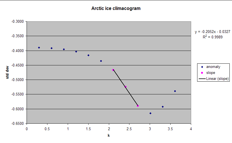
I think I know what you mean. I just did a climacogram for Cryosphere Today Arctic ice area daily anomaly. I used the first 8192 points and there’s a clear reversal in slope at large scale that is too large to be the uncertainty in the standard deviation because of too few points. But a trend would do exactly that. It looked like it was going to be Markovian until the slope reversed (graph here). A graph using the last 8192 points would probably be even worse as the loss trend is larger for the most recent data.
Credit: Dewitt Payne.
Having looked at a bunch of climacograms based on synthetic data, I’ll tell you that my first wild-ass-guess for this climacogram is the sort of thing we would see if the “natural variability” is ARIMA+ oscillation and the forced component is (Determinisitic linear trend). I cannot tell from the climacogram if the “oscillation” is distinct deterministic periodicity or “natural variability” with an oscillation because I’m not sure climacograms are extremely precise tools for this. Also: I could not go so far as to say the system really does have those features. It may be that if we had longer time data it would discover there is yet another oscillation with a time scale longer than k=8 or so. But we don’t have that data.
Nevertheless, the reason I think this looks like part of the natural variability looks ARIMA is the climacogram exhibits ‘concave down’ behavior near k=0. This is typical of ARIMA, in fact it’s typical of AR1. The reason I suspect an oscillation is the “crash” near k-=2 to 2.5. Because the crash is “slowish” (to use an uber technical term) I suspect it’s an oscillation, not distinct periodicity. The reason I suspect a trend is there is a strong uptick after k=3. I will admit that some people would caution that the final data points in an untrimmed climacogram are noisy, but I would also suggest that Dewitt is correct when he write “that is too large to be the uncertainty in the standard deviation because of too few points”
Synthetic Climacograms
To explain this, I’m going to show the features of a synthetic data with known “natural variability”, deterministic periodicity and a deterministic trend. I’ll begin by showing pure natural variability and then add each deterministic component.
Below, you can see ten replicate samples of climacograms fit to a series of 2^16 (i.e. 65536) “days” worth of synthetic “sea ice area” data from an AR1 process with a lag 1 coefficient of R=0.7.
At scales near 1, the standard deviation of “sea ice area” decays; the shape of the decay rate is concave downward. As scale increases, the decay rate followed the ~1/N-.5 shape anticipated for short term persistent Markovian series (e.g. white noise, ARIMA etc.). To the left of the vertical hash are points computed with fewer than 3 overlapping samples from remaining points. Note that the the estimate of the standard deviation for that scale becomes noisy. This will always be the case and is a true, honest justification for interpreting the behavior at those sales with some caution. (This is not to say one should ignore those points. Rather, one should view them as Dewitt has done: Consider whether the deviation from previous behavior is consistent with statistical uncertainty based on computations over too few samples.)
What if we add a forced periodicity to the data?
One might ask: What will the climacogram look like if we add forced periodicity to the ‘natural variability’? Below I supplemented the 10 pure AR1 cases (i.e. cases 1-10) with 10 additional cases to which I added a deterministic signal with 256 days (i.e. cases 11-20). I adjusted the magnitude of the cosine term so that its contribution to the standard deviation at scale =1 is equal to that of the “natural variability” (AR1 term).
After introduction of the periodic term the climacograms retains some “concave downward” appearance at small scale. That is to say: At small scales, the shape of the curve begins to resemble “Hurst”– even though there is nothing “Hurst” about this. The more dramatic change is seen at a scale of 2^8 (i.e 256). At this scale, the standard deviation plunges. This occurs because the effect of the periodic cycle is now averaged out by the averaging scale.
Because the current graph includes a deterministic periodicity the plunge is extremely crisp. The drop would exist in softened form if I substituted some sort of pseudo-cyclic behavior to represent a system with natural variability best described by “AR1 + pseudo-cyclic at with periodicity near 2^8”.
What if we add a trend?
To the system with both AR1 and deterministic periodicity, I added a trend with a magnitude that, if present alone, would result in a computed standard deviation at scale 1 day equal to 2 times that in the AR1 process. Graphs showing the full “AR1+ Cosine+Trend” only are shown below:
Note the climacogram retains some concave downward feature near small scales. This is similar to the climacogram for sea ice area Dewitt supplied. The climacogram shows a “crash” at period of 2^8 days. This is qualitatively similar to the steep drop near k=2 or 2.5 years in Dewitt’s graph, however I selected a shorter periodicity. Finally, the climacogram shows a distinct uptick at higher scales: This results from the presence of a trend in the data. Note that for the magnitude of trend I created, the practice of trimming the climacogram to not reveal the final three points would result in failing to detect the obviously present trend and possibly concluding that Hurst behavior was evident after the decline arising from capturing the effect of the oscillation.
Qualitatively, the graph based on synthetic data resembles Dewitt’s, which I will show again:
Credit: Dewitt Payne.
That said, quantitatively my synthetic graph differs from DeWitt’s. The reason for this is simple: I created the script to make this graph before I ever saw Dewitt’s graph, and the periodicity and trend were selected to best illustrate the qualitative effect of adding trends and oscillations to small scale variation. Other than improve the “titles” on the graphs, I made absolutely no modifications to the script so as to create anything that better resembles DeWitt’s graph. In fact, other than just hunting around, I don’t even know how to rapidly find the “best fit” system based on the shape of a climacogram yet; I have no doubt I could find a method if I thought it was useful.
My intention here is only to show that if one suspects the data might contain either a trend, an oscillation (pdo, enso etc) or a deterministic periodicity, it is very dangerous to interpret the shape of the climacogram fit data that are short relative to the period of any oscillation and also dangerous to interpret the shape of the climacogram by trimming the length to hide the final points under the assumption that any deviation from the trend established prior to the final 3 data points arises due to lack of resolution in computing the standard deviation.
A better practice would be to show the points and provide an estimate the standard deviation in computing a standard deviation computed based on the final 3 points and determine whether the uptick is sufficiently strong to suggest a trend or whether it is actually consistent with lack of resolution in computing a standard deviation. That is, one is advised to estimate the uncertainty in the final data points so that they can make statements similar to the one DeWitt made of sea ice: “there’s a clear reversal in slope at large scale that is too large to be the uncertainty in the standard deviation because of too few points.”
I’ll now leave readers with their thoughts on these. I also thank DeWitt for thinking to create a climacogram based on sea ice data whcih turned out to include precisely the features I want people to think about in climacograms. I’d only had synthetic data– but thanks to DeWitt we now know those features appear in real data. Not only real data, but data for something we’ve traditionally made summer bets on here at The Blackboard: Sea Ice! (I’ll have to launch those!)
Update: Script that that create these graphs and more:ClimogramTests
3 thoughts on “Climacogram: ‘Noise’, Periodicity & Trends”
A funny video Global warming versus nuclear power http://www.youtube.com/watch?v=n92YenWfz0Y very sarcastic etc great sense of humour. Lucia if not suitable remove no problem but I think relevant?
Lucia,
Thanks for working further and posting on climacograms. I trust you will agree on my following points that make some necessary small corrections:
1. When you speak about the “the ambiguity of climacogramsâ€, I trust you mean the uncertainty imposed by the underlying process, and not any ambiguity of the climacogram per se. If you have white noise, the uncertainty is small, but when there is dependence/autocorrelation/persistence, the uncertainty increases. The increase of uncertainty is imposed by the dependence of the process, and the climacogram is a good means to see it, provided that you also draw confidence or prediction limits and not just point estimates. If you use a specified model, like you do in this post, it is easy to calculate prediction limits from your Monte Carlo simulations.
2. On the contrary, because the climacogram uses a very simple and direct statistic, the standard deviation (or the variance) and nothing more complicated, it is quite transparent. For it is much easier to describe the uncertainty of the variance than that of other more complex statistics, such as slopes, spectra, normalized ranges, etc. For the Hurst-Kolmogorov process, you can even find analytical relations of the uncertainty of the variance; see e.g.: http://itia.ntua.gr/537 ; http://itia.ntua.gr/781 as well as the most recent one, http://itia.ntua.gr/1001 (Table 2). Please also notice the high negative bias, which is determined analytically (and easily verifiable by Monte Carlo).
3. When you say that I “neglect†scales longer than 1/10th the full length, you may add the reason why I do this, rather than imply that I truncate climacograms. The reason is that if I have less than 10 data values, I usually avoid giving an estimate of standard deviation. At the scale of 1/10th of the full length, clearly we have 10 data points. Of course, you can proceed up to scale T/2, at which you have 2 data points, but, sorry, I would not estimate a standard deviation from 2 points.
4. When you say (imply?) that I overestimate the Hurst coefficient by “neglecting†these uncertain scales, you may be assured that I do not; see full documentation for the Hurst-Kolmogorov process in http://itia.ntua.gr/983
5. When you speak about “oscillations with periodicities greater than 10 years†I hope you mean “fluctuations with time lengths greater than 10 yearsâ€. I do not know *periodicities* at such scales, but there exist fluctuations with varying lengths, over-annual, over-decadal, over-centennial, over-millennial, etc. Actually, this is exactly what the Hurst-Kolmogorov process is about: to describe these long-term fluctuations. From our email exchanges I conclude that with “periodicities greater than 10 years†you do not mean the Milankovich cycles. These indeed would affect the climacogram, if we went to such long scales using paleoclimatic data. More on this I hope we will publish soon (from ongoing research).
DK
1. When you speak about the “the ambiguity of climacogramsâ€, I trust you mean the uncertainty imposed by the underlying process, and not any ambiguity of the climacogram per se
I mean the ambiguity per se. Sorry if I was unclear.
When you say that I “neglect†scales longer than 1/10th the full length, you may add the reason why I do this, rather than imply that I truncate climacograms.
You do truncate climacograms. I think your motivation is to “trim[…] the length to hide the final points under the assumption that any deviation from the trend established prior to the final 3 data points arises due to lack of resolution in computing the standard deviation. ”
That is, your concern is lack of resolution. I think this is to some extent valid. That your motivation for trimming is, to some extent, based on a sound principle doesn’t change “trimming” into “not trimming”. I am saying that– neverthelss- the practice is dangerous as, for example, in the case of a figure like that created by Dewitt, the practice of trimming would “hide the incline” that exists in the data and which strongly suggests the existence of a deterministic trend. It also strongly suggests that any analysis to estimate the Hurst coefficient based on the points just before the trim spot would be misleading, and likely to oversestimate the Hurst coefficient.
I’m not suggesting that the purpose is to mislead. I think your motives are sound, but you are nevertheless trimming. So your practice is likely to mislead the analysist– which is you– into applying climacograms where they ought not to be applied.
Because of this danger– arising from the ambiguity per se in climacograms, I think
“A better practice would be to show the points and provide an estimate the standard deviation in computing a standard deviation computed based on the final 3 points and determine whether the uptick is sufficiently strong to suggest a trend or whether it is actually consistent with lack of resolution in computing a standard deviation. That is, one is advised to estimate the uncertainty in the final data points so that they can make statements similar to the one DeWitt made of sea ice: “there’s a clear reversal in slope at large scale that is too large to be the uncertainty in the standard deviation because of too few points.â€
Showing the final points along with their uncertainty would permit people reading the discussion to know whether the final points show upticks merely as a result of lack of statistical resolution or because the data is affected by a trend.
4. When you say (imply?) that I overestimate the Hurst coefficient by “neglecting†these uncertain scales, you may be assured that I do not; see full documentation for the Hurst-Kolmogorov process in http://itia.ntua.gr/983
Do you consider the impact of the existance of a deterministic trend contained in the process? No, right?
5. When you speak about “oscillations with periodicities greater than 10 years†I hope you mean “fluctuations with time lengths greater than 10 yearsâ€. I do not know *periodicities* at such scales, but there exist fluctuations with varying lengths, over-annual, over-decadal, over-centennial, over-millennial, etc. Actually, this is exactly what the Hurst-Kolmogorov process is about: to describe these long-term fluctuations. From our email exchanges I conclude that with “periodicities greater than 10 years†you do not mean the Milankovich cycles. These indeed would affect the climacogram, if we went to such long scales using paleoclimatic data. More on this I hope we will publish soon (from ongoing research).
1) If you could point me to your specific analysis on the milankovich cycles, along with the data available on line, that would be welcome.
2) You are misunderstanding my meaning with oscillations.
I will clarify further. BTW: One of my readers encouraged me to email Gavin to find out whether a paper on this would be interesting. He thinks a paper on the inherent ambiguity of these sorts of analysis when applied to non-stationary systems would be interesting. So, I’m pondering that.


A funny video Global warming versus nuclear power
http://www.youtube.com/watch?v=n92YenWfz0Y very sarcastic etc great sense of humour. Lucia if not suitable remove no problem but I think relevant?
Lucia,
Thanks for working further and posting on climacograms. I trust you will agree on my following points that make some necessary small corrections:
1. When you speak about the “the ambiguity of climacogramsâ€, I trust you mean the uncertainty imposed by the underlying process, and not any ambiguity of the climacogram per se. If you have white noise, the uncertainty is small, but when there is dependence/autocorrelation/persistence, the uncertainty increases. The increase of uncertainty is imposed by the dependence of the process, and the climacogram is a good means to see it, provided that you also draw confidence or prediction limits and not just point estimates. If you use a specified model, like you do in this post, it is easy to calculate prediction limits from your Monte Carlo simulations.
2. On the contrary, because the climacogram uses a very simple and direct statistic, the standard deviation (or the variance) and nothing more complicated, it is quite transparent. For it is much easier to describe the uncertainty of the variance than that of other more complex statistics, such as slopes, spectra, normalized ranges, etc. For the Hurst-Kolmogorov process, you can even find analytical relations of the uncertainty of the variance; see e.g.: http://itia.ntua.gr/537 ; http://itia.ntua.gr/781 as well as the most recent one, http://itia.ntua.gr/1001 (Table 2). Please also notice the high negative bias, which is determined analytically (and easily verifiable by Monte Carlo).
3. When you say that I “neglect†scales longer than 1/10th the full length, you may add the reason why I do this, rather than imply that I truncate climacograms. The reason is that if I have less than 10 data values, I usually avoid giving an estimate of standard deviation. At the scale of 1/10th of the full length, clearly we have 10 data points. Of course, you can proceed up to scale T/2, at which you have 2 data points, but, sorry, I would not estimate a standard deviation from 2 points.
4. When you say (imply?) that I overestimate the Hurst coefficient by “neglecting†these uncertain scales, you may be assured that I do not; see full documentation for the Hurst-Kolmogorov process in http://itia.ntua.gr/983
5. When you speak about “oscillations with periodicities greater than 10 years†I hope you mean “fluctuations with time lengths greater than 10 yearsâ€. I do not know *periodicities* at such scales, but there exist fluctuations with varying lengths, over-annual, over-decadal, over-centennial, over-millennial, etc. Actually, this is exactly what the Hurst-Kolmogorov process is about: to describe these long-term fluctuations. From our email exchanges I conclude that with “periodicities greater than 10 years†you do not mean the Milankovich cycles. These indeed would affect the climacogram, if we went to such long scales using paleoclimatic data. More on this I hope we will publish soon (from ongoing research).
DK
I mean the ambiguity per se. Sorry if I was unclear.
You do truncate climacograms. I think your motivation is to “trim[…] the length to hide the final points under the assumption that any deviation from the trend established prior to the final 3 data points arises due to lack of resolution in computing the standard deviation. ”
That is, your concern is lack of resolution. I think this is to some extent valid. That your motivation for trimming is, to some extent, based on a sound principle doesn’t change “trimming” into “not trimming”. I am saying that– neverthelss- the practice is dangerous as, for example, in the case of a figure like that created by Dewitt, the practice of trimming would “hide the incline” that exists in the data and which strongly suggests the existence of a deterministic trend. It also strongly suggests that any analysis to estimate the Hurst coefficient based on the points just before the trim spot would be misleading, and likely to oversestimate the Hurst coefficient.
I’m not suggesting that the purpose is to mislead. I think your motives are sound, but you are nevertheless trimming. So your practice is likely to mislead the analysist– which is you– into applying climacograms where they ought not to be applied.
Because of this danger– arising from the ambiguity per se in climacograms, I think
Showing the final points along with their uncertainty would permit people reading the discussion to know whether the final points show upticks merely as a result of lack of statistical resolution or because the data is affected by a trend.
Do you consider the impact of the existance of a deterministic trend contained in the process? No, right?
1) If you could point me to your specific analysis on the milankovich cycles, along with the data available on line, that would be welcome.
2) You are misunderstanding my meaning with oscillations.
I will clarify further. BTW: One of my readers encouraged me to email Gavin to find out whether a paper on this would be interesting. He thinks a paper on the inherent ambiguity of these sorts of analysis when applied to non-stationary systems would be interesting. So, I’m pondering that.