Yesterday, I posted HadCrut3 trends. I’d put one of my regular blog scripts to the side while I was busy with life. Getting back to it, I wanted to reorganize the way I did a few things so that it will be easier to double check, expand and maintain going forward. Today, I’m going to show my colored spaghetti graphs showing how NOAA, HadCrut3 and GISTemp compare to models. All traces are 13 month smooth.

The colored spaghetti represents 56 individual model runs. To save space, the legend only lists models that had more than 1 run. The observations are in grey scale. The multi-model mean is the heavy black squiggly line. The vertical black lines at 1980 & 2000 indicate the baseline for evaluating projections in the AR4 whose authors chose to provide projections relative to that average temperature during that period. The mean temperature anomaly for each observation and run is forced to zero during that period.
I will leave it to readers to decide whether they think the spread in temperatures across models represent “weather”, “difference in the mean response from individual moels” or a combination of the two. I think most of you know my thought on that. (My thoughts caused me to make colored graphs rather than using to grey scale as in graphs like this one
from climate lab book”.
I’ll be decrufting my script over the next week. Graphs will probably be motivated by the stage of decrufting. I do plan to include an El Nino correct– since someone pointed out that Knight et al. used that. That makes that correction use germane to the discussion of Steven Goddard’s observation that the HadCrut trend since 1997 is currently roughly 0. But in the meantime, you can see that with this choice of baseline HadCrut3 does give lower temperature anomalies than GISTemp but its neck and neck with NOAA.
Have you ever considered using radar plot or somehow animating the spaghetti to help make it more readable?
No. What aspect are you having difficulty reading and how would a radar plot help.
Do you mean somethign like this:
http://projects.gnome.org/gnumeric/doc/sect-graphs-overview-types-radar.shtml
I am mystified.
It’s hard to tell which line is which. The ones in the foreground are ok but the others are buried.
So a radar chart like the first one on this site http://www.visifire.com/silverlight_radar_polar_charts_gallery.php
could allow you to compare many model for a given year. The problem would be you would need a series of them – one for each year.
Maybe you could just scale up the y axis and make the whole thing bigger instead.
Mr E–
Those look similar to the ones I linked. I have no idea how those radar charts would be used to display this data.
But what are you having trouble seeing. There are only a few important things:
1) The dark black one that shows the multi-model mean.
2) The thick grey scale ones — so you can compare.
3) The fact that the mass of interlacing spaghetti is an interlacing mass of spaghetti but that runs of similar colors – from identical models form color bands. There is absolutely, positively no reason to try to figure out which of these individual strands of spaghetti.
Are (1) and (2) what you consider the foreground? That’s what I want you to see. So I suspect you are seeing exactly what I wish to convey with the graph.
Also, you can click the image to make it larger.
One interesting aspect that does relate more to the individual model runs (and would require a different method of presentation): It seems (by eyeball) that the models which match better to the whole or projection periods have worse matches over the baseline period. I’m not sure it’s possible to distinguish between these being better but more noisy models and just being wrong in a different way.
I interpreted the point of the plots here as showing that the variation in the different models over this timescale is large, and just averaging all the models together probably gives an inaccurate impression of the accuracy of the models.
Lucia,
What is the source of the individual model runs and multi-model mean data?
My own calculations, using IPCC data, suggest that the period used as the basis for the official individual anomaly and multi-model mean anomaly figures, was 1980-2000, not 1980-1999 as stated in AR4.
While the resulting difference in the anomalies is very small, it would make the divergence of the actual temperatures from the individual models and multi-model mean slightly lower.
One thing the above graphs do illustrate is that the models are very good at “hind-casting” but not so good at “fore-casting”. But as Niels Bohr is supposed to have said, “Prediction is very difficult, especially if it is about the future.”!
Ray,
The apparent hindcast match on the posted graph is largely a function of the chosen reference period, which I assume is 1980-1999. If you use the same baseline as the AR4 20th Century hindcast graph (1901-1950), you get a different story.
Paul S,
I will have to think about that.
Actually, I was being ironic, as I am personally very sceptical about the value of hindcasts as a guide to the future accuracy of models anyway.
Clearly the models have been selected on the basis that they “forecasted” the past accurately, and would not have been used if the hindcasts had not been reasonably accurate. Having said that, as far as I recall, some of the hindcasts are not particularly accurate.
Of possible interest is this recent news release from the UKMO, in which they claim that they have a better model for forecasting winter weather, apparently on the basis that it produced better hindcasts of the 2009/2010 than whatever they used before:
http://www.metoffice.gov.uk/news/releases/archive/2012/improved-winter-guidance
I suspect that as soon as they put this to the test on forecasting future weather, they will be disillusioned.
Ray,
The point I think my graph makes is that the common good hindcast/bad forecast description of CMIP3 models is not quite accurate. When set against a more reasonable reference period it becomes clearer that there is greater inter-model difference in hindcasting. Furthermore, the model runs which hindcast best are mostly still forecasting pretty well, while the models which diverged during the hindcast period are diverging even more in forecast mode. The ensemble forecast is overweighted by a handful of models which didn’t hindcast very well in the first place.
Regarding whether hindcast quality should be used as a criterion for deciding which models contribute to an ensemble forecast, I noticed there was a brief discussion in an AR5 draft (possibly was discussed in AR4 too, but I haven’t seen it). The upshot is that models which hindcast well do so for different reasons – e.g. low sensitivity, small negative aerosol forcing; high sensitivity, large negative aerosol forcing – and we don’t really have a good indication of which might be correct so a good hindcast is not necessarily an indicator of good forecasting in this case. The reverse is true for bad hindcasts – we don’t really know for sure why they’re “bad” – so it’s not necessarily a good reason for omitting a model from an ensemble, particularly when the aim is to represent the full range of uncertainty. That said, I have noticed a few recent papers which have attempted to lay out, or have called for, more rigorous criteria for determining which models might be best for forecasting.
Paul S,
I generally agree with you, although I am not sure about the fact that the models which hindcast best, producing the best forecasts. It is a while since I was working on this, so I will have to refresh my memory.
I also think it is interesting that the scenario which most closely reflects the actual temperatures, is the “COMMITMENT” scenario, which was based on ZERO growth in greenhouse gasses since 2000.
I think it would be useful to see a comparison of those figures here.
Paul S:
Baseline doesn’t matter for comparing trends, which is what we’re doing here.
Whether they can hindcast isn’t of much use, since that can be deliberately or inadvertently tuned to match a known temperature history.
What is useful is the model’s ability to forecast future temperature trend because that tells us how much fidelity the model has with respect to economic decision making.
Carrick
Baseline doesn’t matter for comparing trends, which is what we’re doing here.
True, but Ray’s point about hindcast-matching over 1980-1999 is substantially influenced by choice of baseline.
Whether they can hindcast isn’t of much use, since that can be deliberately or inadvertently tuned to match a known temperature history.
I’ve made essentially the same point in my subsequent post, although I think the question of tuning is a distraction when talking about forecasting because it’s not really relevant (it may be relevant for other modelling activities). The important thing is that models can come up with different solutions to arrive at the same answer, and we don’t really know which solution is correct, so the fact that they can arrive at the same answer as the observations is not very meaningful in terms of future forecasting performance.
What is useful is the model’s ability to forecast future temperature trend because that tells us how much fidelity the model has with respect to economic decision making.
My understanding of those working on multi-decadal climate projection is that they’re not necessarily looking for a single model to be wonderfully accurate at forecasting (because how would you know until you got to the time it’s trying to forecast?), but rather to have an ensemble of models that cover the full, plausible range of uncertainty. That way you can present probablistic estimates to inform policy choices – a high profile example being the >50% likelihood of limiting warming to 2ºC based on such and such emissions.
PaulS
I’m sure most use an ensemble. This doesn’t make my statement about bias in the mean trend wrong or unimportant.
If the ensemble mean is biased high, the economic forecasts will be biased high. The ±50% range estimated by economists will also be biased high as will all ranges.
If the probability distribution of an ensemble of climate models is used for forecasting it is very important to know whether the ensemble is biased high.
Because uncertainty in the ability to predict also increases the estimate of the best cost, is also useful to know if some models are clearly too high or to low. So, outliers should be winnowed if they are known wrong. (Conversely, if we don’t know predictios from a particular model are wrong, we should keep them.)
PaulS
Missed this before: We are not comparing trends in this post. We are comparing the magnitude of the projected and observed anomalies. Baseline matters in the graph shown here. I’m using the baseline the AR4 used to describe their projections.
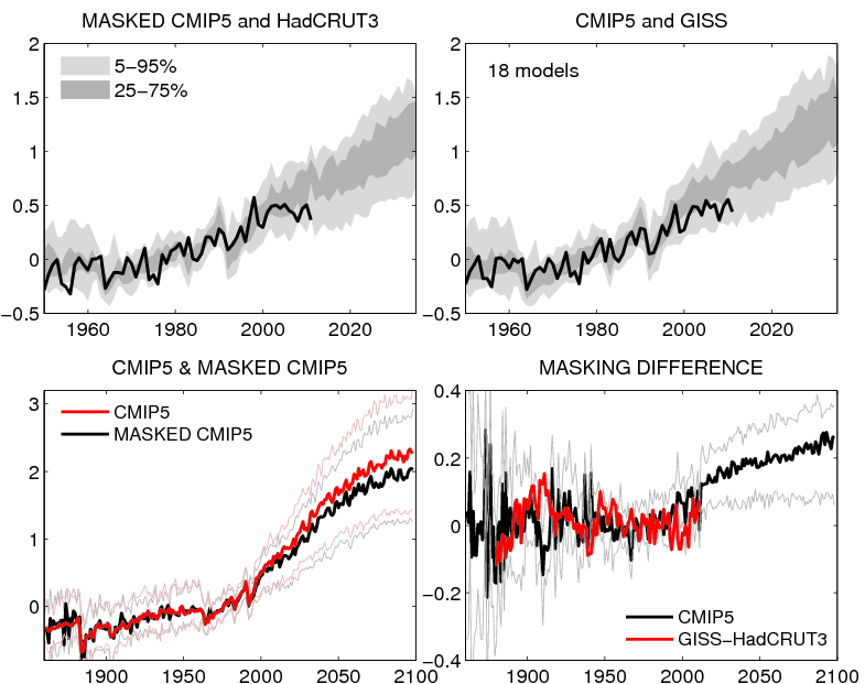
glad to see the masking difference
Temperature trends are interesting, but really are only a small part of the practical concerns related to the issue of climate change. The more important issue imo is what we know about the changes to other conditions that are important to people’s lives as a result of it getting warmer. Almost undoubtedly the most important is potential changes in annual rainfall.
Many analysts used the outputs of GCMs to predict a dire future for people in various parts of the world because warming would cause changes in rainfall and other dire consequences such as a huge sea level rise. It does not seem like the GCMs can adequately forecast future rainfall anywhere, and the models on seal level rise certainly have not been adequately accurate. If we have a model that can predict temperature rise fairly accurately, does it really help much, or is it only the start of our journey towards more useful information about climate change?
I’m not certain it’s the masking difference since it’s not the only difference in methology. But masking does contribute to the difference.
there seems to be something about mpi_echam5 that gives it extreme amplitudes. For the last few years it is among the better models but the way it bounces between extremes makes me wonder whether it is really capturing the climate very well.
Regarding hindcasting, shouldn’t we evaluate model runs done now with updated inputs? If the emissions and aerosols numbers are known more accurately, that would be the model run to be evaluated, not one based on guessing the emissions levels.
I think that another interesting thing about the “COMMITMENT” scenario projections is that the vast majority of the models forecast a rise in temperatures, even without any increase in greenhouse gasses from the year 2000.
The mean increase, relative to 1999 (NB not 1980-99), is 0.134c by 2012 and 0.371c by 2099, although a peak of 0.402c is reached in 2097. However, there is a vast range of projections from the various models.
The lowest projection by 2012 is -0.160c from inmcm3_0 and the highest is +0.503c from cnrm_cm3
The lowest by 2099 is +0.040c from miub_echo_g and the highest is +0.645c from ipsl_cm4.
Clearly not a high level of consistency.
I think models with more realistic ocean dynamics vary a lot more on the decadal scale. So I don’t know that it means much when a model run, or ensemble with same initial conditions, goes close to the multi-model mean over a few decades.
Lucia,
“Because uncertainty in the ability to predict also increases the estimate of the best cost, is also useful to know if some models are clearly too high or to low. So, outliers should be winnowed if they are known wrong. (Conversely, if we don’t know predictios from a particular model are wrong, we should keep them.)”
I have found that very few of the models are consistently high or low.
Ray:
That’s not my experience. These are linear trends from 2000-2100, °C/year, sorted from coldest to hotest.
That meets my requirements for “consistently warmer or cooler”. 😉 Perhaps you meant something different?
BillC:
It’s worse that this… some of the models with bad ocean dynamics have more variability than is seen in real data.
Look at the graph in the post

The orange model is consistently high in this decade. Remember: Agreement during the baseline period is forced through the magic of rebaselining (i.e. averaging and subtracting.)
Carrick-
I don’t doubt that either. And we may be able to find examples of wildly varying ocean dynamics affecting things that are REALLY counterintuitive (though possibly true) like equilibrium sensitivity.
there does seem to0 be an orange-purple dichotomy, if that means anythih
ng. It might be worth looking at their assumptions, if climate scientists are allowed to retain assumptions.
Carrick, (Comment #103464)
Yes, I meant something different.
They are trends over 100 years, which don’t demonstrate consistency.
I meant that within the long-term trend, there is variation.
lucia, (Comment #103467)
I did say “very few”, which surely allows one?
In any case, it is difficult to see the detail with all of the spaghetti.
It looks to me as if the orange line is low during the period prior to 2000, but I will have to look at my own data to confirm that.
Which model is the “orange model”, ncar_ccsm3_0?
Ray– If you mean for any individual run the monthly temperatures over 100 years don’t fall on a straight line but wiggle around the best fit trend, then yes. Each model has “weather”.
But some models show more warming that others and it stands out pretty well in the data. With respect to economic models we were discussing before, if the ensemble of models exhibit too much warming and that ensemble is used, then cost estimates will be biased high. So, to minimize the risk of costly mistakes, we should wish to detect any bias in the models.
Ray–
More than 1 model is consistently high relative to earth temperature. The orange one is the one that stands out in that graph. That’s why I mentioned that one. The mean has been consistently high relative to the earth temperature during for the vast majority of forecast period whether you define it as staring in 2000 or 2001. This isn’t being caused by “one” model. The mean is high.
is my eyesight so compromised thatI see purple is under the mean and orage is over the mean. But the ensemble gives a wide range for the modellers to aim at….
another diogenes said that
@lucia (Comment #103476)
“The orange one is the one that stands out in that graph. That’s why I mentioned that one. The mean has been consistently high relative to the earth temperature during for the vast majority of forecast period whether you define it as staring in 2000 or 2001. This isn’t being caused by “one†model. The mean is high.”
You seem to be interpreting my comments as support for the models, which is definitely not the case.
I am not denying that the mean is consistently high or that it’s isn’t caused by one model.
The problem which I found is that it is caused by different models at different times.
You refer to the orange model being consistently high this decade, but I was referring to the entire period of the models, and relative to the mult-model mean, rather than actual temperatures.
My eyesight might be failing, but I have increased the zoom on my web page and it looks to me like the orange model (ncar_ccsm3_0?), is below the temp. line in the 1980’s, above around 1990 and below again around 1994. Similarly, one of the purple models (mpi_echam5?) is above in the early 1980’s, below again in the late 1980’s, above again around 1990 and around 1996, and frequently below from the late 1990’s onwards.
The problem is that there are more than one orange line and purple line, so it is difficult to distinguish which models they represent. It would help if you could confirm which models they are.
Ray
That’s due to baselining. Models that consistently warm to much will be too warm after the baseline and too cool before the baseline. I placed the vertical lines on the graph to denote that.
The other difficulty is that not all models use the same forcings prior to 2001. After 2001, they use the SRES. So, for dates prior to 2001, some of the differences are due to teams using different forcings.
Some didn’t include volcanic eruptions. Those won’t “dip” during the major volcanic eruptions that occurred from the 70-mid 90s. Some didn’t include variation in solar forcing. And so on. That makes comparison of relative response problematic prior to 2000.
Following earlier suggestions about visualizing spaghetti plots, I’ve posted a JavaScript-active version here, as part of a general facility for making such plots. You can emphasize individual curves by a mouse rollover.
bene Nick, but I can’t see if it ends on 2010 or 2012. Maybe its just my browser
MrE,
The models go to end 2011. The measured data goes to about Nov 2009. That’s partly because of the 13-month smoothing, but the data itself is as I used in the 2010 post. It could be updated, but if doing that it would make sense to use Lucia’s actual data.
Nick–
I just download the available data each time I run. So my observations currently go through Julyor Aug 2012 depending on the year. So the data is fresh on the day when I post.
I think my more recent color graphs show runs not models. I only show models with more than 1 run. It looks like you show models. I am going to have to incorporate the javascript trick, but highlighting the runs. Both the clustering and spread of the runs is one of the things I want to point out. That’s what shows that the spread of all the runs has little to do with “weather”.
On reflection, perhaps my statement that “very few of the models are consistently high or low”, was a slight exaggeration, and I would now re-phrase that as “not all models are consistently high or low”.
To demonstrate this, I have done some further analysis of the models in scenario A1B.
For this, I used the model absolute temperature files, downloaded from the IPCC website and calculated the anomalies relative to 1980-99.
I originally used the absolute temperatures because I was unable to find the anomaly figures on that website.
I then compared these anomalies with actual temperatures, using the mean of HadCRUT3, NASA/GISS and NCDC/NOAA, all adjusted to 1980-99, for the period 2000-2011. Based on this method, the “worst” models at 2011, i.e. those with the highest variation from the actual temperatures were as follows, with deviations from the actual temp.:
miroc3_2_hires 0.658
inmcm3_0 0.572
ncar_ccsm3_0 0.483
ukmo_hadgem1 0.436
gfdl_cm2_1 0.374
At first glance, these models might seem to be the obvious candidates for removal from the scenario, in order to improve it’s overall performance. However, when you look at the wider picture, i.e. performance against actual temperatures of the “hindcast” period, and against the Multi-Model Mean for the period to 2099, the situation is not as clear-cut.
1. While miroc3_2_hires is by far the worst over the period 2000-2011, it was generally lower than actual and the MMM for the period 1900 to 1954, and more or less neutral from 1954 to 1998. For the period from 2012 to 2099, it is consistently above the MMM, reaching +1.61c by 2099. However, I am not sure that it is valid to exclude a model because it is above the MMM, since at the moment we have no idea if that is incorrect.
2. inmcm3_0 shows great variability against actual and MMM for the period 1900 to 2011, overall probably being above zero, but reaching figures of -0.316c against actual in 1937 and +0.681c in 1956, after which it fell back to -0.25c in 1998. For the period 2012 onwards it initially rises relative to the MMM, reaching +0.474c by 2028, but then falls again until about 2074, when it becomes negative relative to the MMM, reaching -0.364c by 2099.
3. ncar_ccsm3_0 is well below both actual and MMM during the period 1900 to 1950, and more neutral but still low during the period 1951 to 1999, only becoming excessive relative to both, since then. Once again, it rises relative to the MMM until 2044, reaching +0.375c, then falls, reaching -0.104c by 2099.
4. ukmo_hadgem1 is generally high relative to actual temp. until about 1926, after which it becomes low until about 1984 after which it becomes high again.
After 2011, it remains higher than the MMM but fairly static until 2041, when it reaches +0.300c, but -0.128c in 2046, after which it rises rapidly, reaching +0.578c in 2099 (after +0.836c in 2098).
5. gfdl_cm2_1 is generally higher than both actual temp. and the MMM until about 1964 after which it becomes more neutral, reaching -0.502c v actual in 1983 and +0.554c in 2008. After 2012, it is generally lower than the MMM until about 2041, when it rises, reaching +0.248c in 2048, but then declines again, reaching -0.161c in 2099, (after -0.628c in 2097.
I think that the above demonstrates that there is great variability, even in the “worst performing” models between 1999 and 2011, and it is by no means a reliable method of deciding which models would be excluded on the grounds of performance. Removal of those models which end up below the MMM by 2099, might only make matters worse.
Carrick, (Comment #103464)
I was quite surprised to find that my trend calculations seem to tie in with yours, even to the last decimal place, since I calculated the anomalies for individual models myself, using absolute temperature files, downloaded from the IPCC website, and those anomalies differed slightly from the multi-model means also downloaded from the IPCC website.
Can you tell me where you obtained the anomaly figures from which you calculated the trends?