Jean S writes:
I noticed something fishy in the figure. It is supposed to be an updated Rahmstorf et al figure, and as you know, I’ve been able to replicate that for a awhile. However, if you look the figure carefully, you notice that temperature trends are not really “bending” as they do in my updated figure… what’s wrong??!
History
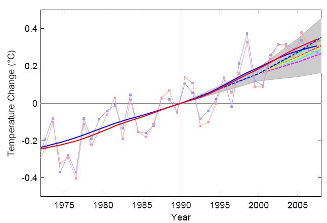
As some recall, Rahmstorf et al. (2007), who back in 2007, based on choice of specific smoothing parameters and method decided the TAR projections were low, produced a figure comparing observations to TAR projections. The legend on the figure stated,
“All trends are nonlinear trend lines and are computed with an embedding period of 11 years and a minimum roughness criterion at the end (6),
Jean S. reproduced the smoothing method described in Rahmstorf paper, selecting m=11 years (to mimic smoothing with the embedding period of 11 year as described in the legend.) This resulted in a good match to the published figure which is inserted in the lower right hand corner.

Click for larger.
So, it would appear that Jean S. was able to a) identify the smoothing method used in the original Rahmstorf paper, b) apply the method and c) reproduce the image in Rahmstorf et al. 2007.
Before proceeding to the evolution, It’s worth nothing that when limited to data collected in 2006, 11 year centered smoothing will involve observations from 2002-2011. As no data are available after 2007, computing the “observation” in 2006 involves guessing the temperatures from 2007-2008, but at least involves no data prior to publication of the projections. Prior to 2005, the computation of the smoothed data uses data from 2001 or earlier. So, comparing the smoothed data to the “projections” before 2006 means that one is, to some extent, diagnosing the “projections” ability to predict the past.
Different smoothing methods weigh the data data inside the smoothing region differently. But to some extent, extent, in Rahmstorfs comparison, 2006 represents the only “smoothed” data not affected by data known before TAR projections were made. So, any good agreement between “projections” and observations prior to 2006 should be interpreted with the understanding that those making projections in 2001 could have chosen a somewhat different method of creating projections had the hindcast been clearly wrong.
Puzzling Evolution
Time passes. Then, out pops “The (Copenhagen) Synthesis Report”, which appears to contain an updated version of the figure form Rahmstorf 2007. The legend for the figure states:
Figure 3: Changes in global average surface air temperature (smoothed over 11 years) relative to 1990. The blue line represents data from Hadley Center (UK Meteorological Office); the red line is GISS (NASA Goddard Institute for Space Studies, USA) data. The broken lines are projections from the IPCC Third Assessment Report, with the shading indicating the uncertainties around the projections 3 (data from 2007 and 2008 added by Rahmstorf, S.).
This wording, seems to suggest the major change from some previous graph was adding data from 2007 and 2008. It might lead the reader to jump to the conclusion that:
- The same smoothing method is used as in some previous graph. This graph is presumably the one in Rahmstof et al 2007.
- Since the legend still indicates 11 year smoothing, one might try m=11.
- Since the legend says nothing about treatment of the end points, one might assume same end point criterion was used in the original and updated figures.
However, Jean S. found that if he used the same smoothing (m=11) with the same end point treatment as in his original reproduction, his new graph did not look similar to Rahmstorf’s “updated” graph. The new graph shows the slope of smoothed observations flattening. Specifically, the flattening of the smoothed trend:
- mostly occurs after 2001 which when the TAR “hindcast/projections” were published.
- increases with time after 2001.
This flattening in shown in the top panel below. I have included a small version of Figure 3 from “The (Copenhagen) Synthesis” in the lower right hand corner:

Puzzled by the difference between the figure in “The (Copenhagen) Synthesis” and the one created using the parameter that seem to be suggested by the text of the report , Jean S began to examine a variety of other smoothing periods. After all, anyone who knows anything about smothing knows this:
What happens if we smooth using m=5 years? How about m=14 years?
Turns out that smoothing with m=14 years eliminates the flattening of the trend, and provides a good match to Rahmstorf figure, as show in the lower panel of the figure above. This is illustrated in the lower panel above.
How is figure 3 in the report created?
Did Rahmstorf use m=14? Did he change the method of dealing with the end point? Did Jean S guess wrong? Who knows?
But right now, something looks fishy with figure 3!
Additional graphs
For those interested, Jean S sent extra graphs showing how the choice of the embedded smoothing window affects the comparison between observations and projections. His graphs show m=5, m=11 and m=14 years.
| 2006 | 2007 | 2008 |
 smoothing: m=05 smoothing: m=05 |
 smoothing: m=05 smoothing: m=05 |
 smoothing: m=05 smoothing: m=05 |
 smoothing: m=11 smoothing: m=11Most similar to Ramhstorf et al. 2007. |
 smoothing: m=11 smoothing: m=11 |
 smoothing: m=11. Based on legend and text in The Synthesis report, what an ordinary reader might expect to be similar to Figure 3 in The Synthesis Report” (aka “Copehagen meeting report”.). smoothing: m=11. Based on legend and text in The Synthesis report, what an ordinary reader might expect to be similar to Figure 3 in The Synthesis Report” (aka “Copehagen meeting report”.). |
 smoothing: m=14 smoothing: m=14 |
 smoothing: m=14 smoothing: m=14 |
 smoothing: m=14. Suprisingly to the ordinary reader, what actually is similar to the figure in The Synthesis Report” (aka “Copehagen meeting report”.) smoothing: m=14. Suprisingly to the ordinary reader, what actually is similar to the figure in The Synthesis Report” (aka “Copehagen meeting report”.) |
Update
In comments, Jean S observed that Tamino showed that Rahmstorf’s curves would flatten out when 2007 data were added in this post.

Not surprisingly, if the same method is used, the end points flatten further when the temperature for 2008, which is low relative to earlier temperatures, is added.
6/25/2009: David Stockwell posted his replication of the Rahmstorf ’11-year smoothed’ results (which matched Jean S’s 14-year smoothed in Matlab). Like Jean S. he shows a flattening if 11 year smoothing is used in R.
I’m confused about this smoothing. How do you calculate a data point for 2006, if you do not have the numbers for 2007-2011?
Mike, I guess it’s enough to explain that the endpoint calculation is essentially based on “minimum roughness” introduced by Michael Mann, see here:
http://holocene.meteo.psu.edu/Mann/tools/tools.html
This is why there is so much fluctuation even if few data points are added/changed. In statistical terms, the method is very non-robust, and IMO should never be used, or at least, no conclusions what so ever should be made about the behavior of the graphs in the end.
The software (by Aslak Grinsted) Rahmstorf uses to calculate these “non-linear trends” also includes as an option another Mannian end-point criterion called “minimum slope”. It flattens the slope much more than this “minimum roughness” criterion. So the fact that Rahmstorf was still able to produce upward “trends” with 2008 data in is IMO an achievement by itself!
Those figures, where the end year is 2007, should be compared to this figure
http://tamino.files.wordpress.com/2008/03/rahmstorf2.jpg
available from this post:
http://tamino.wordpress.com/2008/03/26/recent-climate-observations-compared-to-ipcc-projections/
That is apparently the “real” 2007 update provided to Tamino by Rahmstorf himself. It is worth reading the post in full as if I recall correctly, Mr. “Open Mind” has been very concerned about “cherry picking”…
Mike N–
How you calculate 11 year smooth for the end point always involves guessing the future data. How you guess depends on the exact method used for smoothing and your choice of method to deal with the end points.
So, for example, suppose Rahmstorf 2007 used centered averaging. (He didn’t.) In that case, the 11 year centered average for 2002 is the average of the eleven years between 1996 and 2006.
What’s the smoothed value for 2003? Well, when Rahmstorf first published the 2007 paper, it did not contain the 2007 data yet. To compute 2003, he needs data from 1997-2007. So, he has to guess 2007. So, what should he use?
Some people would just ignore 2007 and then use 1997-2006, That’s 10 year average with no guessing. (Or looked at another way, you guessed the future temperature is the average of 1997-2006.)
But, there is another way. You could convince yourself that the you really need 11 points, but you want to maintain a trend. So, you decide that the temperature in 2007 is equal to the temperature in 2006 plus the difference in temperature between 2006 and 2005. So, if 2006 was warmer than 2006, you are “guessing’ 2007 will be warmer than 2006.
Of course, it’s still a guess! Worse: Suppose you were using a sine wave. doing it the second way will be way off!
In the original paper, Rahmstor used Mannian “minimum roughness” for the end point.
Basically though, if you use “N” year smoothing, smooth data within “N/2” years of the end point should either be omitted or shown with a dashed line. I think Hadley learned this lesson last year.
> introduced by Michael Mann
Uh oh.
Lucia, there are some notes on Mannian smoothing at CA http://www.climateaudit.org/?p=4038 and a function to implement Mannian smoothing here: http://www.climateaudit.org/scripts/mann.2008/utilities.txt
We were able to conclusively benchmark using Mann 20008 data. Replicating in R wasn’t easy – it turned out that there was difference between the filtfilt operation in Matlab and in R. Roman M solved this conundrum contributing filtfiltx, which emulates Matlab filtfilt in R.
You’re saying that Mann uses this mountaintop removal technique?
There are some smoothing methods that do not require projected data at endpoints.
The Henderson trend filter being one that has a variable weight centred smoothing that uses only actual data to end points.
Of course, like all the other smoothing approaches, it too provides end point trends that can not be used with any degree of confidence.
Lucia –
My poor understanding of these smoothing/filtering techniques comes from Digital Filters by R. W. Hamming. When I first read it I understood about one word in three. With the passage of time, it is now down to 1 in 10. 🙂
The key thing in showing the filtered value is whether the values shown near the endpoint are subject to future revision when the next value(s) become available.
I would go further than you did with your wish to see this portion shown as a dashed line. I think there should also be a clear statement that this part of the curve is a projection that makes assumptions about what the future data will be.
If this is done we can clearly see that we are comparing model projections with some mixture of observed and anticipated data during the endpoint period. Nobody would then be fooled into thinking that the graph was comparing models with reality during this final portion.
Comparing model projections against anticipated data is not a sensible way to verify a model.
Jorge–
I have been discussing centered smoothing. I guess I assumed that was implied in MikeN’s question. Obviously, one can do lagged smoothing.
Worse, pretending that somehow, one is doing a comparison of 16 years of “projections” by backdating the projection to include over 10 years of “hindcast” and then smoothing the comparison to propagate the influence of that data forward into all but 1 data point makes absolutely no sense!
Lucia –
My comment about “subject to revision” was an attempt to distinguish in a simple way two major kind of smoothing. From past experience, I find there can be a lot of confusion when more traditional words like physically realizable or causal are used. Naturally I agree with your point that centered smoothing will always be subject to revision.
I find it odd how little interest there seems to be in verifying models by their ability to forecast. In part, I suppose it is because of the time it takes to do it sensibly.
Some of the more extreme AGW supporters seem to have quite genuinely convinced themselves that because the models are “based on physics” and can hindcast reasonably well, there can be no doubt about the ability to forecast.
I imagine serious climate modellers are well aware of the pitfalls
involved in thinking one has captured enough of the physics but probably they prefer to discuss these issues amongst themselves.
Anyway, if discrepancies are found between model and reality that is a good reason to produce another model and another projection.
If they keep doing that they can prevent your statistical studies ever having enough data points to be fully conclusive. 🙂
Lucia,
As Geckko points out, even a centered smoothing window need not imply “projected” points to calculate end points. For example, in a typical implementation of lowess smoothing with a smoothing window of N points, the window is the same for the last N/2 points (i.e. the window consists of the last N points of the series), but the maximum weighting “slides” from the centre towards the end point.
For a generally rising trend (like global temperature), this will tend to depress the curve approaching the end point somewhat, especially if the end point is at or below the smoothed curve.
Deep–
I specifically described that treatment you re-describe in Comment#15083 posted before either you or Geckko posted.
But it’s always good to have you sounding as if you are correcting me while actually re-iterating what I said. 🙂
>I find it odd how little interest there seems to be in verifying models by their ability to forecast. In part, I suppose it is because of the time it takes to do it sensibly.
Actually it’s because they know this is a waste of effort as the models do poorly. Prof Prinn, who is responsible for the global warming gamble wheel after their latest study, in 1999
illustrated well by the failure of all current coupled ocean-atmosphere models (including ours) to simulate current climate without arbitrary adjustments
This is from the description of IGSM v 1.
They go on to write how their model is very good at replicating other model runs.
MikeN
I think this is the definition of “robust” as used by Gavin and likely other modelers. The models agree with each other.
Of course, what we need is “robust and accurate”. Both “not robust but a few may be happen to get the answer right” or “robust, but the average is off” are both less than ideal.
Lucia,
Your example used a simple moving average, with the window being reduced as one approaches the end point. Taken to its logical extreme, that would use the single end point for the last point in the series.
The end point handling I outlined only applies to weighted smoothing, and there is no reduction in window size as one approaches the end point, only changes in the weighting of points in the smoothing calculation.
Deep–
Yes, I gave an example of the general situation. You give another one.
Whether we provide the simpler moving average example I gave or the more complicated example you gave, one can still always rewrite the interpretation as the equivalent of guessing future data points, just as you can with a moving average. It’s just more complicated with the Lowess.
If the real future data do not turn out to match the equivalent “guessed” data, the current guess for the end point will change.
Just to clarify, their 2D model can be tweaked to match up with other 3D models that are out out there, by adding extra feedback factors.
MikeN –
The UK modellers are undeterred by the inability to calculate actual global temperatures or lack of skill in predicting trends. The UKCP09 project is trying to downscale global trend projections onto a 25 km grid. Not content with that, there is a random weather generator which will supply the high frequency weather noise to a 5 km resolution.
I have not yet read all the details but it is a rather ambitious undertaking.
http://ukclimateprojections.defra.gov.uk/content/view/2021/517/index.html
http://ukclimateprojections.defra.gov.uk/content/view/1158/9/index.html
Jean, Deep has posted on tamino’s blog a larger version of the graph, and there are differences between your smoothing and Rahmstorf’s.
If the algorithm to change the graphic was changed then the Synthesis Report has, in my view, a big problem. The group that produced it exists only because (still) many people believe what they are doing is science. The average person will understand perfectly well the dishonesty of changing the algorithm (if this did happen) when the ‘updated’ figure was presented. Lucia or Jean S should contact an author of the report with this rather straightforward question.
It would be visually appealing to see to the m=11 average (used to recreated the 2007 paper and then extended to current data) on the same graph as the actual graph in the Synthesis. In other words, a graph of the m=11 assumed-correct curve and the actual curve, along with the actual results. The differences are significant.
As an aside, it seems to me that any sensible 11 year running average should become rather flat when the underlying data becomes flat. Without any recourse to actual techniques, if the data is not increasing for a decade, it is hard to see how an 11-year running average increases (unless perhaps the first year is an outlier).
There is a flattening, but it is happening more gradually in the updated version, while Jean’s shows a more sudden flattening. The 2008 update for Tamino looks more like Jean’s version. The latest version intersects four of the scenario lines.
MikeN: Deep’s speculation seems to be rather useless. The small differences _in the end_ in the original and my 2006 version are probably due to small changes in the underlying data (last values tend to change a bit; Rahmstorf obviously used early 2007 versions for his original, and I’m using the (almost) current version; recall also that GISS version used in the original is the pre-2YK bug): compare (HadCRUT) 2002-2006 values in Deep’s magnification of the current update


http://deepclimate.files.wordpress.com/2009/06/rahmstorf-2007-update-detail.jpg
to the same years in Rahmstorf’s original
http://deepclimate.files.wordpress.com/2009/06/rahmstorf-original-20072.jpg
I don’t see any differences in “smoothing” (or in values) in the early part.
Deep’s speculation about different weighting is stupid as the software used does not even have any means of adjusting “weights”; only the criterion (“minimum roughness/slope”) and the filter length (m) can be chosen. As I said earlier, “minimum slope” “flattens” the curves much more, and it has definitely not been used. Deep can ask the code from Rahmstorf or Grinsted if he wants to verify those things.
Actually, comparing Deep’s magnification (thanks!) of the latest update to my m=14 update, I’m now more confident that m=14 was exactly what was actually used. I think HadCRUT replication is pretty much exact (the very small differencies in GISS are likely to differences in the version used; I used monthly values to obtain the annual anomalies). When I sent the figures to Lucia, I was sure only that something had changed, and m=14 seemed roughly to give the best match.
Here’s is a close-up of Rahmstorf’s original:

http://i41.tinypic.com/2vtusdy.png
Comparing that to Deep’s close-up, you see that HadCRUT data Rahmstorf used originally had lower 2005 value (relative to 2003 & 2004) and additionally 2003 & and 2004 were reversed.
MikeN & JeanS
Based on revisions since I started blogging, I can confirm that at any time, the past 18 months or so of “monthly” data from Hadcrut is subject to slight revision, over the course of a year or so. These could cause the teensie-beensie differences Deep is concerned about.
In contrast, the difference between smoothing with 11 years or 14 years is sufficiently large that magnification is required for even the near-sighted to see the difference.
MikeN–
Notice that Tamino added 2007 to Rahmstorf’s data and applied Rahmstorf’s method way back. I have that graph embedded above. When Tamino added 2007, Rahmstorf’s first graph flattened more than the current one does with both 2007 and 2008 added. Data from 2008 dipped way down.
Does it really make sense for adding 2008 and 2007 to flatten less than adding 2007 only?
cal browser (Comment#15198)
JeanS emailed me indicating he posted this question at RC this morning
I waited for the answer to appear. Comments with later timestamps now appear, but the one JeanS indicated he left isn’t showing.
Hopefully whoever moderates comments forwarded the question to Stefan rather than simply deleting it JeanS “inflamatory” choice of words. :).
>Does it really make sense for adding 2008 and 2007 to flatten less than adding 2007 only?
No it doesn’t but I’m not sure. My point is that it looks like the curve is flattening sooner in the 2009 Rahmstorf graph. Jean has almost the same, and then a sharp flattening, while in 2009, the temperatures stay closer to the dashed lines, and cross over around 2003.
That looks confusing. I mean Jean has almost the same graph and then a flattening, while in Rahmstorf 2009, …
Below is replication of the Rahmstorf figures with 11 (dashed) and 14 year (solid) embedding period, in R using the new package ssa, that I think explains what is going on.
rahm11-141

Black are the CRU temperatures, and the linear extensions are the data points appended to the end of the series for the ‘minimum roughness criterion’, which adds a line with the same slope as the slope of las window size (11 or 14) points. You can see that the slope of the added points increases a lot from 11 to 14 point, which explains why an increase in the window size would change the ssa curve.
Blue lines are the ssa, first EOF for the 11 (dashed) and 14 (solid) embedding periods. The removal of the downturning in the 11-window by the 14-window as shown above is clearly shown.
The red lines are the actual ssa forst EOF trends, without the ‘minimum roughness condition’. The MRC is not necessary. This is an arbitrary end condition selected by the authors in Rahmstorf 2007.
So its pretty clear that expanding the window would be necessary to maintain an alarming uptrend in the ssa curve. Interesting the noone at RC has responed to JeanS straightforward question yet.
Oh I forgot to say that the lines on the figure are displaced by the ssa package, and I haven’t adjusted them to line up with the data points yet. It makes the lines easier to see though.
For what it’s worth, the corresponding figure in the AR4 uses 13 year smoothing but data appear to end in 2004.
The figure title says
Lucia, it does illustrate that you can change the trend in SSA to produce the message you want by varying the parameters, and truncating the series. This flexibility obviously makes it an attractive method for Rahmstorf and Co.
David–
Absolutely. From my point of view, on of the unattractive things about the original Rahmstorf 2007 paper is that there was no particular motivation for using 11-year smoothing. Why not 13 year? 5 year? or the 30 year “climate standard”?
The TAR didn’t specify how the projections relate to any particular smoothing method. So, it seems a collection of 7 scientists just get to decide that after the data come in?
In my book, it’s bad enough the make an arbitrary decision once. But once they make it, they should at least stick with it.
The main irony of the Rahmstorf et al 2007 paper to me is that a judgement is based on an 11 year trend. Every time you or anyone suggests that the latest 10 year trend in temperature might mean something, the boys at RC slam them about confusing weather and climate, but when they do it, its OK, because after all, it shows more warming (because of the 1998 uptick).
… which happened before they published the projections they were testing.
Yes. For that test, the 1998 uptick influences all 11- year smoothed temperatures from 1993 to 2003. The uptick was known to exist when the projections were published. The data are already serially autocorrelated, and that is enhanced by averaging. The method is to eyeball the data. But somehow, that’s objective? Wow!
Did they happen to say what that 13 point filter was? Weights?
Barry,
The explanation in the figure is this: “Annual mean observations (Section 3.2) are depicted by black circles and the thick black line shows decadal variations obtained by smoothing the time series using a 13-point filter.” I didn’t search any further.
Lucia, it not objective, its not a method at all given the uncertainties surrounding the choice of end treatment aka ‘minimum roughness critierion’, and the sliding of the IPCC wedge to match the data. I haven’t seen any reference to how SSA might be used in this way to generate a p value, or the significance of the claim. Its a Rahmstorf special AFAIK.
Its a wonder why they would use this method when perfectly good statistical methods exist for answering the questions of trend agreement, as your careful and rigorous analyses have demonstrated to everyone. Its a wonder why I see comments on the blogs that Rahmstorf has done it the ‘right’ way. Its a wonder anyone takes it seriously.
David–
I agree that Rahmstof’s method is not a method to test anything. If I’m not mistaken, it’s more common to read warmings about making judgements based on smoothed values. Everyone wants to do it because it seems to easy, and the graphs look so convincing. But that’s precisely why it’s a bad method!
Nice post Jean,
I missed this one somehow before. Dr. Deep doesn’t seem to like any of the math you do Lucia, perhaps you should quit. The reason I bring him up is because he snipped one of my comments for pointing out the biased treatment of endpoint filtering in climate science. Here we see another glaring example. (please don’t snip me 😉 )
I wonder how they get away with it?
Deep climate snipped your comments? Where? At his blog? That could explain why few bother to leave comments there.
With the exception of TCO-like entities, I think it’s pointless to do much snippage or heavy moderation. People would still say what they think somewhere else.
On the more substantive issue: Climate science does seem to resort to all sorts of arbitrarily selected filtering methods with a wide variety of endpoint treatments. I’m still wondering why JeanS’s comment didn’t appear at RC. Looked pretty tame to me.
“arbitrarily selected filtering methods with a wide variety of endpoint treatments.”
In the case of the Synthesis Report, the method was changed deliberately to keep an upward trend going. The change was then misrepresented in at least two places in the report.
David– Yes. That’s how it looks.
He actually moved it to his open thread with some moderation wording claiming my statements were libelous.
He had a post demonstrating that someone had manipulated an polynomial curve fit look like more of a downtrend. I left a reasonable comment (for me 😉 ) which agreed with him but pointed out that his own extrapolation of a high order polynomial curve beyond the data was not a good way to demonstrate his point. Polynomials are after all, unconstrained after the end of the data. Here are some of the statements captain Deep (his moniker is way to cocky) had a problem with.
1. “Of course I have seen the binomial smoothing including some of the highly manipulable versions which straighten endpoints based on user input parameters. …These useful tools are also abused by people who want to make the data look different than it is.â€
2. “It’s equally obvious that other blogs/scientists would insist that you can only use a linear fit when it shows an upward trend obfuscating a downward curve which is slight but real.
Well it’s pretty clear that is what’s been done in this post here but there are many examples we’ve all seen of the same behavior. After one day, I don’t comment at captain deep’s site anymore.
Jeff–
You expressed on an opinion about bias in a community as a whole when applying end point filtering and Deep thought that couldbe libelous? Is Deep in the US? Or somewhere else? ‘Cuz opinions can’t be libelous in the US. Plus, how can you libel an entire community?
Oh well…
Yeah. I read that blog post. People can abuse polynomial fits. Duh.He comes up with his own examples and suggest claims someone might have made, but no one did. Then he explains why the fictional people who might have made these claims would have been wrong had they made the wrong claim. M’kay.
Lucia,
I rather thought my comments were an expression of potential bias accepted by the community than a specific accusation. His article accused certain types of folks known as ‘deniers’ as being biased. My point is that it was a two way street.
At the time, I wasn’t as pissed as I am today. The climate bill is a nightmare of bias and exaggeration and it’s almost enough to turn me into a denier monster.
The only thing holding me back is some warming makes sense. In 10 months of reading and study, I’ve seen no papers which show negative feedback has been dis-proven or positive is proven. The modeling shows too much warming compared to measured data (Thanks for your work on this). The surface temperature data is corrupt. Beyond that nobody really knows.
I wouldn’t have minded finding out AGW was true, at least we would know something. I don’t know if you’re aware, but I own a ‘green’ energy saving company and have already saved more CO2 for earth than all the greenies I’ve ever met. So there is some potential I could monetarily benefit from these idiotic laws.
JeffId
Yes. IANL. Still, expressing the opinion that a community could develop a bias could not remotely be called libel under US libel laws as I understand them.
Maybe in other countries? Who knows. But my impression (based on spelling and writing style) is you are American, Deep Climate is probably American, and we are all hosted in the US. So, what gives?
Jeff Id, go ahead and jump in the Denier Pool. (I’ve been there for years) It might be cold at first, but at least you don’t have to pretend it’s warm. 😉
Andrew
Rahmstorf now admits the change, but I was wrong, it’s M=15 not M=14 😉 See David’s post:
http://landshape.org/enm/recent-climate-observations-disagreement-with-projections/
I created an animated GIF for people to see how Stefan’s method of choice is behaving:

http://i39.tinypic.com/6fnvqa.gif
For those who have not followed this closely, M=11 (2006) “nonlinear trends” are the ones used in Rahmstorf et al Science-paper (2007), where they write:
“The global mean surface temperature increase (land and ocean combined) in both the NASA GISS data set and the Hadley Centre/
Climatic Research Unit data set is 0.33°C for the 16 years since 1990, which is in the upper part of the range projected by the IPCC. Given the relatively short 16-year time period considered, it will be difficult to establish the reasons for this relatively rapid warming, although there are only a few likely possibilities. The first candidate reason is intrinsic variability within the climate system. A second candidate is climate forcings other than CO2: Although the concentration of other greenhouse gases has risen more slowly than assumed in the IPCC scenarios, an aerosol cooling smaller than expected is a possible cause of the extra warming. A third candidate is an underestimation of the climate sensitivity to CO2 (i.e., model error).”
Of course, the fourth candidate might have been simply the “trend” calculation method they used…
Now M=15 (2008) corresponds to Figure 3 of the (Copenhagen) Synthesis report. There it has been written
“Figure 3 … shows the long-term trend of increasing temperature is clear and the trajectory of atmospheric temperature at the Earth’s surface is proceeding within the range of IPCC projections. ”
Of course, it was a simple mistake that the figure caption says
“All trends are nonlinear trend lines and are computed with an embedding period of _11 years_ and a minimum roughness criterion at the end “
Nick–
This is not what MRC does. What MRC involves flipping the data with two mirrors.
The first flip is to assume the future data is the reflection of with mirror about the vertical. So, a set of three data with “y” values of y1, y2,y3 ending in y3 would be assumed to be y1,y2,y3,y2, y1.
Then after that the guessed data flipped around the “x” axis. So, if we had “rebaselined” such that y3=0, the data would be y1, y2, 0, -y2, -y1.
This tends to maintain whatever the trend existed was over the past “m/2″ data points and is not anymore sensitive to specific final point than any other point in the series.
The reason the 11 -year smoothing with mrc roughness goes flat toward the end is that (for whatever reason) the trend based on observations from 2004-2008 is not positive.
If climate modelers believed a claim that ‘weather noise” permits 20 year negative trends to be embedded within rapidly rising long term trends, then they can’t avoid flat spots appearing due to “weather noise” unless they use filters that smooth with time periods greater than 40 years. Of course, in that case, they can’t “test” any model projections (or even most hindcasts) from any if the IPCC reports by eyeballing graphs with smoothed data because everything from 1979 forward is in the “end region” and subject to change when new data comes in.
(Mind you, the could still test using other, not-foolish methods, like t-tests. But Rahmstorf’s choice of smoothing, which seems to involve selecting “m” after looking at the data, is nuts.)
Some clarifications are needed here. The minimum roughness condition (MRC) as suggested by Mann 2004 of double reflection of the last m points, then SSA, is not the method used in Rahmstorf 2007. You would know, because Mann’s method pins the end point to the trend line. Moore 2005 flags the difference by using the abbreviation ‘cf.’ when he references Mann 2004.
The method used in Rahmstorf 2007 is to append a fitted line through the m point onto the end of the series. Clearly the fitted line could be produced in a number of ways, n-order polynomial or SSA itself. In this case a first order polynomial, or linear fit is used. The different approaches illustrate the ‘model uncertainty’ around the choice of end treatments.
It think Mannian filtfilt is another method entirely, as Rahmstorf 2007 uses SSA. Its worth mentioning that the trend line is based on the first EOF of the SSA decomposition. So there is another question, how many EOF’s should have been used. Because SSA assumes stationary, periodic components, it tends to fit a linear trend with TWO periodic components (see my recent posts). So attempting to use the first component of SSA as a smooth is bound to arbitrarily introduce a second derivative, a curving up or down.
Anyway you think of it, its a dogs breakfast, when a simple modified t test would have been adequate.
Steve, I think filtfilt is a different smoothing method from SSA. Another Mannian smoothing method.
Lucia, this is very good.
Once again, we replicated Mannian smoothly exactly at CA in our analysis of Mann et al 2008 where we had before and after results – so there’s no replication mystery on this.
Mannian smoothing considers three different situations: 1) reflection; 2) reflection plus flipping; 3) projection of mean and then picks one of the three methods. This are given inflated names like Minimum Roughness etc.
All three “cases” are built into Mannian smoothing.
As I recall, reflect-and-flip corresponds to Emanuel’s bin-and-pin smoothing in his hurricane data, which he later renounced.
David– You are right. I described Mannian smoothing, which is not what Rahmstorf did. But Rahmstorf also didn’t do what Nick did.
There are a zillion possible ways to smooth, and it appears that the climatologists use many. The reason for any particular choice is obscure. I’m perfectly willing to believe any one of them might be useful in some specific situation. But with Rahmstorf, the choice of smoothing with any end condition to guess data makes the method specifically unsuited for testing fidelity projections.
Lucia, that is why it is so important to understand how the methods work, at least intuitively, before you use them, and Rahmstorf clearly doesn’t. SSA is OK for decomposing stationary periodic data series. Thats all its assumptions justify. They are applying SSA to presumed non-stationary series, then mangling it to fit.
I guess it isn’t any news to posters on this website, but as a novice to the AGW discussion, I was amazed at the moderation of comments over at realclimate.
Two days now and my comment still hasn’t cleared moderation.
Charlie, don’t worry … that’s what happens to all of my comments every time I bother to comment over there. Except once:
http://www.climateaudit.org/?p=715#comment-31682
http://www.climateaudit.org/?p=715#comment-31765