Many people have already entered guesses for July’s UAH anomaly. I guessed 0.435C based on Channel 5 anomalies. Bill Buckner suggested that NOAA maps suggest lower surface temperatures than Channel 5. ( Channel 5 is not a perfect indicator of UAH temps. I can provide statistics on that later. )
Here’s the 30 day image from NOAA :

I don’t know B… I see a lot of white which is near a zero anomaly; I see very few negative anomalies. The weather in Antarctica looks pretty warm.Of course, that’s probably not an equal area projection, but still. Plus, surface temperatures and troposphere temperatures don’t always match.
I’m still betting on 0.435C based Channel 5. (I’m also mystified why Chicago isn’t blue on that map. It’s seemed consistently cool for July. Tom Skilling’s blog indicates it’s the coolest Chicago July in 118 years. )
If you want to watch how the temperature evolved, here is an animation of NOAA temperatures for the most recent 30 days.
[sockulator(../musings/wp-content/uploads/2009/08/noaa_animation.php)sockulator]
(I suspect this will update, so if you read this month’s after publication, it may show whatever the most recent 30 day temperatures are on the date you read it. I’m not sure. But the maps have time stamps, so you’ll be able to tell.)
Other NOAA global circulation animations available here: here.
Do you want to see all the bets?
Guesses so far:
- Andrew_FL: .400C+-.120C
- John F. Pittman: .418C
- Zeke: 0.485C
- VG: 0.5C.
- Zer0th: 0.392C
- Chuck L +0.397C (
- George Tobin: 0.445C
- Steve F: 0.421C
- BBuckner: 0.15C
- RyanO: .411C
- Terry: .404C.
Hmm.. I should enter these in a spread sheet and compute the average. Then we can compare that to Roy’s official reading when he posts it in a few days.
The shading levels on those maps really annoys me! Notice that most of the oceans are covered in white, and the -/+ anomalies only show up over land areas simply because there is much more variability in temp over land surfaces. The map would be more informative if ALL areas were shaded, and maybe would give a better indication of where the global monthly anomaly will be.
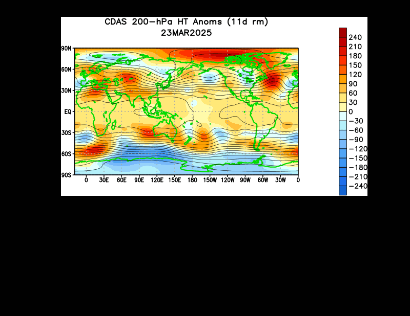
Check out this animation for the month of July in which all values are assigned shading:
http://www.cpc.ncep.noaa.gov/products/intraseasonal/z200anim.shtml
I know its not temperature, but 200-mb heights are directly proportional to average tropospheric temps. We’re burning up!! Its interesting how that cpc map implies that the entire equatorial region is experiencing above normal temps, not just the over the warm SSTs where El Nino is forming.
My Lucia is 0.36
Adams– I added the image. The tropics definitely look warm- and that’s a lot of area. This map does show Chicago and the midwest is cool (which I can confirm.)
The pole are burning up.
Lucia: Please include my guess of 0.205 deg C for the July 2009 Global UAH TLT anomaly.
(Okay, Dr. Roy, don’t let me down.)
Great animations. I haven’t seen those before.
My model says 0.202C – very close to Bob it looks.
It has been a very warm winter in Antarctica this year.
Adam (#17024)
That map seems to be missing the cold patch in the equatorial Atlantic shown in this image.
http://www.osdpd.noaa.gov/PSB/EPS/SST/data/anomnight.7.30.2009.gif
Although you have to dig a bit, I think the base period (“climatology”) for the map I linked to is 1985-1993 excluding ’91 & ’92 (Pinatubo effect).
Your’s is based on a base period of 1979-95. Looks like including the relatively cool early 80s in the baseline tends to “bloody” the colors.
The projection is certainly not equal area – with the equally spaced parallels it looks like the simple equirectangular projection. In reality, Antarctica has the area about 0.8 that of South America.
Lucia: I agree with you on the July temperature of the midwest; Wisconsin has consistently been several degrees lower than average all month. I even had to wear long pants a few times, which irks me no end (my workplace has a very relaxed dress code).
Please put me down for 0.416 on the anomaly pool.
Who knows?…Dr’s Spencer/Christy may apply a major correction (due to drift etc..) if you eyeball the AMSU graph compared with other data. BTW Just saw that its snowing in Santiago (AGAIN!) re SBS Australia TV
Burning up? Uhoh, My BEBE has a FEVAH! Quick, call Dr Gore!
Hehe…
No wonder Antarctica is warm, it’s being shovelling all its cold air up to us in NZ this winter.
Great animations. Thanks for those.
Bill Illis: You wrote, “Great animations. I haven’t seen those before.”
Bill, I created an animation of Global SST (not anomaly) from 1981 through 2009. I haven’t posted it yet. I’d like to discuss with you what I’m seeing, because I’ve never seen it before or mentioned anywhere. It involves an annual cycle in addition to the seasonal cycle. It appears to be yet another reason why the PWP “recharges” so quickly after an El Nino event. So if you like to review what I’ve done and what I’m seeing, please leave me your email address (I won’t post it) in a comment on any thread at my blog.
Regards
Based on the count of seed pods on our jacaranda, I calculate 0.183 for the anomaly.
I have no prior evidence at all that this method is reliable but at least it is testable in the short term. 😉
There are some big ‘shrooms growing in my backyard this week. I imagine the cool and wet summer has provoked their growth, but I am not an expert. My dad says kick them over, but I suppose I’m just going to let them be. They are poisonous?
Andrew
What should make Antarctica so anomalously warm?
Antarctica’s glaciation and resulting albedo do not vary significantly and should lead to the radiative balance being very stable. The warming would seem dynamic, then.
Is this the real El Nino signal?
LeRoux expresses his belief that El Nino is an atmospheric
phenomena with oceanic effect. The warmth of the
Antarctic during this El Nino emergence seems consistent – relative SH weakness means relative NH strength, leading to polar air masses leading fronts to the Gulf in late July.
Climate Audit posted a comparison of 2005 with this year which seems consistent:
http://www.climateaudit.org/wp-content/uploads/2009/07/hadisst_jun2009-jun2005.gif
http://www.climateaudit.org/?p=6563
looks like NH ice is going the 2005 way. My mind “forcing” is working:
http://ocean.dmi.dk/arctic/icecover.uk.php Hahaha
So much for magic…
I think Ill try the AMSU temps now, No, don’t think that one will work…
Hi Lucia, if the anomaly is to the average of the years ( I cannot read the subtitle clearly) 1979-95, I have a question and an observation.
Question: why would that interval be considered normal against which we are cooling or heating?
It leads to the observation that color coded maps of anomalies are a PR tool. Why not take as normal the years 1850 to 1900? Then we would be parboiled in all the red colors.
I think the only rational use of color maps, that would carry information but would not subliminally bias the viewer is to take the whole average, maybe including the year under observation and gauge the present anomaly from there. Then if it is all red, we would know that we are at the hottest part of the set, if it is all blue, at the coolest, and mixed colors would carry information.
Another way of stating this is that since nobody rationally would refute that the global temperatures have been rising ( it is the anthropogenic that is disputed) it is evident that the colored maps will be biased towards the red if the complete sample is not included in the 25 year period chosen for normal, the more red, the further back the interval of “normalcy” is chosen. Since we are interested in what is happening around now, it is the last 25 years that should be averaged and gauged against, to see in a color map what the trend is.
As far as Antarctica, one should not forget it is winter and the average temperatures might be around -60C so a 15 F play is still PR and certainly not melting any ice.
Maybe a bit off topic but interesting anyway
What’s driving the transinet temp changes? Maybe its the krill!
http://www.terradaily.com/reports/Tiny_Sea_Creatures_Linked_To_Large_Scale_Ocean_Mixing_999.html
Finding: the swimming action of tiny sea creatures may have as much impact as wind and tides.
Anna:
Excellent points. The baseline for the anomalies should at least include a complete cycle where the interannual variation is largest. Is there a reason that we should use the entire measurement period for which we have data of a given type? Given that the satellite data is from 1978, then the reference period should be from 1978 to 2009.
Just a small correction: In order to avoid forcing uncertainty, I use a model with an error range of 3.5 degrees C., so I am pretty sure I have already won.
Lucia, I’m watching channel 5 also, and do not see how you can come up with a number anywhere near 0.435C. The raw data for channel 5 is readily downloaded here
http://discover.itsc.uah.edu/amsutemps/data/amsu_daily_85N85S_ch05.r002.txt
and while the graphical web page shows differences in degrees F, the underlying data appear to be in K. The average K for July 2009 was 254.16, and for July 2008 it was 253.84, which works out to +0.32C and +0.58F (the latter is what we see with the graphical page, and the 2008 and 2009 values are -2.76F and -2.18F respectively). Now the July 2008 anomaly was -0.11. So if the July 2009 anomaly is 0.32 higher, we come in at +0.21, about half your estimate. But right at what Bob Tisdale and Bill Illis are projecting.
So put me down for +0.21. Even if channel 5 isn’t exactly what we’ll see when the real number is out, if it is the best source, the real number should be much closer to +0.21 than +0.435.
I wonder why so many people are coming out with estimates in the +0.4 range, if they are using channel 5. Are they confusing F and C? I know you reported your estimate as 0.435C, but the only way I can get even close is to add the July 2009/July2008 difference in F, which was +0.58 to the July 2008 anomaly in C of -0.11, to come up with +0.47.
I think I should ask what people are thinking in comparing the current temps and El Nino to 1997-1998? I don’t think we’re anywhere close to that.
Andrew_KY:
Just as a guess, you are probably looking at inkcap mushrooms. They are considered by some as delicious. Personally, I find them acceptable, but a little bland. Of course, never eat any mushroom until positively identified. Kicking them over, harms them not at all. The organism lives below ground and you are only observing the flowering part of the fungi.
Thank you for the response, G.!
I would upload a pic of it, but I don’t know how, or if I’m allowed. 🙁
Andrew
Basil– I subtract the average 20 year column (13) from the 2009 column. The average column is over the baseline. On july 15 2009, we more than 0.5 over the baseline.
The comparison of this july to the 98 El Nino might not be fair. It might be better to compare to 1997 when El Nino conditions first picked up. We don’t know what’s going to happen. The full comparison to any past El Nino can’t be done until this one ends.
Well, then, lucia, that raises an interesting question, to me at least. What is the “baseline” and where do you see that in the channel 5 data? I’ve been looking for evidence to the contrary, but I think the baseline for the monthly UAH anomaly is 1979-1998. Which is a 20 year period, but is it the same 20 year period used to calculate the average shown in the channel 5 data. For some reason, I’m thinking that the 20 year average shown on the “discover” graphs is the most recent 20 years, not the 1979-1998 baseline used for the UAH anomaly.
BTW, it looks as if I misread the 2008 June anomaly for the July anomaly. Correcting, I’d get 0.06+0.21=0.37. Much closer to your number now.
Well, we shall soon see what the “real” number is, I’m sure.
Basil– I don’t know if the AMSU and UAH timeperiods for baselines are exactly are the same.
I did check the difference between the average UAH and Channel 5 using the Channel 5 average to “baseline” using UAH data through May 2009. On average, Channel 5 is -0.0171C relative to UAH. So, on average it’s just a tad colder. However, in recent moths, channel 5 has been warmer. Since the AMSU drifst around, the more recent data may be more meaningful. But.. I haven’t bothered to do anything detailed because the only use for Channel 5 is to see if data seem to be currently rising or falling. Within 30 days we get the real UAH data, so trying to ‘perfect’ the predictor just isn’t worth much effort.
Actually G, the mushrooms are white, not quite a foot across, and the tops are several inches off the ground.
Ah! Are they toadstools?!?!?
Andrew
Cool animations. err hot animations. I’ve been pondering the question of infilling missing daily data from surface stations.. interesting spatio temporal correlation problem there somewhere.
Lukewarmer: free the data; free the code; free the debate
Put me down for .299 🙂
“I see a lot of white which is near a zero anomaly; I see very few negative anomalies.”
The NOAA map you’re referring to defines the white range as -3 to +3 C, so white hardly suggests “near a zero anomaly”.
“… (I’m also mystified why Chicago isn’t blue on that map. It’s seemed consistently cool for July. Tom Skilling’s blog indicates it’s the coolest Chicago July in 118 years. )”
Technically, 1992 was slightly cooler (but “coolest Chicago July in 118 years” has better propaganda value). There were parts of the west that had their warmest month on record.
Chicago was 3.9 F below normal, or about 2.1 C, so I would think it would show up as white on the map.
http://www.crh.noaa.gov/news/display_cmsstory.php?wfo=lot&storyid=30079&source=0
Eyeballing such a map with such a wide range in each color doesn’t really tell us what the global mean surface anomaly is going to be, but if UAH is really expected to be around 0.435 C, this would imply an NOAA anomaly of close to 0.68 C, which would be their warmest on record.